A restaurant menu has an unusually demanding job. It must make dinner sound appealing, survive the table, and accommodate whatever changes tomorrow. Give it enough personality and someone might photograph it. Give it the wrong production system and someone on staff will quietly come to hate it.
At the Tam O’Shanter, YYES designed reusable menu carriers with inserts that staff could print each day. The visual inspiration included a 1925 letterhead. Old paper supplied the character; an everyday printing routine helped keep it usable. That combination is a useful introduction to a studio whose work often begins by asking what a business already possesses.
A filing cabinet can be a creative department
For the Tam, interviews and archival material pointed toward the restaurant’s playful past. YYES developed lettering with deliberate imperfections, revived a lightning-bolt motif, and extended the identity into the dining experience. A uniform collaboration with Christopher Fleming and sign work with Neiman & Company brought other specialists into the project.
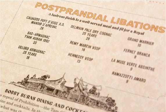
YYES reports that revenue rose nearly 30% and guest count more than 30% within a year of the 2015 rebrand and menu changes. Those changes happened together, so the figures cannot tell us what the graphics alone accomplished. The useful observation is how far the assignment reached: into things guests handled and staff maintained.
The customer changed the question
In February 2020, YYES spotted takeout searches overtaking reservation searches for Lawry’s Restaurants. Pandemic closures soon made that shift urgent. The studio says it helped produce takeout and delivery messaging, graphics, and supporting systems within 24 hours.
The work eventually included Lawry’s At Home, a Shopify store for cook-at-home meals. YYES handled branding, packaging, website work, and a photo shoot with the client’s marketing and operations teams. Its case study describes a modest budget and first-month performance at nearly twice projections. That comparison is against a forecast, not a calculation of return on investment.
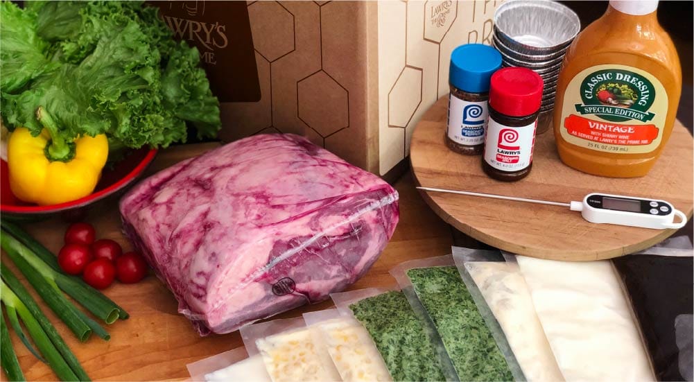
There is a practical lesson here: a new promise needs somewhere to go. Packaging, ordering, and fulfillment have to agree. A business attempting the same move would need the operational ability to deliver the meal as well as the words to sell it. The website is one part of that bargain.
- ListenTakeout search interest rises
- RespondMessaging and ordering adapt
- DeliverA meal travels home
A studio built around the conversation
Ron Fleming and Brent Stickels founded YYES in Los Angeles in 2000. Minneapolis followed in 2008. The studio describes a deliberately small team, with a partner leading each assignment and staying the client’s principal contact. Designers also manage projects.
That arrangement is part of what a customer buys. Questions about a brochure, a website, or a new identity reach the people responsible for making it. When an assignment needs additional skills, YYES brings in freelancers and production specialists. The model gives clients access to a broader range of capabilities through a compact core team.
Fleming’s background includes Tyler Blik Design in San Diego and creative leadership at Maddocks and Company in Los Angeles. Stickels is a writer and designer with an advertising background; his AIGA appearances have included discussions of the realities of running a design business. These are careers built around making and explaining work.
The recruiting form supplies a less formal clue. Alongside work samples, YYES asks applicants about their influences and what they are listening to. Someone looking at your portfolio also wants to know what is going into your ears.
“We don’t have a house style.”
YYES / THE STUDIO’S OWN DESCRIPTION
Orange, enlarged shapes, and a palm tree
A lack of house style is easy to announce. The portfolio gives it substance. Paradigm Talent Agency’s rebrand preserved orange, a recognizable asset, while introducing the agency’s full formal name. TheWrap reported the 2015 collaboration with Paradigm’s creative team and partner agency AM Only. The system had to appear across entertainment-business materials, including trade advertising and script covers.
At USC School of Architecture, the starting point was an existing system of shapes, patterns, and typography. YYES enlarged familiar elements into prominent graphics and used disciplined layouts to support the school’s publications. The project suggests a helpful distinction for anyone writing a design brief: an identity can need fresh applications even when its basic ingredients remain useful.
The Los Angeles Conservancy faced another problem. Its public image undersold the breadth of its preservation interests. After exploring alternatives, the organization kept the architectural capital associated with its identity, alongside a palm tree. YYES added a system of 18 location-based icons, expanding the visual vocabulary around the familiar mark.
Its website needed a similar expansion in usefulness. YYES treated the material as a publication, organizing information around visitors’ interests and connecting related content. The brand launched in mid-2013 after nearly two years of work. The lesson for another institution is concrete: decide how people will find and use the material before deciding how the pages should look.
Carry recognition forward
Put existing forms to new use
Make a broader mission visible
The website before the meeting
For Marquette Asset Management, YYES identified a more specific digital task: prospective clients were using the website to assess the firm before meeting an advisor. Clear navigation and an explanation of its services mattered. The website and printed materials were designed to present a consistent account of the business.
The business cards took that thinking into physical form. Heavy paper and an embossed logo were intended to express a service built around personal attention. You can disagree with a particular paper choice and still appreciate the discipline: the object had a job beyond carrying a phone number.
Five Crowns, meanwhile, needed to welcome a new generation of diners while respecting established affection for the restaurant. The assignment extended from logos and color into signage, the façade, menus, uniforms, and photography direction. Such work puts YYES in the market for coordinated business communication, with room for both a small printed object and a public-facing building.
Buy the brief, then the things
YYES’s services cover strategy, writing, visual design, digital development, campaigns, and production management. Its three stages are discovery, design, and delivery. Discovery establishes the objectives and produces creative, visual, and messaging briefs; it also confirms budgets and schedules. The commercial offering is professional service, shaped around a client’s assignment.
For a prospective customer, a useful first step would be to bring a business problem that can be described plainly. People misunderstand what we preserve. Prospects cannot find what they need. Our restaurant experience now has to travel. Those are questions a team can investigate and use to judge a proposal.
The same approach asks something of the client. Someone has to make decisions, share evidence, and participate in reviews. A company seeking only a predetermined visual treatment may have little use for that discovery work. For everyone else, the portfolio offers a habit worth borrowing: examine what customers recognize, what employees must operate, and what the business needs to do next. Then decide what to keep.