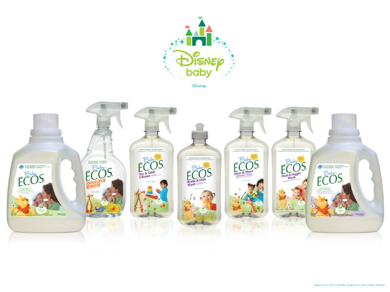
A row of cleaning bottles is an unusually good place to look for a design studio’s argument. In Kashani Design Group’s portfolio, Baby ECOS containers line up beneath the Disney Baby name: spray bottles, a pump bottle and handled jugs, each carrying its own product information. The shapes change. The family resemblance holds. Somewhere between the large container and the small label, the assignment becomes clear: make separate things belong together.
The Beverly Hills firm works across logos, packaging, print, websites and television creative. Its founder, Sherry Kashani, was identified in a company press item about an Opportunista feature on women entrepreneurs in November 2017. The studio describes a team of designers, developers and strategists. But the most useful introduction to its business is the work itself, especially the examples that follow a brand from one format into another.
Baby ECOS offers that trail. Packaging appears alongside a website mockup and printed collateral in the portfolio. Taken together, they suggest a practical reason to hire a studio with several disciplines: a company’s identity has to travel. The bottle cannot explain everything the website can. The website cannot sit on the supermarket shelf. Each must do its own job while remaining recognizably related.
A bottle, a browser, a brochure
Look closely at the Baby ECOS image and the hierarchy becomes visible. The brand name supplies a common point of recognition. Product names distinguish a toy-and-table cleaner from a fruit-and-veggie wash. Character illustrations and family photographs occupy the labels alongside functional information. This is a design problem with several competing demands, all squeezed into a surface that customers must be able to read.
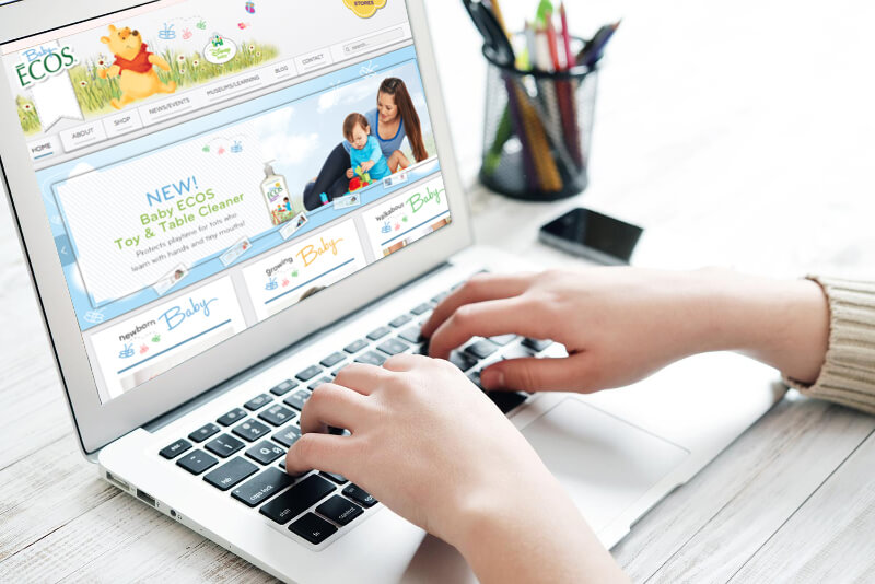
The website example gives those ingredients more room. It shows a Baby ECOS page on a laptop, with a navigation bar, product promotion and family imagery. The familiar characters remain, but the composition changes to suit a screen. It is a portfolio presentation of the work, rather than a claim about how the website looks today. Its value here is the visible relationship between the physical package and the digital page.
A Baby ECOS brochure and an ECOS press kit also appear among the studio’s print assets. That expands the assignment again: printed communication has pages, folds and reading sequences to consider. The lesson is less about matching every layout than deciding which elements should remain familiar. A brand can change its clothes without requiring an introduction every time it enters a room.
For a prospective customer, following this thread is more revealing than counting impressive names. Ask to see how one identity behaves across the actual materials you need. A handsome logo is one piece of evidence. A package, a website and a brochure let you examine whether the design can handle different amounts of information and different ways of being seen.
The brief comes before the look
Kashani’s published process has four named stages: idea, design, development and communicate. The opening stage includes market research, brand positioning, content strategy and media planning. In plain language, the studio proposes working out who the company is addressing and what it needs to say before deciding how the work should look. That sequence gives the creative brief a job beyond collecting favorite colors.
The design stage covers identity, digital branding, packaging, websites and television. Development then concerns integrating the design with other components and the places the brand appears. Communication includes social media development, brand language, content and messaging. This is the studio’s description of its approach, and it provides a useful set of questions for a buyer: what will be decided, what will be made, and how will those decisions carry through?
The services page also gives writing a seat at the table. Brand building includes defining a voice and developing messages for particular audiences. That matters because a company can look consistent and still sound confused. For a buyer, the implication is straightforward: the brief should cover the language on the package or page as carefully as the typeface used to display it.
A zebra gets the front of the bottle
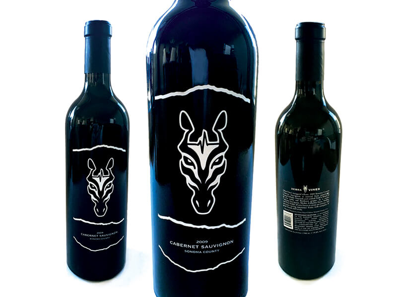
Another packaging example takes a very different visual route. Zebra Vines wine bottles wear dark labels with a white zebra-head illustration and irregular white outlines. In the portfolio photograph, a large central bottle brings the mark close, while two smaller bottles show the front and back. The composition makes the division of labor easy to inspect: an image leads on one side, denser information occupies the other.
There is little visual resemblance to the Baby ECOS work. That difference is instructive. A designer serving several types of business needs more than one house style. Here, the wine presentation relies on a spare, high-contrast animal motif; the baby-products presentation contains brighter colors, recognizable characters and family pictures. These are observations about the displayed designs, not a measurement of how shoppers responded to them.
The broader packaging selection includes Dishmate, ECOS hand soap, First Harvest olive oil and PediMD. Those examples put the firm in the business of arranging identities around tangible products. For someone commissioning that work, a useful first step is to collect the real containers and the required text. The available surface, the product variants and the information all belong in the conversation before the mockups arrive.
Clients with very different first impressions to make
Kashani’s published client roster includes Earth Friendly Products, Disney Baby and BH Cosmetics, along with hotels, healthcare providers, law firms and financial-services businesses. Genre Hotels Group, RK Law Group and Southern California Reproductive Center are among the named organizations. Read the list as a record of relationships the studio presents, rather than an assurance that every engagement is current or identical in scope.
The print portfolio helps make some of that breadth concrete. It includes a University Foot & Ankle Institute brochure, Southern California Reproductive Center material about egg freezing, Genre Hotels work and an Orbitera piece. A consumer-product label and a healthcare brochure plainly carry different information. Seeing both in the same portfolio points to a practice organized around communication formats as well as client sectors.
Its place in the market is therefore best understood as a boutique creative-services business. A buyer can bring it a brand assignment that crosses several formats. The alternatives depend on the brief: an independent designer for a contained task, a specialist studio for a particular medium, an internal team for continuing production, or a broader agency for a larger assignment. That is a buying framework, not a ranking of those options.
The client has homework, too
The company’s description of collaboration is refreshingly direct. It asks clients to participate throughout the work and contribute their expertise and feedback. It also describes project management from beginning to end and regular communication about progress. Those commitments make the relationship part of the service: the customer brings knowledge of the business; the studio brings design, development and strategy.
“Your participation from start to finish is crucial.”
Kashani Design Group, on client collaboration
This approach gives a prospective client a practical preparation list. Identify the person who can approve the work. Gather existing materials. Decide which audience matters most. Bring the awkward examples: the label that must hold too much copy, the brochure that uses different terminology from the website, the logo that disappears at a small size. These are suggested briefing exercises, rather than accounts of failures at Kashani.
They also expose the conditions under which a collaborative assignment becomes difficult. If nobody can settle the message, changing the layout will leave the central disagreement intact. If the client wants to disappear until delivery, a process that depends on continuing feedback is a poor match. Kashani’s stated method makes participation a sensible topic to discuss before commissioning the work.
Buy the assignment you actually need
The commercial offer is client-commissioned creative work. Given the studio’s project-based process, it is reasonable to understand the business as selling expertise and execution around defined assignments. For a buyer, the useful cost question begins with scope: does the job cover a logo, a complete packaging family, a website, written messaging, or several of those together? Those are different purchases even when they share a brand name.
A workable proposal should distinguish design fees from printing, photography, media placement and other production costs, where applicable. It should also say how revisions, delivery formats and approvals will work. These are buyer considerations, not published Kashani contract terms. They allow competing proposals to be compared on the same assignment, and keep an attractive initial concept from becoming an argument about what was included.
The most transferable idea in this portfolio is simple enough to use before hiring anyone: choose one brand and place its materials side by side. Look at the bottle, open the website, unfold the brochure. Decide what should connect them and what each format must accomplish independently. Kashani Design Group’s Baby ECOS examples make that exercise concrete. The identity has work to do after the logo leaves the screen.