A green dot is about as little design as you can get away with. No illustration to admire. No elaborate symbol to decode. For Tipping Point Community, Elixir Design gave that dot a particular job: represent one person. Put the dots together and you have the thing the organization’s name promises. A community becomes visible.
The idea began modestly, with a sticky dot on a lapel pin. Elixir carried it into an expanding visual language. In a 2011 annual report, dots gathered on cardboard covers around a large hole, with a smaller booklet covering the opening. In 2013, the studio made a report readable from opposite ends: donors on one side, results on the other, meeting at the numbers in the middle. The object helped explain the relationship.
That is a useful way into Elixir. The firm sells brand strategy and design, but its portfolio rewards a more ordinary question: what could you make that would help someone understand?
● ● ●
● ● ●
A small symbol with room for more people.
Editorial illustration of the idea, not the client’s artwork.
A company hidden inside an adjective
Elixir’s practical enemy is the flattering word that explains nothing. Innovative. Creative. Quality. You can imagine the meeting in which everyone approves them. You can also imagine the competitor approving exactly the same list.
The studio describes developing its North Star process because outside strategy documents had squeezed away the peculiarities its designers needed. Its response includes individual customer interviews, workshops and prototypes. One workshop asks what audiences think today; another asks what they should think tomorrow. Later, actual communications give the proposed direction something to prove.
This is where Elixir fits in the market: a studio that can help decide what an organization should communicate, then make the things that communicate it. The deliverables include positioning, names, narratives, identities, websites, packaging and event materials. Writers, photographers and filmmakers extend the work beyond a mark on a page.
For a buyer, the distinction matters most when the brief itself needs work. A museum fundraiser, a lifestyle company reaching new customers and a nonprofit explaining its purpose all have decisions to settle before choosing a typeface.
The cover that took a hit
Consider Elixir’s cover for David and Goliath. Malcolm Gladwell’s agent approached the studio. The designers kept the visual continuity of his earlier books and added a single illusion: the cover appears to have been struck, its paper torn open around the impact.
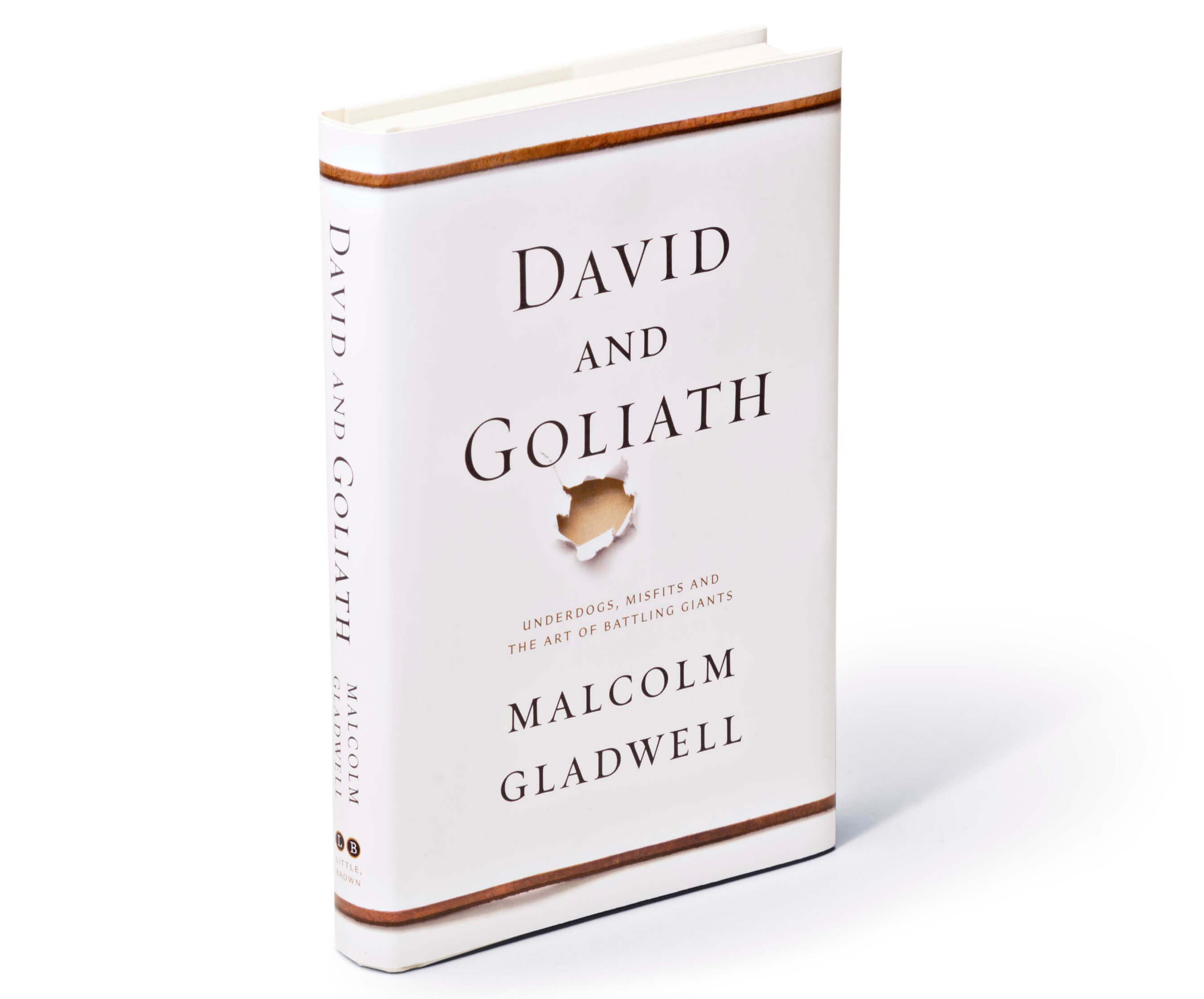
The appeal lies in the economy. The picture refers to the title without trying to summarize the whole book. It also respects something already working: the author’s recognizable visual world. Designing a new thing did not require discarding the old one.
The same restraint appeared in SFMOMA’s Modern Ball. For the museum’s biennial fundraiser, launched in 2005, Elixir created a companion identity with a replaceable ball. A glass marble came first. A crumpled sheet of photocopy paper followed in 2007. In 2012, the form referred to cubism and the museum’s planned expansion.
The mechanism let successive events develop their own personalities while remaining related. A committee could change the theme without starting the identity from scratch. That is a fairly elegant answer to a recurring organizational problem: everybody wants this year to feel different, and somebody still has to recognize it.
The expensive business of looking casual
For prAna, the task was almost the reverse. The clothing company wanted to reach beyond climbers and yoga practitioners while preserving the character its existing fans liked. Elixir’s portfolio dates the engagement to 2009; its journal describes the 2010 rebranding effort.
The studio’s answer carried through catalogs, packaging, stores and the website. Copy and color names were written by hand, scanned and placed. Shadows under clothing, swatches and paper edges were drawn over a light box. Informality required a surprisingly formal amount of labor.

Nathan Durrant’s account supplies the production catch: even a small copy edit required fresh writing or Photoshop work. Repeated color names received alternate handwritten versions. The brand eventually used handwriting fonts, he says.
The lesson is a tradeoff, not a commandment to do everything manually. A handmade effect can carry a specific promise, but somebody has to maintain it. If the copy changes constantly, the labor follows every revision. Before copying the look, count the updates.
Give the room something to disagree about
Elixir’s published “3+ Approaches” method makes room for an expected direction and alternatives further from it. The studio shows unused explorations alongside selected work for projects including FOG Design+Art and Mina Fish House. Rejected ideas get a useful afterlife: they expose the choices hidden by a polished portfolio.
“sometimes the client is not the audience.”Meagan Riley-Grant · Elixir Design
The firm says it learned the hard way that delivering only what a client expected could disappoint. Multiple designers contribute, and an internal favorite can lose its lead when colleagues respond more strongly to another approach. The alternatives create a conversation about who the work must reach.
Readers can borrow a separate, concrete practice from Jerde’s logo advice: rank the places an identity will appear, then test it in the most important ones. Put it on the bottle, the building or the website. Develop it alongside a substantial piece of communication so it has real company.
- Rank its real jobs.Which application matters most?
- Put it in context.Test scale, imagery and surrounding words.
- Ask why it must change.A new manager alone is a weak brief.
Jerde also advises against changing a functioning logo merely because leadership has changed. A material shift in the organization’s offering is a stronger reason. That advice is useful precisely because it can lead a prospective client to postpone buying design.
What the first $15,000 buys into
Elixir’s public FAQ sets a $15,000 minimum for a new client’s first project. It attributes the threshold to the time needed to get acquainted. An initial conversation is free; established clients can ask for small amounts of help. This is a professional-services relationship, with learning concentrated at the beginning.
That minimum is an entry threshold, rather than a universal price for a rebrand. The scope still matters. So does the buyer’s willingness to participate. The studio’s interviews and workshops make particular sense when an organization has a perception problem worth examining. A settled message and a simple production task may call for a smaller engagement elsewhere.
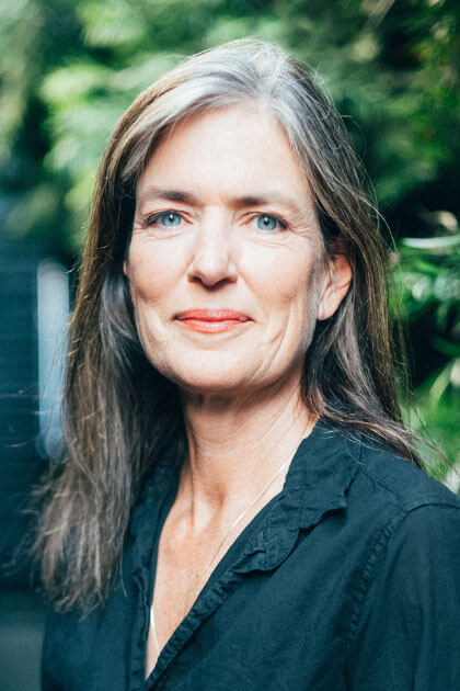
Jerde founded Elixir in 1992. An early catalog competition for a Williams-Sonoma company helped sharpen her sense of what design could do: the team won, and sales feedback made the consequences of visual decisions tangible. In a May 2026 interview with Design Observer, she recalled how motivating that connection became.
The firm’s customer list reflects both commercial and civic work. Alongside consumer brands sit SFJAZZ, UCSF and Tipping Point. For SFJAZZ’s 2020 gala honoring Mavis Staples, an invitation contained a custom seven-inch single. The event began, in effect, before anyone arrived.
When the designers had their own budget
Hall of the Above brings a different kind of evidence. Jerde and her architect husband, Daniel Castor, reopened a historic Petaluma bank building as an event venue in October 2024. In her account, construction cost three to four times the estimate. She wrote that breaking even might take ten years, if it happened at all.
Elixir initially developed a typeset wordmark. Then the team recognized that the building already meant more to local people than the new name. Castor drew it; Nathan Durrant simplified the illustration. Local recognition changed the creative decision.
The episode puts a useful limit on the story. A thoughtful identity does not erase construction costs or fill a calendar by itself. What it can do is notice where meaning already exists and make that meaning easier to recognize. Sometimes the raw material is a building people know. Sometimes it is a dot, waiting for company.
Keep looking
Elixir’s website · Tipping Point project · Studio journal · Jennifer Jerde’s 2026 interview