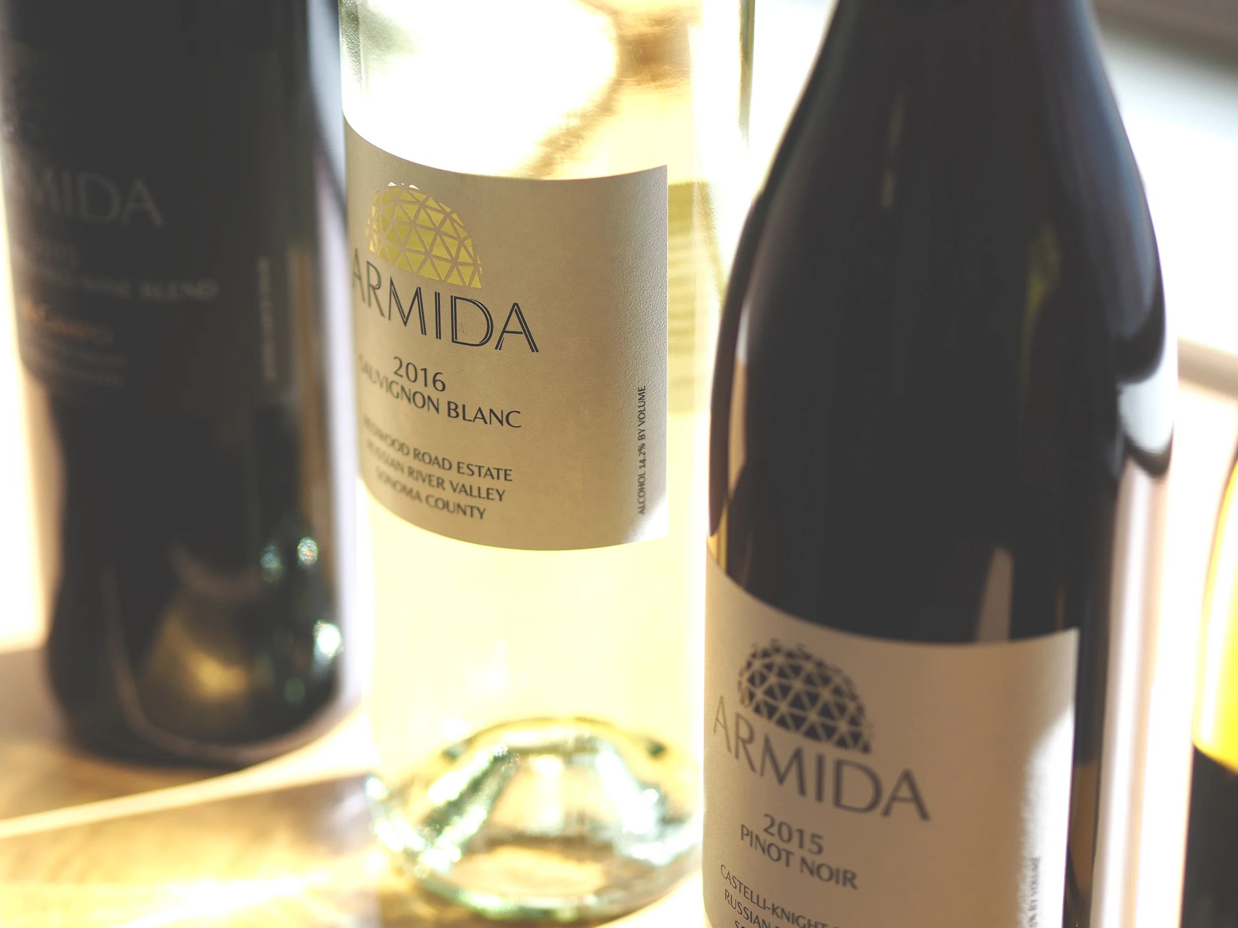
A wine label has very little room for a building. Yet there it is on Armida’s bottles: a small geodesic dome, reduced to a pattern of intersecting lines. Thompson Design Group borrowed it from the winery’s estate. In a category crowded with claims about place, the designers found something that actually belonged to one.
It is a useful place to begin looking at this San Francisco studio. The dome is an answer to a practical question: what can a shopper recognize before reading the explanation? Much of the pleasure in the firm’s archive comes from seeing that question answered with entirely different objects. A bottle needs one kind of introduction. A bag of cat food needs another.
There is an ending to establish first. Thompson Design Group concluded business on February 28, 2019. Its website remains a portfolio, an unusually accessible collection of decisions behind familiar products. Read it as a retrospective, and the ordinary supermarket begins to look like a room full of design assignments.
A designer and a strategist walk into the grocery aisle
Dennis Matthew Thompson and Jody Shoults Thompson founded the firm in 1980. He was the designer; she was the strategist. Their disciplines describe the territory the company occupied: deciding what a brand should communicate, then giving that decision a visible form.
The business sold professional design and consulting services to other businesses. Its offerings covered brand strategy, identity and packaging, naming and messaging, and product and package innovation. Its customers included established consumer brands and smaller businesses; the closing notice described a range from startups to multinational packaged-goods companies.
This was work for people with products to put into circulation. A brand manager launching a flavor, a food company expanding a range, or a retailer presenting several product tiers needs choices to look related and differences to remain intelligible. The label must introduce the product without requiring a salesperson beside every jar.
That places Thompson in the specialist branding-and-packaging market. The same awards and trade galleries feature agencies such as Pearlfisher, CBX, and Little Big Brands. Thompson’s distinctive interest, as this archive suggests, was the existing clue: the recognizable symbol or product truth that could carry a new design. You can see the approach without mistaking it for an exclusive invention.
The printer gets a vote
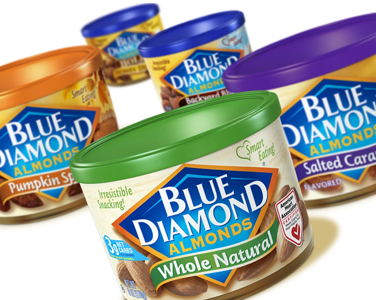
One Blue Diamond assignment makes the practical stakes particularly clear. The company’s new almond butter had a label only 1.65 inches high. Thompson designed it; the production team then faced artwork that conventional flexographic printing would struggle to reproduce cleanly.
WS Packaging proposed rotary offset printing and paid for a sample. Seeing the result persuaded graphics consultant Linda Lennihan to approve the approach. The change saved more than $10,000 in prepress work. That figure belongs to the production decision, not to an agency fee or a total project budget.
“The packaging and the price then do all the selling.”
Kristen Arakaki, Blue Diamond
The first obstacle was an anticipated mismatch between artwork and print process. The useful response was to test an alternative before proceeding. For anyone commissioning a package, the copyable habit is straightforward: bring production into the conversation while there are still choices to make.
Saved in prepress work after the printer demonstrated an alternative process.
A screen is wonderfully accommodating. It has no opinion about the machinery that will reproduce its colors. A physical sample introduces an opinion, and that is its value. The wider lesson is to identify which part of a proposal exists only as a promise, then ask for evidence at the scale where it will have to work.
The cat has to arrive in good condition
Fancy Feast supplies a different sort of reality check. In late 2007, its Gourmet Gold dry cat food moved from paper bags into protective film bags with a reclosure feature. The brand manager reported damage to the old paper packaging. The material change also made possible a glossier presentation, sharper photography, and refinements to the familiar cat and goblet. Thompson received the package-design credit.
Here the brand’s appearance and the bag’s behavior were intertwined. A premium-looking package still had to withstand distribution and storage. The cat on the front could look as composed as it liked; a battered bag would tell its own story.
By the 2018 design gallery, Thompson’s Fancy Feast credits included Gourmet Naturals, where selective gloss emphasized the cat, brand circle, and food against a matte bag. The Appetizers packaging used a cutout to reveal the tub inside. Different formats gave the designers different tools for making the product legible.
That distinction is worth keeping when writing a brief. “Make it premium” is an invitation to debate taste. “Help someone see the food, recognize the brand, and understand the format” creates decisions that can be examined. The second instruction gives both the designer and the client something more useful to discuss than whether everyone likes gold.
How much family resemblance is enough?
Designer Vanessa Roland’s account of her time at the firm describes work from concept to final artwork, alongside an image library of competitive and in-store packaging. Her credited Lil’ Drums project developed packaging and a sub-brand for a smaller Drumstick product while preserving the parent brand’s identity.
It is a compact brief with a built-in tension. A new size needs to announce a difference. An established brand needs to remain recognizable. Too much sameness hides the launch; too much difference makes the shopper do the work of reconnecting the family.
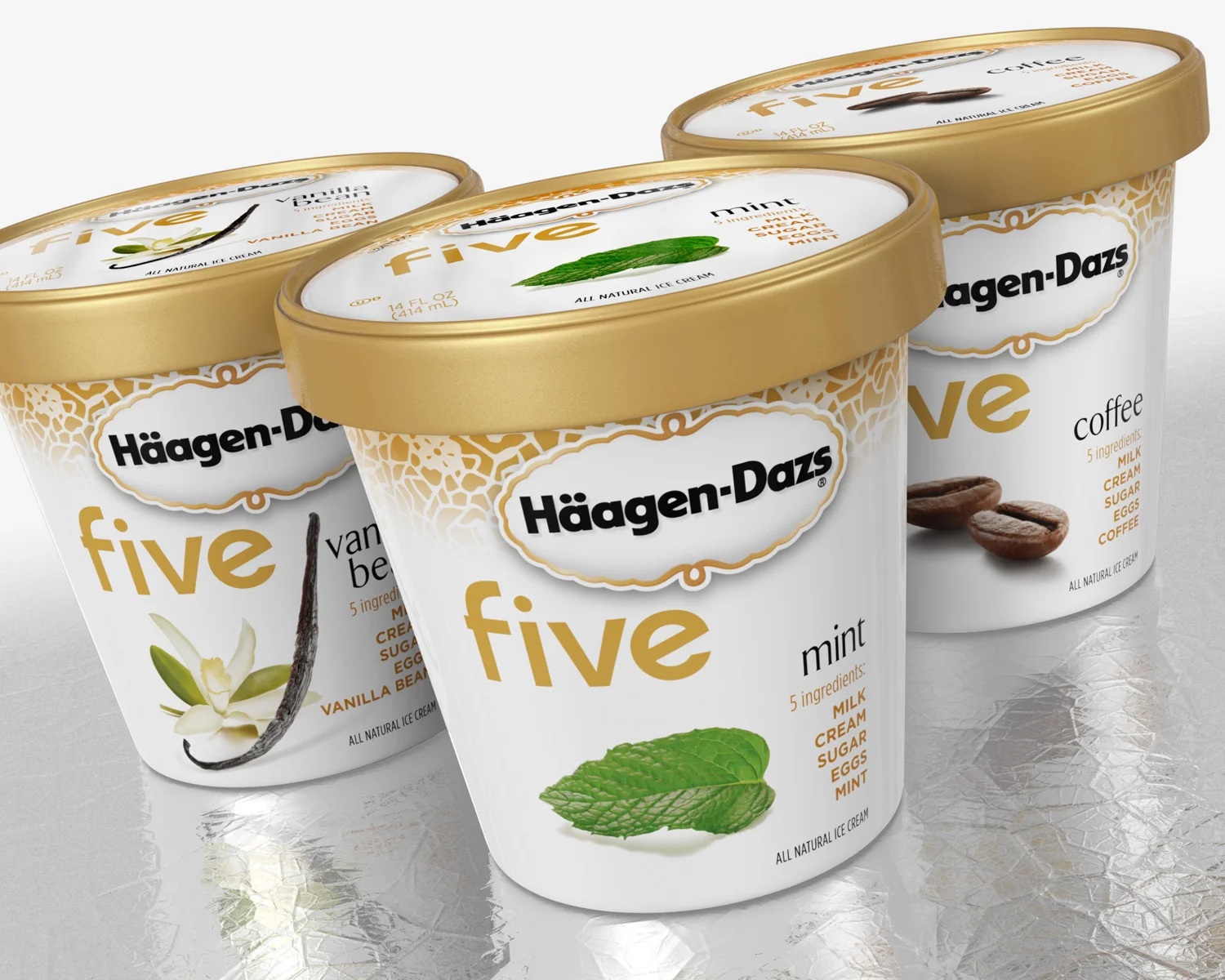
The archive’s Häagen-Dazs five cartons make another product change visible: recipes pared back to five ingredients, expressed through restrained packaging. SanDisk posed a different sorting problem, with a global package system organized around good, better, and best products.
These examples suggest a useful exercise for a brand team. Put the range together. Ask which elements identify the family, which identify the particular product, and which explain the difference worth paying attention to. If one element is trying to do all three jobs, the brief may need another pass.
The package can suggest an occasion
Blue Diamond’s Crafted Gourmet Almonds, credited to Thompson in the 2018 gallery, took the conversation beyond flavor. A dark matte background and orchard imagery framed the product; a grazing-board image on the back supplied serving suggestions. The package was offering a small picture of how the almonds might enter someone’s day.
Straus Family Creamery’s packaging had a broader story to carry. The collaboration won bronze for Best use of packaging at the 2019 Transform Awards North America. The award account connected the redesign to premium products and the creamery’s support for family dairy farming.
There is a condition attached to borrowing either lesson. A serving scene helps when an occasion matters to the purchase. A farming story belongs on a brand with that commitment. Copying the appearance while dropping the underlying reason leaves you with attractive evidence for an argument the product cannot make.
The archive outlived the office
In their farewell, the founders counted well over one hundred employees and associates across the firm’s history, many with long tenures. Their attention went to the people and relationships accumulated during nearly four decades in North Beach.
That is an appropriately human ending for a company whose public work is mostly objects. Behind each carton sat a brief, a disagreement to resolve, a photographer or illustrator, a production constraint, a client’s existing reputation. The surviving portfolio lets a reader work backward from the object to some of those decisions.
Its present use is as a design reference. Take a package you are responsible for and try the three questions above. Then look at it beside its neighbors, at actual size, in the material that will carry it. The interesting conversation begins when the beautiful picture has to become something somebody can pick up.