In 2001, Hansen’s wanted a bigger can. It is the sort of request that sounds reassuringly concrete: take an energy drink, put it in a 16-ounce container, and give the shopper more to buy. McLean, the California branding agency, proposed something considerably less tidy. The company should create another brand.
There is a useful distinction hiding in that exchange. A larger container answers a question about volume. A new brand answers a question about people. Who was still waiting for an energy drink that looked as though it belonged to them? McLean’s answer eventually acquired a black can and a green claw. It became Monster.
The agency’s own summary is pleasingly blunt: “We had a better idea.” That claim could describe almost any creative presentation. Here, however, the work is visible on convenience-store shelves. The more revealing question is how an agency responsible for that much visual aggression also handles a bottle of Jarritos, where familiarity is part of what the customer is buying.
A bigger can, a different customer
McLean’s retrospective describes a Hansen’s energy business losing share in an increasingly crowded market. Its diagnosis was that the existing Hansen’s associations did not fit the audience it wanted to reach. Increasing the package size would leave that mismatch intact.
The development record includes three names taken into graphic exploration: Fatboy, Deuce and Monster. Concepts then went into consumer intercept research at places including extreme-sports events and convenience stores. Hansen’s internal review and McLean’s recommendations informed the final choice. This was a series of decisions about a name, a person and a package, with opportunities to test the relationship between them.
- 01FormatA 16-ounce proposition
- 02AudienceA different consumer identity
- 03ExpressionName + mark + package
Look at the resulting object. The black field gives the green mark room. The name and the claw inhabit the same slightly menacing world. Even before reading the small print, a shopper has been given a fairly specific invitation. A package can do that remarkably efficiently: suggest what sort of person might carry it.
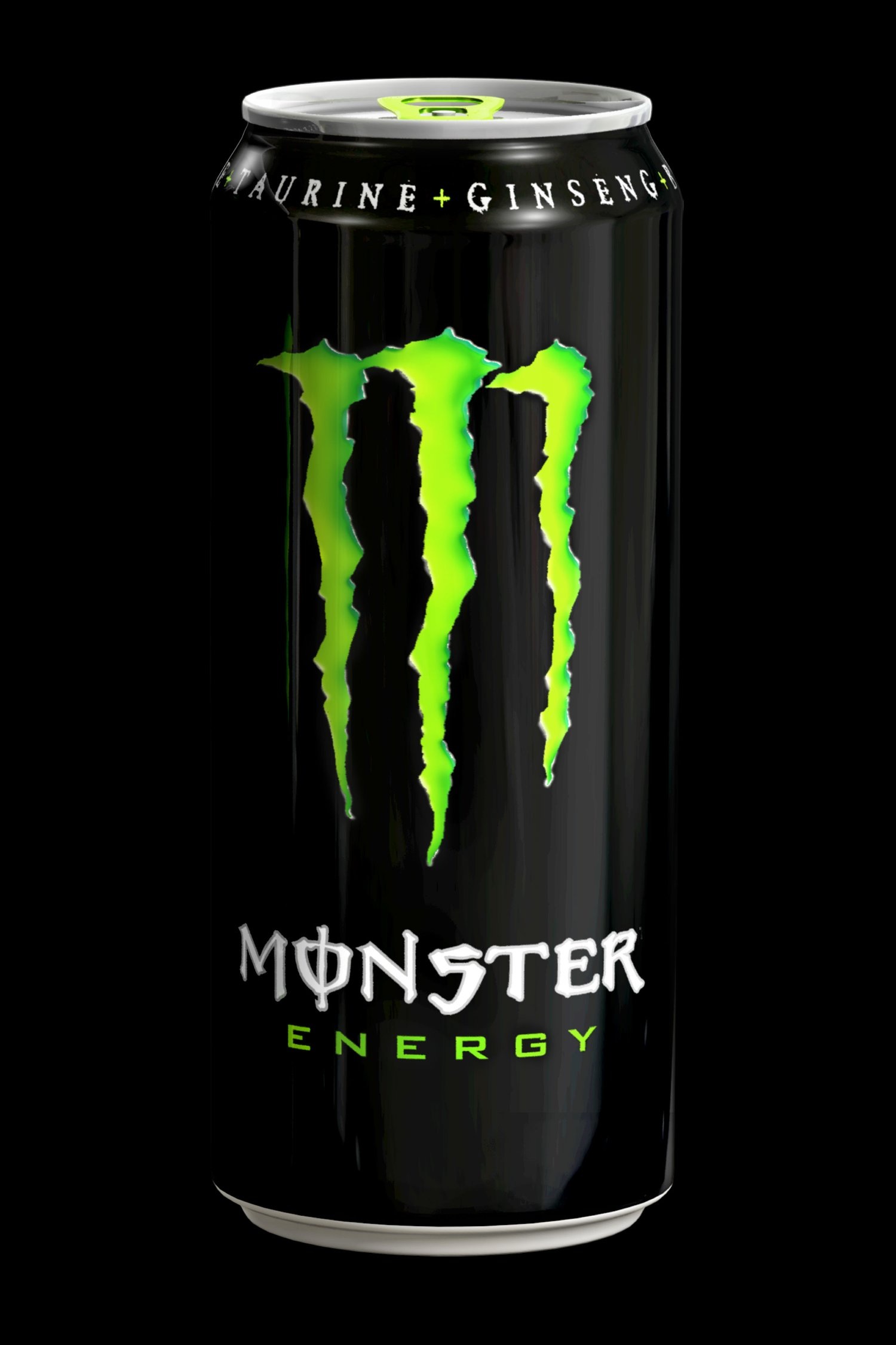
Former McLean designer Fred Hart later described the project’s audience logic in an Agency 29 interview. His account emphasizes people the leading brand was not connecting with. That is a more useful explanation than treating a successful logo as an isolated flash of genius. It puts the commercial question back before the drawing.
The same agency, the opposite assignment
Jarritos presented a different problem. The Mexican soda was reaching a broader mainstream market, and McLean’s assignment was to strengthen its presence and clarify communication without shedding the authenticity existing fans recognized. The agency describes the result as a system refresh: more focus and impact within a familiar identity.
That constraint deserves respect. Recognition is work a customer has already done. Every successful encounter with a bottle helps make the next encounter easier. A redesign that discards those cues asks the buyer to begin again. In this case, the interesting design question was how much could change while the product still felt immediately like Jarritos.
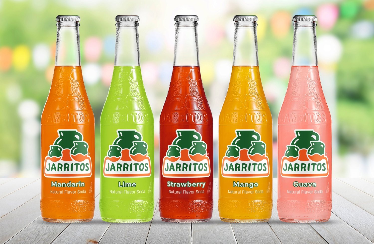
The contrast with Monster is instructive. One project needed distance from an existing identity; the other needed continuity. The portfolio suggests that McLean’s useful skill lies in recognizing which assignment is on the table. Copying the surface of its best-known work would miss that distinction entirely.
The nutpods oat project turns the same problem sideways. A new oat formula had to announce itself alongside familiar almond-and-coconut creamers. McLean developed packaging intended to fit the existing family while creating room for future products. Here, being recognizable and being distinguishable had to happen at once.
Humm Zero adds another variation. McLean made the zero-sugar proposition prominent while evolving the handcrafted logo and keeping the brand’s quirky character. A customer could see the news without having to learn an entirely new visual language. Together, these projects make a case for treating the package as a system that must accommodate the next launch.
A dollar-channel product with its chin up
Pure Kick supplied a small, sharp provocation: why should an inexpensive product look cheap? McLean’s project description identifies the dollar channel and Walmart as important settings for the brand. Its redesign pursued a sporty appearance, on the premise that buying economically should still feel satisfying.
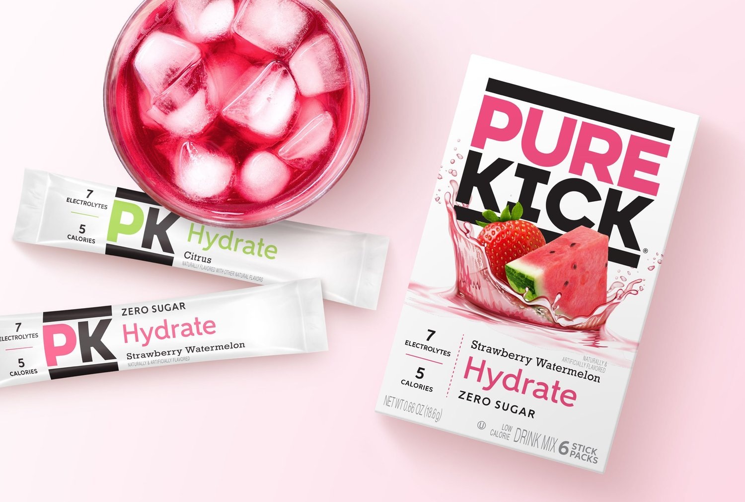
This is where packaging becomes an unusually intimate form of commercial communication. People carry a drink, leave a box on a kitchen counter, or offer something to friends. The object continues speaking after the purchase. McLean’s stated premise is that design can add satisfaction to the bargain itself. That is a specific consumer hypothesis, and a better starting point than simply requesting a premium look.
Other projects locate the useful idea somewhere else. For Kinder’s, McLean used the company’s butcher-shop roots to frame an expanding range of meat preparations for national retail. For Tree Top, its sub-brands and packages had two audiences: children looking for fun and flavor, and parents looking for understandable benefits. Neither brief calls for an energy-drink personality.
The work behind the wrapper
Founded by Ian McLean in 1991, the independent agency sells professional design services to consumer businesses. Its work extends from positioning and naming through identity, packaging, structural design and retail materials. Research support and print consulting belong to the offering too. The attractive package is the visible end of a much longer set of choices.
Its portfolio reaches beyond food and drink. Mothers, the automotive-care business, appears alongside brands such as Sunsweet. McLean describes more than 25 years of cultivating the Sunsweet brand, a reminder that a packaging practice can involve patient maintenance as well as launch-day invention. The agency also says it donated its talents to Make A Stand, contributing branding, packaging and other materials.
Minimum project size listed on Clutch. The directory also lists $200-$300 per hour. Scope determines the actual quote.
A more concrete buying example comes from Manzana Products. Its April 2025 Clutch review describes a January-August 2024 engagement covering a brand and competition audit, strategy, logos and messaging. The reported spend falls in the $50,000-$199,999 band. The client reports favorable consumer and buyer feedback. It is a client account of one engagement, useful for understanding scope rather than predicting another company’s results.
McLean occupies the consumer-brand design market alongside alternatives such as Pearlfisher and Turner Duckworth, which also combine brand identity with packaging expertise. McLean’s particular evidence is its project history: creating a separate energy-drink identity, extending a creamer family and refreshing a familiar soda. A prospective client can assess those decisions against its own problem.
What to borrow before you commission a redesign
Start with the reason for changing. A new audience, a new formula and a national retail push create different requirements. Put those requirements into words before collecting visual references. Otherwise, a team can spend weeks agreeing on a look while disagreeing about the job it must perform.
Then identify what existing customers use to recognize the product. Jarritos, nutpods and Humm illustrate why that inventory matters. Protect the cues that help people find their way; make the new information clear enough to justify the change. That is an editorial lesson drawn from these projects, not a universal prescription for keeping every old logo.
Before choosing a new look, decide what the customer needs to recognize.
The lesson across the portfolio
Finally, test the whole proposition. Monster’s development paired names with packages and took concepts to relevant consumers. The transferable habit is to put the decision back in context. A design that pleases a conference room still has to help somebody understand a product among competing choices.
When a brief depends on continuity, a disruptive identity can spend recognition the business cannot afford to lose. When the audience itself has changed, preserving everything can preserve the problem. McLean’s portfolio is interesting because it contains both situations. The first question is still the one hiding inside that larger can: who, exactly, is this for?