The first thing you notice about a bottle of TRUFF is the cap. It is black, faceted and faintly ridiculous, like a jewel from a very small crown. It was made to resemble a truffle. This is how the Los Angeles design studio Colony likes an idea to behave: no decoding ring, no strategy workshop in the grocery aisle. You see the object and understand the ambition. Hot sauce has left the diner and wandered into the perfume department.
The first thing Colony wants a client to notice, however, is less glamorous. A handsome bottle cannot repair a product nobody wants. A new identity cannot solve poor distribution. A campaign cannot rescue a bad customer experience. The firm has written this down in plain language, which is an unusual bit of copy for people who make money changing how businesses look. Sometimes, Colony says, the right recommendation is to leave the brand alone.
That tension is the most interesting thing about the company. Founded in 2015 by strategist Adam Renfree and creative director Adam Nathanson, Colony sells brand strategy, naming, identity, packaging, digital design, ecommerce, campaigns and activation. But underneath the menu is a narrower product: judgment at the moment a company has too many possible futures. The studio is hired when a founder has a product but not yet a language, when a local favorite is becoming a national business, or when a familiar brand has accumulated so many messages that nobody can remember the useful one.
The can was telling the wrong story
Spindrift is the cleanest demonstration. In 2016, it was still a niche sparkling-water company with a genuine product difference: it used real squeezed fruit. Yet the package behaved like a generic diet drink. The can was sterile. “Fresh squeezed” sounded like a claim anybody might borrow. The calorie count and “no sugar added” line carried the visual weight. Even the fruit graphic, dripping from a corner, made the most appetizing fact look like an accident.
Colony did not invent a new benefit. It promoted the existing one. Fruit moved to the center. The formula became “sparkling water & real squeezed fruit.” A cheeky “Yup, that’s it” made the short ingredient story memorable. Color filled the lower half of the can, giving each flavor an easy shelf code without losing the family resemblance. The strategy can be reduced to a sentence that any founder can steal: find the thing the product can honestly own, then remove the signals that argue against it.
“The highest compliment I can pay is 10 years later we are still at it together.”Bill Creelman, founder and president of Spindrift
That last part matters. Branding projects often produce a burst of attention and a folder full of assets. Spindrift needed a system that could absorb new flavors, formats and channels for years. Colony’s continued relationship with the company is better evidence of the system than a launch-day reveal. It survived use.
A bottle can be an advertisement
TRUFF presented the opposite problem. There was no beloved legacy to preserve. The founders had built an audience on Instagram before the product existed, and the product itself - hot sauce made with black truffles - asked consumers to accept an unfamiliar premium. Colony’s answer was to let the package perform the sales pitch. A custom glass bottle, severe black and white labels, vertical typography and that gemstone cap made the object photographable from across a feed.
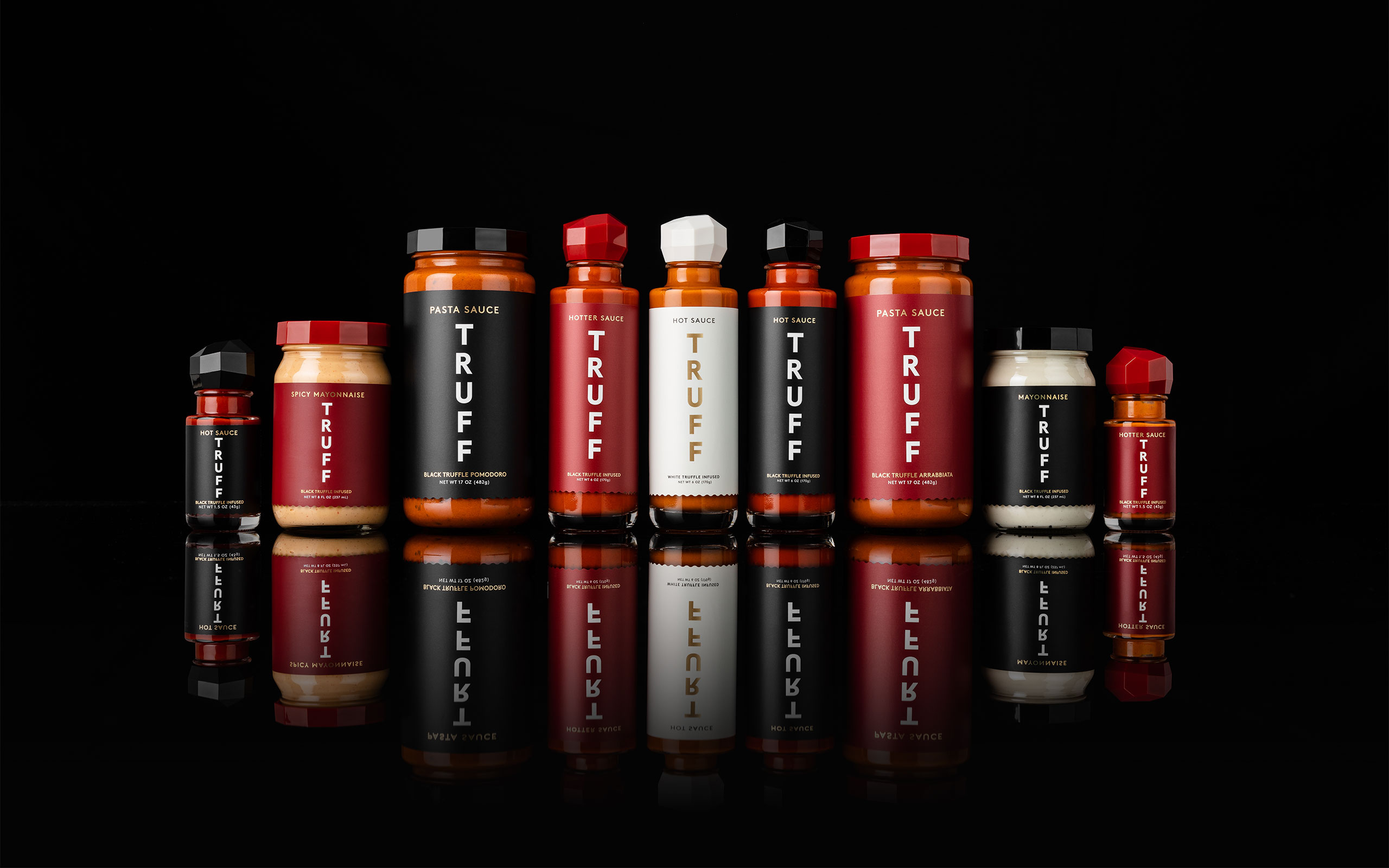
The identity was not merely black and expensive. It was designed to extend. Hot sauce led to hotter sauce, white truffle, mayonnaise, pasta sauce, miniature bottles and collaborations. Colony says TRUFF went on to sell more than 10 million bottles and reach more than 20,000 retail locations. Those figures describe TRUFF’s business, not a controlled experiment in packaging. The fair conclusion is narrower: the visual system did not become an obstacle as the company expanded. It gave the expansion a recognizable container.
The work, stripped of the mood-board fog
Separate a brand problem from a product, distribution or experience problem. Define what changed and what deserves protection.
Turn a defensible product or business truth into positioning, language and a visual idea with edges.
Build the idea into packaging, digital, campaigns, retail and content, then keep adapting without losing recognition.
Proof, not purity theater
Loonen, a young bottled-water company, offered another category crowded with inherited cues. Premium water tends to arrive wearing blue, silver, a mountain and a misty adjective. Loonen’s proposition was more specific: spring-sourced water, filtered and mineral balanced, independently tested, bottled in glass, with results made visible. Colony organized the brand around “water with nothing to hide.”

The distinction is subtle but useful. “Pure” is an atmosphere. Test results are evidence. The design uses warmth, yellow, green and a loon rather than the clinical white coat one might expect from laboratory proof. The practical lesson is not to make every package colorful. It is to let the brand’s strongest fact determine both the message and the conventions worth refusing.
Small by design, broad by necessity
Colony’s public team page lists five people: the two founders, art director Tyler Ward, senior designer Erin Harpur and project manager Alexis Alvarez. That is a small group for a service list stretching from competitive analysis to events and influencer work. The model depends on senior attention, close collaboration with the client, and likely a network of specialist partners where a brief requires it. Colony promises no layers and no handoffs: the people hired are the people doing the work.
Its buyers are not limited to packaged goods. The portfolio includes DÔEN’s editorial ecommerce experience, Harley-Davidson’s Nightster, the founder-focused advisory firm Windproof Partners, and Verve Coffee’s journey from California cafés into wholesale, ecommerce and ready-to-drink cans. The connecting market is not an industry. It is a moment: launch, acceleration, repositioning, expansion or the uncomfortable discovery that a company’s old story no longer fits its new business.
This is also where the method has limits. Clarity can expose a good product; it cannot supply one. A distinctive package helps at the point of choice; it cannot create shelf space, fix margins or make a customer return. And a tiny senior team is most persuasive when a client wants proximity and judgment, less so when the assignment demands thousands of routine assets across dozens of markets at once. The conditions are part of the proposition.
The scarce thing is choosing
Colony’s recent writing places this argument inside the age of generative AI. The studio uses AI for research, exploration and repetitive work. It does not pretend the tools are irrelevant. Its sharper observation is economic: when anyone can generate a hundred polished directions before lunch, polish loses scarcity. Choosing gains it.
A point of view is partly a list of refusals. Spindrift would not look like diet soda. TRUFF would not borrow the rowdy graphics of conventional hot sauce. Loonen would not whisper “purity” beside another snowcapped mountain. These choices worked because each refusal was anchored in something true about the product. Without that anchor, difference becomes costume.
The copyable version of Colony’s approach does not require hiring Colony. Write the product’s strongest defensible truth in one sentence. Ask which existing cues contradict it. Pick one idea with enough range to survive a website, a package and the fifth product extension. Then test whether the customer understands it without the presentation. If the sentence is weak, do not order the new logo yet. That may be the most valuable design decision in the room.