A can of Recess floats through pastel clouds. A tech podcast piles on sponsor logos until it resembles a racing paddock. A protein bar wears gold. These are very different invitations to spend money or attention, and that is what makes Day Job worth watching. The Los Angeles creative agency has built a portfolio in which the client’s personality is allowed to overwhelm the agency’s signature.
Its work lives in the seconds before a purchase or a click: the moment someone decides whether a product looks familiar, intriguing, funny or forgettable. Day Job handles the words and pictures that influence that decision, then carries them into packaging, websites and advertising. For a business entering a crowded category, that is a practical service. Having something to sell is only the beginning. People need a reason to notice.
A can of calm, with careful credits
Recess offers a useful introduction because the work extends beyond a single beautiful object. In its project description, Day Job identifies a relationship spanning pre-launch development, copy, social media, the website and later products such as Mood. The drink’s imaginary setting can travel: from a shelf to a screen, from a can to a sentence.

The credits matter. Designer Stine Nielsen identifies the original brand identity and packaging as her work at Gin Lane, where the team also developed strategy and naming. She credits Day Job with the website, copy, content and further brand development. A memorable brand can have several authors, working at different points in its life.
Nielsen describes designing for stressed, overstimulated millennials. Her hand-drawn logo and soft palette gave the drink a particular emotional register. Day Job’s subsequent contribution shows the commercial usefulness of keeping that register alive after the first reveal. The company still needs posts, product pages and fresh reasons for customers to return.
Designer Katherine Choi’s Mood portfolio, credited to the Day Job Studios team, includes cans, powder packaging, sticks and social material. Those formats illustrate the real test of a brand system: can it accommodate more things without becoming several unrelated brands? For a founder planning a second product, that question is more useful than whether the first mock-up would win applause.
Then the protein bar ordered fish
David takes a different emotional route. Its gold packaging and direct name give a protein bar a degree of ceremony. The design suggests that the buyer is making a deliberate choice, even when the object is a snack. There is little of Recess’s invitation to drift away.
In Marketing Brew’s account, David’s chief of staff, Oula Ghanem, described a protein aisle crowded with color but short on differentiation. Harmon explained the name’s connection to Michelangelo’s sculpture. The useful observation is that a company can distinguish itself through several decisions at once: naming, material, typography and voice.
The campaign work then took an unusually literal turn. David sold frozen cod. Nosh’s recognition of Harmon described the launch as both an expression of the company’s protein focus and a response to criticism of the bars’ processed ingredients. The fish made the argument tangible. A discussion about formulation became something people could look at, buy and joke about.
Inc. reported that David’s in-house team and Day Job devise the brand’s stunts together. According to figures David supplied, the cod campaign increased first-week Instagram engagement by 1,000 percent. That is a client-reported attention measure, with a different meaning from sales or profit. A company commissioning a campaign should decide beforehand which of those outcomes it actually needs.
A tech show dressed for race day
TBPN brings the same attention to personality into media. The show’s visual identity borrows the density of Formula One sponsorship, mixing a forest-green palette with retro broadcast cues. The result makes commerce part of the scenery. A sponsor’s presence feels consistent with the show’s visual premise.
Typeface publisher Sharp Type traces the design credits clearly: Day Job created the initial brand system; Area Technology later carried it into an expanded set of live broadcast graphics. Record Laser supplies the typography across the system. Again, the story is one of an identity being developed and put to work by multiple specialists.
Look at the practical consequence. A media company needs to be recognizable in a website, a clipped interview and a live stream. Similar type and visual cues can connect those encounters. For advertisers, the setting also establishes an expectation about the tone of the show. Design does some explaining before anyone starts talking.
TBPN’s attraction to Day Job also fits a larger change in the agency’s client mix. Business Insider reported work for venture firm Patron and AI startup Stuut alongside the consumer portfolio. Branding services can cross those markets because the central problem repeats: a prospective customer encounters an unfamiliar company and needs a reason to care.
The founders brought more than a mood board
Rion Harmon and Spencer Madsen founded Day Job in 2018. Their backgrounds help explain the agency’s combination of commercial thinking and verbal mischief. An older company capabilities deck describes Harmon’s work at Zipcar, ZICO and MakeSpace; Madsen’s experience includes writing at Stink Studios and the launch of VICELAND. It also credits Madsen with creating the @BERNIETHOUGHTS Twitter account.
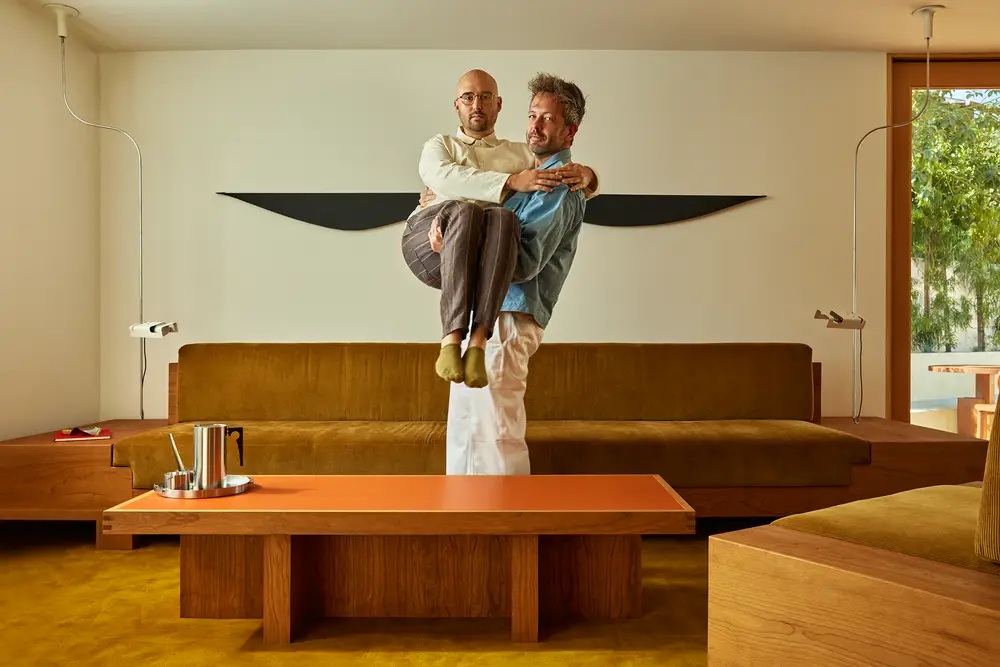
That mix matters in a service business. Someone must understand what a company is trying to accomplish, write something people might remember, and get the thing made. Day Job’s current team page includes operations leadership and a chief technologist alongside designers and creative directors. A website concept needs development. A packaging idea needs production. The joke still has to fit on the label.
The agency’s own site supplies an unusually direct sample of its taste. Visitors encounter a Windows 95-style desktop, a README.txt and a route to Doom. It is a portfolio with an interface that makes a choice about its audience. Prospective clients can experience the studio’s sense of humor before opening a presentation.
The work continues after the big idea
Day Job’s service description groups its work into strategy, identity, digital and content. That covers why a business matters, how it looks and speaks, its web experience and the material it publishes. The business model is commissioned creative work. A client buys expertise and execution across some or all of those activities.
“Creative is only good when it solves problems.”Day Job’s own statement of purpose
The breadth is useful when a launch has many connected pieces. A package can create an expectation that the website must fulfill; an advertisement can introduce language that customer-facing pages need to sustain. Putting those decisions in conversation can reduce the feeling that each department is introducing a different company.
Its hiring material gives a grounded view of the labor involved. The design residency lists real client work, mentorship, brand-system pitches, print preparation and asset delivery. It advertises $23 an hour plus overtime for a 40-hour week and a paid design test. That is compensation for an early-career role, not a price for hiring the agency.
The combination is revealing: originality appears alongside file preparation. For a client, the attractive idea and the usable deliverable need to survive the same process. For a young designer, the education includes both making an argument and making the files another person can use.
Recognition, with the numbers kept in proportion
Day Job appeared at No. 26 overall and No. 3 in design in Fast Company’s 2026 innovation rankings. The magazine’s accompanying profile reported that annual revenue had doubled in each of the preceding three years. Recognition and reported growth suggest commercial momentum, although they do not establish how much of any client’s success belongs to design.
Its more recent work includes an Update energy-drink rebrand associated with Kim Kardashian. That keeps Day Job in a market where its experience is particularly relevant: consumer products competing for an initial glance. The portfolio’s range gives a buyer examples to examine, from drinks and food to a media identity, before deciding whether the studio suits the assignment.
Borrow the question before the look
The transferable lesson is to define the reaction a brand should create, then examine whether its parts support that reaction. A founder can put packaging, a homepage and an advertisement beside one another and ask what kind of company each suggests. If the answers differ, more assets may simply multiply the confusion.
There are conditions attached. A business seeking reassurance may have little use for an abrasive voice. A launch team unable to maintain a complex identity might need a simpler system. Those are practical inferences from the work, not accounts of failed Day Job projects. The decision is about the audience, the product and the people who will operate the brand after launch.
Day Job’s portfolio makes that decision interesting. Pastel clouds, a gold wrapper and broadcast clutter can each make sense in their own setting. Copying the surface would miss the useful part. Decide what your business should feel like to the person encountering it, then make the next encounter agree.