A wine bottle offers a designer an unusually honest brief. There is glass, there is wine, and there is a small rectangle in which to persuade somebody to care. In TRIXMEDIA’s Hilton Wines project, that rectangle measures roughly 95 by 105 millimeters. The agency put paintings on it. Landscapes, color, a sense of movement: a little gallery that happens to contain a drink.
That is a useful place to meet TRIXMEDIA. Branding can sound abstract until it has to fit around a bottle. Then the questions become pleasingly specific. What goes first? What can disappear? What will somebody understand without a salesperson standing nearby?
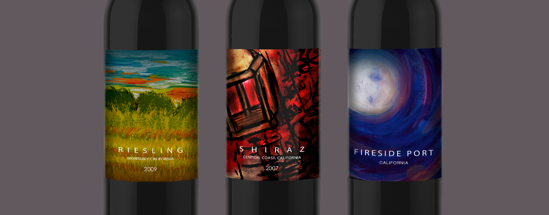
The agency credits Hirbod Human with the label design, describing a combination of painting and graphic treatment. Its case study talks about mountains and sailing as creative inspiration. The result illustrates a recurring interest in this company’s work: translating something a business knows about itself into something another person can recognize.
The approximate label space described in the Hilton Wines brief. A small surface puts a useful limit on a big story.
A company story meets a shopping trip
Human founded TRIXMEDIA in 2003. Today, the Beverly Hills business combines brand strategy with naming, graphic design, packaging, websites and digital marketing. Its published team includes creative strategy, copywriting, illustration, interface design and software development. Those disciplines correspond to the places a brand has to show up, from the words on a label to the way an online form behaves.
The customer list is varied, but food and drink give the portfolio much of its character. Alongside wine are chocolate, nuts and juice; footwear and service businesses widen the picture. This is a professional-services company. Businesses pay it to investigate a problem, develop creative work and help put that work into circulation.

Human’s stated concern is that design should address the intended audience. It is easy to see why this matters. The owner has lived with the product, learned its vocabulary and heard its origin story many times. A stranger has none of that preparation. A package has to make the introduction without requiring homework.
That gap helps explain the appeal of one agency handling several connected jobs. A name creates expectations. A package gives them a physical form. A website has to make the same business understandable again, under different conditions. Coordinating those decisions is part of the service a client buys.
The bottle came before the logo
For Livepop, TRIXMEDIA describes an especially revealing sequence: packaging first, then the logo and website. The team developed three directions, including a restrained typographic treatment and a more organic approach using rough illustrations. The chosen direction emphasized flavor personalities and creative pairings.
One decision stands out. The flavor description became as prominent as the brand’s logo. The business name no longer monopolized the introduction; what the customer would drink received equal billing. The work extended into identity, collateral and point-of-sale material.
Begin with the surface doing the selling. Carry the decisions outward.
There is a practical exercise here for anyone commissioning design: put the first idea in the place where it must earn attention. A logo viewed alone on a large screen enjoys a generous amount of peace and quiet. A juice package has flavor, imagery and product information to accommodate. Starting there forces decisions that a presentation can postpone.
The sequence also gives the team something concrete to discuss. A client can compare how three directions organize the same information. Preference becomes easier to explain when the choice concerns an actual package instead of an isolated mark.
Pistachios get green. Almonds get brown.
Urth Bites wanted to reach health-conscious customers and become presentable to wholesale health-food chains. Its range included organic nuts, dried fruit and jams. TRIXMEDIA worked on naming, identity and packaging, with an eye toward products the company might add later.
The agency used color to distinguish the contents: green for pistachios, light brown for almonds. It also designed takeaway boxes and reusable grocery bags. The identity could travel from the shop into the home.
The useful idea is the relationship between the items. Each package has to identify its contents while remaining recognizable as part of the same family. For a growing range, that creates a repeatable decision: a new product needs its own place within an existing visual structure.
A founder can borrow that question before hiring anybody. Lay out the current range. Then add a blank space for the next product. Does the system have room for it? If every new item requires an entirely new explanation, the design may be creating work that a clearer family resemblance could prevent.
When an old look loses its audience
The Eat Your Choco case begins with a different problem. According to the agency, the European family chocolate business was losing ground as newer brands appeared. It wanted to reach a younger generation. TRIXMEDIA describes customer research followed by changes to the packaging and marketing.
In that account, the strain appeared in the relationship between the brand and its market. Familiarity with the old presentation was no longer enough. The decision to refresh followed the desire to attract buyers who had less attachment to the company’s history.
Something similar appears in Polomac’s footwear refresh. The agency describes an older identity struggling to connect with younger consumers. Its response included hand-drawn treatment, a cheetah icon and refreshed packaging. These cases make the agency’s market position easier to understand: it works with businesses facing a launch, a change of audience or an identity that needs to catch up with the product.
The invoice buys a scope
Clutch lists a $10,000 minimum project and an hourly rate of $200-$300. Those figures are directory indications, not a quote for a particular brief. Historical interviews show why scope matters: Compaxx founder Arrie Blanchette reported spending no more than $1,000 at that stage of a naming and identity engagement; Empire Blue Estates’ branding and marketing project appears in the $200,000-$999,999 band.
“They challenged my way of thinking and gave me techniques to think differently.”Arrie Blanchette, founder of Compaxx, in a Clutch client interview
For a buyer, the sensible comparison is between written deliverables. Decide whether the job includes research, naming, packaging artwork, a website, launch material or continuing support. A design fee and the cost of printing, production and paid distribution belong in the same planning conversation, even when they are separate purchases.
TRIXMEDIA’s four branding packages reflect different starting points: Foundation, Refresh, Support and Acceleration. Its naming service adds preliminary screening and domain considerations. Its web offering covers responsive design, testing and maintenance. A prospective client can use those boundaries to ask for a specific engagement instead of an indefinite promise to improve the brand.
This breadth is useful when the pieces need to be developed together. A business needing only one finished illustration may be better served by a narrower commission. A company whose immediate obstacle is product availability needs to solve that operational problem too; packaging cannot put missing stock on a shelf.
The most portable lesson in TRIXMEDIA’s work is to choose the first encounter carefully. Give the design an actual job, on an actual surface, for an identifiable customer. Then examine what survives. In the wine aisle, the company’s whole story has to begin somewhere. Ninety-five by 105 millimeters will do.