The dragon needed the right paint. During Barretto-Co.’s work for MetWest High School in Oakland, a painter ran into trouble matching the color for a wall-to-wall mascot mural. Junior designer Sierra Randel went to a nearby paint store to sort it out. The episode, recounted in her account of life at the studio, is a pleasingly literal answer to a question that dogs the design business: what, exactly, are we paying you to do?
Sometimes the answer is strategy. Sometimes it is typography. Sometimes someone has to leave the screen and get the dragon right. Barretto’s portfolio spans corporate technology, food, education and philanthropy, but its neighborhood work gives the business its sharpest outline. This is a creative agency selling judgment, with Oakland as both a market and a place where the results become visible.
A school finds its public face
MetWest’s problem was a gap between its educational approach and its public image. The school, part of Oakland Unified, emphasizes internships and projects connected to working life. According to Barretto’s case study, it struggled to communicate that identity to prospective students, families and district stakeholders. Principal Dr. Shalonda Gregory wanted an image that reflected the school’s commitment to social justice and student-centered learning.
The studio examined competing schools, gathered leadership input and used discovery sessions and mood boards to establish a direction. The deliverables included a logo, messaging, colors, typography, guidelines and school merchandise. Barretto describes the implementation as designed around public-school budget constraints. That detail matters: an identity intended for busy educators has to be usable after the agency’s presentation ends.
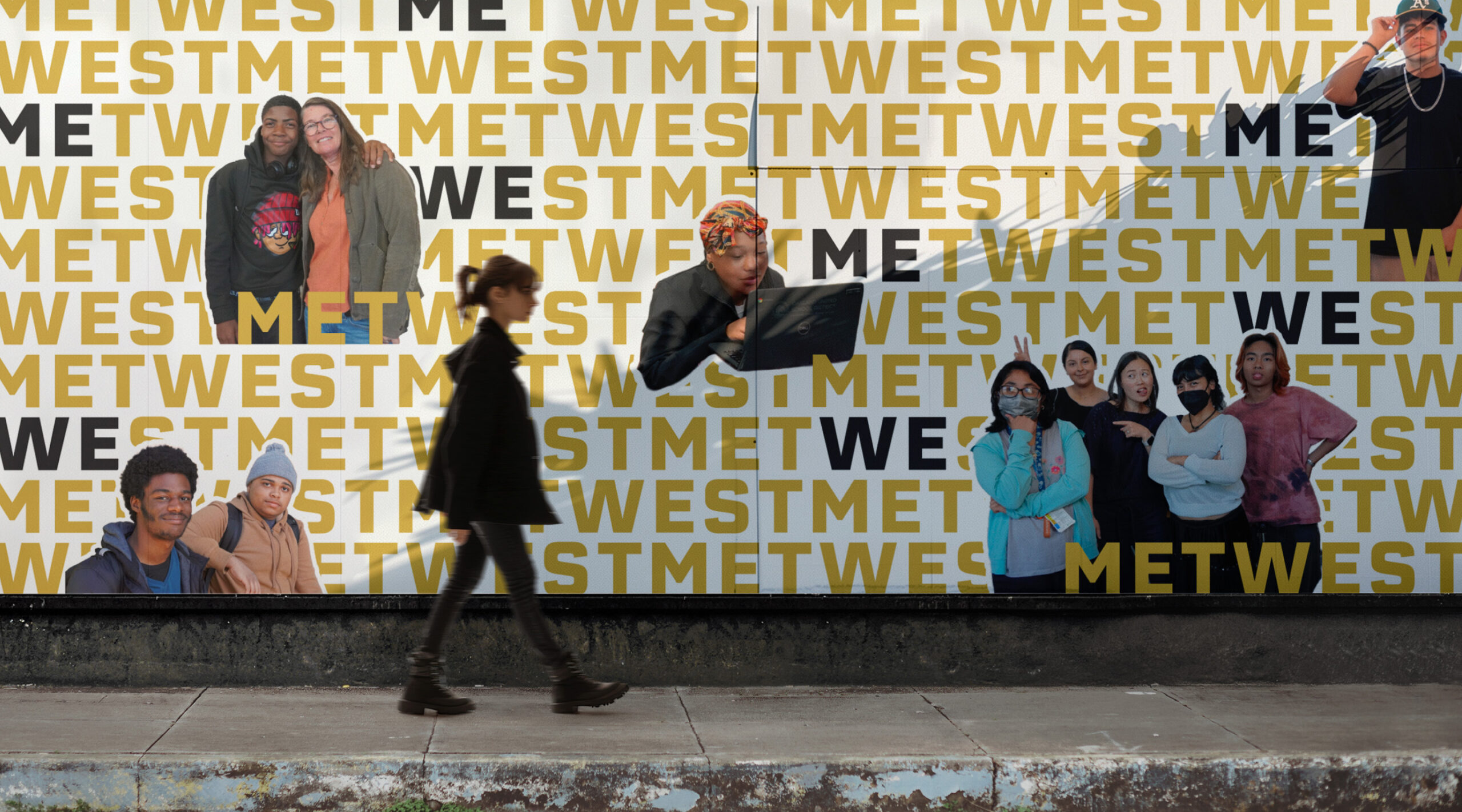
The school assignment also makes the buying decision easier to understand. A client with a complicated story can hire Barretto to establish what to say, how it should look and how staff will apply it. The attractive picture is one deliverable. A system that survives repeated use is the more demanding part of the assignment.
The neighborhood has numbers
Barretto gives its local commitments a radius. The company says at least half its suppliers and vendors, and at least three-quarters of its clients, are within 50 miles. That is a specific operating preference for a studio whose portfolio includes recognizable national brands. Its stated priorities also include mentoring, inclusive hiring, pro bono work and environmental stewardship.
and vendors within 50 miles
within 50 miles
Company-stated commitments
B Lab lists Barretto as certified since January 2024, with an overall B Impact score of 101.9 against the certification threshold of 80. The assessment covers the company’s conduct across areas including workers, community and customers. For a prospective buyer, the certification supplies an external point of reference for the values language on the agency website.
The 1% for Oakland campaign makes the giving mechanism explicit: a pledge of 1% of Q4 sales to MetWest. Its tracker, updated January 1, 2026, showed 80% of a $3,750 goal for the 2025 quarter. Those are dated campaign figures. The useful detail is the denominator: sales, which makes the pledge easier to understand than a loosely defined promise to share success.
The price of making a public program legible
A 2021 Alameda County board packet offers a concrete view of the commercial model. A $112,550 agreement covered writing, design and production for Measure A1 affordable-housing reports and a reporting website. The county had initially engaged Barretto through a $23,000 purchase order. Staff cited the studio’s process and experience with government and nonprofit reports when explaining its selection.
Alameda County agreement ceiling
- Website design & implementation
- $65,000
- Copywriting & graphic design
- $21,000
- Layout & production
- $21,000
- Additional first-report copywriting
- $5,550
The agreement specified three draft cycles and additional charges for further rounds. That is a useful lesson for anyone commissioning creative work: specify feedback as carefully as deliverables. A website and three reports are only part of a scope; decisions, revisions and approvals consume time too.
The economics here are those of a services business. Clients buy creative and technical labor organized around a defined problem. Continuing relationships can extend that work into new publications, products and campaigns. The value depends on whether the client can put the resulting materials to work.
The new idea was to keep the old lettering
The Packard Foundation project offers a more revealing design decision than a before-and-after logo slide. Barretto visited the foundation’s headquarters and the family home, now used for grantee meetings. The studio developed an interwoven visual concept and took color inspiration from California landscapes.
But the headquarters already carried lettering etched into its entrance. After exploring alternative typefaces, Barretto recommended keeping that typographic connection, with a small adjustment to the letter “k” for readability at reduced sizes. The building helped settle the argument. Research gave the team a reason to preserve something.
That restraint has a practical consequence. Organizations accumulate signs, documents and familiar visual cues over years. Replacing all of them can create work without improving recognition. The Packard example suggests a question buyers can copy: which existing details have earned their place, and what evidence would justify changing them?
“Who we work with matters.”
Barretto-Co.’s statement of priorities
From piroshki to product launches
At Cinderella Bakery in San Francisco’s Richmond District, the assignment involved a different kind of continuity. The bakery dates to 1953 and draws on Russian and Eastern European traditions. Barretto’s case study describes an identity that had fallen behind the business. The refresh drew on those traditions while simplifying the logo and building a coordinated approach to menus, merchandise, signage, photography and the website.
The work illustrates the studio’s position between strategic branding and everyday production. A bakery needs customers to recognize it, understand its offerings and place an order. The photography and menu matter alongside the mark on the bag. Buying only one piece can leave the rest of the experience disconnected.
For Foria, the sexual-wellness company, Barretto inherited core brand assets and describes five years of extending them. Its responsibilities included retail packaging, product launches, color studies and sales presentations. That is a different purchase from commissioning an identity from scratch. The client already has a visual language; the agency supplies the capacity and judgment to keep applying it as the product range changes.
Whole Foods brought another challenge: taking a food-centered wellness proposition into the workplace. Barretto developed the FullSpoon name and identity for the offering, then carried it through a website, sales materials and vehicle graphics. The range of applications is instructive. A name has to make sense in a conversation with an employer as well as on a moving van.
A small studio, several kinds of expertise
Founder and principal Steve Barretto’s background includes contracting at Apple while paying for his design education at San Jose State University. His published biography describes work across technology, retail and the arts. The current studio team lists responsibilities spanning art direction, technology, client services and accounting, alongside creative staff and an intern.
Randel’s October 2025 reflection provides a view from the junior end of that operation. She describes access to specialists, participation in client discussions and repeated critique. For packaging, the team explored numerous directions before presenting a small selection. Her six-month list of assignments ran from reports and websites to shirts and the school mural. The variety is part of the training.
The services page puts discovery at the front of the process: interviews, guided exercises and industry research. That makes the studio a plausible choice when an organization needs agreement about its identity as much as it needs artwork. A team simply ordering an isolated asset may have a narrower problem than this process is designed to solve.
The audience changes. The work has to follow.
Calbright College needed a name and identity for a public online institution serving working adults. Barretto developed the Calbright name and worked across messaging, photography, video and website content. Its case study describes a site organized around pathways, support and onboarding. The brief connected a new institution’s credibility to the practical concerns of people deciding whether to study.
ServiceNow’s Workflow Quarterly presented a publishing problem. Barretto describes moving the publication from a print-centered approach to an online experience within one editorial cycle. The work involved a publishing audit, UX strategy, typography, grids and collaboration with editorial, SEO and IT teams. A magazine on a screen needs navigation and interaction decisions that paper never asks of it.
The Bay Area Brewers Guild needed a shared regional identity with room for individual chapters. Barretto used workshops and mood boards to work through preferences, then developed chapter marks and a common toolkit. The project extended into SF Beer Week packaging, posters and event materials. The coordination problem is recognizable: multiple stakeholders want to belong without looking interchangeable.
Together, these assignments suggest where Barretto fits in the market: an independent creative partner for organizations facing changes in audience, identity or delivery. Its alternatives include in-house teams and agencies specializing in a single medium. Buyers should judge the fit against the actual coordination problem, the available budget and their willingness to participate in discovery and review.
The next test of the studio’s own commitments is practical too. Its published 2026 climate plan targets website carbon performance, reduced video-call streaming and regular digital cleanup. The website target runs to the end of 2027. These are operating goals, and their eventual results will matter. For a business built around communication, making the commitment understandable is a useful place to begin.