A brewing tank is an unlikely muse. Yet the vessels made by Ziemann Holvrieka supplied the shapes behind its new brand symbol: an industrial product turned into a recognisable visual signature. CRUSH, the Derbyshire agency behind the work, carried that thinking through a website, exhibition displays and sales materials. The company’s engineering gave the designers something more useful than a fashionable colour palette. It gave them a reason for the design.
That project makes a good introduction to CRUSH. Founded by Natalie Burkinshaw in 2003, the independent agency works across branding, design, digital development and marketing. Its particular interest is businesses with complicated things to explain. Engineering, manufacturing and technology feature prominently, alongside public bodies, charities and consumer names. The common assignment is to make an organisation’s outward appearance catch up with what it can actually do.
The tank was the easy part
Ziemann Holvrieka, a German producer of brewing equipment, tanks and process technology, had a history stretching back more than 170 years. Its identity had become difficult to read. CRUSH’s account describes a muddle of names and visual identities, complicated by the inclusion of parent company CIMC. The business needed to communicate both its shared heritage and its future direction.
Working with its leadership, CRUSH developed a corporate identity and the practical equipment for using it: guidelines, a multilingual website, presentations, brochures, signage and exhibition design. That spread matters. A global manufacturer encounters customers in different countries and settings. A design that makes sense only on the agency’s presentation screen has a short working life.
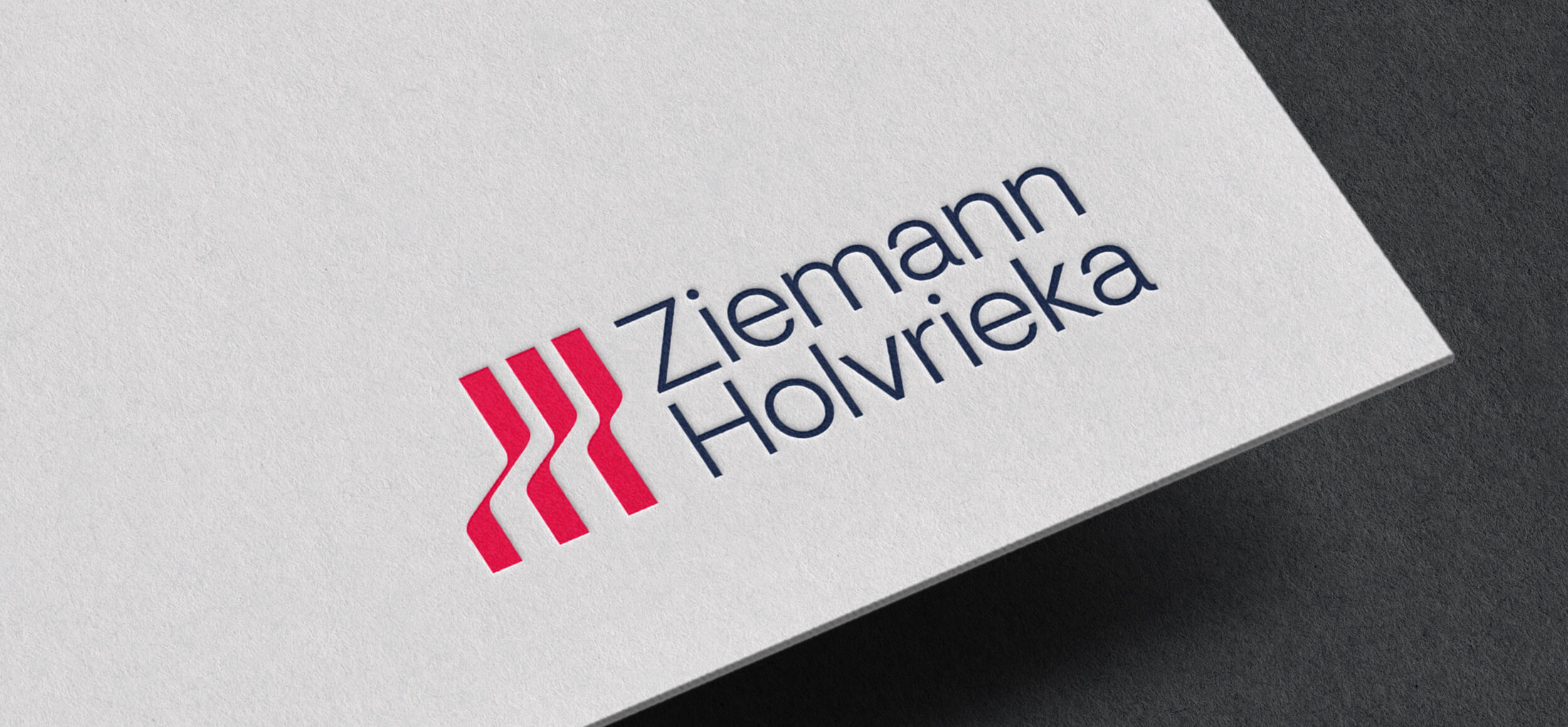
The project earned bronze in the engineering and manufacturing visual-identity category at Transform Awards Europe 2025, followed by a German Brand Awards win in Industry, Machines and Engineering. Those awards recognise the design. The more transferable lesson is the method: find something specific in the business, then give people a consistent way to use it.
Technical accuracy, with room for LEGO
For Arrow ECS, the problem changes. The technology distributor connects vendors with partners who sell and implement their products. Marketing has to make sense of a crowded offering and speak to people who already know their subject. CRUSH’s remit includes technical copywriting, email campaigns, animation, event design and sales materials.
The agency has brought bespoke LEGO cities and gamified sales campaigns into that mix. There is a cheerful audacity to putting play into a technical sales conversation. But the agency’s case study stresses the homework underneath: understanding the audience, the market and individual vendors’ products. An entertaining concept still has to explain the right thing.
The 2025 IBM + Arrow Partner Jam shows how far one idea can travel. CRUSH built an event identity around collaboration, then applied it to social media, internal communications, screens, print and merchandise. Giant stacking cubes joined puzzles, pens and notepads. The same visual language had to work in an inbox and across an event space.
In July 2026, CRUSH announced a Best B2B Creativity shortlist place at the Midlands Marketing Awards for its Arrow work. The positioning is clear: business buyers are people with attention spans, not simply job titles waiting for another product deck.
Make it recognisable
Ziemann Holvrieka
Identity → global rollout
Make it understandable
Arrow ECS
Technical products → campaigns
Make it usable
Ministry of Sound
Mobile website → ticket purchase
A council identity with a replacement schedule
Closer to home, Chesterfield Borough Council presented a less glamorous but revealing brief. When its new branding was announced in December 2014, the previous identity was about 40 years old. It had not been built for websites and social media. Different teams communicated in different styles, and residents could struggle to recognise which services belonged to the borough council.
CRUSH retained the town’s Crooked Spire in the identity and developed a system for broader use. The rollout included templates so employees could produce posters and leaflets without commissioning an individual design every time. Existing physical items would be replaced as they reached the end of their working lives, limiting additional expenditure.
That is a useful answer to the question of cost, even without a project invoice. The expense of branding extends beyond the initial design commission into implementation and repeated production. Chesterfield’s approach treated those later costs as part of the brief. For another organisation considering a refresh, the move worth copying is straightforward: inventory the things that must change, give staff usable templates, and plan replacement around real operating needs.
The website has to sell the ticket
Ministry of Sound brought a different test: help people buy tickets through a website that still felt like the club. CRUSH’s developers worked on third-party ticket-store integration and loading performance despite substantial video content. The site was built with mobile users in mind, and the relationship subsequently extended to three additional websites across the Ministry Group.
It is an example of the agency’s technical side earning its place beside the design work. Its digital services cover primarily WordPress websites, custom programming, applications, databases and integrations, together with hosting and support. Clients can also receive training and documentation to manage their own content after launch.
For a buyer, that combination offers continuity between the people deciding how a website should feel and the people making it function. A clear identity can still be let down by an awkward purchase journey. Here the creative brief had a practical destination: the ticket purchase.
The founder who wanted to care more
Burkinshaw’s account of starting CRUSH is rooted in dissatisfaction with agency service. After studying visual communication and working at London agency Clarion, she moved to Nottingham and freelanced across agencies. She felt clients deserved more attention and better work. Independence offered a way to put that belief into practice.
She founded the business as a single mother. More than two decades later, CRUSH operates from a purpose-built countryside studio in Cutthorpe, near Chesterfield. Its published team spans strategy, design, illustration, writing, motion graphics and development. The company makes in-house delivery central to its offer.

The agency describes a post-Covid shift towards a business led by brand strategy: hiring senior talent, investing in systems and technology, and moving into its studio. Its June 2026 announcement of Burkinshaw’s Campaign UK 40 Over 40 recognition described an 11-person agency. The direction of travel was towards a closer strategic role in clients’ businesses, with the capacity to execute the resulting work.
Continuity runs through its culture claims. In a March 2026 founder feature, Burkinshaw said more than half the team had been with her for over ten years. Long tenure does not automatically produce good creative work, but it can preserve knowledge: why a client chose a direction, what its sales team needs, which details matter. For a service business, those memories have practical value.
What customers are actually buying
CRUSH sells commissioned expertise. A client can buy a full identity programme, a website or a campaign, then continue with marketing and digital support. The agency’s offer extends to smaller businesses and occasional assignments as well as larger, continuing relationships. Pricing follows the brief, company size and level of support, with a tailored quotation after discussion.
Its published estimates put most rebrands at around eight weeks and most custom websites at six to twelve weeks, depending on scope and complexity. These are planning guides. The sensible starting point is to agree what needs to be delivered and who can approve it, then work back from the intended launch.
CRUSH’s approximate timetable for most rebrands.
Scope determines the schedule. Website projects are typically quoted at 6-12 weeks.
In the market, CRUSH sits among independent agencies combining strategic advice with production. Buyers could instead assemble freelance specialists, commission a dedicated web studio or use their own marketing department. CRUSH’s case rests on bringing those disciplines together, with experience in technical sectors and an appetite for the next campaign after launch.
That model asks something of the client. Leadership needs to help settle positioning; technical specialists need to explain the product; employees need to use the finished materials. If the organisation only changes its logo while leaving confusing messages and outdated documents intact, it misses the practical value visible in CRUSH’s fuller projects. The constraint is participation as much as design.
Sometimes the name is the clue
Tech Exchange Chesterfield offers a smaller example of what can change a client’s mind. The group began in 2025 as Chesterfield Tech Meet-Up. As it grew, its founders realised the community was the purpose and the meet-up merely one activity. CRUSH worked through naming options and developed the identity, messaging and supporting materials.
“Same heart, sharper edges, fewer PowerPoint crimes.”
Jim Edgar
Co-founder, Tech Exchange Chesterfield
The useful question is whether a name describes what an organisation now means to people. Growth had exposed a mismatch. The rebrand gave the group language for its wider ambition without requiring it to abandon its original community.
A small tool with an immediate use
CRUSH also offers something readers can try without commissioning an agency. In June 2026, it released a free colour-contrast and typography tool created by design lead James Burkinshaw using AI-assisted coding. It lets designers test colour combinations, preview type across screen sizes and generate CSS for developers.
The starting frustration was familiar: colours and type sizes sometimes needed adjusting once a design reached the browser. The utility brings those decisions forward. Its value is modest and concrete, which makes it a fitting closing exhibit for CRUSH: understand the snag, build something people can use, and make the next person’s job a little easier.