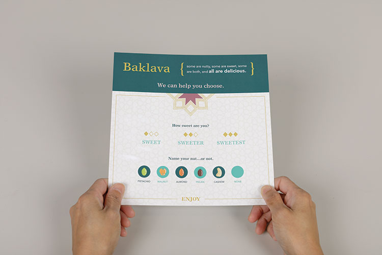
The customer at the dessert counter has a problem. The pastries look wonderful. The names may be unfamiliar. Which one is sweeter? Which contains pistachios? At Sedara Sweets & Ice Cream in Affton, Missouri, the Loft answered those questions with a printed guide and replaceable display labels. Three sweetness levels. Nuts identified. A little less guesswork between looking and ordering.
- Brand strategy, websites, photography and video under one roof.
- Work for food, furniture, construction, spirits and hand-hygiene businesses.
- A useful lesson: design around the question holding up the purchase.
That modest piece of paper offers a useful way into the Loft. A creative agency can describe itself through disciplines, software or a wall of logos. This one becomes more interesting when you examine the awkward little moments its work addresses. Someone cannot picture the chair. Someone cannot find the bottle. Someone sees a beautiful staircase but has no idea what building it required.
The photograph has work to do
Consider Comfy Sacks. Founder Tyler Shearburn wanted an easy-to-use website that showed shoppers what they were buying. The competing experience described in the Loft’s case study involved a tiny fabric swatch and a considerable act of imagination: take this little sample and mentally stretch it over that large piece of furniture.
The Loft developed a new identity, planned content wireframes and produced fresh product and lifestyle photography. The positioning occupied a deliberate middle ground: polished enough to feel desirable, accessible enough for families and college students. The responsive site carried that presentation across screen sizes.
The agency reports that conversions increased after launch. Treat that as a directional client result, rather than a forecast for another shop. The more useful takeaway is the sequence. Establish what the product should mean, decide what the shopper needs to see, then build the pages. Photography becomes part of the buying interface.
The product picture belongs in the same conversation as the purchase button.AN EDITORIAL TAKEAWAY
A brand can begin with a mechanism
For Symmetry, a hand-hygiene business, the important clue was inside the dispenser. Its interchangeable system accommodated hand wash, sanitizer and lotion. The Loft chose a name that reflected that relationship, then extended the identity into literature and other materials.
The website had another practical task. Different buyers needed different information, and potential customers needed to assemble a hand-hygiene program. The Loft built an interface organized around market segments and a feature for selecting program items. Here, brand identity and information architecture grew from the same product reality.
A reading of the portfolio, not a claimed agency methodology.
From the bottle to the inbox
Ballotin Whiskey gives that last question a more literal answer. The Loft’s case study describes an ecommerce redevelopment with a product carousel offering a direct buying action, a store locator and an email sign-up. The site serves both the online shopper and the person who wants to find a bottle nearby.
The relationship continues after the purchase. The agency created automated email campaigns tied to products customers had bought, encouraging recipe use and product reviews. A 10% discount encouraged newsletter subscriptions. That percentage is a promotional offer, not the agency’s fee or a measured return on the work.
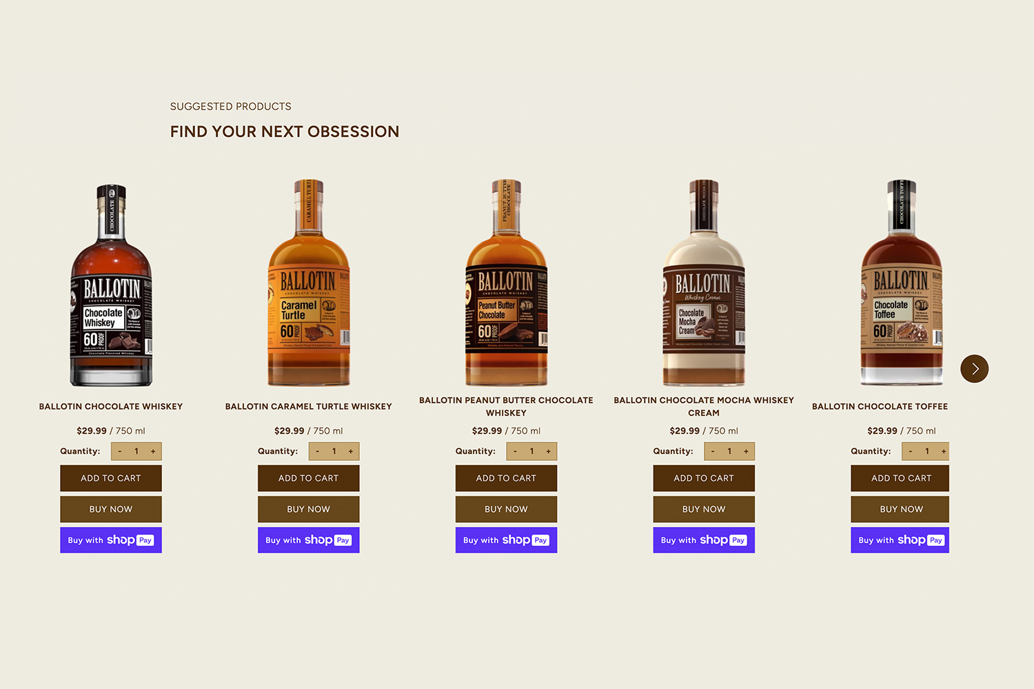
Put those details together and the business model becomes easier to understand. The Loft sells commissioned creative and digital services. Some assignments produce an identity or website; others include continuing imagery and marketing content. For a buyer, the attraction is coordination: fewer opportunities for the photograph, the message and the page to disagree.
Keep the familiar. Show the difficult.
Coordination does not mean changing everything. Landco wanted its logo modernized while preserving the existing color and recognizable L mark. The Loft worked within those constraints. It also developed the identity for Pronto, Landco’s urgent interior-construction service, along with a landing page, service card and animation.
Kirkwood Stair & Millwork presented a different challenge: making craftsmanship visible. The Loft documented the construction and installation of a grand staircase at Big Cedar Lodge. According to its account, loading the finished staircase required 12 men; installation involved a crane and two sections, captured in time-lapse. That is useful material for a company whose expertise can disappear inside the finished building.
For Better Life, the agency worked with Atomic Dust on a website redevelopment and produced lifestyle imagery and videos for the cleaning brand. Collaboration matters here. The Loft also identifies Shopify as an ecommerce technology partner and Clix as a digital marketing partner. Its place in the market is a multidisciplinary agency with specialist connections.

That arrangement offers a practical choice for smaller businesses. A company can hire separate specialists and manage the connections itself, or commission a team that already works across those boundaries. The Loft’s portfolio makes the latter case through finished assignments: a website accompanied by new pictures, an identity carried into print, a product purchase followed by an email.
The useful brief is a question
The public team roster spans creative direction, design, development, content and marketing. It also asks employees about pets and imaginary superpowers. Developer Dan Owen would like to order seasonal food out of season. The detail supplies a welcome flash of personality alongside the portfolio’s practical concerns.
The service promise is succinct: “Customized for you and your audience.” The interesting word is audience. A contractor evaluating millwork needs different evidence from a shopper choosing furniture or a café visitor ordering dessert. A coherent visual style helps, but the useful information changes with the person and the decision.
For prospective customers, the most useful preparation is equally specific. Identify the moment people hesitate. Bring the confusing product options, the missing photographs or the page that fails to explain the offer. Scope the deliverables, agree on the budget and decide how you will judge the result before production begins.
This approach needs something solid underneath it: accurate product information, an offer people want and a way to reach them. Clear labels cannot make the wrong product right. But they can help a willing customer choose. At a bakery counter, that may begin with one very good question: how sweet do you like it?