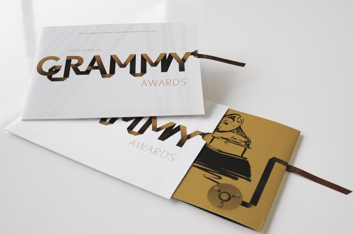
The invitation came with its own little instruction, expressed in recording tape: pull. For the 55th Annual Grammy Awards, IE Design + Communications incorporated a real strip of studio tape into the invitation’s opening mechanism. The ceremony’s artwork had already made tape a visual motif. IE gave that motif a job. A guest could understand the idea with a hand before spending much time reading the page.
It is a useful introduction to a studio whose portfolio moves between university websites, corporate reports, coffee packaging and fundraising materials. These assignments have different audiences and very different shelf lives. But each asks a similar question: how do you get someone to notice, understand and act? IE’s answer often begins well before the choice of a typeface.
A backstage education, then a $3,000 start
Co-founder Marcie Carson’s route into design ran through fashion and live performance. A University & College Designers Association biography records her studies in communications and fine art at the University of California, Santa Barbara, followed by marketing work at Contempo Casuals. In 1993, she joined the costume team for Madonna’s Girlie Show World Tour. She returned to graphic design full time the following year.
Carson and her husband, Corey Baim, founded IE in 1995. Baim had his own touring history as a bass player with Rhythm Collision, alongside work in mortgage banking. An October 2009 Entrepreneur profile put their starting capital at $3,000, with an old Mac among the early resources. That amount belongs to the company’s origin story; it is not a price for commissioning design.
“I started IE Design + Communications because I knew I could do it.”
Marcie Carson, speaking to Entrepreneur in 2009
By December 1998, HOW magazine had selected IE among seven firms to watch, according to the UCDA biography. The career sequence is appealingly untidy: communications, fashion, touring, then institutional design. It also gives the company a more concrete identity than the familiar agency claim to think differently. Carson had worked in settings where presentation was inseparable from preparation.
The sales pitch stopped staring in the mirror
IE initially grew through referrals. In 2001, the founders changed their marketing to emphasize clients’ industries and problems, using newsletters and practical information rather than concentrating on the studio’s designs and accomplishments. Entrepreneur reported that the results took more than a year to emerge. The shift helped IE pursue chosen sectors instead of depending entirely on incoming opportunities.
The same 2009 account described average annual revenue of about $2.5 million in the preceding years, alongside a deliberate effort to keep growth from swallowing creative attention. Sometimes the founders declined prospective work. This was a business built around the capacity to deliver particular assignments, with a client roster to manage and a reputation to protect.
Five websites meet one immovable deadline
Cornell’s five-site assignment makes IE’s practical role especially clear. Undergraduate admissions, financial aid, student employment, admitted students and the graduate school needed redesigned websites within six months, ready for acceptance notices in March. IE’s account describes the old sites as having accumulated confusing user experiences and dated graphics as they grew.
The first problem, then, was organizational drift. IE met stakeholders, researched audiences and developed a shared content plan with coordinated milestones. The sites used Drupal so university staff could manage information. According to the agency, the five launches met the deadline and budget. The deliverable included a way for people inside Cornell to keep the work useful after launch.
One coordinated assignment. IE reports delivery on schedule and on budget.
A separate Cornell human-resources project involved more than 500 pages serving six audience groups. Employees, job candidates and retirees needed different routes through the information. The scale is a reminder that a university website can contain several overlapping public services. An attractive home page has to lead somewhere intelligible.
The useful lesson is to map audiences and content before treating each page as a separate design task. On a linked set of sites, one team’s decisions affect another’s. The milestone plan becomes part of the user experience because it determines whether the pieces arrive as a coherent whole.
At Berkeley, the website moved to the front
For UC Berkeley’s Center for Executive Education, IE conducted more than 25 interviews with clients, faculty, staff and partners. The studio also spent 2.5 days on site, meeting internal stakeholders and observing programs. The assignment covered branding, messaging, a website and supporting materials.
During discovery, the website emerged as the leading brand and marketing priority. It then helped drive the visual identity. That ordering matters. A project can begin with several apparently equal deliverables; research should help decide which one carries the most responsibility. Here, understanding the institution changed the sequence of the work.
2.5 days on site
as the lead need
around that priority
This approach asks something of the client, too. The inference from IE’s account is straightforward: access to people and programs makes the research possible. If decision-makers cannot participate, or the answer has already been fixed before the interviews begin, the same process has much less room to help.
A rulebook with room to play
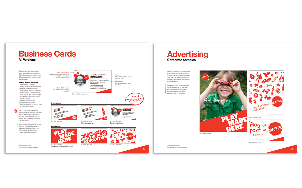
Mattel presented a different tension: how to make a large company look coherent while retaining the energy of childhood play. IE’s portfolio describes graphic standards and logo work alongside a corporate website, reports, advertising and trade-show graphics. Photography required a multi-day shoot at several Los Angeles-area locations.
The stated goal for the standards was to provide a common structure with relatively few creative restrictions. That is a useful distinction within the work itself. A guideline can settle recurring decisions without preselecting every possible outcome. For teams producing many kinds of material, the test is whether the identity remains recognizable as the applications change.
Hillsides, which serves vulnerable children, young people and families, needed an identity that could work across several related communications. IE developed a pinwheel concept and carried the brand into four websites and capital-campaign materials. The agency says the board’s response helped establish the concept as the campaign’s visual foundation. Approval had somewhere practical to go.
The coffee bag and the wine-auction program
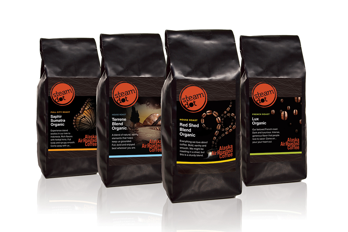
SteamDot arrived with a more open brief: an Alaskan coffee business needed a brand. IE began with mood boards, gathering references from color, materials, interiors, objects and imagery. The name drew on the railway history around Anchorage’s Ship Creek. Packaging, signage, retail environments, collateral and a website followed.
This is where the value of a connected design practice becomes easy to see. A coffee bag has to communicate at close range. A sign must work across a room or street. An interior surrounds the customer. Developing them together gives the idea several tests, and gives the business a recognizable personality across physical settings.
Print production adds another kind of expertise. Classic Litho + Design describes a longstanding relationship with IE and documents a Manhattan Beach wine-auction program made to resemble stained glass. Its account specifies 2,500 copies, UV process inks, a dull spot coating and a raised UV layer on silk-cover stock.
The result depended on the printer as well as the artwork. Texture, reflected light and the folded format were production decisions. For someone commissioning an elaborate invitation or event program, the copyable habit is to discuss materials and finishing early. A screen preview cannot settle how an object feels in a hand.
Why universities keep appearing in the portfolio
Higher education gives IE repeated opportunities to combine editorial thinking and design. For Cal Poly’s university magazine, the studio worked with leadership to investigate audience needs and perceptions, develop names and design concepts, then carry the selected direction into print and a companion website. The magazine was considered as a publication with readers, before becoming a set of layouts.
Client credits provide another view of that practice. The spring 2017 issue of Cal Poly’s Cultivate names IE as publication designer. Loyola Lawyer’s 2011 issue also credits the studio for design. These are tangible institutional outputs: stories, reports and updates that have to accommodate substantial amounts of information.
At the University of Oklahoma, the university’s own team had already conducted research, including surveys, analytics and a digital audit. IE’s task was to interpret that work into a website approach with simpler navigation and adaptable content areas. The research did not have to originate inside the agency to influence its design.
The brief that suits this studio
IE sells custom design and communications services to organizations. Its portfolio supports a business model of commissioned assignments and continuing client relationships, with brand strategy, publication design and web development often appearing together. Buyers include marketing departments, university communications teams, development offices and businesses building a public identity.
The market position is clearest when several needs overlap. A specialist web firm, an independent identity designer or an internal creative team may cover part of the same brief. IE’s demonstrated combination is research plus visual systems plus execution across print and digital media. Its portfolio makes that combination more persuasive than any claim that the individual services are unique.
A sensible first conversation would bring an audience, a communication problem, a deadline and the people who can make decisions. A small, settled production task may need far less discovery than a university-wide redesign. The telling detail in IE’s work is how the medium takes on the assignment: a website sorts the routes; a coffee bag carries the place; a strip of tape tells a guest where to pull.