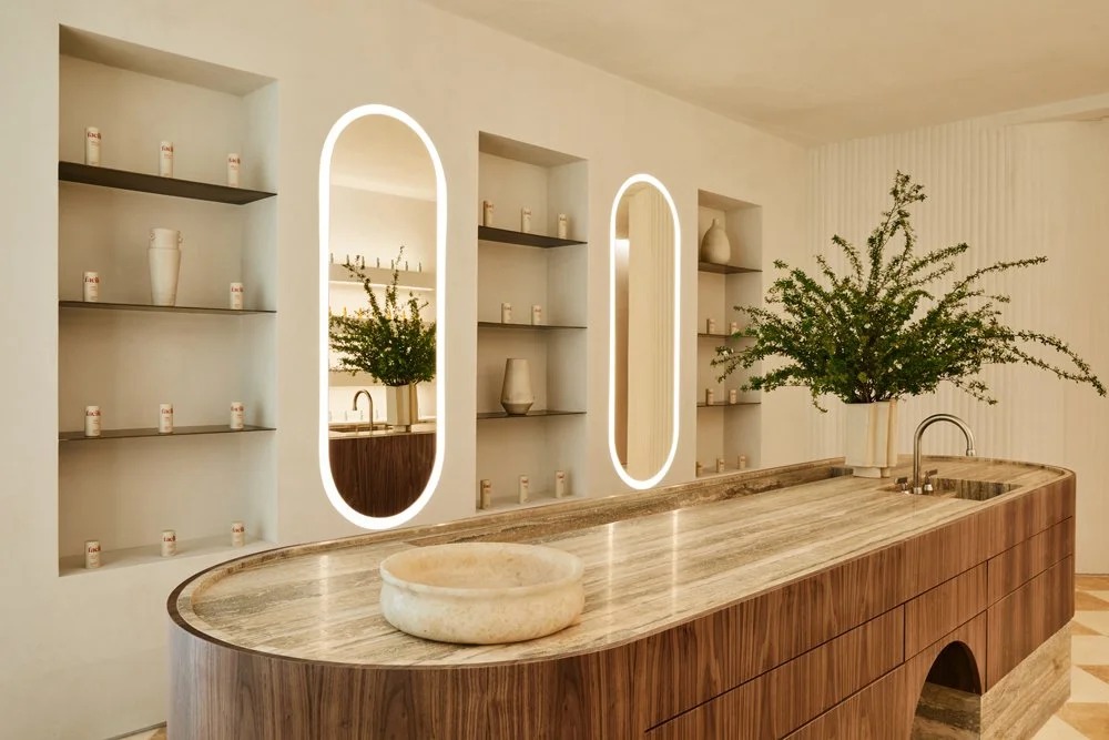
A skincare bottle has to make sense in two places: on a shelf and in somebody’s life. For Facile, the Los Angeles medispa, there was a third place to consider. The business was moving its flagship while developing its own skincare range. A customer might meet the brand in a treatment room, then take a small piece of it home. Those encounters needed to feel related.
That was the assignment for Another. The studio’s Facile case study describes an existing identity and packaging system that lacked consistency. The brief called for a refresh that could accommodate both the new space and the products. The work covered creative direction, brand design, packaging, collateral and copy. Before choosing a prettier bottle, somebody had to decide what the bottle belonged to.
Look through Another’s portfolio and this problem keeps appearing in different costumes. A restaurant needs its printed materials to carry the warmth of its dining room. A furniture company needs to explain a technical feature without losing the appeal of an afternoon outside. A barbershop has rather more going on than haircuts.
A barbershop with several identities
Manifest, in Washington’s Adams Morgan neighborhood, combined a barbershop, retail and a speakeasy. Founder KJ Hughes brought Another the job of making that assortment understandable. Its scope extended from positioning and copywriting to packaging, a website and wayfinding. This was a business people would navigate with their feet as well as their eyes.
Another drew visual cues from the materials and renderings of Manifest’s architecture and interior partner, Snarkitecture. The project extended into Of US products, the Out of Office bar and the Abode apartment. Related typography helped the different names belong together. The useful question was how much resemblance each needed. Too little, and a visitor could miss the connection. Too much, and the individual experiences would have little room to speak.
Shared typography. Distinct names and marks.
Here is a practical test for anyone commissioning branding: put the things a customer encounters next to one another. The appointment email. The sign. The menu. The box. Can you explain their relationship without pointing to the logo? Manifest makes that question unusually visible because its offer already contains several businesses.
The sneaker hiding in the swimsuit
Another’s customers also include brands whose recognition is hardly in doubt. For Nike Swim, the challenge was to introduce the Sneakerkini and communicate its connection to sneaker design. Recognition of the parent brand could only do part of that job. The particular product needed an explanation.
The studio developed a campaign combining live-action capture with CGI. It brought suggestions of water and sunlight into the studio and connected footwear with swimsuit details. That choice gives the project its interest: the creative route began with something specific about the object being sold. A familiar name supplied attention; the design connection supplied a story.
For Outer, the outdoor furniture business, Another built a broader brand film and shorter pieces addressing sustainability, design and technology. Work appeared across digital and outdoor advertising. The relationship then extended into an Outer Shell film that reused captured material to explore the product feature more closely.
There is an economical idea here even without attaching a price tag: plan the relationship between the long film and the smaller pieces before the shoot. A campaign can introduce a company, explain a feature and give different placements the material they need. That requires deciding what each piece is supposed to accomplish.
Sometimes the brief is the thing that changes
Byte’s 2022 assignment began with a crowded seasonal proposition: a new year and a reason to start a dental aligner program. Another redirected the message toward why people put off beginning. The work expanded into a refreshed visual language and a broader strategic approach, with stories involving characters preparing for meaningful personal moments.
The distinction matters to a buyer of creative services. You can commission an execution of a settled idea. You can also commission an examination of the idea itself. Another’s case studies repeatedly describe assignments that cross that boundary. A request for a campaign becomes a positioning exercise; a location move becomes an identity problem.
At Gracias Madre, the restaurant’s identity drew on family kitchens and the passing of recipes between generations. Another describes secondary lettering derived from Latin grandmothers connected to the team, alongside a custom logotype and illustrations. It is an unusually personal reference for a design brief. The warmth had somewhere particular to come from.
“curious in our approach, and joyous in our execution”
Another’s description of its working culture
A small studio finds a bigger home
Chelsea Matthews founded Another in 2013 with an initial focus on social media creative. Over time, the studio’s work broadened. By its acquisition, the business combined strategy and campaigns with identity and production. The Los Angeles Business Journal reported that it had ten employees when it joined TUX in 2024.
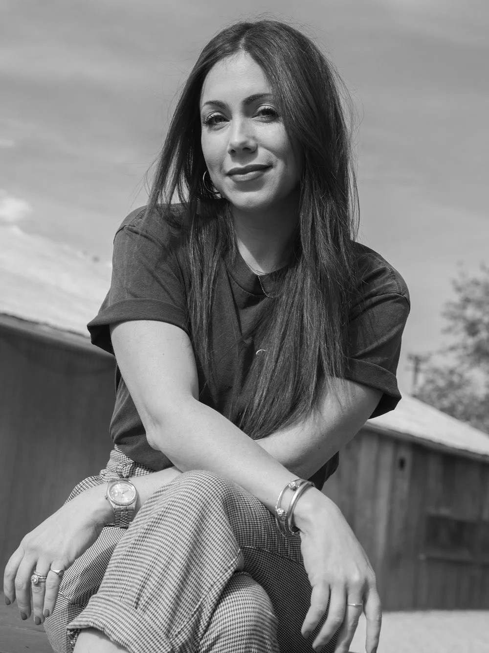
TUX announced that Matthews would become a partner and vice president of creative for its U.S. business. Her stated reasons included opportunities to grow, collaborate and learn. The arrangement brought the team into an operation spanning more disciplines and a wider geography. It also placed the studio’s client relationships inside that larger business.
The deal is useful context for understanding Another today. Its public portfolio documents the studio’s work, while its website directs visitors to the TUX acquisition. Anyone considering an engagement should begin with that relationship in mind.
Culture has a more conversational record in Sessions, Another’s podcast. Its fourth season turned the microphone toward team members to discuss purpose, visual strategy and creative process. A prospective collaborator can hear the people discussing how they think about their work, alongside the finished projects they display.
Bring the whole problem
Another sells creative services to businesses: strategy, design and production organized around client assignments. In the agency market, that places it across the territory occupied by branding studios and campaign producers. Its particular appeal lies in the connections visible between disciplines. A client can bring a product launch, a hospitality concept or a brand refresh with several moving parts.
That breadth is most useful when the parts depend on each other. If the assignment is one tightly specified asset, a narrower engagement may be sufficient. If the team cannot revisit positioning or coordinate the people responsible for different channels, an integrated proposal will be harder to implement. These are scope questions to settle before falling in love with a portfolio.
The lesson a reader can borrow is modest and demanding: choose a concrete brand decision, then follow it into everything the customer encounters. For Manifest, that meant related identities across a place with several purposes. For Nike Swim, a design connection became a film. For Facile, a bottle had to feel at home in a room. Start there. Put them beside each other.
Look closer. Press play.
Explore the work and hear the people behind it.