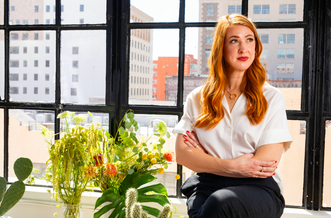
A brand called Nice People could get away with a smiley face and a pleasant introduction. Amber Asay gave hers a sharper founding argument: she had worked for enough bad bosses. The studio’s name would advertise the kind of relationship she wanted to have, with colleagues as well as clients. In a business that sells taste, she was also selling a way of working.
Asay described the impulse in a 2019 Communication Arts interview, where she connected difficult workplaces with her decision to go out on her own. Her stated interests included gender equality and giving designers proper credit. There was ambition in the choice, but also an ordinary, recognizable wish: to enjoy the people on the other end of a project.
Today, Nice People offers identity, packaging and digital design, with a portfolio that moves from wellness products to publishing and houseplant care. The studio says it has worked with more than 100 clients. Its appeal is easiest to understand through the assignments: make a product recognizable, make an online catalog navigable, make several makers feel part of one enterprise. Those are specific jobs for design.
A pleasant name with a pointed origin
The early studio operated remotely. In Eye on Design’s account, Asay argued for giving creatives a choice between home and office, connecting flexibility with wellbeing and better work. The publication also raised the awkward business question behind selective client relationships: declining work is easier when you can afford to. That tension belongs in any reading of the name. A good intention still has to coexist with a paying client roster.
Asay’s background supplied a visual vocabulary as well as an opinion about management. She spoke of collecting inspiration from vintage architecture, fashion and printed ephemera, especially from the 1920s through the 1970s. Custom logotypes were a specialty. Historical references gave her a large collection of shapes to draw from without requiring every client to wear the same retro costume.
“Life’s too short to work for assholes.”Amber Asay · Communication Arts, 2019
The $233 lesson before the studio
One small production story predates the business. In 2013, Asay made a newspaper to showcase her design range: four pages, 100 copies, a reported production cost of $233. The published production notes record a ten-day turnaround. Her original plan called for metallic gold ink alongside black; the budget pushed her toward a digitally printed gold substitute.
Then came the gamble. With time tight, she ordered the full run without a test print. The color came back differently than she had imagined. Eventually, the coppery result appealed to her and worked with the paper used for the belly band. The compromise became acceptable because she could see how the finished parts related to one another.
That is a useful detail for anyone commissioning print. Agreeing on a color on a screen is only one decision; paper, process and proofing come afterward. The $233 was a personal promotional project’s production bill, years before Nice People’s later commissions. Its value here is the specificity of the tradeoff: a desired finish, a budget limit and a physical result that forced a second look.
Poosh needed a publishing system
Nice People’s Poosh portfolio entry describes a launch assignment spanning a custom logo, website design and development, Instagram templates, newsletters and print. The intended character was editorial and fashion-conscious. The practical problem was substantial: a site had to accommodate a long catalog of articles while helping readers find material relevant to them.
Seen that way, the wordmark is only one part of the work. Typography can establish a mood, but the surrounding system has to keep functioning when the next article arrives. Newsletter layouts and social templates extend those decisions into repeated use. For a client publishing regularly, that continuity is a useful thing to buy.
The transferable idea is to judge an identity against its busiest day. Put several headlines, different photographs and a newsletter alongside the logo. Ask whether they still feel related and whether a reader can find a way through. Nice People’s listed Poosh deliverables make a strong case for setting that broader assignment at the outset.
The client already knew something
DEON LIBRA brought a different kind of clarity. According to Dieline’s 2023 account, the wellness brand arrived with consumer research, a red color direction and a bottle reference inspired by vintage Murano glass. Nice People built around those decisions, adding details including spot-gloss lettering and cartons that carried the visual identity outward.
The project earned five category awards, contributing to Nice People’s 2023 Studio of the Year title. Dieline awards that honor to the entrant with the most overall wins across its competition. The publication described Nice People then as a fully remote agency with no more than ten employees.
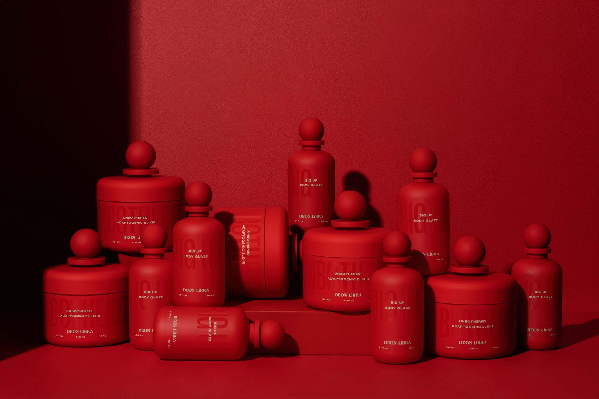
For a prospective client, the revealing part is the starting point. Hiring a designer need not erase what a founder already knows. A useful brief can distinguish established decisions from open questions. That leaves room for the studio’s judgment while preserving information earned through contact with the audience.
GIFTED wanted to be heard
The challenge at GIFTED by FreeFrom was coherence. Its products came from different makers; the rebrand needed to make the larger collective easier to understand. Asay’s 2025 interview describes listening closely to a team that wanted its identity to communicate warmth while also feeling bold and activist. Soft colors and assertive typography became parts of the same visual language.
The work received Dieline’s 2025 Design for Good Award. Asay described the project as particularly aligned with her reasons for starting the studio. Her account also suggests a useful correction to the usual designer-client hierarchy: understanding how people describe themselves was central to deciding how the brand should look.
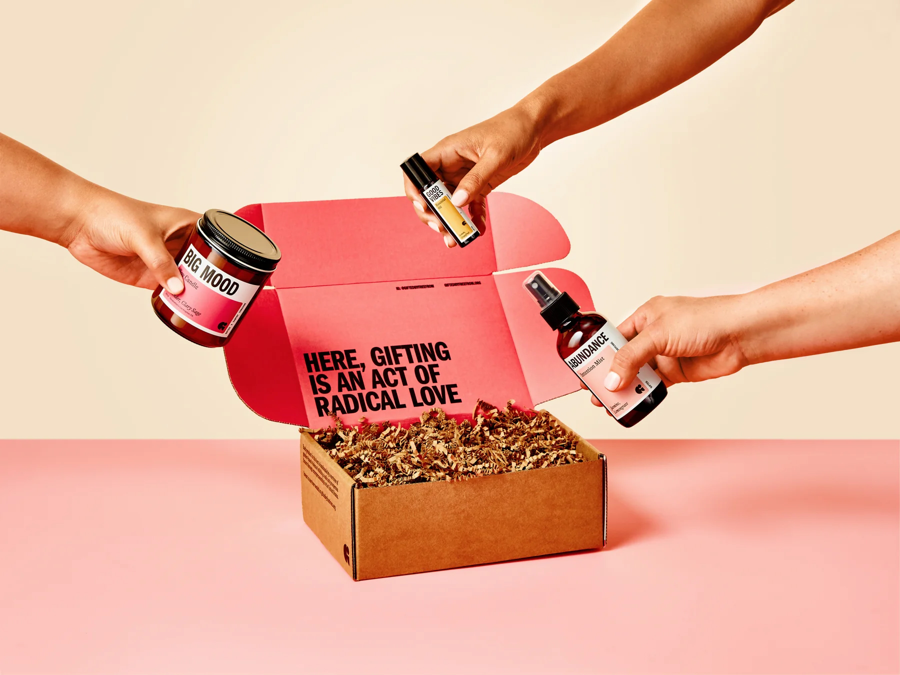
GIFTED’s current storefront makes that collective visible through survivor-made gifts, product groupings and a clear explanation of its survivor-led business. A shopper can browse by intentions such as celebration, appreciation, wellness and connection. This is where the design question becomes concrete: can someone understand both what they are buying and the organization behind it?
Plant care gets a louder wardrobe
The studio published its Happy Happy Houseplant branding in June 2026 and a website case study in July. In a public project description shared by designer Rachael Gibilterra, Nice People described the visual approach as a meeting of apothecary and band poster. Oversized plant illustrations identify the category; separate palettes distinguish formulas while holding the range together.
The live shop puts that personality to work across plant food, leaf care and pest-control products, with bundles and merchandise alongside them. Its site credits Nice People. The playful presentation gives shoppers several ways into the catalog, while the product labels still have to communicate which bottle does what. A joke can invite attention; a recognizable product family helps organize it.
What the commission actually buys
Nice People’s service list covers naming, brand strategy, packaging, print production, copywriting, photography direction, websites, ecommerce, signage and environmental design. It is a commissioned service business. A prospective client starts with an inquiry and a discussion of the project. The studio describes working with startups as well as brands that have been operating for decades.
The breadth is visible in an unexpected assignment: The Torrance, a 310,000-square-foot workplace property. Working with Ferro Concrete, Nice People contributed to branding, packaging and print. The materials included a brochure and a small batch of gin for investors and business partners. Even an office property can have a reason to appear on a bottle.
The craft beneath that range is less mysterious than the polished portfolio might suggest. In an earlier AIGA interview, Asay described sketching the skeleton of lettering, refining it on tracing paper, then scanning and tracing digitally. Her approach begins with composition. She has also demonstrated custom wordmark work in an Adobe Live typography session, making the decisions available for other designers to study.
For a buyer comparing a freelancer, a specialist web shop, a boutique studio and an internal team, the useful distinction is the scope of the problem. Nice People’s portfolio supports a role connecting identity to physical and digital applications. That makes particular sense when a business needs several related outputs and wants them considered together.
The same reasoning sets limits. If a product’s fundamental promise remains unsettled, packaging alone cannot settle it. If a team wants to purchase a finished appearance without discussing audience, content or production, these case studies offer little reason to expect the same results. The practical thing to copy is the preparation: bring what customers have taught you, identify the applications that matter, and leave enough time to examine the work in use.