A wooden wine box makes a promise before anybody pulls a cork. It suggests ceremony, permanence, something worth putting away. For Ridge Vineyards, that promise had acquired some inconvenient baggage: wood that was becoming harder to source and boxes that sometimes arrived looking worse for the journey. Revel Brand Design helped work on an answer that a collector might initially consider a downgrade. Cardboard.
The replacement kept recognizable Ridge lettering and Paul Draper’s signature. It also made room to explain the wine and its packaging. In an August 2025 WineBusiness Monthly account, Ridge staff described initial resistance among international buyers, followed by approval once they understood the reasoning and saw the result. The sales task included explaining why a less traditional material belonged around a prized bottle.
That is a useful introduction to Revel. The Petaluma creative agency works on the space between what a business knows about itself and what a customer can understand at a glance. Its assignments include food packaging, wine labels, websites and campaigns. A prettier surface is part of the job. So is deciding which familiar signals deserve to survive.
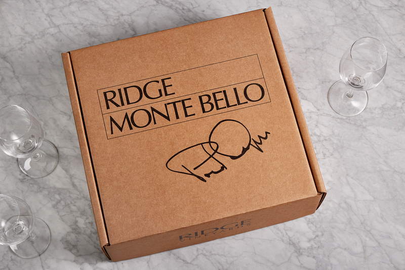
Less box. Same occasion.
Revel’s account describes months of research with Packaging Arts, including material sourcing and durability testing. The result was a three-bottle package using recycled paper, water-based ink and a protective Green Cell Foam insert. Materials and presentation were treated as one problem: the wine still had to arrive safely, and opening it still had to feel considered.
The agency projected that the switch would replace 10,000 wooden boxes and remove 50,000 pounds of shipped weight annually. Those figures describe its stated packaging impact, not a measured carbon saving. They nevertheless give the project a useful physical scale. Here, a design decision can be discussed in pounds as well as typefaces.
Annual projections published in Revel’s project account. Weight reduction is not a carbon-emissions measurement.
The copyable idea is to write a packaging brief that includes the journey after the sale. A box must endure handling, explain its contents and eventually go somewhere after it is emptied. An attractive prototype answers only part of that brief. Testing and a credible explanation of the change belong beside the artwork.
The agency that outgrew its own name
Revel began in 2005 under founder Christine Martin. In a reflection on its twentieth anniversary, she described leaving an agency culture where working late was treated as evidence of dedication. She wanted meaningful creative work with room for a life outside it. The business she built remains independent, according to that account.
It was originally called Firefly. By January 2017, the agency was explaining why it had renamed itself Revel: its capabilities had grown beyond those of the boutique design shop it had started as. The old identity no longer described the business accurately. Finding the new name took months, research and, by the company’s cheerful admission, some pinot noir.
For an agency paid to examine other companies’ identities, this was an unusually close encounter with the brief. The name needed to express its interest in food, wine and the pleasures of living. The episode also supplies a sensible threshold for a rebrand: a mismatch between the business and its presentation, rather than simple boredom with the stationery.

Today the team page lists nine people across strategy, accounts, design, digital and production. Martin is principal; Lincoln Young is creative director. Revel promises clients direct access to the creative team from the start. That matters for work in which an owner’s description of a business must survive several rounds of interpretation before becoming a label or website.
A bread bag starts with a question
Revel’s strategy writing begins with a short question: “What’s prompting this need for change?” Its examples are practical: customers are confused, a category feels crowded, or salespeople struggle to explain the difference. The firm uses workshops and a Brand Definition Program to turn those problems into a blueprint for design.
“What’s prompting this need for change?”Revel, on the question before the redesign
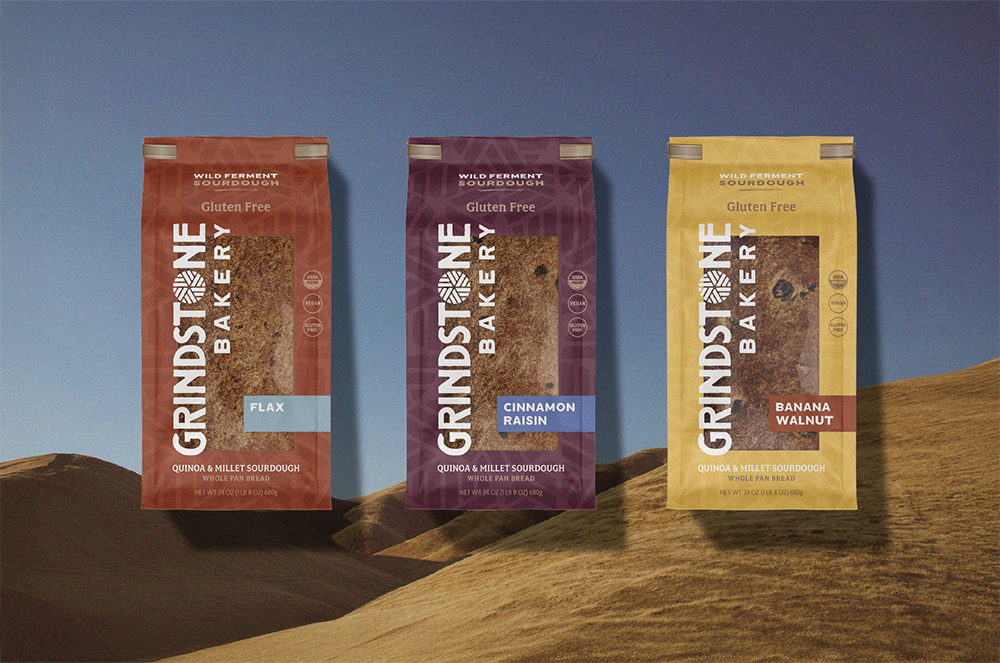
Grindstone Bakery shows the sequence. New owners wanted to relaunch a Sonoma County bakery making wild-fermented, gluten-free bread. Revel researched the market and audience, developed positioning and a brand story, then redesigned the packaging, beginning with a material choice informed by sustainability. Guidelines and other branded materials followed.
The resulting bags give the bread a large window and the product varieties clear color differences. Those are visible design choices, not evidence of a sales increase. But they show the practical work inside the word “branding”: helping a buyer identify the maker, inspect the product and distinguish one loaf from another without turning shopping into homework.
- 01 / UnderstandMarket, audience, reason for change
- 02 / DefinePosition, story, voice
- 03 / MakePackage, identity, supporting materials
- 04 / RepeatGuidelines for the next application
Keep the grandmother. Change the conversation.
La Tortilla Factory presented a different problem: refreshing a familiar brand without stripping out its memory. Revel refined the vintage lettering and reworked the Abuela figure while preserving the character of the mark. Color and messaging then carried across packaging, the website and social media. The assignment was continuity with enough change to make the range feel current.
Fetzer arrived with a new label already in hand. Revel’s role was to help reposition and activate the brand, including a new digital expression. Its work used informal language, brighter color and energetic lifestyle imagery to address a younger audience. The distinction matters: the documented assignment was broader brand and website work, and the case study does not claim Revel designed that incoming label.
At Straus Family Creamery, the central idea was agricultural. “Organic farming is our main ingredient” connected the company’s farming values with the products in the refrigerator. Revel extended the premise through photography, print, digital and audio advertising, infographics and social posts. The same thought had to make sense at different sizes and in different places.
Together, these projects suggest Revel’s particular fit within the agency market. Its portfolio is heavily grounded in products people eat and drink, with the repeated challenge of making heritage, ingredients or farming practices legible. A brand owner can buy individual creative skills elsewhere. The attraction here is a team accustomed to connecting those details across packaging and marketing.
The service menu divides that work into three parts. Brand Foundation covers audits, positioning, customer journeys and the relationships between brands in a portfolio. Brand Building includes identity, naming, packaging, voice and guidelines. Brand Extension takes the resulting decisions into websites, displays, printed materials, photography and campaigns. For a marketing director, that makes it possible to think about both the immediate assignment and what will have to follow it.
A new package, for example, creates another question: what happens when a customer looks up the product online? The page, imagery and description need to help that person recognize what caught their attention. Reading Revel’s portfolio this way suggests a buying criterion more useful than whether a single mockup looks appealing: whether the work remains coherent when it leaves the presentation.
Beyond the grocery aisle
The portfolio also extends into civic and business communication. For Sonoma County Regional Parks, Revel refreshed an identity using Hood Mountain, the Russian River and old-growth redwoods as visual references. The work continued into a style guide and marketing materials. A public park needs recognition too, whether the identity appears on a sign, a vehicle or a visitor’s guide.
American AgCredit hired the agency for campaigns centered on the stories of its agricultural customers. Revel describes carrying those stories across websites, print and digital advertising, billboards and trailers. This is the same coordination problem in a different setting: a business has many opportunities to introduce itself, and those introductions should sound related.
There is a useful smaller example in Visit Fort Bragg. Its tourism operation had been borrowing the city’s logo when it needed a mark. Revel developed a distinct visual identity and messaging for the destination. The problem began with a missing identity, rather than an existing logo that needed cosmetic improvement.
What the relationship asks of a client
Revel sells professional creative services to organizations, through projects and continuing engagements. Clutch lists a $10,000 minimum project size and a $150-$199 hourly range. These are directory figures, not a quote for any of the projects here. They position the engagement as a considered marketing purchase, with scope needing attention before the work begins.
A 2023 Clutch review from an organic dairy marketer praises flexibility through interrupted projects while mentioning delays and minor communication issues. That is a useful reminder that collaborative design needs decisions from both sides. Direct access to creatives can help; an agreed approval process and a client willing to settle internal disagreements still matter.
Revel itself describes sustainable packaging as a problem constrained by budget, production schedules and material availability. Its Paradise Ridge work combined screenprinted bottles, a shortened capsule and lighter glass. The right answer therefore depends on what can be sourced and produced for the actual product. A material that suits one winery is not automatically the answer for another.
Even recognition does not guarantee a design reaches customers. Revel won a Creativity International Silver award for a WX Brands Four in Hand wine-label concept in the category for work never produced. It is an amusingly candid portfolio footnote: a design can win over judges without ever earning a place on the shelf.
For a prospective client, the most useful preparation is to identify the decision that design must help someone make. Recognize the product? Understand an ingredient claim? Feel comfortable with a changed package? Revel’s work gives those questions tangible form. The finished object may be a bag, a website or a plain paper box with a familiar signature.
Look closer
Explore Revel’s website and project portfolio; follow its work on Instagram and LinkedIn.
Read Dispatch or the WineBusiness Monthly packaging feature. For a longer explanation of the process, American AgCredit links to Revel’s 2020 brand-building webinar and presentation.