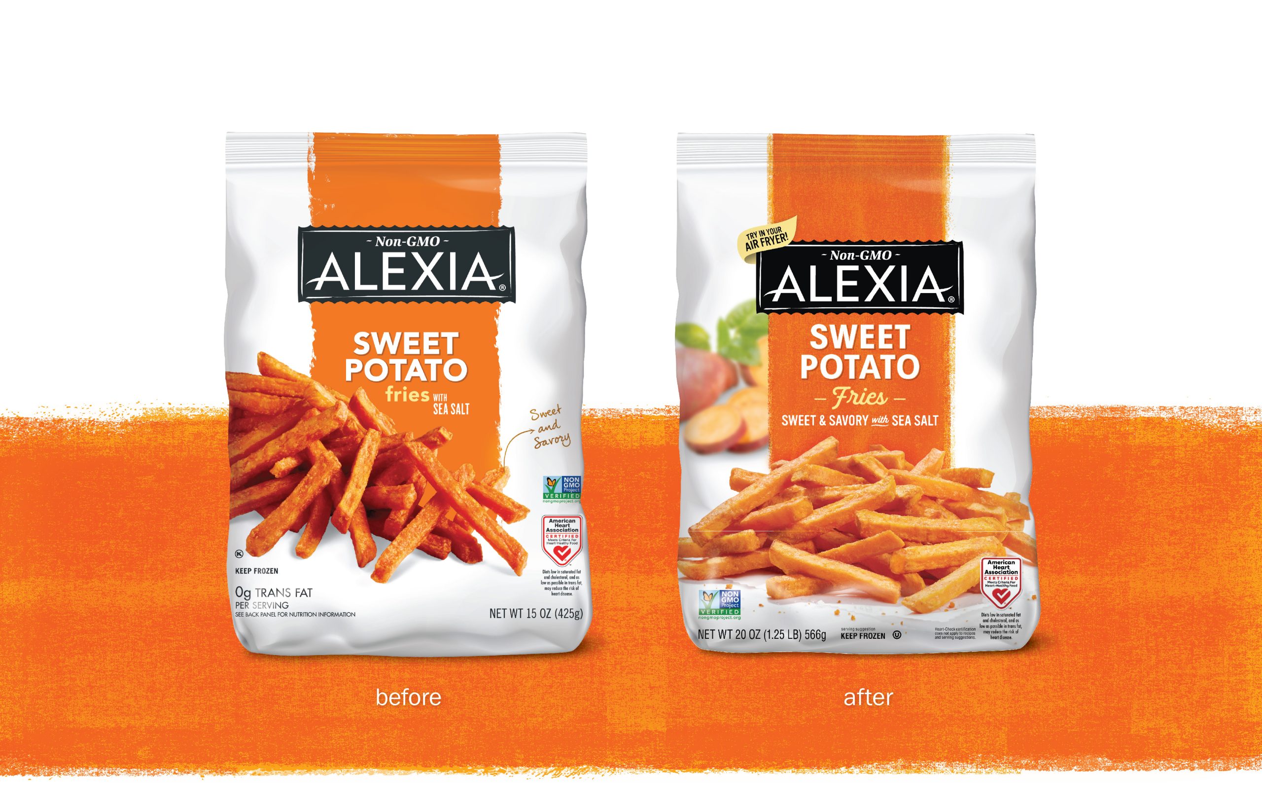
The white bag survived. So did the orange stripe. When Truly Creative refreshed Alexia’s frozen potato packaging, the familiar outline of the brand remained easy to spot. The fries, however, received more flattering treatment: natural-looking light, parchment, scattered seasoning. It was the difference between identifying dinner and beginning to want it.
This is a useful place to meet Truly Creative, because restraint can be harder to explain than reinvention. A dramatic new logo makes an obvious presentation slide. Keeping a color because it already helps someone find the product requires a different kind of confidence. The Petaluma agency’s work repeatedly returns to that question: which parts of a brand are earning their space?
The fries needed a better introduction
Alexia’s brief was to refresh its core frozen potato range. Research suggested an opportunity to strengthen appetite appeal, while retaining associations with better-for-you ingredients. Truly updated photography and typography, added preparation and dietary cues, and preserved the dominant white and flavor colors. The agency reports that 82% of consumers preferred the redesign over the previous packaging.
Preferred the redesign over the previous package, as reported in Truly Creative’s case study. A preference result, not a sales-growth figure.
That distinction matters. A packaging test asks one question; the checkout answers another. Mixing their answers produces an impressive number with a misleading label. The more interesting observation is visible without a spreadsheet: a redesign can change how food feels while leaving the shopper’s route to the brand largely intact.
First, get everyone to agree on the pasta
At Jovial, the assignment expanded before the printing began. A flour packaging correction prompted cofounder Carla Bartolucci to ask for a coherent system across the portfolio. Then a stakeholder survey exposed disagreement over which messages mattered most. Ingredients and dietary claims had been competing for attention.
“As it turned out, nobody was on the same page - literally nobody.”Frank Bergin, Jovial president, speaking to Designalytics
The redesigned packages reached shelves in late summer 2021. Designalytics reported that pasta sales rose 27% in the following six months against the same period a year earlier. It also reported no increase in marketing spending. That comparison makes the result interesting; it does not isolate every possible cause of growth.
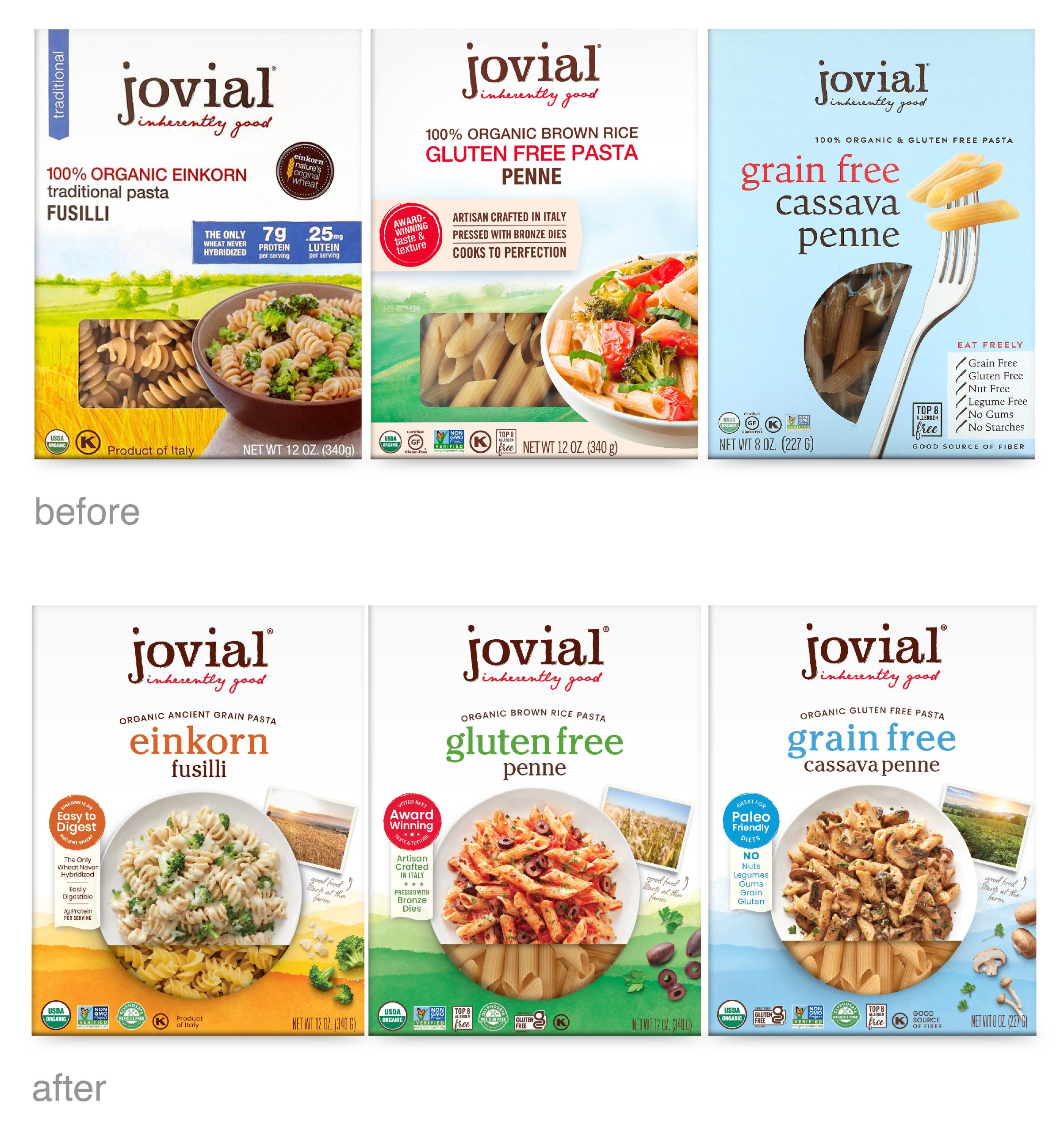
Truly’s solution combined a softer visual system with clearer distinctions between product lines. Watercolor landscapes and farm photographs connected the food to its origins; plated dishes and recipes connected it to dinner. The underlying design problem was unusually relatable: how do you make things belong together without making them look interchangeable?
For someone planning a redesign, there is a cheap first exercise here. Ask each decision-maker to rank the package’s three most important messages separately. Compare the lists before commissioning layouts. If the rankings disagree, the designer is being handed an unresolved business decision. A larger headline cannot settle it.
A dragon, a mother, a farmer
The same agency that organizes pasta also changes the expression on a dragon. For Tai Pei, Truly was asked to attract younger shoppers while preserving recognition. It improved legibility, enlarged the food’s presence and made the familiar dragon more approachable. The character had to remain itself while becoming better company.
José Olé presented a more specific communication job. Its Double Stuffed Taquitos needed to belong to the established range and make the extra filling obvious. Truly updated the charro illustration, used a pattern inspired by papel picado, and paired the filling claim with photography showing the inside of the product. Here, the reason to choose could be pictured.
For Mommy’s Bliss, the agency kept the mother-and-child illustration and blue palette while using secondary colors to help distinguish products, flavors and ages. It also gave the founder’s story room on the back panel. A range that began with a handful of infant products could expand into additional family wellness lines without losing its visual relationship.
Farmer Focus required a different emphasis. Its existing package used familiar poultry imagery, while its distinctive story centered on farmers. Truly built an identity around a father and daughter on their farm, with the Blue Ridge Mountains behind them. The package also highlighted the Farm ID that lets shoppers connect the chicken to its farmer.
These projects resist a single visual formula. A lively frozen snack and a reassuring family wellness product have different jobs. The recurring move is to identify the useful detail already inside the business, then decide how prominently it should appear. Sometimes that detail is a character. Sometimes it is a human being.
The work around the box
Truly Creative is a business-to-business creative agency. Its commercial work consists of commissioned services: positioning, naming, identity, packaging, copy and supporting design. Clients can bring a new product, an existing range that needs organizing, or a brand stretching into another category. Continuing extensions create further work after the first package reaches stores.
The service list follows the product beyond the shelf. Photography and three-dimensional renderings support product presentation; e-commerce assets bring it onto shopping screens. Sell sheets, coupons, retail displays and trade show booths carry the same story into sales conversations. A brand manager can use the agency for several connected pieces of a launch.
- 01 / DecideWhat should the buyer understand first?
- 02 / DesignWhich words and images make that clear?
- 03 / ExtendDoes it still work across the range and online?
An editorial synthesis of the agency’s services and project examples.
Its place in the market is specific: a studio with substantial food and wellness packaging experience, working where brand strategy meets everyday retail decisions. The alternatives include another packaging specialist, a broader creative agency or an internal design team. The relevant buying question is whether the assignment benefits from connecting the product’s positioning to all those practical surfaces.
The studio across from the wetlands
Carrie Dufour founded the business in 2003. It operated as Sloat Design Group before adopting the Truly Creative name in 2019. The studio sits across from Shollenberger Park’s wetlands, a pleasantly literal reminder that food branding has a world outside the supermarket.

Since 2013, its Farm to Shelf program has provided pro bono strategy and packaging work for sustainable farms in Sonoma, Marin and Napa counties. Employees also receive four paid volunteering days a year. For an agency working with national brands, that local program brings the same communication problem down to the scale of a family producer.
The approach has conditions. Preserving recognition helps when the existing cues are worth recognizing. It offers less guidance to a new brand starting with nothing, or one whose familiar appearance sends the wrong signal. Clear packaging also needs a product that can fulfill its promise. The practical lesson is to earn the change: know what the shopper needs to understand, and make each piece of the package help.