A beer package has a fairly urgent assignment: tell someone which beer it is. At Deschutes, that assignment had become harder than it sounded. By 2019, the craft aisle was crowded with elaborate labels and competing personalities. Perspective: Branding’s response included an almost comically practical edit. It took “Brewery” off the packaging. Deschutes got bigger. The customer had one less word to process.
That decision makes a useful introduction to the California agency. Its business is giving food and beverage companies a clearer, more recognizable presence where products are bought. Its current proposition, “Change less. Grow more.”, treats restraint as something worth hiring. For a marketing department contemplating a sweeping makeover, the uncomfortable question is whether the old package contains something valuable that the new one might accidentally erase.
Perspective works in that space between familiarity and neglect. An established brand needs to remain easy to find, but keeping every old detail can make it increasingly easy to overlook. The agency’s projects offer a series of specific answers: enlarge a name, reorder a message, make the food more appetizing, or organize a family of products so that each member knows where to stand.
The six-pack that needed breathing room
Deschutes founder Gary Fish described the need to evolve the brewery’s marketing after three decades in business. The pressure came from a changed market: a once relatively sparse craft category had become intensely crowded. What failed first, in the agency’s account, was visibility. A brand with a substantial history was struggling to be seen among packages competing for attention.
Perspective put the brand and beer style ahead of the decorative storytelling. The 2019 system used red and blue associated with Oregon’s landscape, while illustrations continued across carriers and bottles. Red Chair’s imagery drew on encounters aboard a mountain chairlift. There was still personality, but the sequence mattered: identify the beer, then reward the person who looks closer.
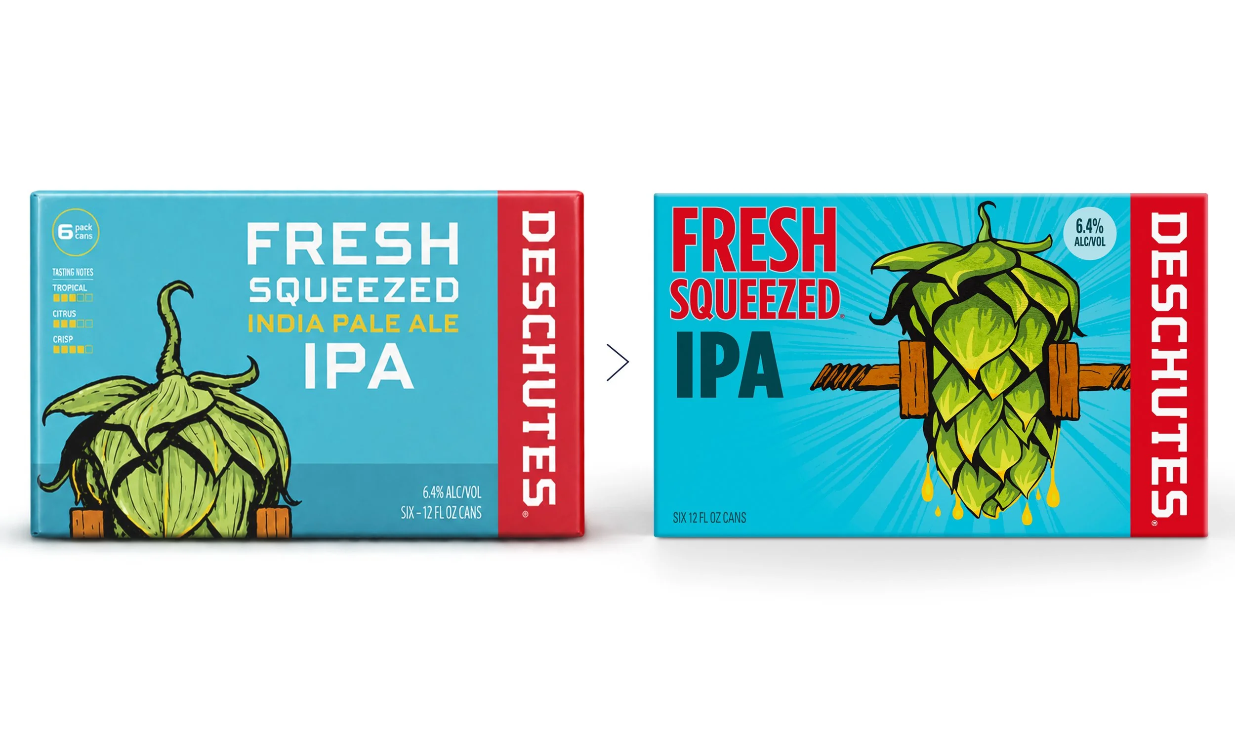
The distinction is visible in the agency’s current Fresh Squeezed comparison, which should be read as a portfolio example rather than a dated photograph of the original rollout. The familiar red brand strip survives; the product name and hop illustration change in emphasis. The package still belongs to the same family. A shopper does not have to learn its identity from scratch.
Perspective attributes this result to its work. Treat it as a portfolio claim, rather than an isolated measurement of design’s effect.
Three questions, no mood board required
Simon Thorneycroft, Perspective’s founder, has long framed packaging around three qualities: visible, visceral and memorable. In a 2017 interview, he argued that attractive graphics alone do not establish a brand. The package must attract attention, produce a feeling and leave something the buyer can recall.
“At the end of the day, it’s about selling products.”Simon Thorneycroft, speaking to FoodNavigator in 2017
His memory test is especially useful because it asks for ordinary language. Can someone describe the package well enough for another person to find it? That moves the discussion away from whether the designer likes the typography and toward whether the buyer can use it. Thorneycroft also warned that black packaging can disappear in actual store conditions, however handsome it looks against a white presentation background.
Visible
Would you spot it among its neighbors?
Visceral
Does it make the product feel desirable?
Memorable
Could you describe it after looking away?
For a brand team, a practical application is to take the proposed pack out of the presentation and put it beside competing products. Then shrink it to an online shopping image. Finally, remove it and ask what people remember. These are editorial suggestions for using his criteria, not a substitute for consumer research. They do, however, give the next design meeting something concrete to argue about.
Broccoli pizza borrows from the tile shop
Spinato’s posed a different problem. The family business was preparing a gluten-free broccoli-crust pizza line in 2019, building on its restaurant background and frozen-food offering. Its existing packaging leaned on an old-fashioned pizzeria appearance. According to the project account, that look was failing to communicate the quality and craftsmanship of the food.
Perspective used classic Italian tiles as the starting point for a packaging system. The connection was culinary and cultural: a new kind of crust could still belong to a family with a long interest in making pizza. A box built entirely around the novelty of broccoli risked letting the ingredient overwhelm the meal.
The useful lesson is to distinguish the reason a product exists from the reason someone wants to eat it. A dietary attribute can help a buyer choose; the visual presentation still needs to make dinner appealing. Spinato’s illustrates how a redesign can change its vocabulary without abandoning the business’s origins. The family’s experience becomes relevant through the design, rather than merely appearing as a date on the box.
Keep the bell. Turn up the cheese.
Mission’s refrigerated organic tortillas show preservation at work. For the 2017 launch, Perspective retained a large, centrally positioned Mission logo while giving the surrounding packaging a more contemporary illustrated treatment. A clear upper portion showed the product. The lower portion carried a farm scene, with green distinguishing corn tortillas and yellow identifying flour.
That is a fairly precise division of labor. The familiar logo supplies continuity. Illustration and color introduce the new line. The window lets the tortilla make its own appearance. For an established company moving into a different part of the store, the design makes room for novelty while keeping a recognizable point of reference.
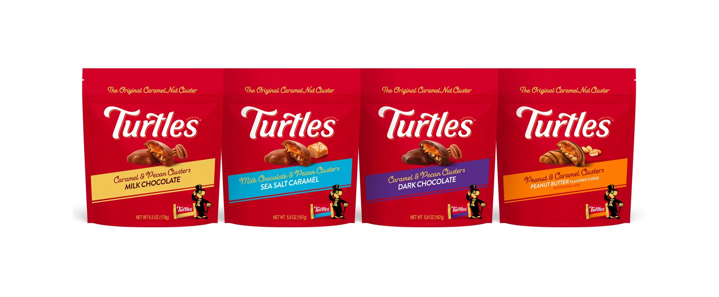
Cheez Doodles required a related balancing act. Wise Foods wanted to refresh a brand with loyal consumers and expand its offering. Perspective made Cheez Doodles more prominent and reduced Wise to an endorsing role. It enlarged “Cheez” relative to “Doodles,” developed the existing yellow circular element, and shifted background colors toward food associations.
The work covered a range reported in December 2016 as 35 existing products, alongside three new additions. That scale changes the assignment. A successful pack has to work next to its siblings, including stronger flavors and promotional variations. A logo treatment that only looks convincing on one carefully composed mockup leaves most of the problem unsolved.
What an ice cream lid can say
For United Dairy Farmers’ Homemade Brand Ice Cream, Perspective drew on family continuity. The identity featured a father and son above the brand name. Flavor names appeared on recipe cards, a marble background suggested a kitchen surface, and gold replaced black on the lids. Large scoops and ingredient photography kept the actual dessert in view.
Each element had a small assignment within the larger story: inheritance, preparation, ingredients, quality. The agency was translating a company history into things a shopper could see. That is where its food specialization becomes tangible. Appetite, family, indulgence and trust have to fit on an object that might be considered for only a moment.
Big-agency experience, a smaller front door
Thorneycroft’s route ran through Landor in London, San Francisco and Madrid. He moved to San Francisco in 1999, went to Spain in 2003 and returned to the Bay Area to establish Perspective in 2005. His background included corporate identity and retail environments before consumer packaging became his main focus.
The firm’s current service list runs from category analysis, naming and brand narrative through identity, packaging, line extensions and production. Buyers are commissioning professional design work. They can bring a portfolio problem, a launch or a smaller assignment, and the resulting work may extend into retail displays and guidelines. It is a service relationship built around a company’s products and decisions.
Its competitive position sits between internal design resources and larger branding agencies. Perspective promises experienced attention, a lighter process and cooperation with a client’s existing teams. Those are the agency’s stated working principles. Its contact page invites prospective clients to begin with a simpler project and develop the brief together, a practical way to make a relationship assessable before enlarging it.
The cost question therefore begins with scope. A flavor extension and a portfolio redesign buy different amounts of work. A useful brief identifies the packs, markets, retail formats, photography and production files required. That is an editorial buying principle suggested by the breadth of Perspective’s services: specify the deliverables before trying to compare the value of proposals.
A bulldog on the business card
For all its emphasis on restraint, the agency has enjoyed a crowded picture when the setting allows it. Thorneycroft commissioned illustrator Steven Noble to create business-card artwork called “Against the Odds.” The scratchboard composition included an English bulldog, Spitfires and rugby players alongside Abraham Lincoln and a bald eagle. It tucked a transatlantic biography into a small surface.
There is also a documented teaching connection. In 2015, Chapman University students developed packaging and retail-display assignments with input from Perspective’s principals, Cal Walters and Thorneycroft. A later studio visit involved a tightly timed cleaning-product brief and direct critiques. These accounts show commercial design being discussed at the level of details and business purpose.
The boundary of Perspective’s current proposition is implicit in its focus on established brands. Preserving recognition makes sense when something recognizable is worth preserving. A new product may need an identity built from the beginning; an unwanted product needs more than a tidier label. Read across the projects, the agency’s useful habit is to ask which part of the buying decision design can actually improve. Start there, and the next pack has a clearer job.