The logo had to stay. For a branding studio, that is a wonderfully inconvenient opening brief. BUILT, the New York accessories brand known for its neoprene wine totes, wanted a stronger presence at Walmart. Shopper preferences were shifting, shelf space was shrinking, and a familiar name needed fresh energy. What Else worked on the surrounding system: a city-inspired grid, new colors, clearer typography, and imagery that looked beyond New York to families elsewhere in America.
The assignment offers a useful introduction to this Brooklyn studio. A recognizable mark can be only one part of a brand’s problem. The package, the page, the words, and the people pictured around it all have jobs to do. In BUILT’s case, keeping something was part of making something new. The practical lesson is to identify the constraint before commissioning the makeover.
A studio for the day after launch
What Else sells branding and graphic design services. Its work travels across consumer goods, software, financial technology, and nonprofit organizations. The recurring question is how an identity will function once the presentation ends and somebody has to use it. That might mean making a product understandable, giving a marketing team repeatable tools, or making a website easier to maintain.
Clients can commission a defined project or bring the studio into a broader creative role. The offering includes implementation and fractional support alongside strategy and design. This places What Else among independent studios competing for work that might otherwise go to an agency, a freelancer, or an internal team. Its portfolio makes the case through connected applications, rather than a claim to own one particular industry.
Ten years of watching teams work
Adam Lehman founded What Else in 2022. In his launch announcement, he described a decade spent observing different ways of organizing creative work, from an enormous company to a three-person agency in a garage. He had seen teams flourish and burn out. The studio grew from that experience, with an ambition to make worthwhile work and leave a better example for the designers who followed.
“Kindness is never negotiable,” Lehman wrote. It is an unusually plain promise in an industry fond of elaborate manifestos. His announcement also linked usefulness to two audiences: the customer encountering the design and the internal team responsible for operating it. That second audience helps explain why guidelines, production, and everyday tools appear so often in What Else’s projects.
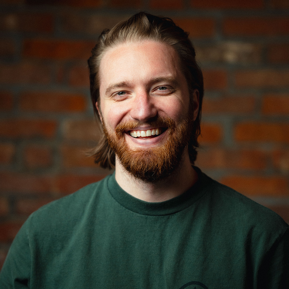
On Never Work a Day, Lehman and strategy partner Jason Bacher discussed assembling teams around individual client problems. The episode’s description presents What Else as fully remote. That makes the workshop idea less about a room full of desks than about who comes together for an assignment. A drinks launch and a software identity need different combinations of experience.
California comes in yellow and blue
Montara puts the studio’s range in one hand. The sparkling verjus drink uses early-harvest Chardonnay grapes; What Else’s assignment extended from visual identity and packaging to launch materials and e-commerce. SomethingElse brought the studio into the project, which it developed with co-founders Katie and Scott Mitic. A beverage concept had to become something people could recognize, understand, and buy.
The can is a small lesson in emphasis. The name runs vertically, with yellow and blue doing much of the visual work. In its September 2025 coverage, DIELINE singled out the coastal palette and starburst symbol. The package announces a mood before a shopper has worked through the unfamiliar word “verjus.” That is a sensible division of labor between image and explanation.
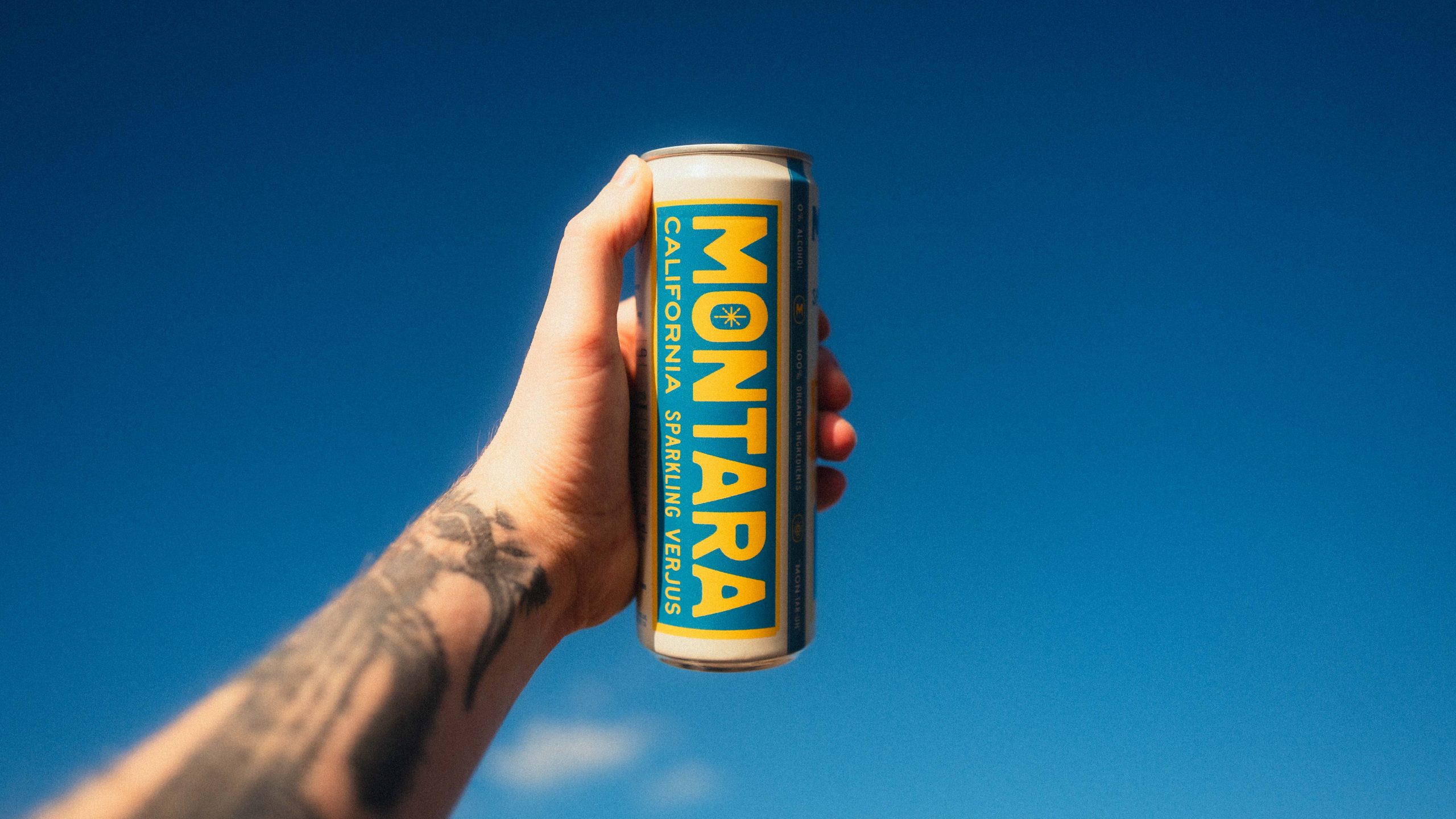
Montara subsequently received a Merit in the low-alcohol and no-alcohol category of the 2026 DIELINE Awards. That is specific recognition for the packaging work. It also gives the studio a public result that a reader can inspect: the can, its treatment, and its place in the awards gallery.
What Else also worked on Kally, the Mitics’ verjus-based wine alternative. That engagement covered positioning and customer experience, with a flexible design system and marketing assets. Together, the projects show the studio working through different commercial expressions of a related ingredient. The useful point for a founder is scope: the identity has to make sense on the package and in the experience through which it is sold.
The glamorous website has an unglamorous job
Photographer Mark Seliger approached What Else in 2024 as his studio repositioned itself as a creative partner offering agency services. A photographer’s website is an obvious place to expect beautiful images. The more revealing detail is behind the screen: What Else connected WordPress to Seliger’s existing digital asset manager.
That integration was intended to make updates easier without increasing the team’s workload. It is a concrete interpretation of useful design. The website needed to express a broader business offer while fitting the machinery already holding the photographs. Replacing the visible experience did not require treating the existing working system as disposable.
For anyone briefing a website project, this is worth copying. Describe where content lives, who updates it, and what makes that task awkward. Those answers belong beside the visual references. A page that impresses a prospective customer still needs someone behind it who can keep the information current.
Trust has to travel from the screen to the booth
Sardine’s problem was different. The fraud and payments company needed to look like a credible choice for customers entrusting it with serious work. What Else’s scope included identity, voice and tone guidelines, web design, booth design, and logo animation. The stated aim was to give prospective customers enough confidence to proceed toward signup.
That makes the physical event space part of the same assignment as the website. A person meeting the company at a booth should encounter a recognizable business when they return to a screen. The studio’s role here is to make the company’s expertise legible across those encounters. Trust remains something the underlying service must earn.
Temelio, a grant management platform, brought another operational concern: an identity that could grow with the company without loading extra tasks onto the team. What Else worked on branding, website design, product guidelines, and messaging. Its layered visual concept gave the system a unifying idea. The practical ambition was consistency that a developing organization could sustain.
A month for an AI brand; a koala for travel tech
For Obvious, described in the case study as previously Flatfile, the brief set a time boundary: core brand foundations in a 30-day sprint. What Else worked with co-founder and chief product officer Jon Bell and his team on strategy, identity, messaging, and art direction. The visual approach drew on collage, natural colors, and a Flower of Life-inspired logo.
Lehman’s account of that project describes presentations becoming collaborative working sessions, with clients involved as ideas developed. This is a helpful distinction for a buyer considering a compressed schedule. A short sprint needs a bounded assignment and people ready to participate. It is a poor basis for expecting unlimited exploration followed by an immediate, effortless rollout.
Cobber shows a lighter route into a technical product. Previously ResPax, the travel booking platform adopted an approachable identity with a koala mascot. The animal references its Australian roots, while the name means friend or mate in Australian slang. What Else’s work translated that friendly positioning into a visual system, guidelines, messaging, and templates. The mascot has an actual brief.
For embedded payroll platform Salsa, the studio connected strategy, messaging, and identity with a redesigned website and marketing toolkit. These projects do not share one aesthetic. They share a need to turn an explanation of the business into things its team can repeatedly put to work.
Brief the work, then count the upkeep
The buying lesson across this portfolio is to be specific about what needs fixing. BUILT’s pressure came from the retail environment. Seliger’s assignment joined repositioning with content operations. Obvious needed foundations within a defined period. Calling all three “a rebrand” would conceal the decisions that made each project different.
A useful brief should name the audience, the business change, the existing assets worth keeping, and the people responsible for the finished work. It should also separate the initial design assignment from development, content production, and continuing support. Those are different demands on a budget and a team, even when they sit inside one relationship.
“kindness is never negotiable”Adam Lehman / launch announcement
The studio’s recent public conversation adds another useful habit. In Preview Media’s account of their interview, Lehman and Bacher describe revisiting goals quarterly and treating the business as an experiment. The same episode explores asking clients what they dislike. That question can expose a boundary faster than a request for an abstract description of the perfect brand.
There are limits to what this kind of work can solve. A clear identity depends on a business that can explain its offer; a reusable system depends on a team willing to use it. For What Else, the interesting claim is practical enough to test. Open the templates. Try the website update. See whether the next piece of work becomes easier to make.