A quail has made it onto a downtown light pole. Beneath the word “Habitat,” bright shapes assemble a pocket-size version of California: bird, flowers, hills. The photograph is from San Luis Obispo’s 2019 banner project. Traffic carries on below. The banner has a few seconds to make its point.
The firm behind the artwork, ( iii ) DESIGN, also worked on packaging, brand identities and websites. Its business was turning an organization’s intentions into something other people could understand. Sometimes that something hung above a sidewalk. Sometimes it explained what a college was building.
This is a retrospective with an unusually definite endpoint. The studio’s own company description dates its run from October 2004 through March 2020. “It was a fun ride!” is how it signs off. To understand the ride, follow the work around town.
Seven ways to picture a place
The downtown banners were commissioned through the city’s Promotional Coordinating Committee. Their subjects included the Ah Louis Store, the Fremont Theatre and the Railroad Square “Iron Road Pioneers” statue. A Pride celebration and a Folklorico dancer appeared alongside the Mission and local wildlife. The selection gave several different versions of belonging a place in the same streetscape.
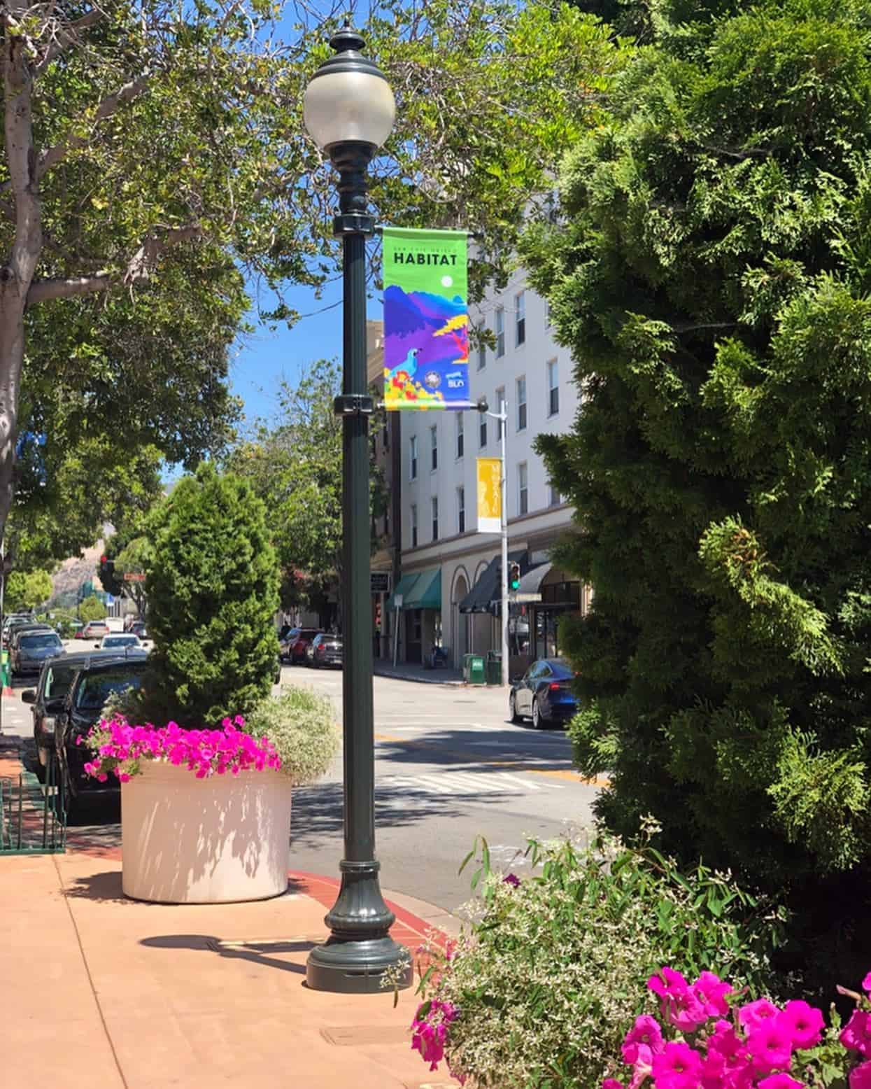
The city also described plans for a style guide that community partners could use for future banners. That detail matters. A visual identity becomes more useful when the next person can extend it. The banner announcement reads as a public beautification story; viewed as a design assignment, it is also a problem of continuity.
A small studio can occupy an interesting position here. It works at the scale of an individual object while dealing with the larger question of who gets represented. You can judge a banner’s colors from across the street. Judging its choice of subjects takes a closer look.
The anniversary gift was time
In 2014, the studio offered a local startup a design grant. The recipient was VegThisWay, maker of the RAWR Bar, a snack for children. The commitment was 50 hours of donated work. A possible identity package included a logo, type choices, colors and a positioning statement, with the actual work depending on the recipient’s needs.
Design time pledged to VegThisWay in 2014. An in-kind contribution, not a published price for a brand identity.
Managing partner and art director Wyatt Renew connected the idea to working with Cal Poly’s Hot House and attending an Economic Forecast Summit. Those experiences had sharpened his interest in how design could help young businesses locally. Eligibility focused on small, recently launched county businesses, or ventures still developing a business plan.
The grant’s structure is the useful part to copy: specify the recipient, cap the commitment and let an actual need determine the deliverable. Fifty hours makes generosity schedulable. It also requires choices. A studio making this kind of offer needs enough capacity to honor it without leaving its paying clients waiting.
The client buys the connection
The studio’s public business profile described a broad service practice: strategy, print, packaging, responsive websites and content. It favored being treated as an extension of the client’s team. That is a particular working relationship, with client input and the designer’s judgment both expected to shape the outcome.
Its business model was commissioned creative work. A customer could bring a communication problem and have related pieces developed by one studio. The alternative might be coordinating separate specialists for a logo, written material and a website. The appeal of a generalist studio is the connection between those pieces; whether it is the right supplier depends on how much of that connection the customer needs.
Cuesta College offers a concrete example. Its Measure L website launched on May 5, 2015. The college’s public update credited iii Design and described a destination for construction alerts, project details, timelines, vendor opportunities and bond news.
This is design with an impatient audience. Someone checking a construction alert needs the relevant information quickly. A potential vendor has a different task. The same website must make room for both. Its purpose gives the creative brief boundaries: organize the information around what people came to do.
A box can lead back to the game
In another 2015 project, Cal Poly professor Brennan Davis approached the studio for design and packaging for Snaption. The party game paired pictures with fill-in-the-blank captions. Players supplied their own words, and the person choosing the picture picked the winning response.
The collaboration reached into the concept itself. As Davis explained in the launch announcement, the team helped refine his original idea alongside the branding work. A designer handling a box has to understand the thing inside it. That investigation can expose decisions that deserve another pass.
“we refined my initial concept together”
Brennan Davis, describing the Snaption collaboration, 2015
The announcement set out a planned Kickstarter launch and a $25 support level that included the game. That figure belongs to the proposed customer offer, not the studio’s invoice. The distinction is worth keeping: product price, production funding and creative labor answer different questions.
For a founder, the lesson is to leave room for useful questions before every product decision hardens. That approach requires a willingness to revise. When a client only wants an already-approved file prepared for production, a broader exploration may add time without helping the assignment.
Reports, snacks and the work between
The client list also reaches into the county’s nonprofit life. The Community Foundation’s 2017 annual report thanks ( iii ) DESIGN for helping make the publication possible. The Women’s Legacy Fund’s 2015 report and 2020 report credit design partly donated by Missy Reitner-Cameron.
These are quieter objects than a street banner. They carry research, institutional activity and community priorities into a form that can be circulated. Their presence in the studio’s record helps explain its market: organizations with something to say, and a need for someone who could give that message a usable shape.
There was a lighter side to its public identity. The studio’s specialties included snow-cone making. Its nonprofit support had included a United Way snow-cone party, complete with a photo booth and costumes. The joke on the services list had a real-world counterpart.
The next thing she wanted to make
Missy Reitner-Cameron founded the studio in 2004 after moving from Los Angeles to San Luis Obispo. In her Bunker biography, she describes a smaller city with room to do her own thing. Years before closing the design business, she had also started The Bunker as affordable space for artists.
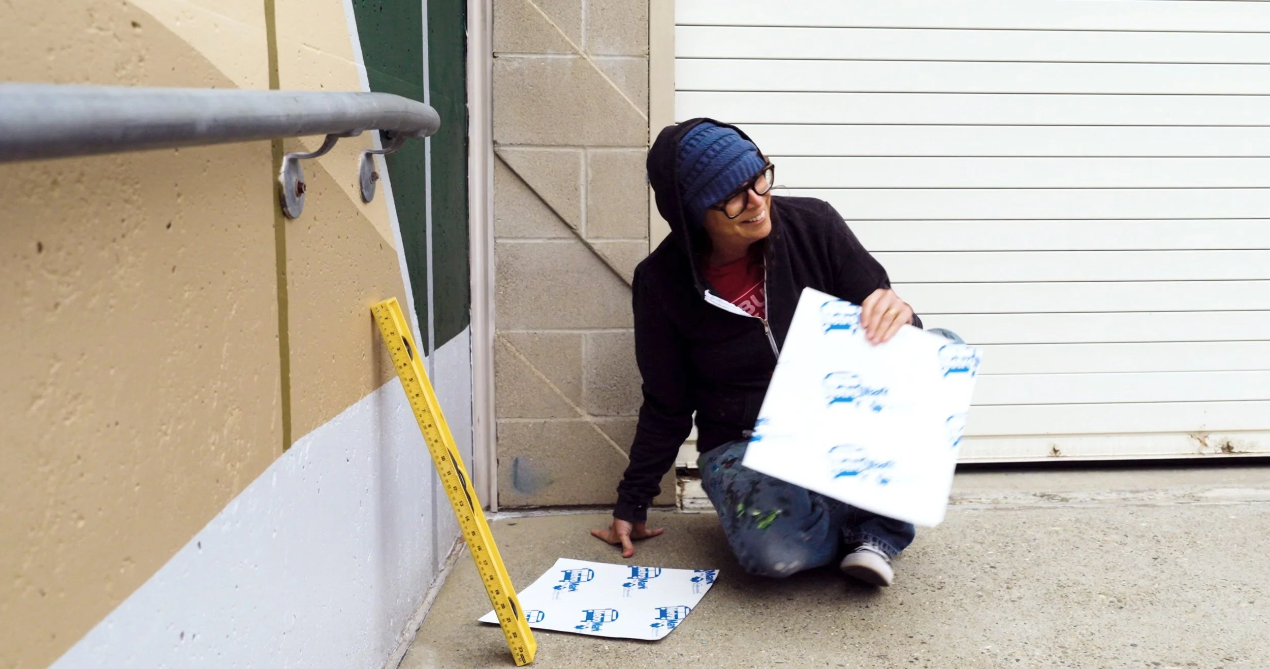
Her account connects the studio’s 2020 closure to deciding she was ready to become a full-time artist. The Bunker became the setting for a further chapter. That explanation gives the end of the company a human scale: the founder wanted to spend her days differently.
The completed projects make a useful record of the business she ran. A young food company needed an identity. A college needed to explain construction. A city needed pictures of itself. Each assignment called for attention to a different audience, material and setting. Put them together and the portfolio begins to resemble the place.