A logo has an unusually comfortable life inside a presentation. It sits in the middle of an empty page. Nobody has squeezed a telephone number underneath it. Nobody has asked it to share space with six product descriptions. Then the presentation ends, and the logo goes to work. It meets the brochure, the website, the package and the advertisement. Suddenly, being handsome is only part of the assignment.
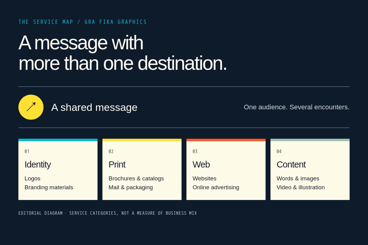
That small journey is a useful way into Gra Fika Graphics. The company’s published offering brings together identity design, marketing materials, websites, images and words. Read it as a collection of things to order and it is a broad design menu. Read it as a sequence of encounters with a customer and it becomes more interesting. The same business has to introduce itself repeatedly, in places with different rules.
Gra Fika describes its specialty as Marketing based visual communication - new media & traditional
. The phrasing puts the commercial purpose close to the craft. There is an audience to reach and a goal to achieve. The design is supposed to help those two things meet.
A logo with somewhere to go
The company lists logos, collateral and branding materials alongside brochures, catalogs, advertising and packaging. Those are concrete outputs. An organization could approach that offering with an identity to establish, a service to explain or a product to present. The useful question is how the pieces relate once they leave the designer’s screen.
Consider a hypothetical business introducing a new service. Its advertisement makes a promise. Its brochure expands on that promise. Its website gives the reader somewhere to act. Each item could be attractive by itself, yet the sequence could still be confusing. Perhaps the advertisement uses one description while the website uses another. Perhaps the brochure’s central benefit disappears from the page where inquiries happen.
This is the opportunity suggested by Gra Fika’s range: treating the connections as part of the design assignment. It is a reading of the service model, rather than a claim about a particular campaign’s results. The company puts enough adjacent disciplines on the menu to make that conversation possible.
The brochure and the browser
The two media families make different demands. A printed brochure has a fixed size and a physical order. A website offers multiple routes through information. A catalog must make a collection legible. Packaging has to carry its message on an object. Keeping a business recognizable across those surfaces involves more than dropping the same logo into a corner.
Gra Fika’s service description extends into photography, video and illustration, then into copywriting, marketing and public relations. That combination is revealing. A photograph can demonstrate something that takes a paragraph to explain. A line of copy can rescue a layout from ambiguity. An illustration can make a complicated idea easier to inspect. The choice of medium is itself a communication decision.
The appeal of this broad offering is therefore partly about coordination. When words and images are considered together, the brief can address both what a reader notices and what the reader understands. Whether a particular studio delivers that well is something to assess through relevant work and discussion. The service list establishes the scope of the proposition.
The brochure and the website should be on speaking terms.
An editorial takeaway
The customer implied by the menu
What kind of buyer does this offering suggest? Someone responsible for getting an organization’s message into the world. That could mean commissioning an identity, preparing promotional materials or connecting a printed piece with a web presence. These are use cases inferred from the services, rather than a roll call of Gra Fika customers.
Its place in the market is the graphic design and marketing communications service business. The buyer commissions creative work. Useful alternatives to compare include an independent designer for a focused assignment, a specialist studio for a particular discipline, or an agency coordinating several channels. Those choices distribute responsibility differently.
Gra Fika’s positioning puts breadth and marketing purpose together. That is the feature to investigate when comparing it with another provider. Ask how a proposed identity will extend into the actual materials the organization needs. Ask who handles the words, the images and the adaptations. A long service menu becomes valuable when the answers form a coherent assignment.
Buy the assignment, then the artwork
The company’s description emphasizes affordability. Treat that as a statement of positioning. For a buyer, the meaningful cost question begins with the work being purchased: the number of applications, the amount of original content, the revision process and the production responsibilities. A logo file and a coordinated set of marketing materials are different purchases.
A useful brief names the audience, the offer and the intended next action. It then lists the places where the design must function. If a brochure needs new photography, say so. If the website needs new copy, put that in the scope. If printed pieces require production coordination, clarify who owns it. This is an editorial buying framework, not a description of Gra Fika’s internal process.
The same discipline helps contain the weakness of a broad offering: an assignment can expand each time someone discovers another item on the menu. The cure is a defined first release. Identify the essential materials, agree on the work and decide what can follow. For unusually specialized software development or a large, continuous production workload, evaluate the relevant technical capability and capacity directly.
For [audience], explain [offer] so they can [next action], across [formats].
Put the pieces next to each other
There is a small exercise worth taking from this company’s service mix. Gather an organization’s advertisement, brochure, website and packaging, where relevant. Look at them in the order a customer might encounter them. Read the headlines aloud. Check whether the offer stays understandable and whether the next step stays visible.
Do the pieces sound like the same organization? Do they repeat useful information or merely repeat decoration? Does the website answer the question the printed piece raises? Those questions turn a discussion about taste into a discussion about the experience being built.
Gra Fika Graphics offers a reason to examine that journey because its published services cover so many of its stops. The transferable idea is straightforward: commission the relationships between the materials as deliberately as the materials themselves. Give the logo somewhere to go, then see how it behaves when it gets there.