A wolf built from black triangles sits above the name WOLF 60. Nearby, a purple drone hovers over IndigoDrone. At the bottom of the same portfolio sheet, a gold monogram gives RBN Properties a rather different entrance. The sheet belongs to the public design portfolio of Sunil Barwal, the designer associated with Barwal Designs. Taken together, its nine marks suggest a practice comfortable changing its visual vocabulary. The wolf gets an angular silhouette. The property name gets tall, formal lettering. Nobody has been made to wear the same suit.
That range is a useful way into Barwal Designs, a business offering websites, logos and graphic design. Its public pitch emphasizes appearance, usability and work adapted to a client’s needs. The interesting part is how those ambitions show up in ordinary commercial objects: the page somebody scrolls, the mark they recognize, the card they take away. These are small encounters with a business. Design determines what each encounter puts first.
A company portrait in nine marks
Look again at the logo sheet. IndigoDrone uses a picture of the thing its name describes. DRONES4U, elsewhere on the sheet, also uses a drone, but exchanges purple for orange and gives the central camera a more prominent role. Similar subject matter produces different treatments. The comparison is especially useful because it makes the designer’s choices visible without requiring an elaborate explanation of either business.

Other marks make language do more of the work. CUSTOM TXT places its final letters inside a red speech bubble. FLO Collection bends its large blue letters into a continuous shape. The sheet moves between illustrations, symbols and lettering, with different levels of formality. Those visible differences support a modest conclusion: this is a portfolio with several styles available, rather than one signature treatment applied across every name.
Barwal’s stated objective on its Clutch profile is to produce “logical and simple but very catchy designs.” The useful tension is between those ambitions. A mark needs enough personality to invite a second look, yet enough order to remain legible. This sheet gives a prospective buyer something concrete to discuss: which treatment suits the business, where the mark will appear, and what should survive when the design gets small.
“Logical and simple but very catchy designs.”Sunil Barwal, describing his design objective
The assignment continues after the logo
The service offering extends into business cards, banners, flyers, posters, advertising and social graphics. That places Barwal Designs in the market for commissioned visual communication. A customer brings a business, a message and a set of places where that message must appear. The designer’s job is to give those pieces a usable form. In that arrangement, the deliverable might be a single graphic or several related items.
The Atlas Stair Parts business-card mockup in Barwal’s portfolio makes the point neatly. One face gives the name and symbol plenty of breathing room against a dark teal field. The other carries a person’s name, role and contact information on white. The two sides divide the work: recognition on one, practical detail on the other. The staged photograph-like presentation lets a buyer see both at once.
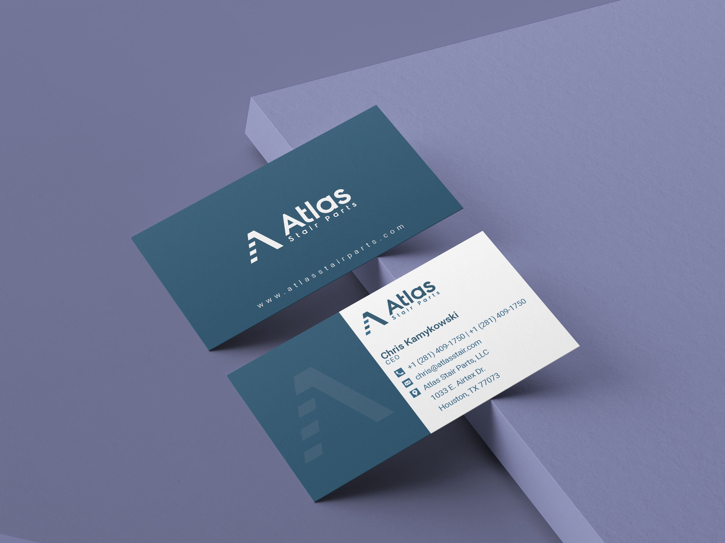
There is a lesson here for anyone commissioning a card or a page. Decide which information must win the first glance. Then decide what the reader needs next. In this example, the business name takes precedence on the dark face; the contact details become the subject on the reverse. That is an editorial reading of the composition, not a claim about how the company conducts its design meetings.
Nor does a name appearing in a portfolio automatically establish a paid client relationship. These images are best read as examples the designer has chosen to present. They let a reader inspect color, spacing and emphasis. A purchasing decision can start there, then move to the precise work needed for a new assignment.
A web page that keeps pointing somewhere
The website example reproduced here presents an Akina Pharmacy promotional page inside a desktop mockup, alongside a long view of the layout. Teal buttons recur down the page. White space separates the opening message from subsequent explanations, product imagery and frequently asked questions. Viewed as a composition, the page has a clear rhythm: introduce the offer, explain it, provide another opportunity to act.
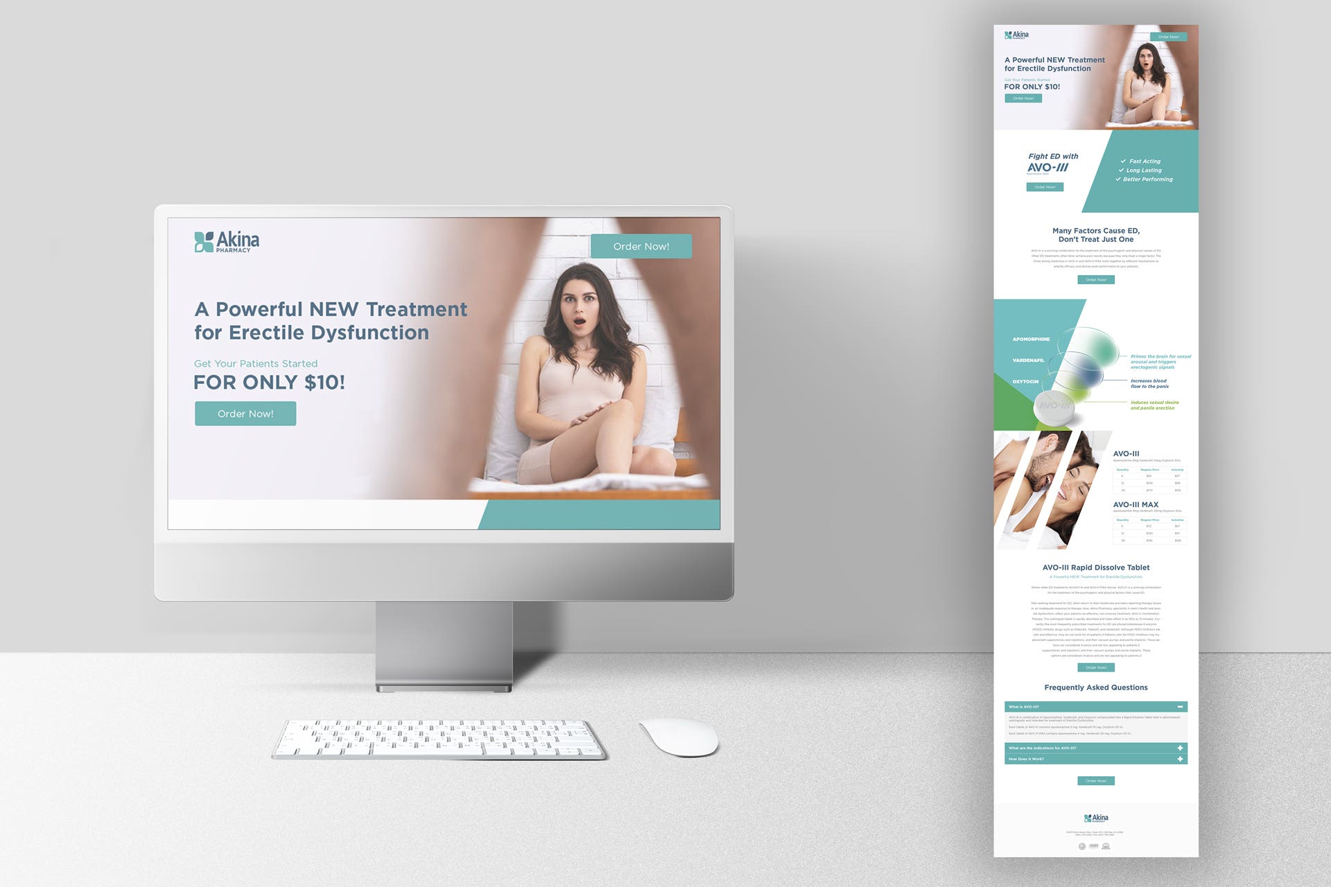
The subject matter is health-related, but the image’s relevance here is its visual organization. Its advertising copy is not evidence of medical efficacy, and this is a design example rather than a treatment recommendation. What the layout makes available for inspection is the relationship between headline, image, explanation and action. A screenshot can show where those elements sit. It cannot demonstrate how many visitors clicked or bought.
For a business weighing website design, that distinction matters. A strong-looking presentation is one part of the brief. The next conversation should cover what a visitor needs to accomplish and which content helps them accomplish it. A service business might prioritize an inquiry; a shop might prioritize a product. Those are hypothetical uses of the offering, not identified Barwal customer projects.
The price needs a brief beside it
Barwal Designs’ Clutch listing advertises a minimum project size of $1,000 and an hourly range of $25 to $49. Sunil Barwal’s separate Freelancer profile displays $20 an hour. These are figures from different listings, not interchangeable quotations. They establish how the services have been presented to prospective buyers; they do not establish what a particular customer ultimately paid.
A listed starting project size. Scope, deliverables and a current quotation determine the actual budget.
The business model is straightforward at that level: design work for clients, with project and hourly pricing signals in public marketplaces. The practical question is what the fee covers. A buyer comparing proposals should be comparing the same assignment: number of pages or assets, number of review rounds, and the files or implementation to be delivered. Without that common brief, a smaller number may simply describe a smaller job.
A useful request could specify a primary logo, a compact version, a business card and a website layout, then ask for separate costs for each. That is a suggested buying method, not a published Barwal package. It makes the conversation concrete. It also gives both parties a way to identify additional work before an apparently minor request changes the assignment.
Where the generalist earns a place
Sunil Barwal lists web and graphic design experience at Barwal Designs beginning in January 2010; his Freelancer account records a March 2012 joining date. His public professional offerings also include WordPress design, presentation design and user experience design. Together with the portfolio, those entries place him across several neighboring design tasks. The appeal is breadth: a buyer can explore related visual needs with the same practice.
That puts the business alongside independent designers and small branding or web studios as a type of provider. A buyer could also choose to assemble materials using templates, or engage separate specialists for identity, print and web. The meaningful comparison is the amount of judgment and coordination the assignment requires. The portfolio’s range is relevant when several different formats need attention.
There are boundaries to that fit. A business requiring complex application engineering, extensive research or a large implementation team should specify those requirements separately. Equally, someone needing one quick adaptation of an existing design may have a much narrower brief. These are conditions for choosing a service, not evidence of a failed Barwal project. The work shown here supports a discussion about visual design; additional requirements deserve their own evidence.
The same exercise can improve a brief before a designer sees it. Put the proposed website, card and social graphic beside one another. Write down the action each should support. A card may need to make a phone number easy to retrieve; a promotional page may need to explain an offer before asking for a response. Consistency does not require identical layouts. It requires decisions that still make sense when the available space changes.
For Barwal Designs, the combination of web and print examples is therefore more informative than the length of the service list. The card shows compression: a few pieces of information fitted into a small object. The web mockup shows sequence: information distributed down a long page. They ask different things of a designer. Looking at both gives a prospective customer a more useful starting point than choosing a favorite logo and assuming the rest of the work will follow automatically.
What a reader can copy immediately is the habit of looking closely. Compare two marks for similar subjects. Inspect both sides of a card. Follow the calls to action down a page. Ask what gets emphasis and what gets left out. Barwal Designs becomes more intelligible through those observations than through a list of adjectives. The portfolio supplies the objects. A careful buyer supplies the questions.