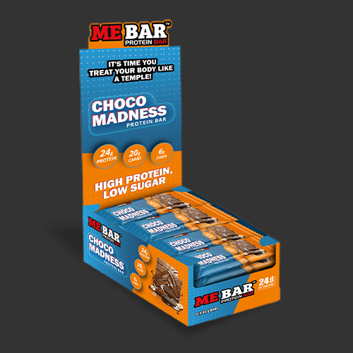
A protein bar has very little time to make an introduction. In a packaging mockup displayed by Digital Visions Tech, blue and orange do the waving. Heavy lettering announces the flavor; small circles parcel out the nutritional claims. The carton becomes a miniature billboard. Elsewhere in the agency’s portfolio, the subjects include celebrity campaigns and fantasy game interfaces. The distance between a snack counter and a battlefield is considerable. The recurring assignment is easier to recognize: make the important thing visible, then give everything around it a coherent identity.
That is the useful way into this company. Digital Visions Tech describes itself as a “Full-Stack Design Partner,” a phrase that becomes more concrete when its work is spread across a table. Logos, advertising graphics, packaging, company presentations and user interfaces all sit within the offer. For a business commissioning them, the attraction is continuity: several things to make, with one team carrying the visual decisions between them.
A protein bar makes the introduction
The ME BAR packaging image is a good place to linger because it shows the difference between an identity and its application. The mark occupies the top of the display. The flavor gets room beneath it. The wrappers repeat the same palette. Even before reading every word, the viewer can see which objects belong together. This is an observation about the artwork, rather than a claim about how many bars it sold.
The company’s wider portfolio moves between social advertisements, presentation decks, book covers and graphics for Amazon listings. These are different reading situations. A shopper scanning a product image, a prospect opening a presentation and a viewer choosing a video do not arrive with the same patience. A useful design partner must make the identity recognizable while allowing each piece to do its particular job.
For a prospective customer, that suggests a better opening brief than “make it pop.” List the places where the design will appear. Decide what a person should notice first in each one. Bring the actual copy, dimensions and product images. A strong-looking sample is helpful; a sample that survives the awkward real headline is more revealing.
Consider the packaging example as a briefing exercise. If the same product needed a narrow web banner, the entire carton image might become too small to read. A designer would have to decide which details deserve to survive: the brand, the flavor, the wrapper, perhaps a single claim. That adaptation is where a shared visual identity earns its keep. Resizing a picture and redesigning its hierarchy are different amounts of work.
The famous face and the working relationship
Digital Visions Tech’s campaign portfolio includes names such as Sylvester Stallone, Ric Flair and Daymond John. Those names naturally attract attention, but the company’s description on Behance adds context: it says it has worked with US companies providing services to celebrity clients. That places at least part of its stated experience inside a chain of creative production, where an agency can make the graphics that accompany somebody else’s campaign.
It is a useful distinction for understanding the business. A campaign image can demonstrate a designer’s handling of photography, type and hierarchy. A famous subject does not, by itself, explain who commissioned the work or how the commercial relationship operated. The relevant question for a buyer is what the team actually made and whether that resembles the assignment at hand.
The everyday side of the offer is equally revealing. Corporate stationery and company profiles sit alongside the celebrity material. These are the documents a business sends when there is no famous face to do the introductory work. The design has to organize the company’s own story: what it does, whom it serves and why the recipient should keep reading.
“Your Full-Stack Design Partner”
Digital Visions Tech’s homepage promise
That range suggests a service for businesses with several connected design needs. A small marketing team could commission a campaign and its supporting materials together. An established business could seek a revised visual identity across existing formats. Those are practical uses of the advertised services, not a claim that every customer buys the same bundle.
When the scenery changes, the controls still have to work
The game work adds a different test. In its War of the Ages interface showcase, Digital Visions Tech describes moving through battlefield displays, maps and exploration screens. Settings range from ancient Egypt to volcanic terrain and futuristic environments. Its stated design concern is maintaining recognizable navigation and visual hierarchy as the scenery changes.
Here, consistency has a job beyond looking coordinated. A player must distinguish the world being depicted from the information needed to move through it. A decorative frame can establish a mood; a poorly placed control can interrupt the action. The agency presents the project as an exercise in making those parts coexist across a connected visual experience.
IDENTITY
Its Telescoop.nl banner work offers a commercial parallel. The company describes space-inspired imagery and a coordinated system for promoting astronomy products. The interesting tension is between spectacle and clarity. A dramatic sky can establish the subject immediately, but the hardware still needs to remain legible. The product is the reason for the advertisement.
Read together, those examples explain more than the phrase full-stack does. The common skill is deciding what stays stable and what changes. Typography, spacing and navigation can provide familiarity. Photography, scenery and product details can vary. For readers commissioning their own work, that is a copyable approach: agree on the repeatable rules before requesting a pile of unrelated pictures.
The quote begins with a budget conversation
Digital Visions Tech sells a service engagement initiated through a quote request. Its inquiry form asks for a budget and offers choices including less than $1,000, $1,000 to $5,000, $5,000 to $10,000, $10,000 to $50,000 and more than $100,000. These are intake categories. They should be read as a way to start a scope discussion, not as fees for particular designs.
The lowest and highest inquiry options. A project still needs its own scope and quote.
The useful buying exercise is to unpack the word “design.” Does the assignment require an identity, a set of campaign variations or an interactive prototype? How many sizes must be delivered? Who supplies photographs and copy? Which files will the client need afterward? Those decisions help make proposals comparable. They also keep a low-looking initial quote from becoming a debate about what was included.
The agency’s published workflow has four stages: kickoff, design, revisions and final delivery. It describes establishing goals and scope first, then developing the work, incorporating client feedback and handing over the final designs. Its contact page says it aims to answer inquiries within 24 hours on business days. That is a response target, separate from the time required to finish a project.
- 01KickoffAgree on the goal and scope.
- 02DesignDevelop the visual direction.
- 03RevisionsReview and refine together.
- 04DeliveryPrepare the final designs.
A client can make that sequence more productive by naming one person to consolidate feedback. Ask reviewers to explain the problem they see: the headline is hard to read, the product disappears, the next action is unclear. That gives a designer something to solve. A collection of conflicting preferences gives everyone another meeting.
A small-agency offer with an international address book
LinkedIn identifies Los Angeles as the company’s headquarters and gives 2022 as its founding year. The website also lists Lahore and London. A public recruitment listing for a full-time, on-site marketing role places work in Lahore and identifies Azhar Saleem as CEO. His associated profile describes a background in graphic design and video editing.
The listing sought skills in social content, advertising and analysis, which fits a business selling visuals intended for active marketing use. The company’s stated mission emphasizes understanding a client’s goals and translating its brand into design. Its public description of collaboration is similarly direct: clients give feedback as the work develops.
In market terms, the offer sits among outsourced creative services. A buyer can assemble freelancers, employ an internal designer or commission a specialist studio. Digital Visions Tech’s pitch concentrates several visual disciplines in one engagement. The potential convenience is fewer handoffs between branding, promotional assets and interface work. Whether that convenience matters depends on how connected those needs actually are.
The best way to assess that breadth is with a representative assignment. A buyer could ask to review one core design alongside its most demanding variation before approving a larger set. For a campaign, that might mean the smallest placement; for an interface, a screen carrying unusually dense information. This is an editorial recommendation drawn from the portfolio’s range. It tests whether the visual idea can handle the work it will actually be asked to do.
Give the design a job before giving it a deadline
A broad design service is most useful when the problem is sufficiently defined to design against. If the real obstacle is an unclear offer, buying more banners will leave the offer unclear. If the assignment needs functioning software, interface artwork must be paired with implementation. If the goal is sales, the creative also needs an audience and a way to evaluate the response.
Digital Visions Tech’s portfolio supplies a practical starting point for that conversation. Choose the example closest to the work you need, then discuss its decisions. What gets the largest type? What repeats across the set? What must the viewer understand without stopping? On a protein-bar carton or a fantasy battlefield, those questions give attractive work a purpose.
Explore the work
Company website ↗ Design portfolio ↗ Behance ↗ LinkedIn ↗ Instagram ↗ Facebook ↗