A food truck has a surprisingly ruthless way of judging graphic design: it opens for business. Windows lift. Doors swing. Carefully arranged words can disappear. In Honey’s work for Sacramento’s Central Kitchen, the logo, message, and contact details were designed to stay visible through that daily transformation. Before anyone admires the artwork, someone has to find lunch.
That attention to use is a good introduction to the Sacramento creative studio. Honey works across brand strategy, packaging, websites, and marketing, with a concentration in food, beverage, and agriculture. Its clients need people to buy a bottle, recognize a family business, trust a public service, or try something they have been overlooking. The design has a job after the presentation ends.
The portfolio moves comfortably between a tortilla producer and a passenger railway. What holds it together is an interest in how people choose: what catches their attention, what reassures them, and what makes the next step feel worthwhile. A good-looking label is welcome. A reason to pick up the jar is the larger assignment.
A grocer’s daughter reads the shelf
Founder and CEO Meghan Phillips grew up in Sonoma, with vineyards nearby and a father who worked for Safeway. She studied marketing at Sonoma State, worked in wine, and moved into coffee. In a 2023 interview, she described that early experience as an education in how people buy and what brings them together around a table.
While working in coffee, Phillips saw room for a food-and-beverage agency that combined marketing and design. She founded Honey in 2008. The progression helps explain the studio’s particular expertise: the farm, the producer, the store, and the customer belong in the same conversation. The person growing something and the person choosing it may care about different details.
Phillips started the business while pregnant with her first child. She later explained that its name came from her fascination with bees working together and returning to the hive. The metaphor is sweet enough; the career history gives it substance. Honey’s founder had already spent years around businesses whose products depend on many people doing their part.
“Optimism is a strategy”
Meghan Phillips · Founder and CEO
The family story goes on the jar
Mi Rancho gave Honey a substantial story to work with: a Northern California food business that began as a Mexican grocery store in 1939. As the company developed its consumer business, Honey worked on positioning, packaging, photography, content, and its website. The assignment reached from a new product’s name to the way a shopper added it to a cart.
For the Simply Nourished tortilla line, decorative illustrations drew on talavera pottery. For organic salsas, the packaging gave space to the family history behind the recipes. Those are specific choices about what a customer should notice and remember. Heritage becomes visible in the object being sold.
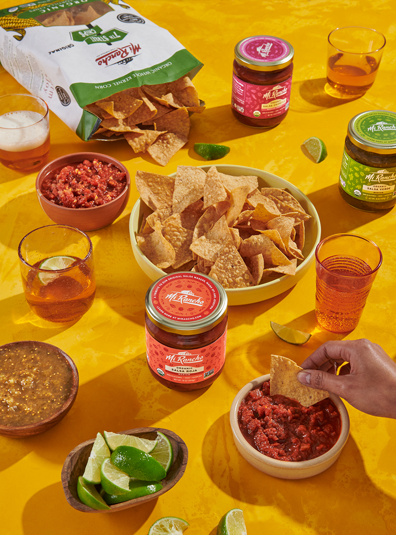
Honey reports that Mi Rancho’s ecommerce sales increased 64 percent in 2021 compared with 2020. That is a company-reported outcome across a period of change, rather than an isolated test of a label. The useful lesson is the connected scope: the same business story had to make sense on a package, in a photograph, and at checkout.
A wine label with room for the guests
Honey’s Sean Minor Wines work takes a different route to the table. The studio saw an opportunity to reposition small-production wines around the owners’ enthusiasm for sharing them. The resulting Invited Series translated hospitality into illustrations of convivial scenes, with glasses, bottles, and snacks suggesting an evening already underway.
The initial two wines, a Grenache and a Pinot Noir, totaled fewer than 650 cases. Italian poster-inspired typography, gold foil, and embossed details gave the labels their character. Wine-club members received the first opportunity to buy, followed by wholesale and direct-to-consumer release. The packaging and the order of the launch spoke to the same audience: people who wanted to feel included.
At LangeTwins, another winery client, the key decision concerned hierarchy. Honey’s discovery included walking the family’s property and learning about its farming and habitat restoration. The website then shifted from presenting the family’s brands with equal emphasis to leading with LangeTwins. Product filtering helped visitors move from the broader story to a particular wine.
That is a useful distinction for a business with several product lines. More information does not automatically produce a clearer choice. Sometimes the important design decision is which name gets introduced first, with the others following in a sequence a customer can understand.
Lunch deserves a public face
Central Kitchen brings the food expertise into public service. Honey’s relationship with the school nutrition operation began in 2018 and extended to a mobile food truck developed to improve access and encourage student participation. The truck needed to look welcoming at a school and credible at a community food festival.
Honey designed the wrap and supporting materials, including menu displays, signage, food wrappers, and staff gear. The work treated the operation as a restaurant experience. Photographing actual students being served food also made the service visible as something people could recognize in their own day.
The open-window detail matters because it makes the brief concrete. A school-food brand has to survive movement, distance, and a busy serving line. The transferable idea is to examine a design where people will encounter it. Put the package on a shelf. Open the truck. Read the menu from the queue.
What happens between the stops?
Capitol Corridor presented a different problem. In Honey’s account, post-pandemic ridership remained at 65 percent of its earlier level as travel habits changed. Knowing the train existed was insufficient. The campaign had to make the journey feel relevant again.
“Only By Train” focused on experiences during the ride, with fictional characters inspired by passengers. Honey worked with KJ2 Productions on the films and 3fold Communications on paid media. The studio reports 4.3 million people reached in the first two months, alongside a 9.9 percent November ridership increase. These are campaign case-study figures; the collaboration deserves the credit.
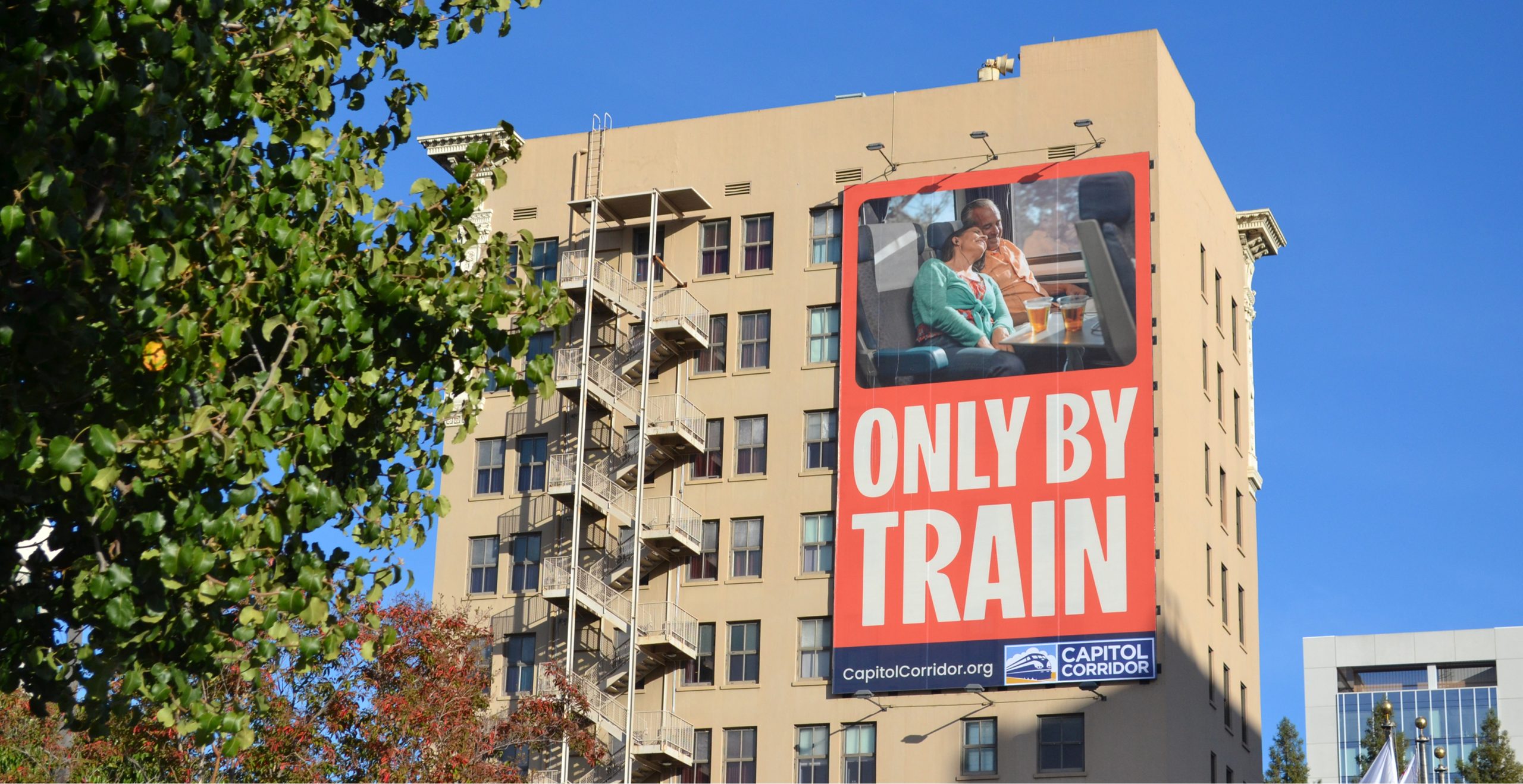
People reached during the first two months.
The strategic lesson is a change in the question being asked. What can someone do with the time they would otherwise spend driving? That gives the creative team something human to show, while schedules and ticketing still have to support the promise.
A newsroom needs an introduction, too
For Abridged by PBS KVIE, Honey’s work began with months of audience research. Surveys and focus groups explored what Greater Sacramento residents wanted from local news. Third Plateau developed a community advisory panel. Honey helped translate the findings into the name, identity, and launch materials.
The campaign, developed with 3fold Communications, reached 1.4 million people in its first flight, according to Honey. The studio reports that nearly 2,400 post-launch newsletter subscriptions brought the total above 6,000. It also attributes 93 percent of new users to paid channels. Those figures make distribution a visible part of the story: an identity needed a route to its audience.
Here, the food specialist’s broader market position comes into focus. Honey also serves institutions and community organizations that need an intelligible public presence. Familiarity with a place can travel across industries, provided the team does the work of learning what each audience needs.
The work before the artwork
Honey calls its process the Hex Method. Its three published stages cover discovery and research, strategy and ideation, then execution and assessment. Workshops and audience research precede the creative work; planning the introduction and reviewing results follow it.
& research
& ideation
& assessment
The commercial offering is a service relationship: organizations hire the studio for work on their brands and campaigns. Its portfolio includes individual launches and continuing engagements. For a buyer, that creates a practical scoping exercise. Naming, packaging, a website, photography, production, and media placement are different pieces of work, even when one strategy connects them.
A useful project brief should say what needs to change, who needs to act, and which deliverables will help them do it. It should also separate the cost of making the creative work from the cost of producing and distributing it. That is a purchasing lesson drawn from the range of collaborators visible in Honey’s projects, rather than a claim about its contract terms.
The approach asks for participation. A company unwilling to share its history, introduce its customers, or settle its product priorities will have less to build on. A polished campaign also depends on the underlying service: the train journey, checkout, or meal must meet the expectation the design creates.
A room for the people doing the work
Honey’s internal arrangements make its collaborative language more tangible. A July 2026 report described a former print shop with shared desks, a photography studio, and a private lactation room. Most staff worked together in the office three days a week and remotely on Wednesdays and Fridays.

The space also accommodates client gatherings and local vendors. President Maggie Giordanengo described an in-person culture the team enjoys. Those details suggest how the studio keeps its interest in food and community close to everyday work, with clients and colleagues occasionally sharing more than a screen.
Across the portfolio, Honey’s most instructive decisions are often modest enough to copy: give the recipe’s history room on the jar, choose which brand leads the website, keep the message visible when the truck opens. They turn an abstract request to improve a brand into something a person can see, understand, and use.
Meet the work
Visit Honey ↗ · Explore the portfolio ↗ · Studio notes ↗
LinkedIn · Instagram · Facebook
Watch: Harvest at LangeTwins ↗
Watch: Behind the teamNAMI campaign ↗