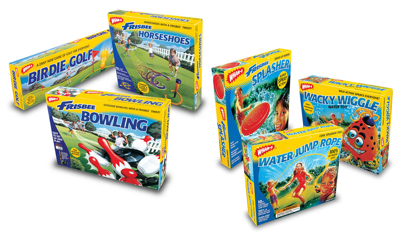
A toy box has very little time to explain itself. On Group 22’s Wham-O packaging, yellow borders frame splashing children, flying discs and games spread across a lawn. The names do their shouting in blue. A bowling set and a jump rope belong to the same family without pretending to be the same thing. It is cheerful, busy, practical work - the sort of design that has to earn its space on a shelf.
Follow that work back to its maker and the assignments become unexpectedly varied. Group 22’s portfolio moves from outdoor toys to Honda sales training, then to theater artwork and a Jaguar coffee table book. The connection is a working problem: a company needs its message to make sense in the particular place somebody encounters it. A box, a browser and a brochure each impose their own rules.
Founded in 1996, the El Segundo, California, company describes a practice spanning print and interactive media. Its stated philosophy is unusually plain: “design should first and foremost communicate and it should never get in the way of the message.” That sounds obvious until a striking concept has to become an editable website, a production file or a screen someone uses to learn their job.
The box is part of the argument
The Wham-O examples make a useful starting point because the design decisions are visible. A long Birdie Golf box, a taller Frisbee Horseshoes package and smaller water-toy cartons share a conspicuous yellow frame. Product photographs and pictures of play occupy much of the remaining space. The eye can find a family resemblance before it reads the details.
That is a specific kind of branding discipline. The package must identify the maker, distinguish the product and suggest what the buyer will do with it. Its proportions change from one item to another. So does the amount of explanation required. The visual system has to stretch without losing the cues that hold the range together.
Nearby in the portfolio, Mattel work includes TechTrax and Juice Box identity and packaging examples. Arbor brings an entirely different surface: the snowboard deck. Looking across those projects suggests a practical strength in adapting graphics to objects with fixed dimensions and real production demands. A snowboard, after all, is an awkwardly narrow place to put an idea.
For a client, this kind of work addresses the distance between approving an identity and applying it. The package is where the concept meets a shape, a collection of required information and competing demands for attention. Group 22’s range is interesting because it includes those constraints, not merely the cleanest view of a logo.
Honda puts the designer in the training room
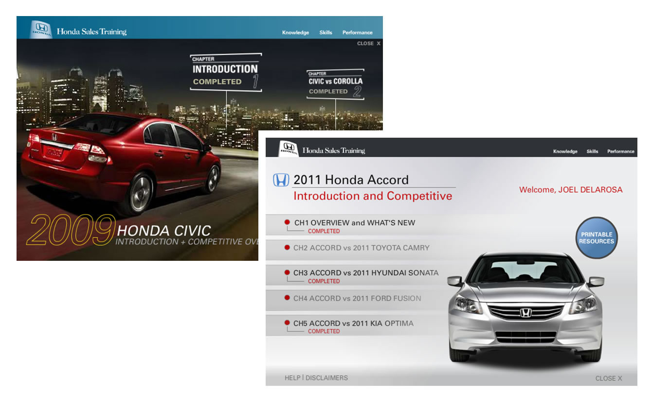
The Honda portfolio shifts the audience from the shopper to the person preparing for a sales conversation. Historical screen images show training for the 2009 Civic and 2011 Accord. The Accord interface organizes chapters around an overview and comparisons with other vehicles. Completion markers sit beside the chapter titles; printable resources get their own button.
Those small details change the assignment. A training screen must tell someone where to begin, what they have finished and where to go next. The vehicle photography establishes the subject, but the navigation carries much of the useful work. An attractive car image cannot explain a learner’s progress by itself.
The other Honda examples include a facts guide, advertising and point-of-purchase materials. Seen together, they show several places a vehicle message may need to travel. The instructional screen gives information a sequence. The guide gives it a printed form. The display puts it in a selling environment.
The lesson a commissioning team can borrow is to write down the audience’s task before discussing the visual treatment. Learning a product comparison, spotting a promotion and finding a reference fact are different activities. A useful brief should say which one the design must support, and identify the person who will judge whether it does.
An editorial reading of the work, not a performance ranking.
Four plays should not look like one play
Consistency can become a bad habit if it erases the thing being sold. Group 22’s Geffen Playhouse artwork offers a useful counterexample. One portfolio sheet places four very different images together. The Country House appears with books and a small house enclosed in glass. Slowgirl becomes a green landscape that also reads as a face.
Wait Until Dark uses a stark black-and-white composition and an eye peering through a narrow opening. The Birthday Party takes a looser, drawn approach. Even at a glance, these are different invitations. The designer’s task is to create enough atmosphere to make a stranger curious before that stranger knows the story.
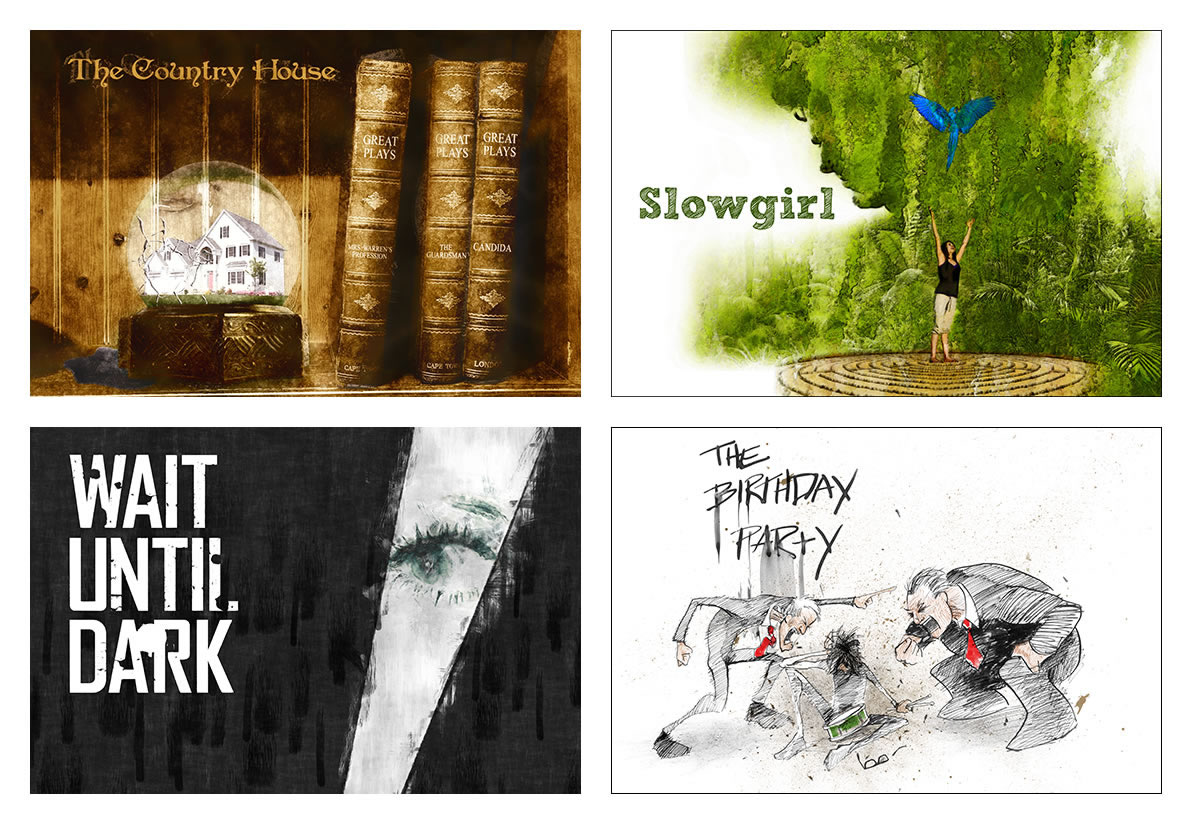
This work complicates the easy description of an agency as having a recognizable house style. The theatrical images call for range. The toy packaging calls for resemblance. Both require judgment about what should repeat and what should change. That distinction matters to any organization with several products, events or audiences under one name.
It also explains why the portfolio is more revealing than a list of services. “Graphic design” can mean maintaining a family of packages or inventing an image for a particular play. Those are related skills, but a buyer should still ask to see work that resembles the problem at hand.
The website has work to do, too
Group 22’s digital examples extend into institutional and business communication. Its UCLA project is a CMS-based website for the Department of Molecular and Medical Pharmacology. The portfolio also includes credit-union websites and an interactive annual report for Edwards Life Sciences. These assignments place design around information people may need to revisit.
The practical attraction of a content management system is the ability to maintain material through an organized publishing interface. In a project brief, that brings the editor into the conversation alongside the visitor. Who supplies the text? Who approves a change? How will a new page fit? Those questions belong near the beginning of the work.
Kyriba’s portfolio entry adds another variation, with examples covering a website, a trade-show presentation, internal posters and an infographic. The interesting question is how the same organization presents itself across settings with very different amounts of reading time. A passing visitor and someone studying a screen need different levels of detail.
A buyer considering this kind of studio is therefore buying a combination of design and implementation services. The business relationship centers on assignments and delivery: defining material, creating it and putting it into usable forms. Group 22’s published examples suggest room for both bounded projects and continuing support, depending on the client’s needs.
The handoff belongs in the brief
Stephen Ludwig is identified publicly as Group 22’s president, and the company presents Stephen as its owner and creative director. Its account of staffing emphasizes matching expertise to project scope and existing technology. That is a useful organizing principle for a practice whose portfolio moves between physical production and interactive work.

There is a human reason to care about that arrangement. A beautiful layout still needs someone to prepare it correctly. A functioning website still needs someone to check the content. These responsibilities become easier to discuss when the brief names the final formats, the review stages and the people accepting delivery.
“design should first and foremost communicate”
Group 22’s published design philosophy
For a marketing team, the relevant alternatives include a specialist packaging studio, a web agency, an independent designer or its own employees. The case for a practice spanning several media is strongest when the assignment genuinely spans them. A single, narrowly defined task may need only a specialist; a larger rollout needs someone to account for the connections.
That choice also shapes a sensible cost discussion. A buyer can make proposals easier to compare by specifying the number of layouts, package variants, page types and review rounds, then separating creative work from printing, media placement and continuing maintenance. This is purchasing advice drawn from the range of deliverables, not a claim about Group 22’s contract terms.
The same discipline helps prevent a broad brief from turning vague. Name what the audience should understand or do. Identify the formats in which the message must appear. Decide which parts should stay consistent, and which must change to suit the task. Then review an actual package, screen or page, rather than approving the idea only in a presentation.
Back at the Wham-O boxes, the point is refreshingly tangible. The customer can see the game, read its name and imagine the lawn. Across Group 22’s portfolio, the medium keeps changing. The useful question stays close to the object: can somebody pick this up, look at it or click through it and understand what comes next?
Take a closer look
Explore the studio’s website, its LinkedIn profile, and the project galleries for Wham-O, Honda, Geffen Playhouse and Kyriba.