The moth was getting in the way. Expression Systems, a biotechnology company in Davis, wanted a visual identity that could hold its own among much larger businesses. Its existing logo had a moth, plenty of detail and lettering that became difficult to read. Shrink it, and the problems grew. Wallrich Creative Communications kept the wing motif, simplified the treatment and changed the typography. The familiar part survived. The thing that made it difficult to use did not.
That is a revealing place to begin with this Sacramento agency. Branding discussions can float toward personality, ambition and other things that resist a ruler. Here was a problem you could reproduce on a small piece of paper. Wallrich’s account of the redesign makes a useful argument: before deciding what a company should look like, find out where its current identity stops doing its job.
01 / THE BRIEFMake the complicated thing legible
Wallrich sells the work that connects an organization’s intentions to someone else’s understanding: strategy, words, visual identities, advertising and websites. Its clients include hospitals, utilities, manufacturers, associations and professional firms. These are businesses with something to explain. Their audiences might be choosing a service, finding information or simply trying to get through the day.
Consider California Disability Services Association. Wallrich adapted existing material into a responsive website with clearer navigation and a visual emphasis on the people its members serve. Color choices were considered against accessibility guidelines during the branding process. That sequence matters. A palette selected only for a printed presentation can become somebody else’s problem when it reaches a screen.
The agency’s portfolio also includes print advertising for tomato ingredient processor Morning Star, built around its international expertise. That brief addresses business customers. It belongs in a different conversation from a grocery advertisement. Across these assignments, the useful skill is translation: understanding enough about a client’s world to decide what the audience needs to notice.
“starting with the greatest need first”
Wallrich’s description of how it scopes work
Its business is an agency service, with work scoped to a client’s needs and budget. A buyer can bring a defined assignment or a marketing problem that still needs diagnosing. The agency’s breadth makes particular sense when a new identity must carry into copy, advertising and a working website. Someone has to keep those decisions connected.
02 / THE SETTINGYour audience is waiting for security
An airport is a peculiar advertising environment. People have time to look, but plenty of other things to think about. Dignity Health’s campaign in the Sacramento airport security line used colorful illustrations and suggestions for small acts of kindness. The messages encouraged travelers to greet a worker warmly or get in touch with someone they loved.
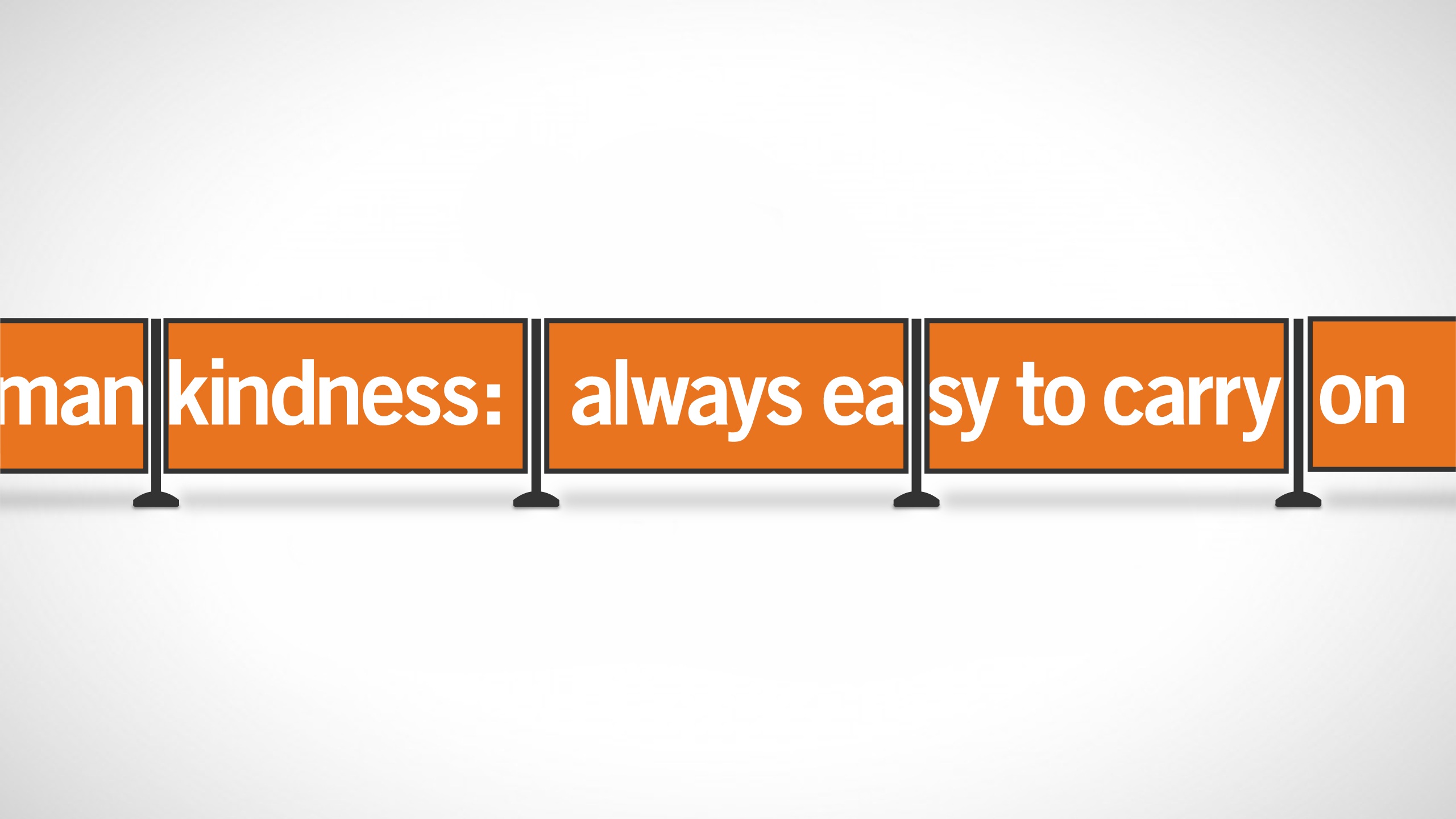
The interesting choice is the scale of the request. A friendly greeting is something a traveler can do right there. The placement supplies the situation; the writing supplies a manageable action. That is a more useful way to think about media than treating every available surface as a rectangle waiting for a slogan.
For law firm Churchwell White, Wallrich used a different approach: powerful pictures, three-word headlines, no body copy and a custom URL. The campaign appeared in Sactown magazine and at Sacramento International Airport. Wallrich reports that the client continued receiving comments about the placements a year later. That is evidence of reported attention, rather than a measure of new legal business.
Give the picture room to make its point.
Both airport projects begin with a practical limit: the audience is occupied. The appropriate response changes with the client. A hospital’s kindness message and a law firm’s dramatic image do different jobs. Copying either execution without that context would miss the decision that made it interesting.
03 / THE INTERACTIONWhen the explanation becomes a game
SMUD wanted customers to understand the relative cost of running household appliances, including during summer peaks. Wallrich developed Attack of the Phantom Appliances, a tower-defense game interrupted by knowledge quizzes. The title sounds like something discovered on late-night television. The brief concerns electricity use.

A game gives an explanation a structure: something happens, the player responds, another question arrives. For a utility trying to teach an unfamiliar distinction, that structure can be worth considering. It also sets a higher bar than making a poster. The interaction needs to remain understandable and worth the effort. The medium has to earn the extra work it asks of the audience.
Another historical application, CondomFinder, connected a public-health distribution effort with people looking for free condoms. Wallrich’s case study reports three million distributed through more than 160 locations within 15 months. Those figures describe the program’s reported activity. They should not be confused with a measured health outcome or treated as something attributable to design alone.
The useful distinction is between a message and access. Telling people that a service exists is one assignment. Helping them locate it is another. The latter depends on participating locations, accurate information and the service being available when somebody arrives. A well-designed interface is part of that chain.
04 / THE REPEAT VISITPut the reminder where the decision happens
For NorCal Pipeline Services, the medium became decidedly physical. An internal vehicle-safety campaign used illustrated office posters and dashboard stickers. Wallrich’s line linked driving with the company’s safety priorities. A dashboard is hardly glamorous inventory, but it puts the reminder near the behavior it concerns.
The Professional BusinessWomen of California assignment dealt with a different kind of repetition. Wallrich created a conference lockup using the organization’s existing logo, intended to return year after year. The annual theme could change while the event retained a recognizable identity. Consistency here is a way to make previous exposure useful.
These are modest ideas with practical consequences. Build around the actual point of use. Preserve the part people recognize. Decide what needs to change each time and what should remain stable. A team can apply those questions before commissioning a single piece of artwork.
- Where does it fail?Try the identity at its smallest real size.
- Where will it live?Consider the screen, queue or dashboard.
- What happens next?Give attention somewhere useful to go.
05 / THE COMPANYLearning to run the thing you make
Lila Wallrich co-founded the agency in 1990. In her anniversary account, the founders borrowed against their homes and gave themselves six months to make the business work. Early prospecting involved library reference books and telephone calls. One small assignment eventually became the agency’s largest client.

The account includes harder adjustments. Projects stopped after September 11, leading to a layoff. During the 2008 downturn, the firm strengthened sales tracking and cut pay, beginning at the top, to retain staff. The changing approach reflects a basic service-business exposure: demand can disappear faster than payroll obligations.
A later chapter is now public. Wallrich announced in 2026 that Jennifer, who joined in 2000, was taking over as CEO after ten years of succession planning. The announcement puts continuity at the center of the handoff. For a company hired to understand other organizations, keeping that accumulated understanding inside the business has an obvious value.
Wallrich’s place in the market is the small, broad-service agency a client can bring several connected problems to. The portfolio’s appeal lies in its decisions: simplify the moth, account for the screen, use the queue, put the reminder on the dashboard. For anyone commissioning creative work, those examples suggest a productive opening brief. Show the agency the place where understanding gets difficult.
Follow the work
Wallrich’s portfolio ↗ · Agency journal ↗