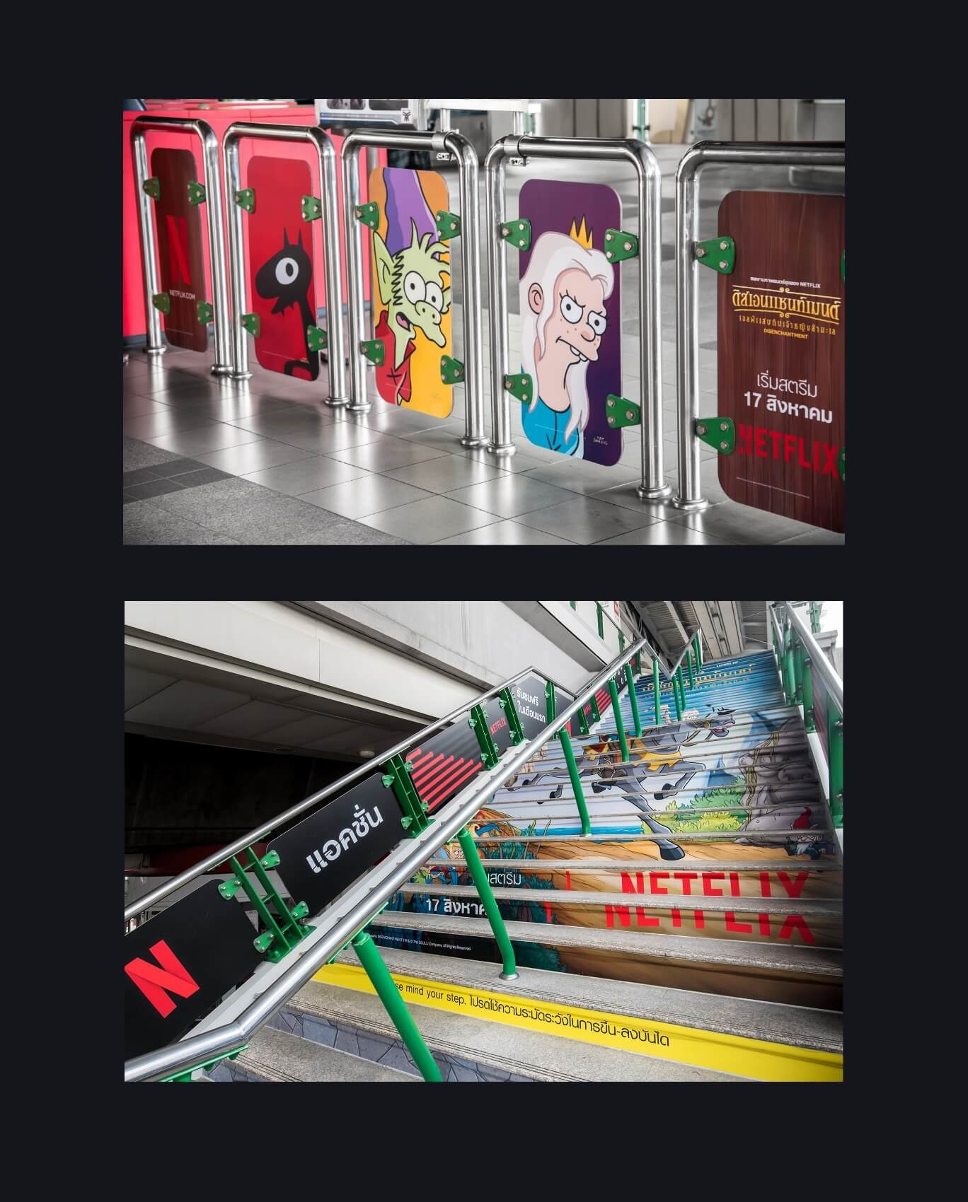
A Bangkok commuter approaching the subway found a little more fantasy than usual on the way to the train. Characters from Netflix’s Disenchantment occupied the gates; artwork climbed the stairs. Citizen Best, the brand marketing agency behind the station takeover, had taken a television world and fitted it to the decidedly unglamorous business of getting somewhere.
That is a useful introduction to this company. Its work lives where a brand meets a constraint: another alphabet, an old publicity still, a refrigerator shelf, a donation form. The creative idea has to remain recognizable after the dimensions, audience and purpose change. Citizen Best’s portfolio makes that often overlooked part of branding unusually visible.
The alphabet is part of the artwork
For Netflix, the agency says its Bangkok team has transcreated Thai lettering for more than 2,000 titles, drawing type to echo the character of the original key art. Transcreation here includes a visual problem. The letters carry some of a show’s atmosphere before a viewer has read a synopsis or pressed play.
The agency dates its conceptual cover-art work for original U.S. Netflix titles to 2017. Alongside that concept work, its streaming services include retouching, title treatments, digital banners and advertising for physical spaces. The subway project shows how far apart those destinations can be. A design that works on a screen must also make sense while someone walks past it.
Max brought a related production problem. Its older titles needed artwork refreshed for the platform’s visual style while staying recognizable. Citizen Best describes manipulating key art and stills, retouching images and assembling franchise artwork, with 1,000 assets delivered on a tight schedule. Its case study describes continued work across hundreds of titles.
The revealing detail is the range of pieces: backgrounds, episodic stills, tiles and series imagery. The glamorous poster is only one member of a large family. For an entertainment marketing team, the agency’s value lies partly in managing that family resemblance through repetitive, exacting production work.
Agency-reported production counts. Different engagements, different units.
Two founders, four cities
Founded in 2015, Citizen Best is led by co-founders Kris Flint, its account director, and Cherry Lao, its creative director. Flint’s biography combines experience running businesses with coding, operations and marketing. Lao describes her move from Bangkok to California as an influence on how she reads images, symbols and cultural differences.
That pairing helps explain the portfolio’s combination of practical systems and visual interpretation. Lao’s account of creative leadership emphasizes explaining design choices and strengthening the team. Flint’s includes the operational work of helping clients turn a business problem into a marketing assignment. Outside work, their biographies offer a pleasing split: dance for Lao, Taekwondo and cycling for Flint.


The agency identifies as minority- and women-owned, with team members in San Francisco, Los Angeles, Austin and Bangkok. Its stated working culture favors open input over rigid roles. More consequential for a buyer is its promise to learn the client’s tools and processes. A marketing department hiring extra capacity has little appetite for running a second department just to manage it.
When the website falls behind the business
Lexar’s assignment makes the commercial problem concrete. The memory-storage brand needed a website that still welcomed consumers while giving its enterprise offering more prominence. The scope included multiple product pages and nine solution categories. Adding more pages alone would not resolve the question of whom the site was addressing.
Citizen Best used strategy sessions, competitive benchmarks and brand pillars to guide the interface. A consumer/business toggle gave the two audiences distinct routes within the same brand. The design also allowed for future sub-brands. It is an instructive choice: a business changing direction may need a clearer entrance before it needs an entirely different identity.
Luminate+ required a fuller launch package. For the legal-content streaming service, Citizen Best worked through strategy and naming, a prelaunch page, the website, app conversion and signup emails. Promotional material addressed both individual lawyers pursuing continuing legal education and firms buying subscriptions as client gifts. One product needed two purchasing arguments.
These projects place Citizen Best between a strategy consultancy and a production studio. Its services extend from defining audiences and positioning to writing interface copy and delivering campaign assets. The alternative depends on the assignment: an in-house team, an independent designer, another branding studio or a specialist entertainment vendor. Its strongest claim to consideration is the connection between those tasks.
Five pages, a hundred invitations
For a nonprofit, the first thing to fail can be the everyday website. Save The Bay’s old site was inefficient and difficult to maintain, according to Citizen Best’s account. The agency developed strategy and identity before rebuilding it, using photography, illustration and a clearer order of messages to cover policy work, community activity and staff expertise.
It also integrated a simpler donation process. That belongs in the branding story: a visitor who understands the cause still needs a usable way to support it. Citizen Best’s strategy material describes seven audience personas for the organization, a reminder that “the public” is rarely a sufficiently precise design brief.
Civic Season presented a different constraint: two months to launch a five-page website linking to roughly 100 events and learning destinations. The new identity had to sit comfortably beside the two sponsoring brands, Made By Us and Civics Unplugged. Citizen Best supplied positioning, messages, visual identity, website work and social creative.
The San Francisco Design Week project account dates the work’s start to 2021 and describes a system the client could keep developing independently. By 2023, the collaboration included a 30-page print and digital guidebook, The Story of You, with a playful Y2K-influenced aesthetic. The initial website became a foundation for subsequent material rather than a disposable launch announcement.
The Civic Season work received an honorable mention in Civic Design at the sixth San Francisco Design Week Awards. The more transferable achievement is practical: organize the content so people can find an event by place or interest, then give the organization a system it can continue to use.
The cheese has to look ready to eat
Citizen Best’s range also includes something less abstract than institutional positioning: queso. Legit Queso was preparing three flavors in microwavable containers for refrigerated grocery and convenience-store aisles. The agency developed identity, packaging and a website around texture, ingredients and ease of preparation.
Its tagline, “Cheese when you please,” carries the convenience argument in five words. The assignment illustrates the agency’s attention to the product’s actual selling conditions. A tub has limited room to explain itself, and the shopper needs a reason to pick it up. The design and copy have to agree about what that reason is.

At TechCrunch, the surface area was larger. Citizen Best’s relationship began with the 2021 Sessions: Enterprise event, for which it reports producing more than 40 branded assets. For the 2025 flagship event, it developed creative direction and a visual system using layered shapes, grids and stage-specific iconography. A style guide carried the identity across signs, digital promotion and stage graphics.
What the relationship costs
Citizen Best sells ongoing support through three monthly tiers. Published starting prices are $3,900 for 40 hours of Essentials, $7,600 for 60 hours of Elevate and $13,500 for 90 hours of Expand. The distinction is scope as well as time: routine creative support, brand refresh work, or foundational strategy and creative leadership.
Published monthly starting plans
The initial term is three months, followed by a monthly arrangement. The pricing page describes weekly check-ins, adjustable hours, one-month rollover of unused hours and cancellation with a month’s notice. At the entry rate, three months totals $11,700 in plan fees. Buyers should match the tier’s capabilities to the assignment before comparing hours.
A separate example gives project-level context. Direction.com’s Clutch review reports $10,000–$49,999 for rebranding and graphic design between December 2022 and March 2023. Deliverables included refreshed logos, product naming, iconography and a color palette. CMO Connor Wilkins praised on-time rounds and the way meeting feedback appeared in the next designs.
“They led us to an elevated brand image while still allowing our creative input to inform the design process.”Connor Wilkins, Direction.com · March 2023
That review describes a concrete feedback mechanism: designs before weekly meetings, discussion during calls and recaps afterward. It offers a useful buying criterion. Ask how a disagreement becomes a revised deliverable, and who records the decision. Collaboration is easier to assess when it leaves a visible trail.
Build something the next person can use
The examples suggest a method readers can borrow: define the audience, identify the immediate obstacle and carry the same decision into every necessary format. For Lexar, that meant separate audience routes. For Civic Season, it meant findable events and reusable structure. For Netflix, it meant lettering that belonged to both the language and the show.
This kind of engagement asks something of the client. Someone needs to set priorities, supply context and respond to creative decisions. A company needing an occasional isolated asset may have little use for a three-month relationship. A team expecting an identity refresh to repair an unclear offer should settle the underlying business choices before approving the colors.
Citizen Best’s published thinking on design systems favors reusable visual and verbal rules over repeatedly starting from scratch. Its portfolio gives that argument substance. A brand earns its keep when the next email, event sign or title treatment can be made coherently. The finished presentation matters. So does what happens on the next working day.