A company can have a logo and still struggle to explain itself. When Appvia approached PS Design about its corporate image, the studio’s discovery work uncovered something more awkward than an outdated look: employees were unclear about the organization’s values and goals. The people inside the business needed some of the same clarity as the people outside it.
That is a revealing place to begin a design project. You could spend a meeting debating blue. You could commission a handsome symbol. But a symbol needs something to stand for. The interesting work starts when someone asks what, exactly, the company wants people to understand.
PS Design, the California studio founded by creative director Petre Spassov, works in that space between an explanation and its visible form. Its portfolio moves from software companies to therapy services, from conference websites to objects that reward being opened. The connecting thread is the effort to give an idea rules, materials and a life beyond the first presentation.
The brief behind the brief
For Appvia, the organizing concept became a digital architect: a business bringing order to complicated development infrastructure. PS Design translated that idea into an architectural grid, softened with hand-drawn elements and welcoming colors. The identity arrived in early 2020 across a website, conference booth, brand book and other materials.
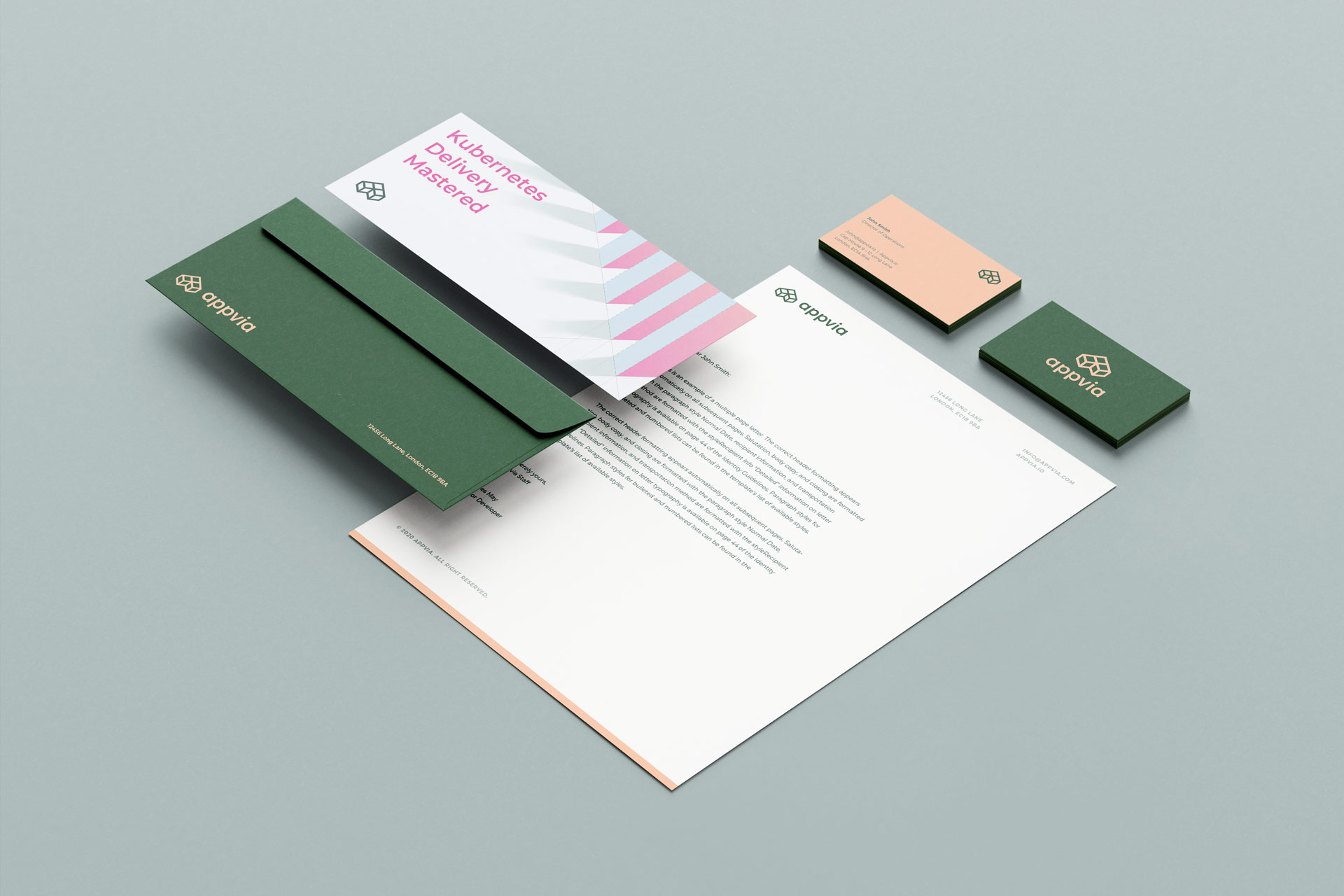
The practical lesson is available before anyone hires a designer. Ask colleagues to explain the company separately. Compare the answers. Disagreement gives the brief something useful to address. A visual identity can then express a shared position, instead of disguising the absence of one.
That makes the buyer’s job more demanding, too. Someone has to settle the underlying questions. If a leadership team keeps changing its account of the business, even a carefully constructed identity will keep inheriting the confusion.
A robot needs a filing system
Consider PS Design’s illustration work for Sauce Labs. The assignment involved developing a visual language and a library of graphics for a website launch. The studio retained the company’s familiar bots while depicting subjects including cloud testing, security and community.
The particularly useful detail is almost administrative. Illustrations were classified at three scales: city, room and item. Those categories gave future compositions a structure. A designer making the next asset would have a way to decide how much of the world to show.
Editorial schematic of PS Design’s illustration categories. No performance metric implied.
This is where a branding engagement can earn its continued usefulness. Organizations need another slide, another landing page, another announcement. The work has to be repeatable by people who were not in the original meeting. Attractive examples help; a small set of intelligible decisions helps the next person get started.
The square that went to a conference
For SeleniumConf’s 2023 return to in-person gatherings after a three-year pause, PS Design built around overlapping squares and the line “we_build_together.” The visual vocabulary included three square sizes, nicknamed bits, bytes and megabytes. Programming references gave the identity a connection to the people attending.
The assignment extended to a website with light and dark modes, a UI system and conference materials. In its account of the project, the studio reports more than 400 developers attended and that attendee satisfaction exceeded previous Selenium conferences. That is a report about the event as a whole; the design should not be credited with causing every happy survey response.
developers attended the 2023 event,
according to PS Design’s case study.
Appium offers a related example. For JS Foundation, PS Design developed an identity around a cyclical mark suggesting automation, along with animated icons, custom type and guidelines. It also addressed the relationship between the platform and its conference series. The logo was one member of a larger family that needed to look related.
Please open the typography
Then there is the coffee box. PS Design’s Fika promotion drew on a Swedish trip and the pleasure of taking a coffee-and-sweets break. As the package opens, its lettering extends. The message about taking more time is built into the movement of the object.
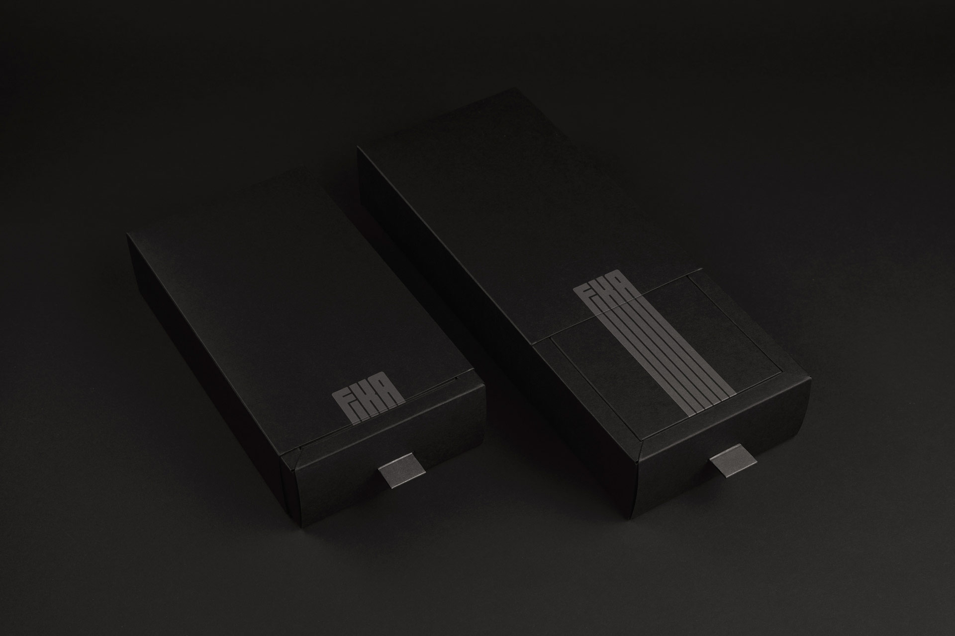
Made as a gift for clients and colleagues, the package used matte black Neenah stock, with production by Czar Press. Graphis awarded Fika Silver in its Packaging 10 competition; the project also appeared on Communication Arts’ 2021 typography shortlist. A quiet object managed to get noticed.
The studio explored a different kind of opening in Layers of a Creative: nested wooden boxes, inspired by Russian dolls, presented in packaging that unfolds like a flower. The boxes were intended to remain useful after the initial surprise. Here, the physical construction carries the studio’s argument that apparently simple creative work contains several layers of thought.
Love of Type went further toward deliberate destruction. A perforated strip lets the recipient tear into a small box to retrieve an acrylic ampersand ornament. Five hand-drawn letterforms supplied the variations. A typography project became something someone could hang up.
What the client is buying
These objects explain the studio’s range more clearly than a long list of capabilities. PS Design takes commissions for strategy, identity, packaging, digital design and content. Its business is professional creative work shaped around a client’s assignment. The self-initiated gifts are demonstrations of those skills and ways to maintain relationships.
Its customer mix includes technical organizations such as Appvia and Sauce Labs, as well as AIGA Orange County, Suncup ABA and Lacuna Legal. The portfolio describes work for organizations of different sizes in the United States and internationally. A buyer can come with a company identity problem, an event to launch or a family of materials that needs coherence.
The range also changes what a sensible buying conversation should cover. A logo, a website and a manufactured gift require different kinds of work. Ask for a scope that names research, design, revisions, implementation and production where applicable. Agree who will maintain the resulting materials. Those are useful questions to settle before comparing proposals.
“No Afterthoughts”
PS Design’s studio motto
The studio applies that motto to its own identity, including a struck-through PS wordmark and printed collateral using embossing, letterpress and foil. The point, in its telling, is to give design proper consideration early. The same standard is useful for the client: leave room in the project for design to influence what gets made.
Craft, with other people in the room
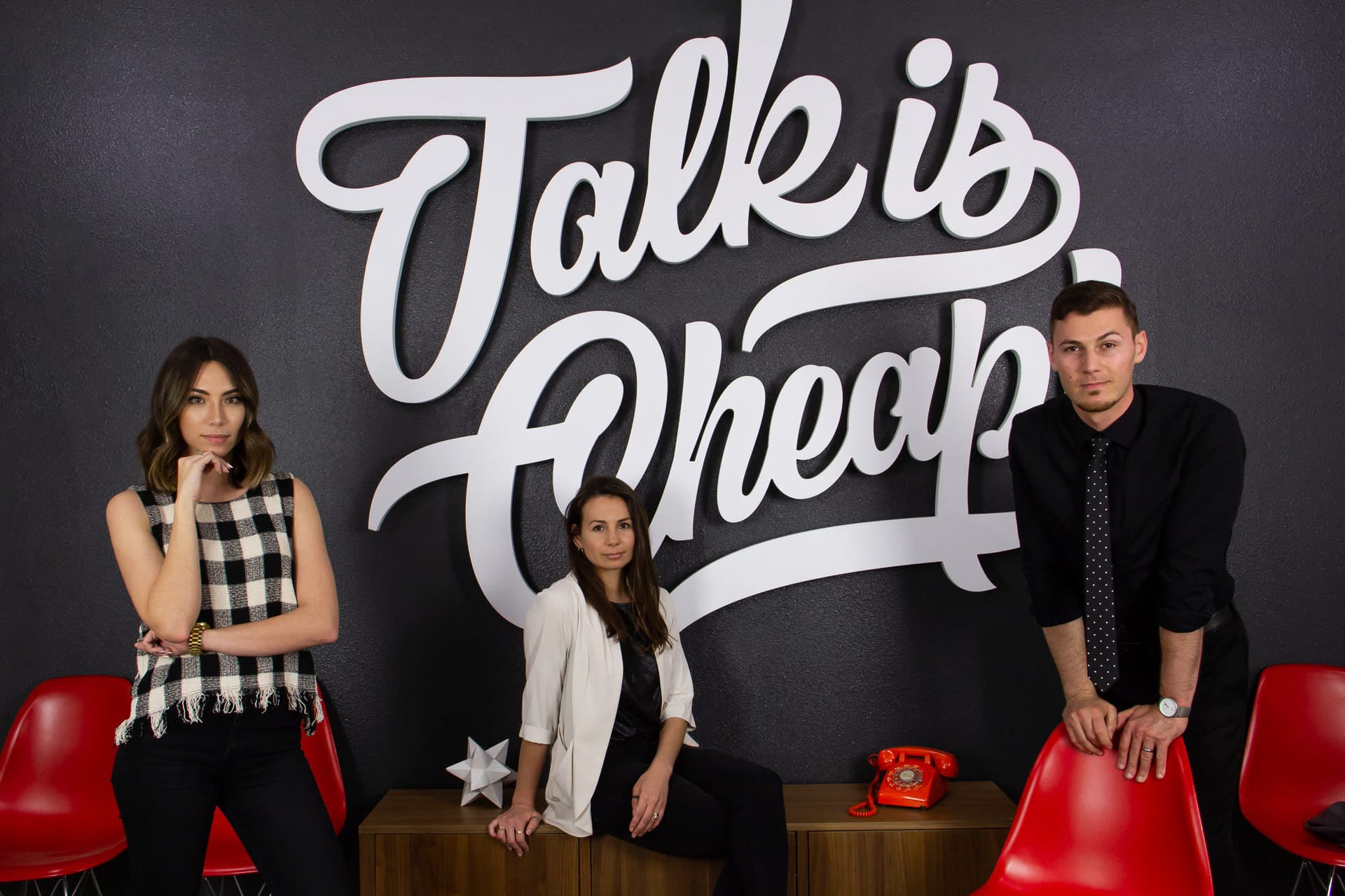
PS Design’s team page names Spassov, editor and copywriter Rebecca Spassov, and graphic designer Hanna Raymond. Project credits broaden the picture. Animation, development and production involve named collaborators. That combination matters when judging the studio’s place in the market: its published work crosses several disciplines while keeping individual contributions visible.
For AIGA Orange County’s Ethos awards, Spassov shared creative direction with Avo Adourian. Deliverables included a custom typeface, concrete trophies, promotional motion and social templates. The physical award and the digital announcement belonged to the same assignment. That is a useful example of the studio’s breadth for someone choosing between a specialist freelancer, an in-house team and an outside branding practice.
There is a later chapter in Spassov’s professional story. In a November 2025 interview, he and Adourian described building their separate venture, Reform Studio. Their account includes a ceiling collapse, pandemic disruption and the challenge of combining working habits. They also described the need to commit fully to the joint practice. That history belongs to Reform; it helps place the founder’s subsequent work without turning two studios into one company.
The next person should know what to do
Look across PS Design’s portfolio and the useful question becomes quite specific: what happens when someone uses this? A developer encounters a conference site. A marketing colleague commissions another illustration. A recipient pulls a tab. The idea must survive that encounter.
For a reader planning a rebrand, that is a practical test to copy. Pick three real applications before approving the direction. Put the proposed identity into them. Then give the rules to somebody who did not create them. Watch where they hesitate. The next design decision may become much easier to see.
Look closer. Open something.
Visit the studio ↗ Explore the portfolio ↗ LinkedIn ↗ Instagram ↗ Behance ↗ Dribbble ↗
In motion