A rabbit can survive a rebrand. The gradients, bevels and drop shadows surrounding him might not be so lucky. When Chase Design Group revisited Nesquik, the agency found a familiar character buried in decades of accumulated graphic effects. Its designers focused on Quicky’s bent ear and relaxed posture, then reconsidered how the rest of the package should behave. The assignment sounds modest until you imagine explaining to a large food company which pieces of its visual history have become clutter.
That is a useful introduction to Chase. The agency sells brand strategy, identity and packaging design, with work extending into digital communications and physical spaces. Its particular territory is the familiar product that needs another look. A carton must invite attention while remaining recognizable. A mascot must interest a new generation without becoming a stranger. There is commercial judgment in deciding how much change a brand can carry.
The music was there first
Margo Chase founded the business in 1986. Her early work included graphics and packaging for Madonna, Cher, Prince and Bonnie Raitt. Custom lettering gave those projects a signature that ordinary typesetting could not supply. The music business offered plenty of room for personality, and Chase developed an eye for the small formal decisions that make an image feel like it belongs to somebody.
Her route into design was wonderfully indirect. She studied biology with veterinary ambitions, then pursued medical illustration before leaving that program. The eventual portfolio included Madonna’s Like a Prayer and the logo for Buffy the Vampire Slayer. Gothic lettering helped make her name, but the business that grew around her would have to speak in many other voices.

Clark Goolsby, now Chase’s chief creative officer, has described how those music assignments informed later packaging work. For Califia, Chase challenged the category’s familiar combination of blue, splashing milk, almonds and gable-top cartons. The brand adopted a different structure and graphic approach. The connection between the two kinds of work is easy to see: a record sleeve and a grocery package both have to establish an identity before anyone experiences what is inside.
Chase received an AIGA Fellows Award in 2009 and died in 2017. Her influence remains visible in the company’s attention to drawn forms, custom type and illustration. Yet the agency’s continuing work also depends on the less glamorous business of organizing a range, producing packaging and helping other teams use a design consistently. The expressive idea has to survive those jobs, too.
Eighty ways to say ice cream
The 2021 US Häagen-Dazs redesign makes that balance tangible. The brief called for a different expression of luxury: more color and playfulness, while preserving the brand’s familiar signals. Chase refined the framed logo, retained prominent white with gold and burgundy accents, and gave individual flavors their own illustrated patterns. A custom typeface called Dazs helped tie the system together.
The US Häagen-Dazs packaging refresh rolled out across an 80-SKU line in 2021. One attractive carton was only the beginning.
That scale matters. A design that works for one flavor may become confusing when repeated across a freezer. The project combined family resemblance with enough variation to distinguish products. It also changed the mood of the brand without treating recognition as something disposable. Luxury could accommodate a little movement and a brighter palette.
The work then moved into scoop shops. Chase’s case study covers menus, uniforms, lighting and wall murals, with a design approach adaptable to different shop formats. This is where a packaging agency’s remit becomes more interesting: the carton supplies a visual vocabulary that people can walk into. Type, color and illustration have to work at the scale of a room as well as a hand.
A limited-edition collaboration added illustrations by Jade Purple Brown. Chase developed the packaging, while the wider activity included a Brooklyn pop-up designed by advertising agency Cartwright. The division of labor matters. A coherent brand experience can come from several contributors, provided the idea is clear enough to travel between them.
A rabbit, a salt brand and a crowded aisle
Nesquik required a different kind of editing. In Chase’s account, the brand was struggling to connect with a new generation, and its identity had become crowded with visual effects. The designers simplified around recognizable assets, then distinguished the audience for bottled drinks from that for powdered mixes. The former addressed young adults; the latter had to appeal to children and reassure parents.
The useful lesson is specific. Before adding another claim, flourish or texture, identify the part of the package that already carries meaning. In this case, the bunny’s posture and bent ear were worth studying. A character is more than its outline. Small gestures can hold the personality that a redesign is supposed to preserve.
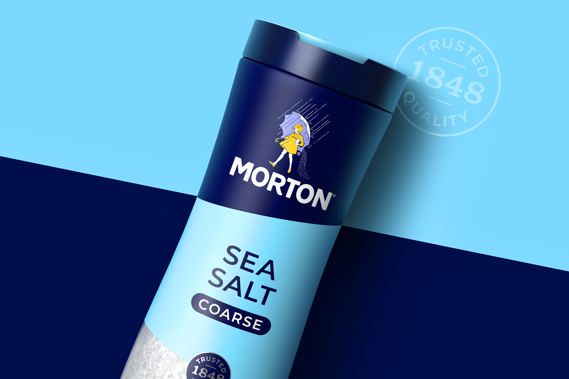
Morton presented another problem: a famous salt brand with a portfolio extending beyond cooking. Chase developed packaging flexible enough for different categories while maintaining a recognizable relationship between products. It also created a licensing guide, with graphics, patterns and typography for uses including fashion, home decor and kitchen products. Here, the work was partly about deciding how far familiar imagery could stretch.
Follow Your Heart faced the reverse of obscurity: a long history that newer competitors were making harder to see. Chase describes an established plant-based brand getting lost in a busy aisle. Its assignment brought identity and packaging into a wider campaign, including web and social work. The common thread is a diagnosis before a style choice. Each brand needed a different part of its story made more visible.
Translation, with a cheese moon
Otoki brings a different pressure to the portfolio: introducing a Korean food company to international audiences. Chase’s work encompassed the move from Ottogi to Otoki, positioning and visual identities for Jin Ramen and Cheesy Ramen. The team redrew the familiar symbol and developed a system whose Korean and English typography could feel related.
“We created a typography system that had the same feeling in both languages.”Jon Arriaza, creative director, on Otoki
That decision involved Korean-American team members, according to the published project account. It is a concrete example of cultural knowledge affecting the work. Matching the mood of two writing systems demands more judgment than choosing two fonts that happen to fit inside the same box.
Cheesy Ramen received Moonie, a cheese-moon mascot whose expressions change with the flavors. Jin Ramen uses Korean-inspired patterns and flavor-specific characters. Those details make the range easier to distinguish while giving it something to say beyond the contents of the packet. The broader lesson is to decide which cultural cues deserve emphasis when a brand enters a new market. Familiarity in one country does not automatically explain a product in another.
What a client is actually buying
Chase operates as a business-to-business creative services agency. Brand owners and retailers commission the work; consumers encounter the results. Its public client roster includes P&G, PepsiCo, Nestlé, Mattel and Target. Those relationships place it in the market for substantial consumer-brand assignments, where a design may need to work across a product family, a marketing campaign and a retail environment.
Its stated capabilities include research, naming, brand architecture, package production, digital design, visualization and environmental graphics. Consumer products and packaging are explicitly central to its expertise. For a potential client, the attraction is continuity: the people developing the identity can help carry it into finished applications. That reduces the number of times the original intention must be reinterpreted.
The practical scope deserves attention before any budget discussion. Naming a new product, refreshing an existing range and redesigning a shop require different deliverables and different collaborators. A useful brief identifies the decision to be changed, the assets already recognized, the formats required and who will approve the result. These projects show why production and implementation belong in that conversation from the start.
Specialist branding agencies and internal design teams offer alternatives. Chase’s portfolio makes its case through the combination of expressive craft and coordinated application. The distinction is visible in the work itself: lettering becomes a packaging system; packaging becomes a shop; a licensing guide makes room for products beyond a brand’s original aisle. A buyer can judge whether that breadth matches the assignment.
The studio after the founder
The current leadership includes CEO and chief strategist Chris Lowery and chief creative officer Clark Goolsby. Goolsby’s account of the New York office offers a more personal view of the organization. When he planned to leave Los Angeles after his wife received a New York job opportunity, Margo Chase suggested opening a studio there. He has described the trust she gave him to run it.
The UK operation has its own continuity. In February 2026, Design Week reported that Shannon Osment, who established Chase’s UK presence in 2017, had become managing director. Pete Hawkins became group creative director, with both leading from a larger Bristol office. The company’s contact page now lists Los Angeles, New York and Bristol locations.
There is a smaller tradition worth keeping alongside the expansion: client holiday gifts. Chase has made original wrapping paper, elaborate chocolate packaging and a doodle book. The 2019 Valentine’s coasters explored typography and graphic-design curiosities. These are cheerful demonstrations of the same interest that runs through the commercial work: familiar objects reward closer attention. Sometimes the next useful idea starts with noticing what is already there.
Look closer
Visit the studio, browse the work or hear the people behind it.