There is a peculiar dishonesty in the way brand work is usually photographed. The logo sits alone, immaculate, at the center of a tasteful square. There is no hurried product manager asking for a deck by four. No regional marketer stretching the mark. No conference booth, quarterly report, app screen, legal disclaimer, or 404 page. The picture shows the christening. A company, unfortunately, has to live the rest of the life.
Grafik Design Co has organized itself around that inconvenient remainder. The fully remote studio is based in Sacramento and led on client work by Creative Director Grady Fike and Art Director Giulia Notari. It does the handsome things - logos, typography, colors, packaging, illustration, animation. But the more revealing items in its portfolio are libraries, toolkits, templates, guidelines, training assets, and years-long relationships. Grafik does not merely want the identity approved. It wants the identity to survive contact with the organization.
The trouble begins after the applause
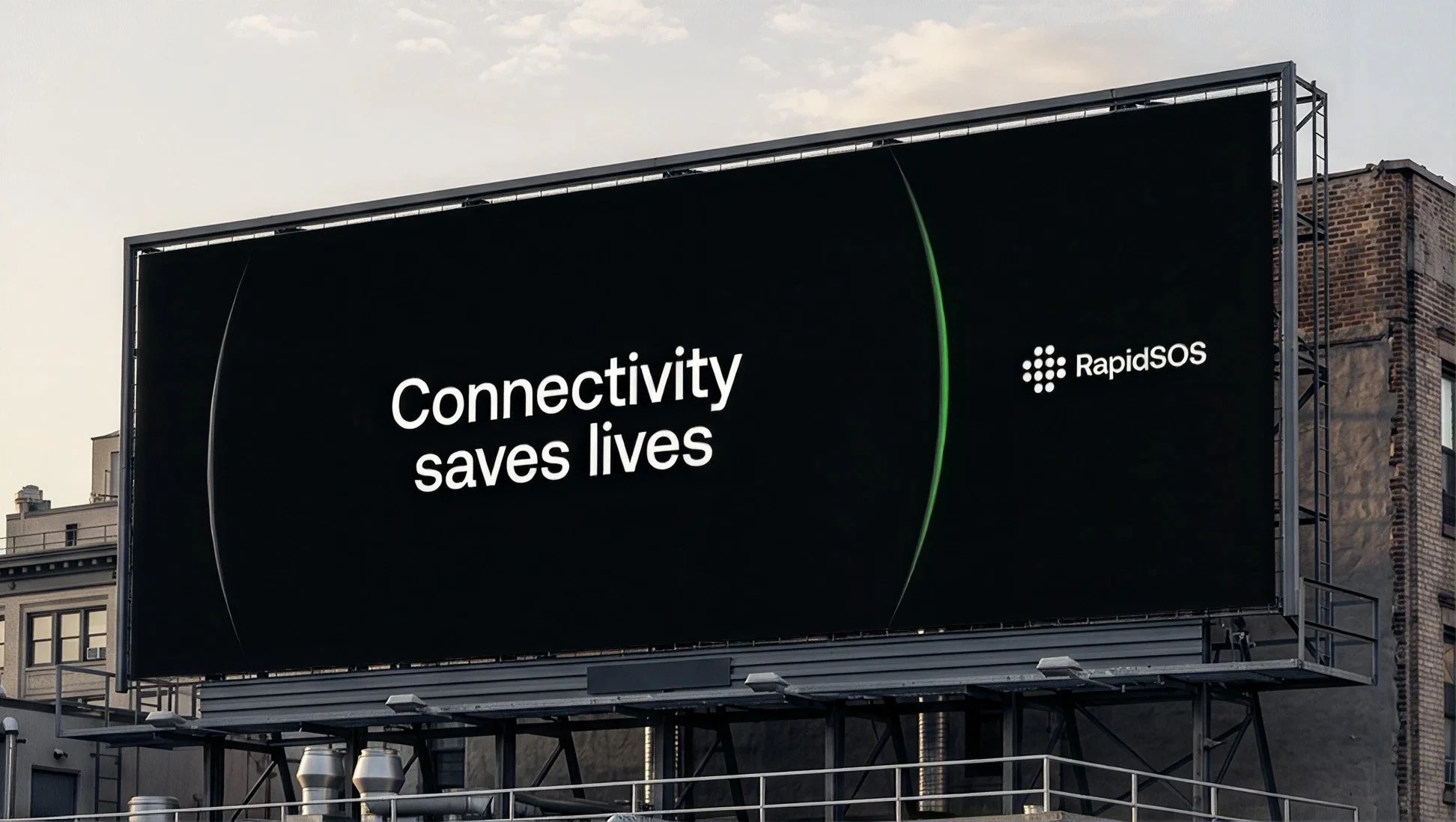
Take RapidSOS, the emergency-response technology company connecting devices, enterprises, 911 centers, and first responders. By 2025, more than a decade of product and infrastructure had accumulated behind an identity that no longer carried the weight of the business. This was the first failure: the old brand had become smaller than the company it represented.
Grafik joined as an embedded partner for six months. The visible output was a new identity built to feel confident and reliable without turning cold or institutional. The less visible output was the point: brand architecture, a 60-page guide, a Figma library, social and presentation templates, business documents, secondary marks, training material, motion rules, and a launch film. A working group of more than 35 people, over 25 product team members, the marketing organization, and more than 30 public-safety and enterprise leaders fed the process. The logo was the simple part because everything else had to agree with it.
Those are client-reported website changes, not proof that typography alone caused traffic to rise. They are still useful. Brand launches often produce admiration without behavior; this one coincided with more people arriving, more new people arriving, and each person looking a little farther. The design had somewhere to go.
A studio that remembers
The cleaner demonstration of Grafik’s model is Sourcegraph. The relationship began in 2021 with a brand audit that became the developer-tools company’s first formal guide. Grafik refined a logo, drew icons, made blog templates, booths, ebooks, ads, and swag. In 2022 it built an illustration system that could make complicated code concepts legible without reaching for the usual floating blobs of software marketing.
Then Sourcegraph changed. Its internal team created a new brand system. An ordinary agency might describe that as losing the account. Grafik was asked back to lead the illustration strategy. Years of accumulated context meant fewer elaborate briefs and less ceremonial handoff. The resulting “Protocol Aesthetics” used continuous lines, disciplined grids, and small controlled breaks - technical drawings with manners. The work lived in the company’s core Figma library, where other people could extend it.
The identity-to-operations stack
Institutional memory is usually treated as a side effect of a long engagement. Here it is close to the product. The studio carries the old decisions forward, notices when the new ones contradict them, and saves a busy team from reopening settled debates. Sourcegraph’s testimonial puts it plainly: “Grafik feels like an extension of our own internal team.”
Senior hands, silly questions
Grafik’s public process comes in three paired verbs. Ask & Align establishes what the brand must do before anyone starts decorating it. Make & Refine turns the premise into a visual language. Embed & Evolve keeps the studio close enough to object when an application weakens the system. It is a tidy sequence, but it also explains the economics: focused identity projects can become ongoing creative partnerships.
Ask & Align
Position, audience, purpose, and the awkward question everyone avoided.
Make & Refine
A complete visual language, tested beyond the perfect mockup.
Embed & Evolve
Context stays in the room while the brand meets new demands.
The culture pitch is equally direct: senior people remain on the work. “The people you meet are the same people who do the work,” the studio says. Fike’s team bio mentions strong opinions about typography and an affection for seemingly silly questions. Notari’s credits fresh pasta alongside an eye for detail. John Rojas, a designer and animator working from Spain, collects dad hats. These jokes do a modest but useful job. They make the people legible before the kickoff call.
One method, several markets
Grafik is not an industry specialist in the narrow sense. RapidSOS has a government and enterprise audience. Sourcegraph sells developer infrastructure. Super.com serves consumers across credit, savings, cashback, and travel. Selene is skincare; Mod Real Estate sells mid-century homes; Old Soul roasts coffee. The common problem is not sector knowledge so much as translation. A company has a complicated idea and a growing pile of touchpoints. Grafik gives both a repeatable visual grammar.
The Super.com work makes the range visible. Grafik expanded an existing illustration style and its mascot, Spottie, into character animation, product moments, homepage motion, event work, decks, merchandise, and campaign pieces. One animation aired in Chicago as the 2023 Super Bowl began. The same discipline that keeps an enterprise guide orderly can also make a cartoon character move with the right amount of bounce.
This is where the studio sits in the market: larger and more systematic than a freelance logo practice, smaller and closer to the work than a many-layered agency, and easier to add than an entire permanent department. The client buys strategic judgment, craft, production capacity, and continuity. Public pricing is absent, which makes the buying question less “What does a logo cost?” and more “How much reinvention is the team paying for now?”
The useful part to copy
Grafik’s approach can be borrowed without borrowing its typefaces. Start a brand project by inventorying the decisions people repeatedly remake. Build the asset library alongside the showcase applications, not six months later. Put the system where teams already work. Train the people who will touch it. Then keep one person or partner close enough to remember why the rules exist.
- Use an embedded studio when an internal team is lean, demand changes weekly, and the brand must stretch across many channels.
- Give the partner access to strategy and decision-makers; production without context merely accelerates inconsistency.
- Judge the handoff by whether ordinary teammates can make the next asset without reopening the entire identity.
- Choose a narrower engagement when the need is truly one-off, the organization will not collaborate, or no one owns the system after launch.
There is no romance in a well-named Figma component. It will not be framed in the lobby. But the component is where the promise of the identity becomes repeatable. Grafik’s bet is that the most valuable part of design is not the instant when everyone first sees the brand. It is the hundredth Tuesday afterward, when someone needs to make something quickly and, almost without thinking, gets it right.