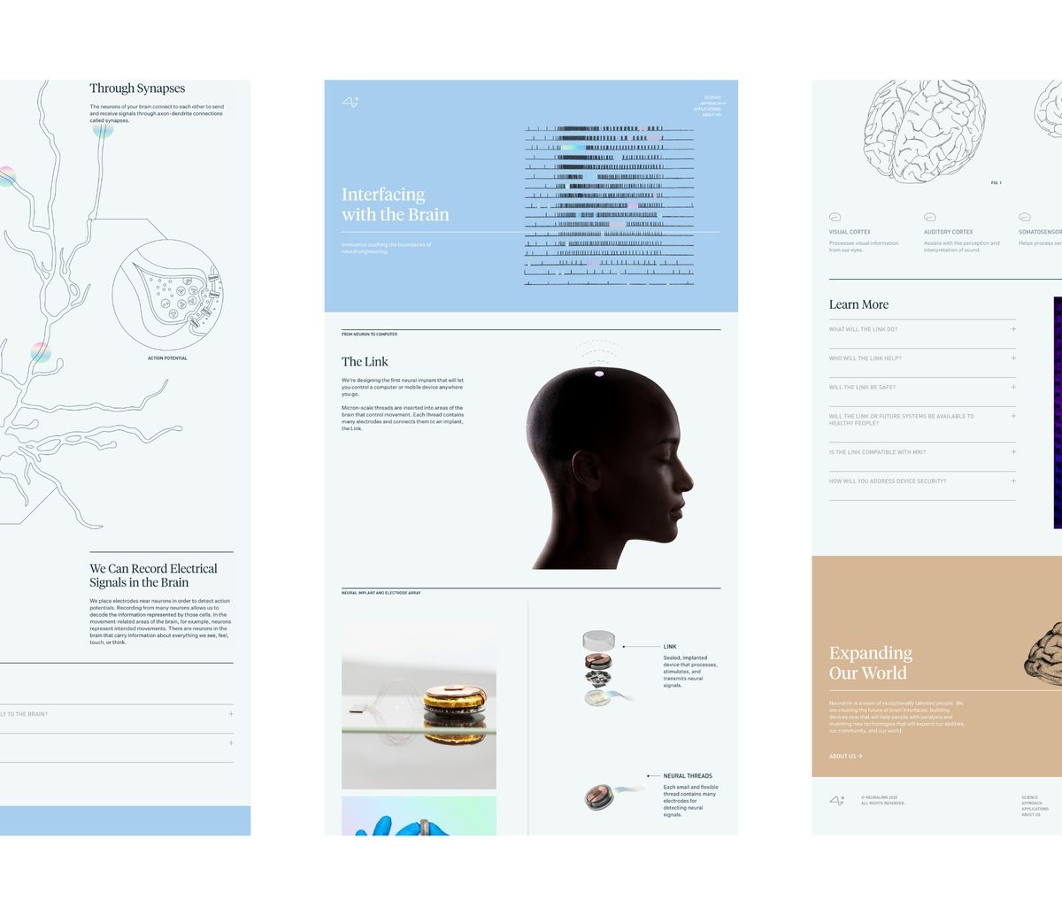
The reference material for Neuralink’s new visual language included an unusually heavy piece of reading: Principles of Neural Science. A company developing brain-machine interfaces had handed its designers a neuroscience textbook. Play SF took the hint. Scientific illustrations, an editorial sensibility and carefully controlled color became the ingredients of a public-facing identity for technology that could otherwise feel forbiddingly abstract.
It is a useful introduction to the San Francisco studio. Play works on the distance between what a company knows about itself and what everyone else can understand. That distance can be measured in unfamiliar science, a crowded software screen or the simple difficulty of recognizing one beer among its neighbors. The studio’s answer usually extends beyond a mark into a set of design decisions that can hold together across many applications.
Founded by Casey Martin in 2016, Play SF also operates under the name Play Studio. Its portfolio connects startups with established companies including Figma, Adobe, Stripe and Dropbox. The common thread is a communication problem: a launch, a new product family or an existing business whose visual presentation needs to catch up with what it does.
A textbook earns its place on the mood board
For Neuralink’s summer 2020 progress update, Play worked with company leadership on a visual language and website. The existing logo stayed. That detail matters: the assignment involved giving the company more expressive tools without making a replacement symbol the centerpiece of the exercise.
Neuralink co-founder Max Hodak supplied the textbook early in the exploration. Its diagrams and other visual material offered a connection to the scientific discipline behind the product. Martin described pinning reference images to the studio wall and experimenting extensively with color before settling on a restrained foundation with brighter spectrum accents.
“The company is rooted in science, and the brand needed to be too.”
Casey Martin, speaking to Design Week in 2021
The typography reinforced that editorial character. For a reader encountering unfamiliar technology, the reference to a textbook offered a recognizable way into the subject. The lesson for a company commissioning design is pleasantly practical: bring the material your people actually use. A technical manual may provide a more specific starting point than a folder of fashionable websites.
The brewery that made room for another pattern
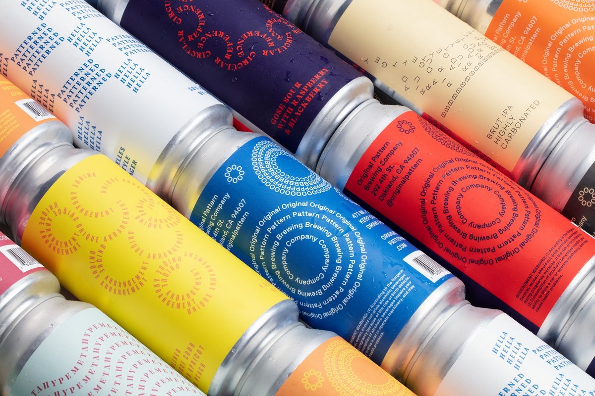
Original Pattern Brewing Company gives the same studio a very different canvas. Play built an identity around the possibilities already contained in the brewery’s name. Graphic elements could rotate, rearrange and move beyond a rigid linear arrangement. The system extended across packaging, photography, advertising, signage and the physical environment.
Viewed alongside the Neuralink work, the beer project makes Play’s range easier to understand. A science-led identity benefits from an editorial frame; a brewery can accommodate more visible mischief. The connective tissue is the search for an idea specific enough to guide later decisions. Original Pattern provides that idea before anyone has opened a design file.
There is a commercial advantage to thinking this way, although it should be treated as design logic rather than a measured sales result. A reusable system gives a team room to introduce another application without inventing an unrelated look. The useful question becomes whether the next can, sign or photograph still belongs to the same family.
Fifty websites start with five groups
Figma’s assignment introduced a different kind of constraint: quantity. Play created 50 customizable templates for Figma Sites, covering uses such as portfolios, business launches, events, blogs and résumés. Each needed an identity of its own while demonstrating the website builder’s capabilities.
The team began by cataloging audience needs with Figma and organizing them into five use-case groups. UX work established the purpose and content flow of individual templates. Fonts and photography came from a defined selection of Google Fonts and copyright-free images. Interactions included hover effects, loading animations and transitions tied to scrolling.
This is the less photogenic part of design that makes the photogenic part possible. Before arranging a beautiful page, the team had to establish what someone arriving there should do. A résumé, a product launch and an event announcement ask different things of their readers. Attractive sameness would have missed the brief.
For anyone managing a large creative assignment, the transferable move is the inventory. Name the audiences, define their tasks and decide which variations are meaningful. Only then does producing dozens of designs become a tractable problem. The number of deliverables is a useful planning fact; it is not, on its own, a measure of their usefulness.
Find the picture inside the product
Play’s work for Lumafield follows the material back to its origin. The company makes industrial CT scanning technology. Its brand mark translates three-dimensional XYZ axes into a two-dimensional crosshair-like form, while the palette takes its cues from scan maps. The line “Look Within” connects the imaging function to an engineer’s habit of investigation.
Remedy Robotics required a more human register. In Play’s account of the assignment, the medical robotics company needed to communicate technological ambition while earning trust and attracting specialists. Satellite images of waterways supplied a visual metaphor for the branching vessels inside the body. Warm office photography gave that abstract geography a human counterweight.
These are specific design choices, not evidence about the performance of either client’s technology. Their value for the profile lies in showing how Play approaches unfamiliar subject matter. The work starts with something that belongs to the client, then finds a form in which an outsider can recognize it.
The approach needs discipline. An elegant metaphor can become decorative if the audience cannot connect it to the offering. A commissioning team should test both the immediate impression and the explanation that follows. If the beautiful picture needs a long speech to justify it, the picture may be doing too little work.
Sometimes the brand already has a house style
Not every client needs a new identity. Dropbox asked Play to create a family of glyphs for Capture, Sign, Forms, Fax and DocSend. The symbols had to tell separate product stories while fitting the existing Dropbox architecture, including its familiar geometry and blue-and-graphite palette.
Stripe’s assignment was another exercise in extension. As part of a broader rebrand, Play developed product UI and data-visualization systems. It separated full screens from smaller widgets so that a large product story and a focused feature could receive different treatments. The visualization work covered part-to-whole relationships, distributions, geography and diagrams.
Those projects place Play between brand strategy and detailed production. It can help establish the organizing idea, then make the assets that marketing and product teams need to communicate it. For a buyer comparing studios, this is a meaningful distinction to investigate: who will carry the concept through to the less glamorous surfaces where customers actually encounter it?
At Adobe MAX, the experiment became the scenery
For Adobe MAX 2024 in Miami, Play collaborated with Adobe Brand Studio on an event identity using the Adobe lens as a recurring visual device. The process combined small human-made sketches and textures with Firefly-generated imagery. Designers then assembled collages and used Photoshop’s generative fill to extend the compositions.
The resulting visual language appeared across motion, signage, environmental applications and merchandise. Its usefulness came partly from having an existing brand element to organize the variation. The lens could frame many different images while maintaining a recognizable connection to Adobe.
It also offers a concrete account of generative AI in studio work. Human choices supplied inputs, selected material and shaped compositions. A buyer evaluating a similar process can ask for that sequence to be made explicit: where the imagery begins, who edits it and how the final set stays coherent. The production method belongs in the discussion of the deliverables.
A serious business with a deliberately unserious biography
Play’s own presentation leaves space for jokes. Its team page turns biographies into comic performances. The copywriter’s dog and a designer’s imaginary-world preferences get room alongside job titles. These are pieces of studio self-expression, best read as humor. A 2019 studio portrait also described seeking inspiration outside design through music, surfing, antique fairs and other ordinary diversions.

By April 2026, a Visuelle interview introduction described Martin’s business as a roughly 30-person studio spanning San Francisco, London and beyond. Play’s current contact information includes San Francisco and Brooklyn addresses, and its website names a wider network of cities. The working identity is international even as the company retains its San Francisco base.
The business sells commissioned creative work across brand strategy, identity, web design and development, motion, CG art and physical applications. Play Gives adds donated identity work for causes the studio supports. Play Capital invites a separate investment-related conversation with startups and emerging brands.
For a prospective client, the sensible starting point is a concrete assignment: the audience that needs to understand, the moment that matters and the places the design must appear. Then define the scope, budget, approvals and handoff. A tightly specified production task may suit an in-house team or a narrower specialist. Play’s portfolio is most relevant when the idea and its many expressions need to be worked out together.
The most useful takeaway is small enough to try without hiring anyone: put something real from the business on the table. A scan. A textbook. A list of what users came to do. Play’s projects show how much design can grow from paying close attention to the thing being designed for.
Explore the work
Play Studio · Project portfolio · Studio news · Instagram · LinkedIn · X · Behance
Listen: Casey Martin on Visuelle · Watch the Adobe MAX project in motion · Explore the Figma Sites templates