A wolf and a rattlesnake are locked together on the crest of Atlético Dallas, a soccer club preparing for its first USL Championship season in 2027. The badge looks as though somebody might have inherited it. In fact, the founding story was made for the occasion. Moniker and its collaborator ModestWorks imagined the encounter, then built a visual identity around it. The club received a past tense before its first kickoff.
That is a useful introduction to Moniker, the San Francisco studio founded by designer Brent Couchman. Its work deals in the gap between what an organization is and what people can recognize about it. Sometimes the answer is a hand-painted animal. Sometimes it is a quieter palette, a different photographic approach, or instructions that keep dozens of designers from improvising dozens of incompatible brands.
A new club, an old-looking argument
For Atlético Dallas, artist Tom Meek developed the heraldic illustration through an iterative process. Topaz blue, prairie-soil black and mineral silver connected the surrounding graphics to the Texas landscape. Custom blackletter numerals added another layer of character. The studios used texture and historical references to give a new institution the visual weight of an established one.
The origin story deserves careful reading: ModestWorks calls the legend imagined. It is brand fiction inspired by a place, rather than a recovered piece of local history. That distinction makes the project more interesting. The designers were constructing a shared symbol that supporters could take up and give meaning through use. The identity was unveiled in May 2025; the football would follow.
Dallas Trinity FC offered a different set of materials. Working again with ModestWorks, Moniker drew its name from the Trinity River, reinterpreted the city’s familiar Pegasus for the crest, and looked to Fair Park’s art deco lettering for custom typefaces. Here, existing civic references supplied the connections. Two clubs in one city needed separate personalities. Geography provided a vocabulary broad enough for both.
Atlético Dallas
Wolf + snake
Heraldic illustration
Blackletter numerals
Dallas Trinity FC
River + Pegasus
Civic references
Art deco lettering
The company behind the company’s appearance
Moniker calls itself an identity studio. Its services cover strategy, visual identity, print, digital, motion and film, packaging, environments and advertising. Those categories describe a business that sells commissioned expertise: helping organizations decide how to present themselves, then producing the visual and verbal materials that make those decisions tangible.
The studio describes its approach as building brands from within the organization, connecting external distinction with internal agreement. That can mean creating a company’s first identity, refreshing an established one, or preparing a broader system for a new stage of growth. The customers include technology businesses, healthcare providers, consumer brands and cultural organizations, alongside those soccer clubs.
Its position in the market is that of a specialist design partner. A client can bring Moniker into an existing design organization, as Coinbase and One Medical did, and use the outside team to develop a shared direction. The practical appeal is access to experienced makers who can discuss the problem with the people responsible for solving it.
The freelance work became the business
Couchman’s route into running a studio was gradual. He had worked at Fossil and Hatch Design, and freelanced outside regular working hours. In an early interview, he recalled reaching a point where his own workload exceeded the work at his day job. Larger direct assignments, supplemented by work for other studios and agencies, eventually became enough client business to sustain Moniker.
That account contains a fairly plain entrepreneurial lesson: demand preceded the independent operation. Couchman also credited friends and collaborators with recommendations that brought in substantial projects. His stated ambition was modest in wording: “we want to work with nice people on good projects.” The sentence describes a selection principle as much as a mood.
“we want to work with nice people on good projects.”
Brent Couchman / founder & creative director
A 2014 interview adds a telling personal detail. Couchman collected old Graphis annuals and rare design books, developing a network of dealers in the United States and Europe. The appetite for design history helps explain the ease with which the portfolio moves between restrained geometric marks and older visual languages. The references change with the assignment.
When growth makes the identity harder to use
One Medical supplies the clearest account of a problem arriving before the redesign. As the provider expanded, its identity grew complicated and difficult to apply. According to Moniker’s project account, the appearance also stopped matching the experience the company wanted to convey. The first task was an extensive audit and competitive analysis, undertaken with the internal design team.
The resulting system used a refined logotype, fewer colors, expressive typography, photographs of real people and hand-drawn illustration. Credits identify Dinamo’s logotype work, Grilli Type’s custom GT Super, photography by Michael O’Neal and illustration by Charlotte Trounce. Guidelines gave the collection a structure that could accommodate further expansion.
For a buyer, the sequence is worth noticing. An audit identifies what deserves to survive. A palette and type system establish repeatable decisions. Imagery supplies a human register. Guidelines make those decisions available to people who were never in the original meeting. The useful test is whether the next team can produce a recognizable piece of communication without starting over.
Coinbase needed familiarity. Oculus needed daylight.
Coinbase presented a different tension: how to make a new financial category approachable while communicating trust. Moniker worked with its design team on a custom typeface, logos, color, layouts, motion and guidelines. Typography took cues from the monospaced lettering of financial documents and from wayfinding. Familiar forms helped frame an unfamiliar subject.
The project illustrates the studio’s scope. A symbol alone cannot establish how a moving image behaves or how a dense page organizes information. Those choices need to belong to the same family. For an internal marketing or product team, a coordinated system offers a starting point for many assignments instead of a fresh aesthetic debate each time.
For Oculus, Moniker describes a two-year collaboration on an identity meant to reach beyond gaming. The work included the wordmark, a logo system, typography, photography, product visualization and layouts. A conspicuous decision was the move from black backgrounds to white, intended to make virtual reality feel more accessible in everyday life.
That change gave a strategic ambition a visible expression. The brief concerned a broader audience; the visual treatment had to make room for it. Never Sit Still handled animation and Where Giants Roam supplied renders. The credits also show how a small studio can assemble a wider range of skills around a particular assignment.
The part that travels to 19 offices
Intuit’s refreshed identity launched in fall 2022. A subsequent San Francisco Design Week session described the work from initial planning through international implementation, including research, testing, product integration and updates to 19 offices. The 2023 Red Dot award entry credits both Intuit and Moniker.
Intuit’s design-week presentation followed the identity from exploration to physical workplaces around the world.
An office count changes the way one reads a rebrand. Decisions have to travel through buildings, screens and teams. The attractive reveal is one moment in that process. For companies assessing this kind of service, implementation belongs in the initial brief: which environments must change, who owns each one, and how the system will be maintained after launch.
There is also a purchasing question. Clutch lists Moniker with a minimum project size of $50,000 and an hourly range of $50 to $99. Treat those as directory indications, subject to a current proposal. A company planning an identity commission should define the deliverables, specialist production, rollout work and approval responsibilities before comparing bids. A logo and an international identity program make very different demands on a budget.
The paper had other ideas
For Designer Fund’s internal speaker series, Moniker made 12 posters. Speakers could change, so the designs were organized around topics. The studio moved from vector artwork toward physical constructions in colorful Colorplan paper, using renders to explore composition and lighting before laser cutting, assembly and photography.
Production resisted the tidy plan. Several cutting shops would not take the small, unusual job. A supplier in Oakland agreed, but transporting large sheets was awkward. Once the pieces were assembled, the team discovered it needed more components and returned to the cutter. The photographs required several days of hands-on work.
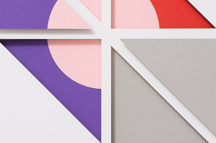
The transferable idea is specific: anchor a system to what will remain stable, and test it in the material that will actually be used. The topics outlasted the speaker schedule. The assembled paper exposed a problem the render had left unresolved. Allowing for that second production pass is part of designing the job.
The person inside the client matters
Small-team collaboration depends on conditions that a portfolio cannot supply. On the podcast One More Question, Couchman emphasized internal teams preparing senior decision-makers for the process. An outside designer benefits from the trust a client’s own colleagues have already earned. The implication is practical: appoint an internal partner who can explain decisions and bring the right people into the conversation.
Without that access, direct collaboration loses much of its advantage. A tightly prescribed, one-off production task may need a different arrangement; a company seeking a broader identity must be willing to examine its existing choices. The commissioning organization has work to do, too. Agreement cannot simply be delivered as another file.
Moniker’s current announcements include identities for Oakley Meta, Atlassian Rovo and the biotechnology company Instance. The subjects keep changing. Across the documented projects, the recurring question is how an idea becomes something other people can use. A crest has to belong on a shirt. A typeface has to carry an ordinary sentence. A brand earns its keep in those repeated, unglamorous appearances.
Explore the work
Moniker’s portfolio · Studio news · LinkedIn · Instagram · Twitter / X · Facebook
Listen: Brent Couchman on One More Question
Read: Couchman on starting the studio
Watch: Atlético Dallas in motion