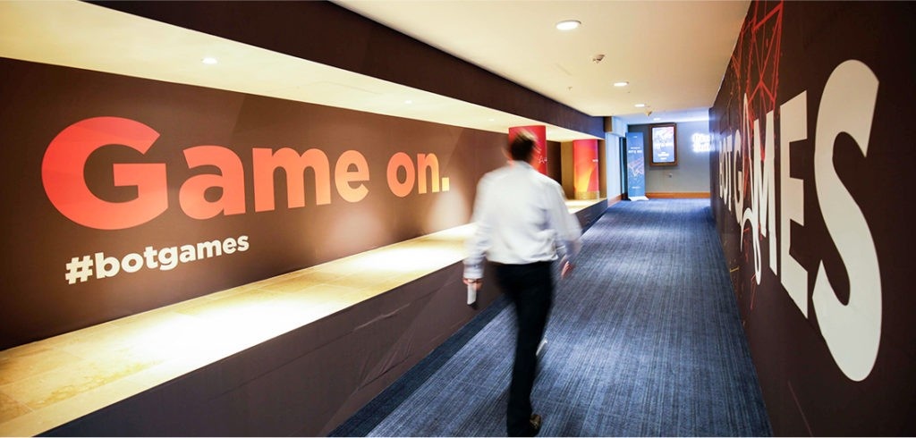
A 14-foot mirrored logo slowly turns outside a technology conference, catching the skyline and the people walking past. Inside, the branding has escaped the screen and occupied the building. For Automation Anywhere’s 2019 Imagine event, Design in Mind made the company’s identity something attendees could stand beside, photograph and walk around. A rather demanding assignment for a logo.
The same agency has helped a youth orchestra’s volunteers make consistent concert posters. That distance between spectacle and everyday usefulness explains the San Jose firm better than a list of design disciplines. Its work has to survive contact with people: the employee opening a presentation, the parent making a flyer, the conference producer trying to get the doors open.
The logo has left the laptop
Founded by Katie Otis in 2002, Design in Mind grew from a solo practice into an agency serving startups, established corporations and nonprofits. Its four main service areas are branding, marketing, websites and events. Across those categories, it develops the words, visual identities and practical materials that help organizations explain themselves.
The portfolio stretches from LinkedIn and Automation Anywhere to Tradeoffs, Ploughshares and San José Spotlight. These customers have different audiences and different reasons to hire outside help. A technology company may need a conference identity that travels. A newsroom needs readers to recognize and trust it. A nonprofit needs its mission to make sense to someone encountering it for the first time.
Otis’s event specialty arrived through a client relationship. In a 2021 Dynamo Events interview, she recalled an existing customer asking the agency to brand a large San Francisco conference. The team already understood the brand; the client had a budget that allowed it to explore the space. That assignment gave the agency a way to bring its services together.

What broke was the execution
Asked about her biggest event failure, Otis pointed to insufficient vetting of print and production vendors and insufficient supervision of output and installation. She told the client what had gone wrong, then worked into the night fixing what she could before registration opened. Her compact verdict: “It’s all in the execution!”
“It’s all in the execution!”
Katie Otis · Founder · 2021
That admission gives the agency’s emphasis on production a useful context. An approved layout still has to become a physical object. Vendor management, installation and onsite support are consequential parts of the service, particularly when errors arrive at the size of a wall.
For CloudBees’ DevOps World, the agency developed a surreal visual world populated by characters including stingrays and mushrooms, with the familiar Jenkins character appearing throughout. The design extended to signage, presentations and stage graphics. Then, according to the project account, bad weather forced a switch to a virtual event in the final hours. The team returned to production and adapted the material for digital delivery.
The lesson a buyer can borrow is specific: review how an identity behaves in its actual formats before declaring it finished. Ask to see the slide, the sign and the screen. A system that depends entirely on one venue or one delivery format leaves a producer fewer options when the plan changes.
An editorial checklist drawn from the agency’s event, web and template work.
Even LinkedIn has to explain itself
One of Design in Mind’s revealing assignments involved an audience already inside the client’s business. LinkedIn’s InDay gives employees a day each month to connect, collaborate and innovate. But the agency’s case study describes declining participation, aging themes and newer employees who did not understand the tradition. Flexible working arrangements made participation harder to prioritize.
The response included a brand audit, refreshed logo, messaging, promotional video, signage, templates and an asset library. The brief was about making the purpose of an existing program legible again. Employees and managers needed a clear reason to take part.
This is where the agency fits within a company’s operations. Internal programs need communication just as products do. A familiar name can conceal an unfamiliar purpose, especially after hiring and workplace changes. The InDay example suggests a useful starting question for any internal campaign: what does a new employee think this is for?
Natera’s 2025 Global Sales Meeting brought a related challenge into a physical setting. Under the theme “Make It Count,” Design in Mind created event branding, environmental graphics, wayfinding, presentations, motion graphics and video. The assignment sought to reconnect sales employees with the purpose of the genetic testing company’s work while retaining its scientific credibility.
A concert poster needs a second performance
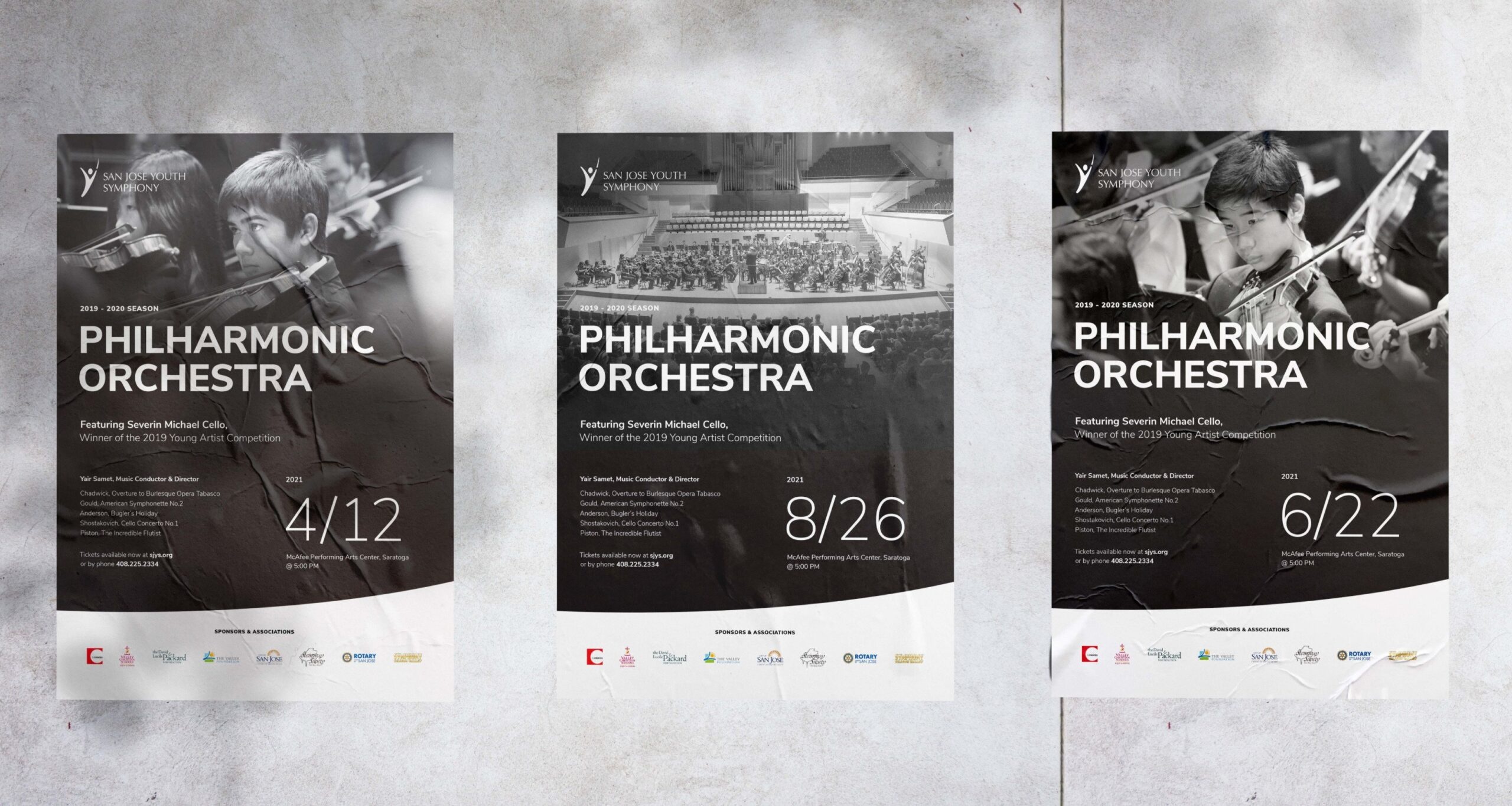
For San Jose Youth Symphony, the problem was maintaining a recognizable identity with a small marketing budget and volunteer-made materials. Design in Mind refined the existing logo, brightened its established colors and developed typography and icons. The changes respected an organization that had to appeal to young musicians as well as parents and donors.
The lasting deliverable was a set of adaptable templates: concert posters, audition flyers, brochures and social posts, supported by simple brand guidelines. Someone other than the original designer would need to make the next announcement. The agency’s case study values the Design in Kind gift that supported this project at $25,000.
That is a useful way to judge a rebrand. Open the files a volunteer will inherit. Consider whether changing a date, replacing a photograph or announcing an audition requires another agency engagement. The design has a longer working life when the next person can operate it.
Design in Kind formalizes the agency’s nonprofit support through discounted services and selected pro-bono work. Its published historical figures include $228,000 in donated services from 2013 through 2022 and $76,000 in discounts from 2016 through 2022. Those are different reporting periods, so they should not be treated as an annual giving rate.
The program’s published terms also define boundaries: the annual gift excludes work requiring third-party participation, such as development, animation, video and photoshoots. Recipients need involved stakeholders and prompt communication. A donated engagement still requires a client team able to make decisions.
Serious subjects, clearer invitations
Tradeoffs covers the complicated U.S. health care system. Design in Mind’s rebrand addressed a fragmented identity with a coordinated logo, tagline, website, podcast artwork and presentation template. The visual approach combined editorial structure with bold color and texture. The challenge was to convey expertise while making difficult material approachable.
Ploughshares, which works to reduce nuclear threats, wanted to reach a younger and more diverse audience while retaining existing supporters. Its assignment included naming, messaging, identity, guidelines and marketing materials. Here, the design question was who could see themselves participating in the mission.
Both projects show why a buyer might need writing and design in the same engagement. A revised visual identity carries only part of the explanation. The name, introductory language, website structure and everyday communications all influence how quickly someone understands the organization and whether they feel invited to engage.
The cost of getting everyone into one file
Design in Mind sells custom creative services through scoped client engagements. Clutch lists a $5,000 minimum project size and a $100-$149 hourly range; DesignRush lists a $10,000-$25,000 minimum budget and a $200 hourly rate. These differing directory figures are indications for an initial conversation, not an agency quotation.
A more concrete historical example appears in a Clutch review from San José Spotlight: a logo, branding and website engagement is listed in the $10,000-$49,999 range, covering September 2018 through June 2023. That range describes the reported engagement, not the price of a standalone logo.
The agency has been unusually explicit about one of its own purchasing decisions. In September 2020, it explained why it made Figma its primary web design software after using it with another agency on Imagine Digital. Shared files and live feedback mattered more than continuing to pass design files between people.
Its published comparison put the Figma plan it needed at $45 per editor per month, versus $9 per contributor for Sketch, alongside a $2,700 annual InVision subscription. These are historical costs. The agency judged the overall difference small enough to favor collaboration and fewer separate tools.
It also acknowledged tradeoffs: developers had mixed preferences, and organizing larger Figma projects could become messy. The decision was tied to this team’s size and workflow. The transferable habit is to compare the full cost of doing a job, including companion software and handoffs, before judging a tool by its seat price.
Buy the handoff, too
Design in Mind occupies the space between an internal creative department and specialist outside suppliers. Its appeal is the ability to connect strategy, writing, design and delivery across assignments. A company hiring it is buying access to a coordinated team and a process for reaching decisions, as well as finished assets.
The agency’s published process moves through discovery, concepts, refinement and delivery. Buyers can make that process more useful by defining the audience, the decision-makers and the intended applications early. Consolidated feedback matters when several people have opinions about a design and only some can approve it.
Its 2025 Imagine work in Orlando continued the event relationship with Automation Anywhere. The “Let them soar” theme appeared through flight motifs, gradients, environmental graphics, stage content and presentation materials, with onsite support for final adjustments. The recurring client brought a new story to tell and another building to occupy.
A buyer comparing this agency with a freelancer, an internal hire or a larger branding consultancy should look at the work that follows approval. Who prepares the templates? Who coordinates production? Who helps when the venue changes? Design in Mind’s most instructive projects answer those questions in concrete objects: a usable poster, an adaptable conference identity and a very large mirror.
Follow the work
Explore the project portfolio, meet Design in Mind, or read its design and agency-life blog. Find the team on LinkedIn, Instagram, Facebook and X. Katie Otis discusses event work in her Dynamo Events interview.