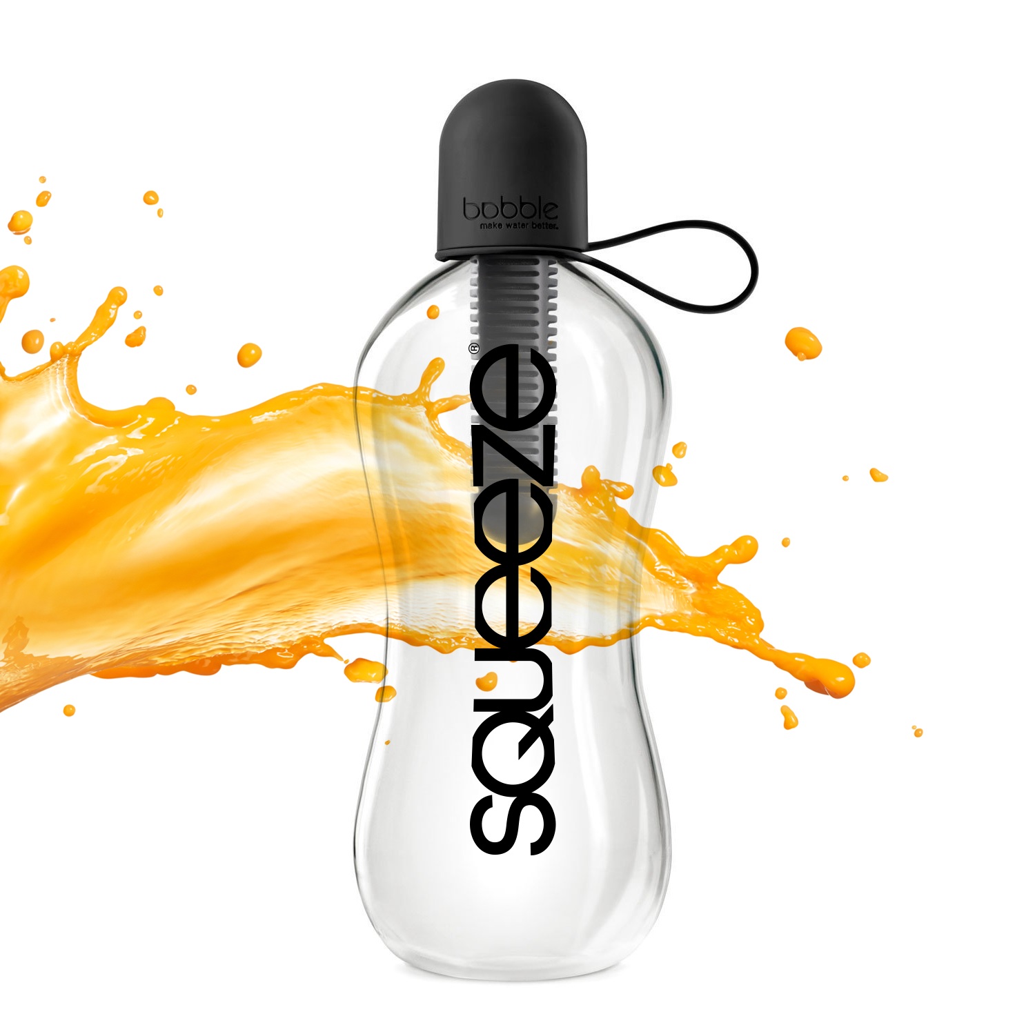
A juice bottle takes a splash of orange across its middle. Down the front runs a black wordmark: Squeeze. In Blur Design’s portfolio image, the letters are close enough to make the name feel like an instruction. It is a small joke with a commercial job. Before anyone reads an explanation, the design has begun to explain the product.
The Oakville, Ontario, studio presents that identity on a bottle, a hat and a shirt. Those applications matter. They turn an abstract proposal into something a client can imagine holding, wearing or handing over a counter. They also introduce the question running through Blur’s work: what happens to a brand once it leaves the designer’s screen?
The answer gets pleasantly specific. A fishing charter gets a nautical identity. An electrical business gets a compact icon. A beauty supplier’s anniversary arrives with gold foil. Alongside its client work, Blur sells neighbourhood-themed clothing. This is a company whose portfolio gives almost as much attention to where a design goes as to how it looks.
A name with something to do
Blur describes Squeeze’s identity as an exercise in manipulating a font. The attraction is economy: a word about pressure gets a closely packed visual treatment. There is enough of an idea to carry onto several objects without requiring an elaborate supporting illustration. The bottle presentation makes that relationship especially easy to read.
That offers a useful way to judge branding work. Ask what the design contributes beyond spelling the name. Does its shape reinforce the product, the mood or the promise? Then examine an application that resembles the actual business. A handsome mark on an empty page has fewer responsibilities than one wrapped around a container.
EZ Electric supplies another variation. Blur’s description says it combined the business’s name into an icon; the project also shows business cards and a hoodie. An electrical contractor and a juice business have different customers, but both examples let a buyer inspect how a compact identity might behave across everyday materials.
The fishing charter and the restaurant
Moby Nick provides the portfolio’s most cheerful name. The project is a rebrand for a local chartered fishing service, which Blur says it wanted to return to its roots through an authentic maritime look. Vintage-style artwork and shirt applications give the presentation a recognisable nautical vocabulary. The name brings the literary wink; the design supplies the atmosphere.
The useful observation here is about specificity. An identity for a charter business can draw meaning from the experience being sold: time on the water, a captain, a boat. For a client reviewing this kind of work, the question is whether the visual references belong to its own operation. Borrowing another company’s sea legs would be a less persuasive move.
Mythos, a restaurant project, has a different assignment. Blur describes a brief that combined elegance with a family-friendly character, extending across the logo, menu and signage. That combination contains a real design tension. A restaurant can look formal enough to feel expensive or casual enough to lose the sense of occasion.
The portfolio’s menu and apparel presentations make the scope tangible. A diner might meet the name outside, read it again at the table and see it on a staff member. Thinking about those encounters together is an actionable lesson for a restaurant owner preparing a brief. List the encounters before deciding how many separate pieces to commission.
Different businesses. Different surfaces. The application belongs in the brief.
When the paper is part of the message
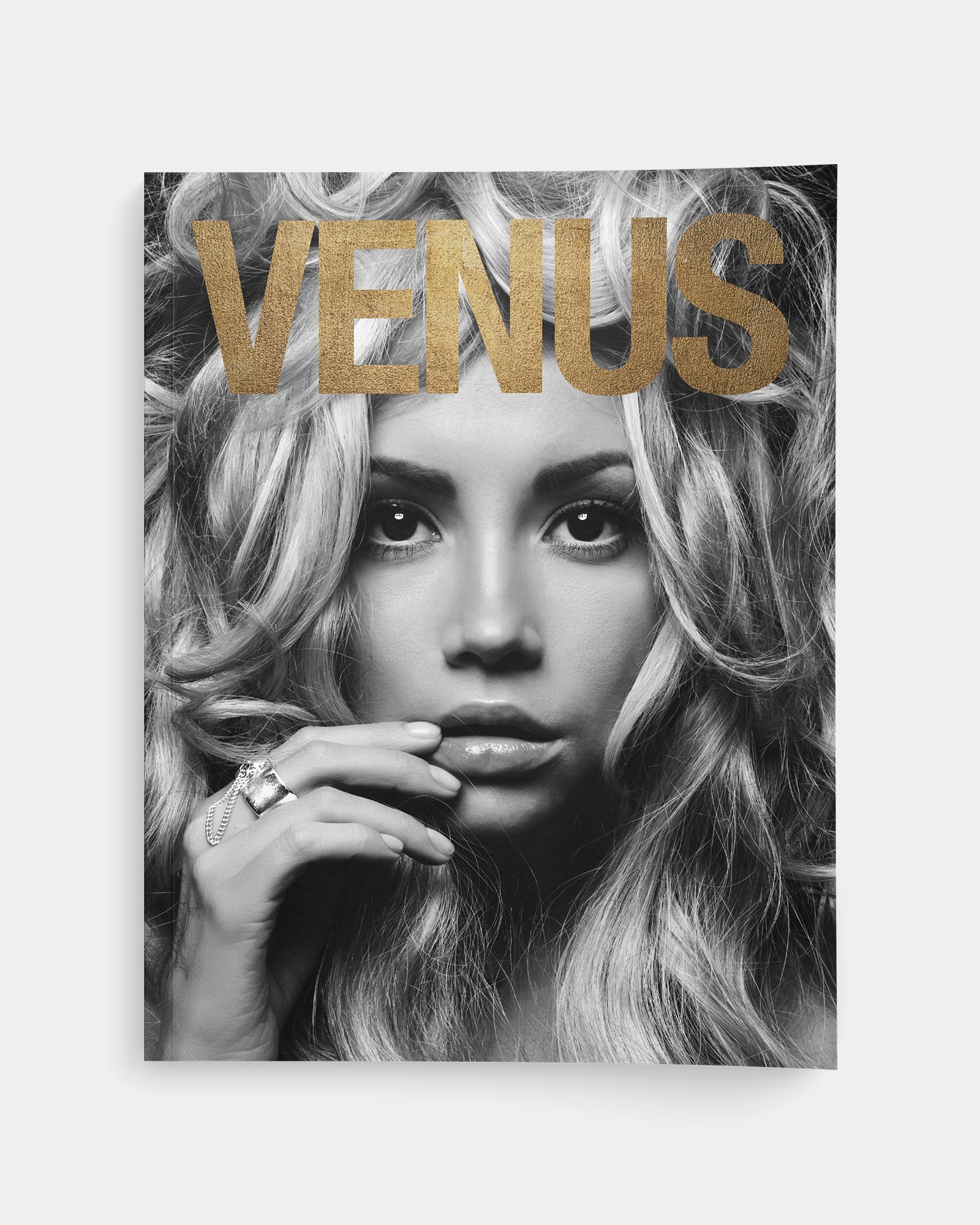
For Venus Beauty Supply’s 40th anniversary, Blur’s account becomes unusually material. The studio says it designed and printed promotional pieces throughout the year, pairing selected paper stocks with gold foiling. The anniversary gave that finish a reason to exist. Gold had a job in the celebration.
The portfolio includes a magazine-style cover with a large gold title over a monochrome beauty image. Its effect depends on the relationship between photograph, lettering and finish. On a screen, the reader sees the suggestion of that contrast. In a printed piece, the paper and foil would become part of the encounter.
For a prospective customer, this is a prompt to discuss production while design decisions are still open. Request a sample of the proposed stock and finish; compare the effect at the intended size. A finish chosen late may force a redesign or a budget adjustment. That is a planning consideration, not a reported problem on the Venus assignment.
There is ice time on the screen, too
The physical work does not exhaust the studio’s range. IceNow appears as a mobile app design project, with phone-interface presentations and accompanying identity material. Blur’s description centres on making the experience of searching for ice time straightforward. It also includes a personal aside: the team calls itself a group of hockey fans.
That detail gives the project some human texture without needing a grand origin story. Familiarity with a subject can help a designer ask useful questions, though it does not replace checking whether an interface works for its users. The publicly presented assignment is design work; the portfolio should be read at that level.
360Active moves into women’s fitness and lifestyle branding. Blur’s presentation uses a lively palette and carries the identity into a book, poster and business cards. Set beside Moby Nick’s vintage maritime styling, it shows a willingness to change visual vocabulary with the assignment. The clients are not all dressed in the same house colours.
A design studio with a shopping cart
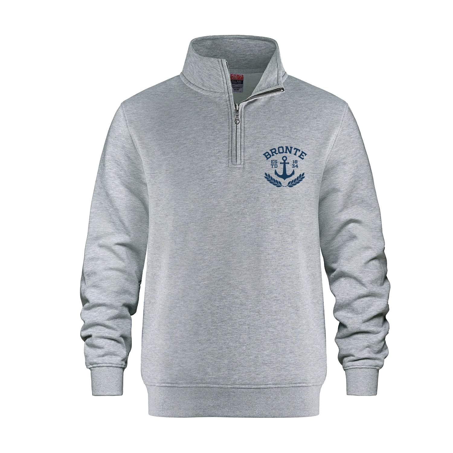
The retail side makes Blur’s interest in merchandise particularly concrete. Its Bronte Harbour collection includes shirts, hoodies, quarter zips and hats. Product names reference a crest, a lighthouse, collegiate lettering and an “Est. 1834” motif. Local identity becomes something a customer can choose in a size.
At the time of review, the live collection listed vintage T-shirts from CA$30, quarter zips from CA$50 and vintage wash hoodies from CA$60. These are starting retail prices for particular garments, not fees for commissioning a new brand. They put a visible price on one part of Blur’s offer: the finished merchandise.
Listed starting prices, checked September 11, 2026. Specific products and variants; not custom design fees.
A separate Bronte Astronomer collection lists a hoodie and T-shirts. The Richmond Hill Lightning storefront reaches into player apparel, fan wear and accessories, with embroidery or fabric decals specified on different products. These stores reveal the ordering details that sit behind the cheerful phrase “branded merchandise”: garment, size, colour and decoration.
They also show two kinds of customer relationship. A business can approach Blur with a creative assignment; a shopper can select an existing product and add it to a cart. The first starts with a conversation about scope. The second starts with a product listing. Both bring visual design into a transaction.
The brief should include the handoff
Blur occupies the broad service territory between a branding studio and a print-and-merchandise provider. Its offer spans identity, web work, printing, displays and promotional products. The commercial appeal is coordination: a client can discuss the visual idea and its proposed uses within the same relationship.
That breadth has local alternatives. Oakville’s Kiwibcreative also advertises branding, web and print-plus-promotion design. So a long services menu alone is a weak reason to choose an agency. Blur’s more useful evidence is the work itself: the way an anniversary affects a finish, or a fishing business affects an illustration.
“Everything stems from design.”
Blur Design, describing its services
The studio describes its customers as ranging from small local businesses to educational and charitable organizations and national corporations. Its LinkedIn company profile lists 1998 as the founding year. The portfolio provides a more immediate introduction than longevity does: prospective customers can look for an assignment resembling the job on their own desk.
A sensible brief would identify the audience, the first few places the identity will appear and the quantities required for physical pieces. Ask for the proposed deliverables, revision process and production responsibilities to be written down. For printed work, make approval depend on the relevant proof or sample. Those are buyer-side practices suggested by this mix of services.
The approach is most useful when several applications need to agree with one another. A customer who only needs an exact reprint of finished artwork has a narrower purchasing decision. A business seeking extensive software engineering should define that requirement separately from visual interface design. Matching the assignment to demonstrated work keeps the conversation useful.
Blur’s portfolio rewards a simple habit: look past the isolated logo. Read the menu, inspect the bottle, consider the paper and picture the shirt being worn. That is where the studio’s proposition becomes easiest to judge. A brand has places to be. The design needs to arrive ready.
Take a closer look
Browse the work, explore the collections or get in touch.