The sailor is smoking a pipe. Above it, the name Bender’s fills a whiskey label in tall, insistent letters. There are stalks of grain, a whale and enough ornamental linework to suggest that someone enjoyed making this. Look closer, though, and the decoration has an address: Treasure Island, in San Francisco Bay. The bottle’s personality came from somewhere.
That is a useful place to begin with Okay, the Oakland design studio led by Carl Bender. In a trade that can turn almost any brief into a discussion of adjectives, this particular project offers something pleasantly solid. An island. A former Navy brig. A designer who was also helping make the product. The visual idea had a life outside the presentation.
A place before a palette
Bender and Christopher Cohen launched their whiskey company in 2013. In a later interview, they described considering more than 50 names before returning to Bender’s. It was a surname with a conveniently boozy second meaning. It also made the venture personal: the designer would see his own name every time he looked at the bottle.
The nautical imagery had an equally concrete origin. Their Treasure Island base occupied a former Navy brig. Bender lived in Oakland and Cohen in San Francisco; the island was a meeting point between them. A whale and a weathered maritime sensibility gave that geography a recognizable form. This was a story they could tell without inventing an ancestral sea captain.
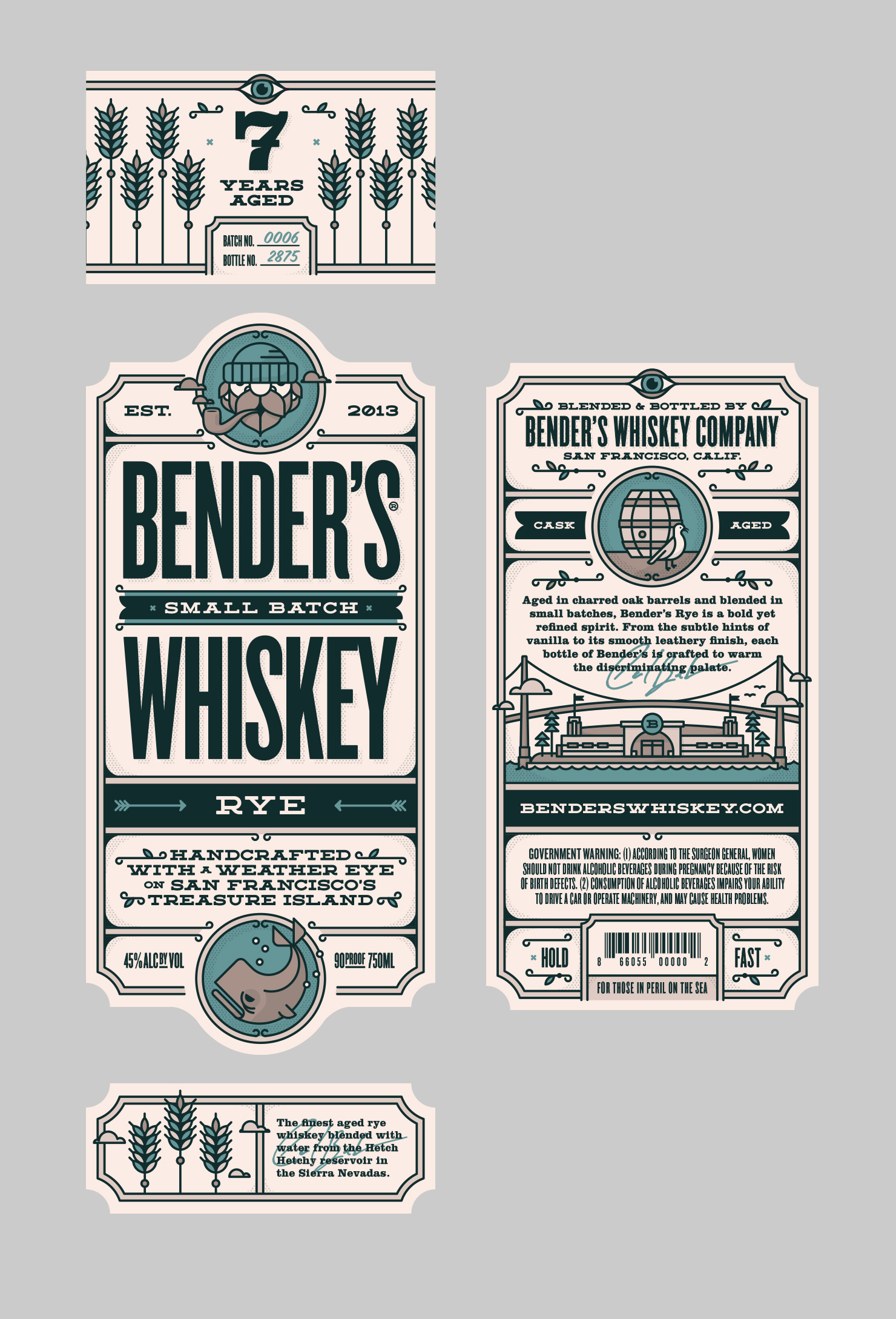
Okay’s published case study explicitly credits the studio with developing the seafaring graphics. It reports that the first batch sold out within eight months, alongside distribution in California, Oregon and Washington, D.C. Treat that as the designer’s account of the launch. The packaging belongs in the story of the business; assigning the whole result to the packaging would require a different kind of evidence.
What the pictures do establish is a coherent set of choices. The large lettering catches the eye. Smaller illustrations reward a second look. Grain and place supply information as well as decoration. A buyer can begin to understand the product before turning the bottle around. For someone commissioning an identity, that is a more useful ambition than asking for a brand to feel “authentic.”
The studio is small. The assignments travel.
Okay’s public description centers on Bender and an established network of creatives working across print and digital projects. His Behance biography calls it a one-person design shop. The operating idea is easy to grasp: a recognizable creative lead, with collaborators contributing to particular assignments.
One visible example is the Fireside Box Set for Dave’s Coffee. Illustrator Amit Botre credits the spot illustrations as a collaboration with Bender at Okay. Another comes from music: the credits for Lotus’s 2014 Nomad remaster name Carl Bender and the studio’s historical web address for art direction and design. These are specific working relationships, each attached to something people could hold, open or buy.
Okay sits in the commissioned-design part of the market. Its offering is expertise applied to a client’s problem: identity, illustration, printed materials and digital design. A prospective buyer is choosing a creative working relationship. The sensible comparison is with other independent designers and boutique studios, taking into account who will actually make the work and how collaborators will be involved.
“Be tough on standards and easy on people.”Carl Bender, on his design principles
Bender’s broader portfolio helps explain the range behind that proposition. It also deserves careful reading. Agency collaborations, a graduate project and his later work at Esri appear alongside commercial identities. Those are different kinds of experience. A good portfolio lets a buyer inspect the contribution, then ask how that experience fits the next assignment.
Try fitting the idea into fifty pixels
For The North Face, Bender worked with Tomorrow Partners and design director Katie Heit Gardner on icons explaining technical product features. The available space was no larger than 50 by 50 pixels. The team explored several visual directions before choosing a single-color approach with a consistent line weight. The resulting collection contained more than 80 icons, used on the website and product materials.
One color. One line-weight approach. Many technical features to explain.
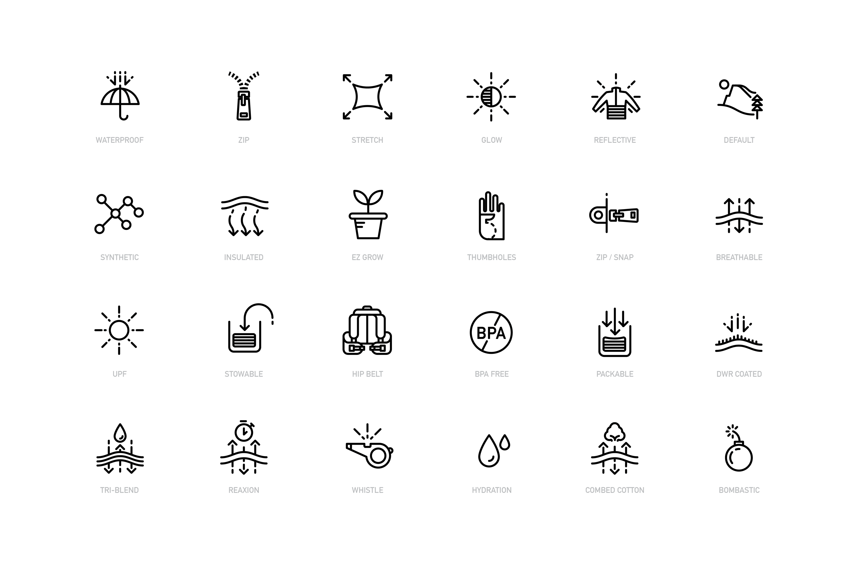
The contrast with the whiskey label is instructive. A label invites some lingering. A tiny product symbol has to survive compression. The useful continuity is the attention to where the design will be encountered. Copying the maritime ornament would miss the lesson. Copying the habit of defining the viewing conditions would get much closer.
Ask the people who have to use it
In Bender’s Esquire project, the audience was legal professionals handling sensitive files. Working with product lead Espen Tuft and strategy lead Amanda Gross, the team interviewed prospective users, built working prototypes and tested them with selected members of the audience. A minimum viable product reached a beta group at Bay Area firms. The final phase included brand guidelines and a UI design library.
That sequence matters. Interviews gave the team something to design against; prototypes made the proposal usable enough to examine. The finished visual rules came with experience of the product. For a client, the practical question is whether the engagement gives users a chance to reveal a problem while the design is still easy to change.
A different kind of translation appears in Bender’s work for The Bay Lights. Leo Villareal’s original installation used 25,000 white LEDs on the Bay Bridge. Bender’s identity and communication materials had to represent a moving public artwork in static forms. The portfolio shows a restrained palette and applications spanning a website, posters and a booklet. Here, the supporting design had to help people approach an experience much larger than itself.
The label could not reopen the bars
Bender’s whiskey venture also supplies a useful limit to the branding story. In 2023, the partners told 48 hills that they had lost their distributor before the pandemic. Their concentration on restaurants and bars then left them exposed when those customers shut down. The business went dormant for a couple of years.
The same report describes another gamble: unusually heavily charred barrels that Bender said cost three times as much as regular ones. Early aging produced a woody spirit that worried the partners; fruit flavors emerged later. These were whiskey-production costs and decisions, separate from Okay’s design work. They show how much of a branded product’s fate sits beyond its appearance.
For a buyer of design services, the implication is straightforward. Put the commercial problem in the brief. If customers cannot find the product, distribution needs attention. If they cannot understand a feature, communication may be the obstacle. If a service is confusing to use, test the interaction. These problems can coexist, but they require different work.
Bring a true detail to the first meeting
The most portable idea in Okay’s work is a modest one: begin with something specific enough to make choices possible. A location with a history. A fixed number of pixels. A lawyer’s actual working habits. Each gives the designer a way to decide what belongs and what gets in the way.
Before commissioning a similar project, gather the places where the design must appear, the people who must understand it and the facts that make the business particular. Ask to see the proposed identity in those conditions. A beautiful isolated mark is only the beginning of that conversation.
Back on the whiskey label, the sailor still has his pipe. It is a small joke attached to a real place, doing a real job. That seems an entirely reasonable thing to ask of a design studio called Okay.
Look closer
Explore Carl Bender’s project portfolio, Okay on LinkedIn and Bender on Behance. Follow the bottle through Bender’s Whiskey’s own story, the founders’ naming interview and the 2023 anniversary feature.