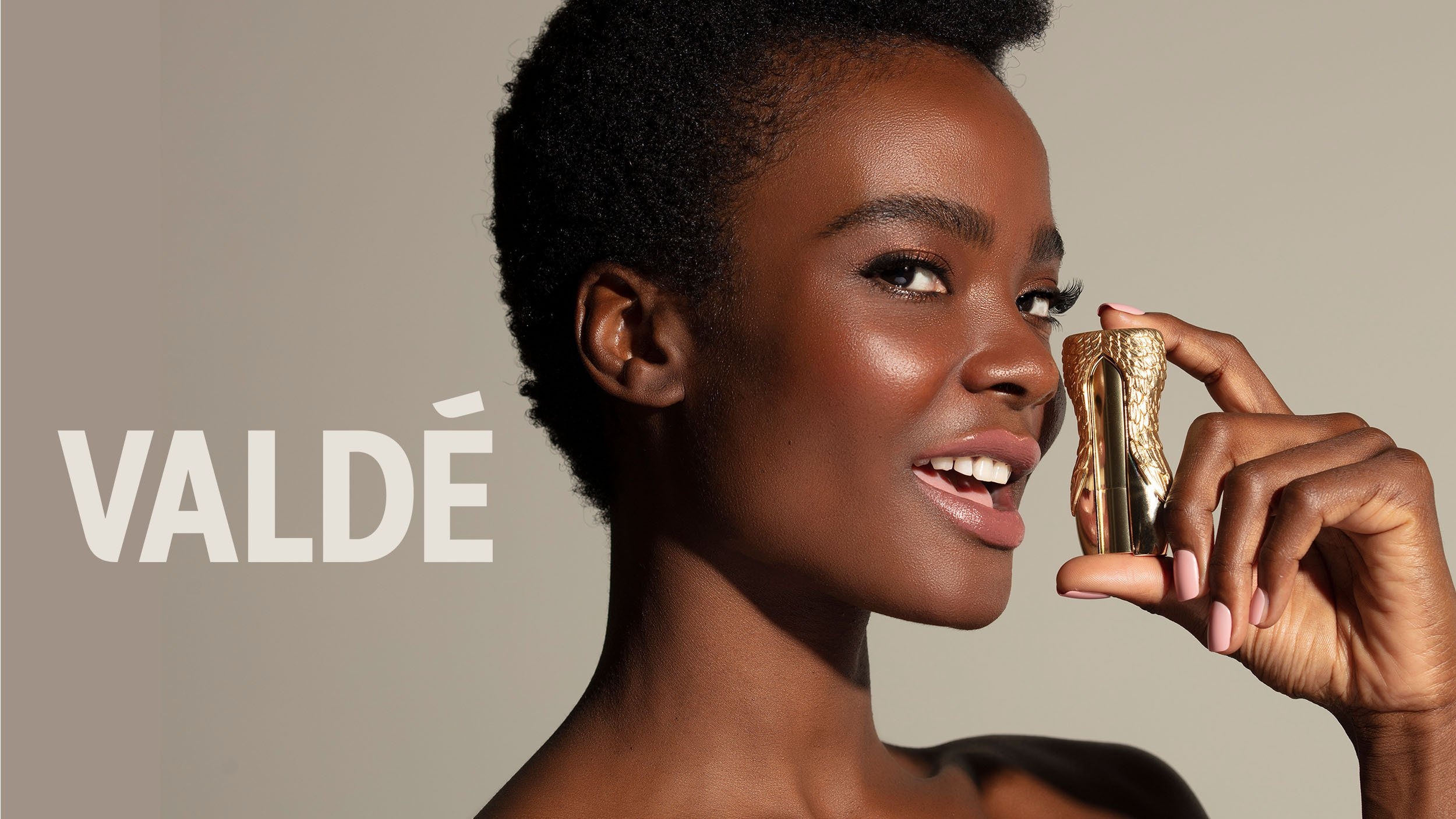
A lipstick case can have ambitions. In Winter Design Studio’s portfolio, Valdé appears as a gleaming, sculptural object held beside a model’s face, looking thoroughly unwilling to disappear into a bathroom drawer. The premise is straightforward: make lipstick something worth keeping. For a design studio, that changes the assignment. The package has to carry an idea about permanence before anyone reads the product description.
Winter worked on Valdé from its beginnings, shaping strategy, narrative, identity, creative direction, product design and packaging. That breadth explains the company more clearly than the usual parade of client logos. This is a business concerned with how a brand becomes an object: what it looks like, how it communicates and how the intended design survives production.
Founded in 2010, according to its LinkedIn profile, the Los Angeles studio works across beauty, wellness, beverages and lifestyle products. Its portfolio moves from Florence by Mills cosmetics to Chloe wine, from period-care brand Nixit to Disney character collaborations. The recurring subject is recognition. What makes a shopper understand the product, remember it and recognize its relatives?
Growing up without changing your name
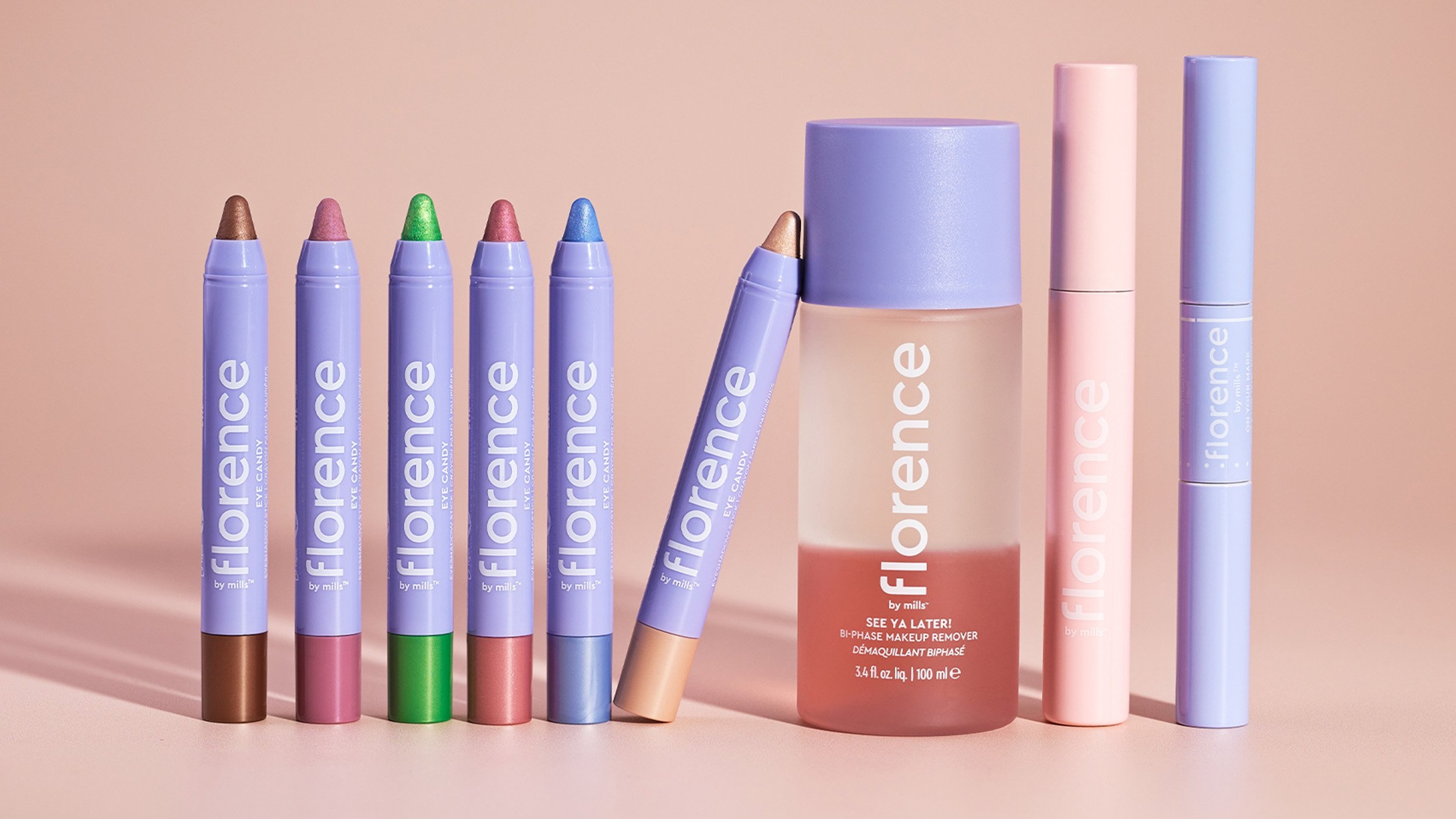
Florence by Mills offers a particularly useful test. Created with Millie Bobby Brown, the brand needed room to evolve as its founder and audience matured. Winter describes an assignment to develop that identity while preserving its familiar character. The practical response included color and iconography that made the product range easier to navigate, alongside a visual language capable of accommodating more products.
Look at the lineup: lavender bodies establish a family resemblance; differently colored ends distinguish individual eye pencils. The effect is cheerful, but it also has a job. A collection must remain legible when the shopper is choosing between several small objects. Packaging operates at the scale of a whole range and at the scale of a hurried glance.
Winter reports more than five years of continuing support for Florence, including packaging and photography direction. The lesson for another brand is specific: decide which visual signals deserve to survive before introducing new ones. A refresh can make room for expansion without asking existing customers to learn the brand all over again.
A darker kind of brand refresh
KVD Beauty posed a related question with an entirely different palette. Winter’s account describes a brand seeking a broader audience while retaining its distinctive edge. The studio used a refined packaging system, tonal black finishes and a more luxurious visual treatment. Darkness remained part of the appeal.
That is an instructive creative decision. Broadening a brand can tempt a company to remove whatever seems difficult or unusual. In this case, the existing aesthetic supplied the direction for the change. The challenge was to make its expression more considered. A familiar characteristic became something to develop.
Other beauty projects begin further upstream. Winter says it developed Saint Jane’s strategy, identity, packaging and visual language from the ground up. For Olga Lorencin, the assignment centered on bringing the aesthetician’s expertise and personal approach into the brand story. For Toty, the studio describes adding warmth, color and optimism while maintaining the identity’s scientific credibility.
Together, these examples suggest an approach based on the particular brief. A botanical skincare brand, a dark cosmetics identity and a sunny SPF range should communicate differently. The useful consistency sits in the questions being asked: whose product is this, what makes it distinctive, and which choices will make that visible?
The people between the idea and the factory
Co-founders Bahia Sommers and Chad Sommers both hold the title of creative director. Winter describes Bahia’s work as beginning with strategy and storytelling, before those ideas become identities, products and experiences. Chad’s biography emphasizes more than two decades of product design and development, including experience with beauty, consumer products and entertainment companies.
The pairing matters because packaging is full of decisions that cross professional boundaries. An identity leads to a shape; that shape requires material and production choices. Winter’s public description places manufacturing knowledge inside its creative practice, with attention to structural concepts, finishes and the practicalities of getting a product made.
“We begin with the idea.”
Winter Design Studio, describing its approach
Nixit makes that connection tangible. As the business expanded beyond its original menstrual cup, Winter’s work included packaging, custom bottle development, manufacturing support, point-of-sale displays and creative direction for photography. A widening range needed to feel coherent across several kinds of product and several places where customers would encounter them.
For a buyer considering the studio, this is a useful scope check. A business bringing a physical range to market can commission work that connects identity with components and retail presentation. The service becomes especially relevant when separate product decisions need to express one recognizable brand.
Connected decisions, drawn from the studio’s service offering.
What the client is buying
Winter’s commercial offering is creative work for other businesses. Its services include branding, product development, seasonal collections, rendering, photography direction, printed marketing and visual merchandising. Continuing client support, visible in the Florence relationship, extends the work beyond a launch. The business model is best understood as commissioned services with scope for an ongoing creative relationship.
The studio uses 3D visualization both during development and for finished product imagery. It describes working with manufacturers on custom components that fit a client’s brand and budget. Renders help stakeholders see a proposed object before production; they can also serve product pages and retailers. Smaller photography shoots can happen in-house, while larger productions involve outside specialists.
The practical takeaway for a prospective client is to bring the whole product problem to the brief. Include the component, the package and the images that will introduce it. Winter’s offering connects those decisions. Its place in the market overlaps specialist packaging agencies, product-development consultancies and internal creative teams; the attraction is coordination across those disciplines.
The compact with an egg-carton cousin
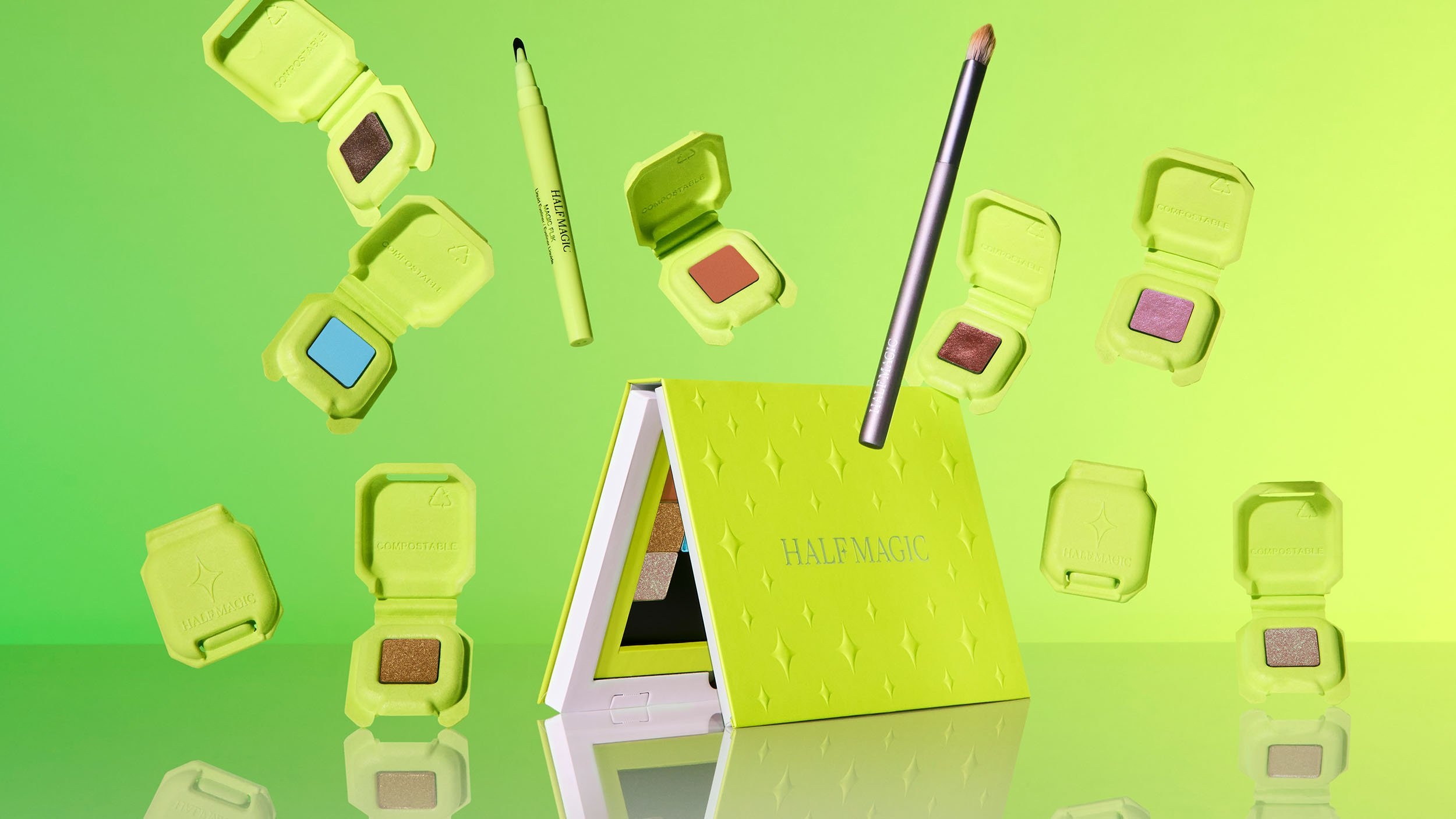
Half Magic adds a material twist. The beauty brand’s vividly colored Paperfoam packaging appeared in Dieline’s 2023 coverage of its Plastic-Free Innovation of the Year award. The article attributes the award to Mythology and Paperfoam and lists Chad Sommers among the project contributors. The credits describe a collaboration involving multiple specialists.
The material, based on ingredients including potato starch and paper fiber, has a visual kinship with an egg carton. In this setting, it becomes bright green makeup packaging. The appeal comes partly from allowing an unfamiliar beauty material to look like itself. A soft-looking surface can communicate a different set of priorities from a polished conventional compact.
The same report raises a commercial complication: moving toward plastic-free packaging can increase production costs. For a brand considering a similar direction, the implication is to settle the material ambition and budget together. A surface selected for its character also requires acceptance of its behavior. The article describes dents and makeup marks as part of the proposition.
Fashion enters the wine aisle
Winter’s beverage work gives the article a welcome change of scenery. Chloe takes its cues from fashion, with a bow anchoring an understated identity. The studio describes bringing that sensibility to premium wine and says the resulting brand has endured for more than a decade. The visual proposition is easy to grasp: dress the bottle with a recognizable signature.
Elsewhere, the references change. Paleta’s wine-cooler design borrows the mood of fruit popsicles and summer parties. Vintea’s wine-and-tea blends received light, bright launch imagery. Lemonade Stand, a wine-based alcoholic lemonade from Main & Vine, combined branding with art direction for a national launch.
There is specificity even in the smallest graphic device. Winter’s Benziger entry explains that a foil-printed illustration represents the winery’s biodynamic story. Tribute uses a family emblem to convey the Benzigers’ shared history. These are compact storytelling assignments: compress a place, a process or a relationship into something that fits on a bottle.
Mickey ears, midnight blue and a donated identity
The entertainment projects reveal a playful side of the same discipline. Winter’s Disney x Johnson & Johnson bandage packaging used black-on-black printing and a UV treatment to bring out Mickey Mouse’s ears. Its Hello Kitty portfolio entry describes a pop-up feature for a palette celebrating the character’s 40th birthday. Familiar figures still leave room for decisions about structure and finish.
A Marc Jacobs Beauty holiday collection from 2014 found its organizing idea in one nail-polish shade, Midnight In Paris. Winter’s account connects the shade to the Parisian sky during Jacobs’s time there. A color became the starting point for a collection, giving individual pieces a shared reference.
Away from the retail shelf, Bahia Sommers donated logo and identity work to My Friend’s Place. The Los Angeles nonprofit identifies her as a founder of Winter and a Safe Haven volunteer. It is a concrete glimpse of the people behind the portfolio: someone already involved in the organization contributed the skill she practiced professionally.
For anyone borrowing a lesson from Winter, start with that attention to the particular subject. Florence needed navigable growth. KVD needed to preserve its edge. Valdé began with an object meant to last. The useful work happens when those intentions become decisions a customer can see: a colored pencil end, a black finish, a case worth keeping.
Explore the work
Visit Winter’s project portfolio or explore its services. Follow the studio on Instagram and LinkedIn.
Further reading: Dieline on Half Magic’s packaging; My Friend’s Place on its new identity; Charlie Sin’s Florence photography.