A headphone can begin with a frequency chart. This one began with Japanese robots. When designer Eneri Abillar worked with Vapor Studio on Skullcandy’s Mix Master headphone, the DJ whose name it carried wanted something drawn from Japanese robots of the 1960s, 1970s, and 1980s. Abillar sketched Mix Master Mike as a robot, then worked the idea toward a helmet-like form. Eventually, the design needed a foam model you could hold. The mood board had acquired dimensions.
That journey is a useful introduction to Vapor Studio, a California creative agency whose work moves between the thing being sold and the story around it. Its history includes headphones and footwear; its current website foregrounds drinks, wellness, and eyewear. Across those categories, the interesting question stays fairly constant: what should a brand feel like when somebody encounters it away from the presentation screen?
The answer might live in a silhouette, a package, a color, or a line of copy. Vapor’s portfolio makes the case for considering those decisions together. For a company launching a consumer product, that can mean bringing designers into the conversation while the object and its position in the market are still open to discussion.
A robot on the drawing board
Abillar’s account of the Mix Master project makes the division of labor clear: he was the lead designer working for Vapor, in collaboration with Skullcandy and Mix Master Mike. Once the DJ selected the helmet concept, drawings became more precise. Abillar sculpted a full-size model, then used measurements from that physical object to develop the technical drawings. He says the final production form remained close to the original model.
The sequence matters. A sculpted model gives people something to turn, inspect, and argue over. It brings a drawing into the space that a head, a hand, or a hinge must occupy. The practical lesson is to choose a prototype that answers the next difficult question. Sometimes that means putting down the mouse and picking up a piece of foam.
- 01Robot
reference - 02Helmet
sketch - 03Full-size
foam model - 04Technical
drawings
The finished headphone also had to work in a DJ’s world. Tyll Hertsens’s November 2011 review, now hosted by Stereophile, described a mute button and separate cables for phone listening and turntable use. He listed the price at $299. That is a concrete measure of where the product sat commercially: a considered purchase with functional expectations attached. The retail price describes the headphone, not the agency’s design bill.
Boots before brand decks
Vapor’s founder, Ricardo Camargo, arrived with experience inside a consumer brand. A 2014 announcement of his appointment to SponsorsOne’s advisory team describes his earlier work at Burton Snowboards, managing the boot line and launching Gravis footwear. He founded Vapor in 2003. A later design-panel biography put youth lifestyle consumers at the center of his experience.
That background helps explain the agency’s product vocabulary. Footwear involves questions of shape, materials, construction, identity, and audience before anybody writes an advertisement. A brand consultant with that experience has reason to care about whether the product supports the promise. A campaign can introduce a shoe. The shoe gets the longer conversation with its owner.
Vapor’s adidas Neo assignments offer another view of that habit. Abillar describes designing footwear for the label while working with adidas designers and directors. Speed made precise hand sketches especially important. Many silhouettes drew on traditional adidas uppers, with changes in materials, construction, and detail. The assignment called for knowing what to preserve as well as what to change.
For a team buying design, that distinction is useful. A brief can identify the familiar cues customers already understand, then name the parts that need development. Otherwise, “make it fresh” can become an invitation to change everything at once. Vapor’s recorded Neo work suggests a more disciplined conversation about which elements carry recognition and which can make a product feel new.
A can with somewhere to go
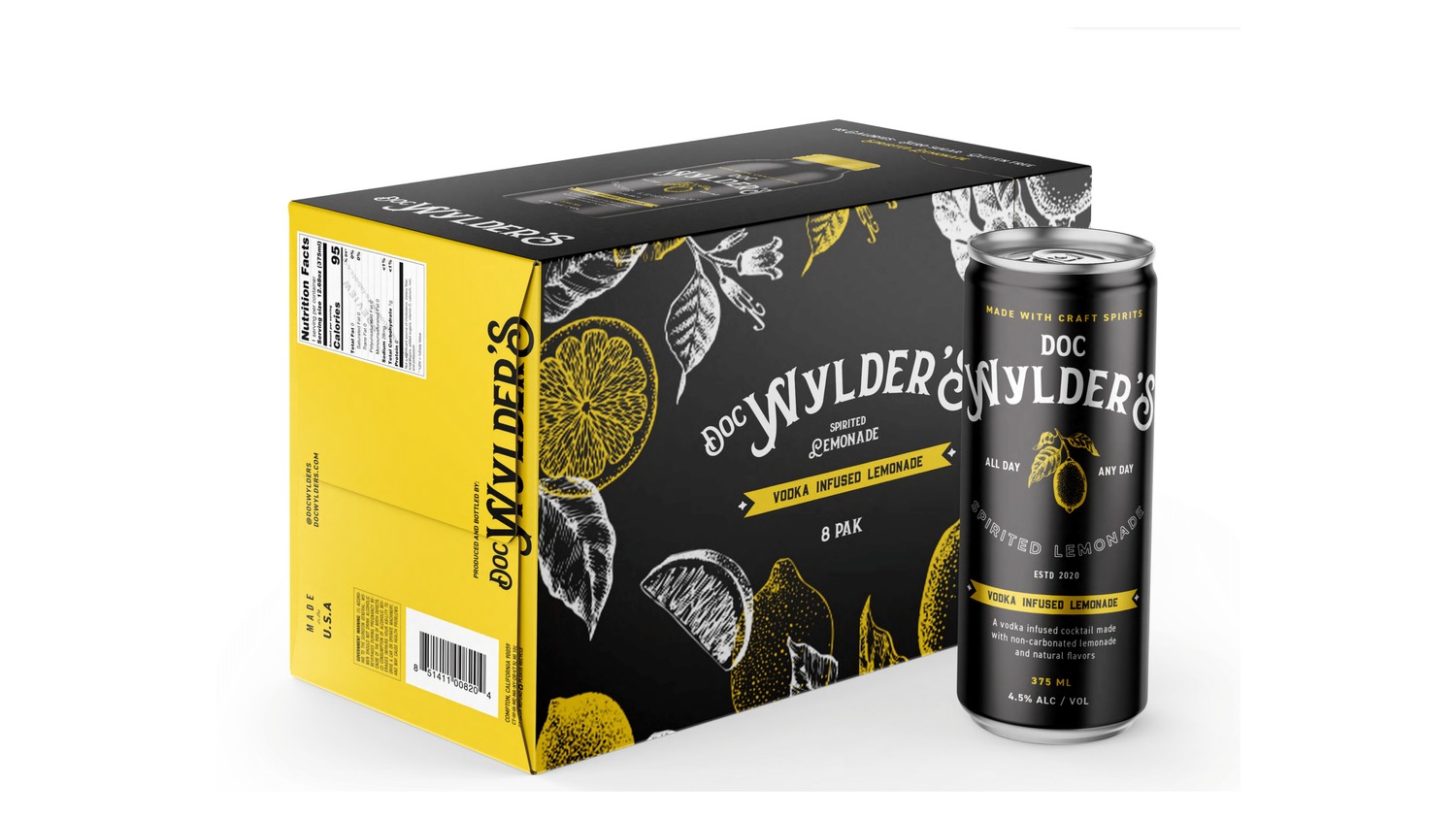
On Vapor’s website, Doc Wylder’s is surrounded by water, sunshine, and people enjoying the kind of afternoon that makes calendars seem unnecessarily strict. The packaging presentation puts a dark can beside a yellow-and-black carton, with decorative lettering and illustrated fruit. The lifestyle imagery gives the drink an occasion. The package gives that occasion something a shopper can recognize.
Read as creative work, this is a compact demonstration of how a consumer brand acquires a setting. A product image answers what is in front of you. A river scene suggests when you might want it and who might be there. The two can support each other without requiring every advertisement to retell the brand’s entire history.
Smithville Distillery takes a different route. Its portfolio sequence uses a brick wall, a water tower, dark backgrounds, and whiskey imagery. The creative material emphasizes a particular place. Where Doc Wylder’s offers the feeling of a loose summer afternoon, Smithville works with local texture and a more restrained visual register. Those are readings of the designs, not claims about either campaign’s sales performance.
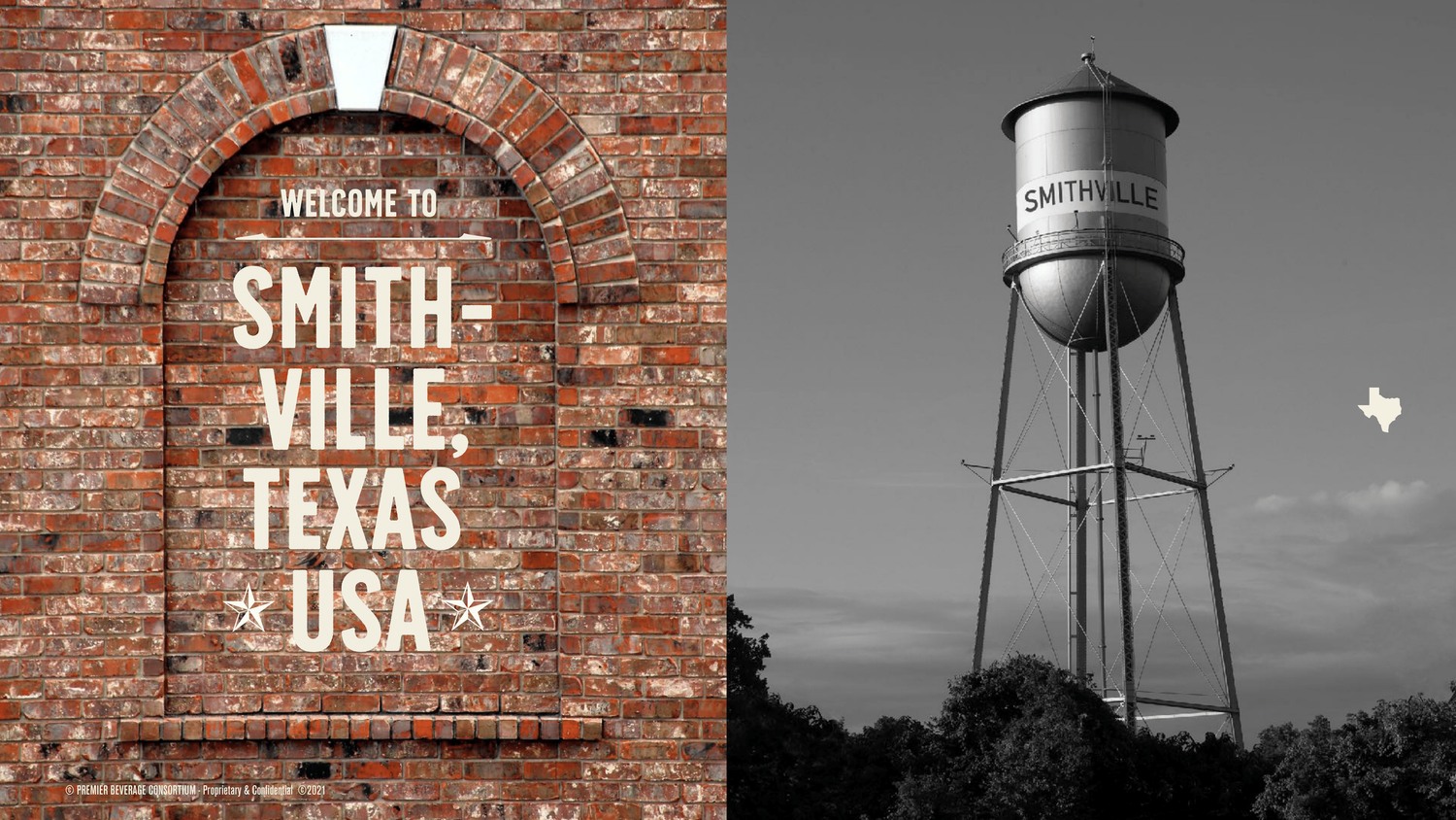
The comparison is helpful because it shows why an agency’s own house style should not dominate every assignment. Both projects concern drinks, yet they use different associations. A founder can borrow that exercise: put two proposed creative directions next to each other and ask what each implies about the buyer, the occasion, and the product’s place on the shelf.
The color has to travel
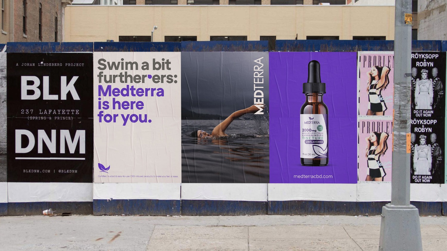
Medterra’s portfolio provides another test. Purple and cream recur across packaging, a desktop website presentation, and outdoor advertising mockups. The scale changes; the visual connection remains easy to see. On a bottle, space is scarce. On a large poster, the same palette can become an attention device. A useful identity needs enough flexibility for both jobs.
The work also shows why “brand design” can reach beyond choosing a logo. Type size, product photography, background color, and the relationship between message and pack all affect recognition. A website can accommodate detail that a passing pedestrian will never read. The challenge is deciding what survives as the viewing time shrinks.
VonZipper’s work is more mischievous. Bright yellow words sit over lifestyle photographs, including a surfer beside a car and a figure leaning back into the sun. The repeated verbal treatment gives the images an attitude as well as a color. It suits a portfolio in which the person using the product often matters as much as the isolated product shot.
Vapor’s public client list extends to Nike, Oakley, Logitech, Electra Bicycle, W Hotels, and Pepsi, among others. The list gives a sense of market range. The individual projects offer a better way to judge the work: look for the actual design decision, the intended audience, and the places where the idea had to operate.
The name that sent everybody back
One less photogenic part of the agency’s work offers a particularly useful lesson. In a Haloo customer case study, Camargo describes naming projects delayed by communication with clients’ legal advisers. Some candidates initially received approval, only for later conflicts to force a restart. Vapor began using Haloo’s search tool to screen candidates before presenting them.
“Naming is hard.”
Ricardo Camargo, in Haloo’s customer case study
The change moved a difficult check earlier. The cost described was wasted effort and delayed progress. For a project manager, the general principle travels well: identify the decision that could invalidate the next stage, then schedule that check before the team becomes invested. The prettiest presentation cannot make a rejected option usable.
Buying decisions, not decoration
Vapor fits the market as a business-to-business creative consultancy for consumer-facing brands. Its stated capabilities run from consumer insight and strategy through identity, communication, product architecture, and go-to-market work. Its public descriptions emphasize designers working with strategists and content teams. That is an account of its working structure, rather than a claim about office perks or employee satisfaction.
The alternative for a buyer might be a specialist identity studio, a product-design consultancy, an integrated agency, or an internal team. Which route makes sense depends on the decisions still available. If the object, audience, and distribution are fixed, a tightly scoped packaging or communications assignment may be enough. If those choices are unsettled, a broader team has more to contribute.
That breadth requires an equally clear brief. A prospective client can name the audience, list the deliverables, set a budget, and identify who approves changes. It helps to distinguish the design fee from research, prototypes, production, photography, and media spending. These are purchasing considerations for this kind of engagement, not a description of Vapor’s contract terms.
The approach has a practical limit: designers need access to the decisions they are being asked to improve. When nobody can alter the product, review a candidate name promptly, or agree on the customer, more creative options can simply produce more meetings. Settle the authority alongside the assignment.
Vapor’s most instructive work makes that collaboration visible. A DJ’s reference becomes a form. A familiar shoe gets carefully chosen changes. A can and a river scene start speaking the same language. For a client, the useful ambition is concrete: leave with choices that still make sense when the presentation ends and somebody picks up the product.