A phone floats between two cliffs. On its screen: a date, an airport, a flight number, a gate, a seat. The scenery is theatrical; the information is almost aggressively ordinary. That tension makes Hosanna’s StayFly presentation a useful introduction to the studio. The rocks win the first glance. The boarding details have to earn the second.
Hosanna works in the space between those two glances. Its trade is digital design: the appearance, organization and movement of software that people must understand well enough to use. Across its public portfolio, cars, bank accounts and clothing collections receive the same basic invitation: look at this, then know what to do with it. Browse the studio’s work.
That sounds straightforward until visual ambition starts competing with the task. Founder Val Pavliuchenko has a pleasingly destructive way of describing his response. In a June 2026 interview, he said: “I try to ruin the beautiful version early.” Remove the cinematic treatment. Shrink the screen. Place the design beside an everyday product table. See whether the idea survives.
“I try to ruin the beautiful version early.”
Val Pavliuchenko · Founder, Hosanna
A studio that sells the whole screen
Hosanna’s company profile puts creative direction, research, branding, interface design, animation, 3D graphics and development on the same service list. Its stated reach extends across mobile devices, computers, televisions and automotive interfaces. The commercial proposition is broad: a business can bring a product problem that crosses visual identity and interaction, rather than treating each discipline as an isolated assignment.
The buying audience is a product team or brand commissioning design work. The ultimate audience is whoever taps the result. Those groups have different tests. A commissioning team needs a direction it can develop and present; an end user needs an intelligible action. Hosanna’s positioning makes the relationship between the two the subject of the engagement.
Its founder’s professional portfolio lists a product-design role at Milkinside and a founder and design-director role at Hosanna. That distinction matters when reading his career. Experience acquired inside another studio belongs in the account of his expertise; it does not automatically turn that studio’s customers into Hosanna customers. His public work supplies a more useful picture of his interests: interfaces across industries, accompanied by a recurring concern for visual identity.

The ticket gets top billing
StayFly App Design, published in September 2023, gives the studio’s pitch a concrete setting. Its stated ambition is a shorter journey from searching for a flight to buying a ticket. The project is credited to Pavliuchenko and Ivan Pepchuk. Treat it as a design presentation: a proposal for how travel software might communicate.
In the pictured itinerary, flight number, gate and seat share one compact group. The airport names carry more weight than their supporting labels. A vertical sequence gives the day a readable order. The surrounding rock faces do something else entirely: they turn a functional screen into a piece of travel advertising. The composition lets the viewer inspect utility inside an image designed to attract attention.
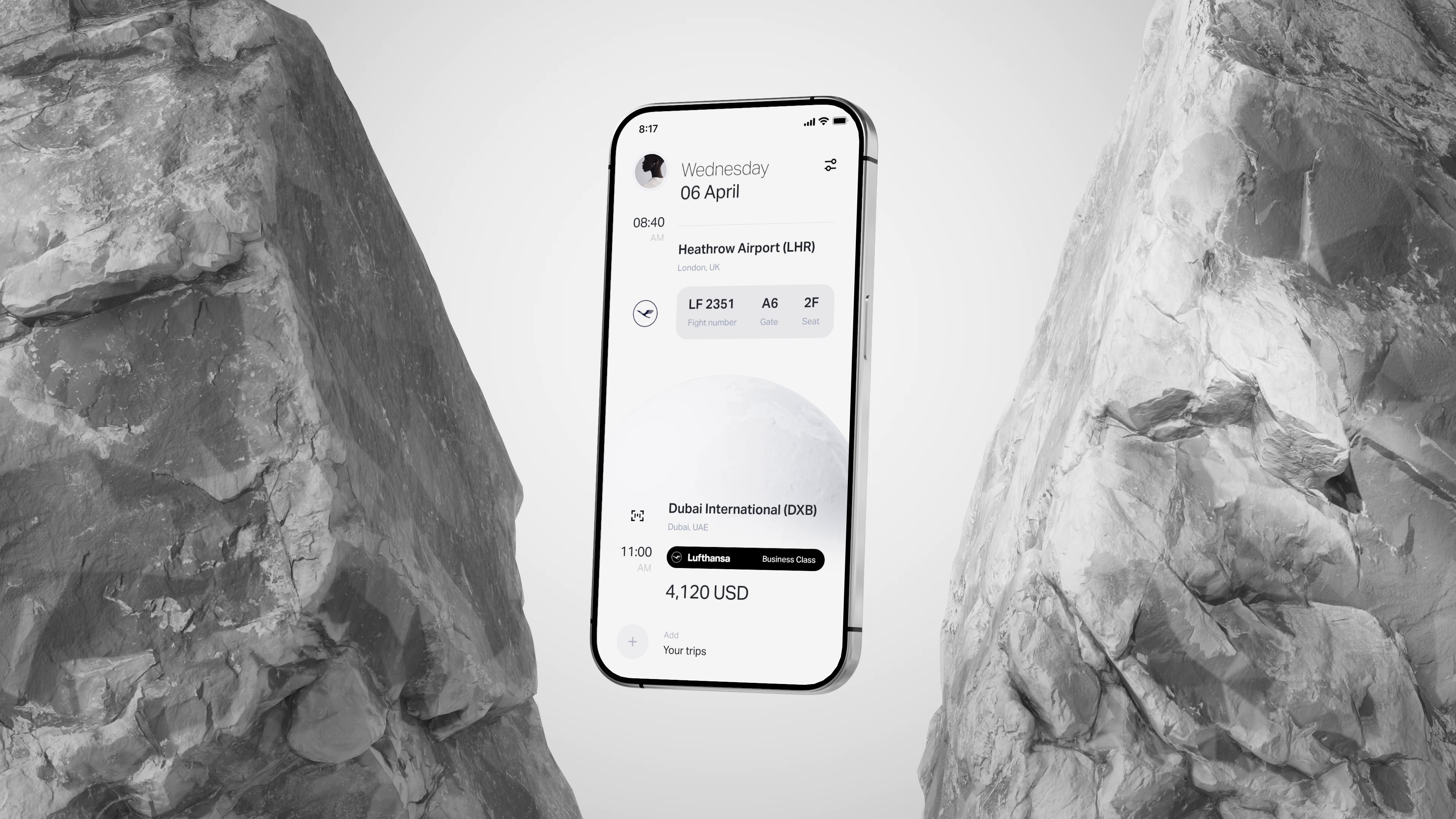
The practical lesson for a reader is to separate those jobs during a review. Study the presentation as a piece of communication, then study the interface as a set of decisions. Can you find the departure information without admiring the landscape? Would the grouping make sense with a different itinerary? Those questions turn looking at a portfolio into a useful exercise.
Travel is only one stop. The August 2023 Crystal Bank App Design entry places mobile banking in the portfolio, again with Pavliuchenko and Pepchuk credited. Beside StayFly, it shows the studio pitching its capabilities across distinct kinds of transactions. Buying a trip and navigating an account both require an interface to organize choices, although the information and consequences differ.
A showroom is not a dashboard
Hosanna’s automotive work offers another useful pairing. [NEW] Audi Website, published in September 2023, is a website presentation centered on the experience of encountering the vehicle. HMI Car Navigation, published the previous month, puts the interface itself inside an automotive setting. Both entries credit the same two collaborators.
Read together, they ask different questions. A vehicle website can invite someone to linger over an object; a navigation interface must explain where someone is going. The distinction helps explain why “automotive design” is too loose a description of the work. The surface, the context and the action matter. A persuasive promotional sequence and an intelligible navigation screen need separate judgments.
The studio’s Website Audi AG video also makes motion available for inspection. That is particularly useful for readers accustomed to reviewing still images. A still can show where an element sits. A sequence shows how attention travels between elements. Watch for what the movement explains, what it merely decorates and how long it asks the viewer to wait.
The brand names here identify portfolio subjects. They should be read as examples of design work, without assuming an Audi commission or a production deployment. That leaves plenty to discuss: the subject chosen, the interaction presented and the relationship between an attractive vehicle and the screen used to explain it.
Fashion supplies a different rhythm
The December 2023 Louis Vuitton portfolio entry describes a clothing interface that lets someone focus on a style and move to another trend. Its credits make the division of labor explicit: Pavliuchenko for product design, Pepchuk for motion design. It is a small but revealing detail. The movement has an author alongside the interface.
For a reader evaluating the studio, that credit is more informative than a vague promise of creativity. It points to two related crafts being brought into one presentation. A clothing interface must give the merchandise a setting while leaving browsing understandable. The design question is how the shopper moves through the collection, as well as how the collection looks at rest.
A separate Milkinside website concept, published in May 2023, makes its exploratory status explicit in the title. Its tags include typography, animation, interaction and 3D. Together with the fashion work, it shows Hosanna using portfolio projects to explore the meeting point of brand presentation and digital behavior. The concept label is useful context for appreciating the experiment on its own terms.
The price has a scope attached
There is a concrete commercial marker in Pavliuchenko’s Dribbble service listing: $90,000 for a three-month end-to-end product and interaction design engagement. The described work stretches from early ideas and UX research through interfaces, interactive prototypes and developer handoff. That is a specific advertised package, rather than a universal Hosanna price.
Pavliuchenko’s advertised Dribbble package. Scope-specific; observed September 2026.
The listing helps locate the offer in the market. This is a substantial design assignment aimed at teams prepared to invest in development of the experience. A buyer comparing it with a single-screen commission would be comparing different deliverables. The useful comparison is scope: research, prototypes, visual decisions and the material handed to developers.
For procurement, the sensible next move is a brief that names the product, its users, the decisions it must support and the expected handoff. A price becomes meaningful when both sides agree on what constitutes completion. A polished prototype, for example, should have its role in the project stated clearly before the work begins.
AI makes the interface question harder
Pavliuchenko’s 2026 coverage turns toward AI. A studio-provided feature in The Next Web describes his work connected with IAM+ and Natural AI, and an interest in Natural OS. His argument is that powerful systems still need understandable ways for people to express intent and act on results. The interface carries the responsibility for making capability usable.
A Design Times account offers a more specific example: Costar, an assistant conceived around travel and daily life. Weather, maps, hotels and restaurant reservations sit within the described experience. The design challenge is continuity across those tasks, including the boundary between the assistant taking initiative and asking for approval.
The interesting product question is what a person must relearn when the task changes. If an assistant moves from displaying weather to arranging dinner, the significance of its actions changes too. A reader can use that distinction to interrogate any assistant demo: identify the information shown, the decision proposed and the moment of commitment. This is an analytical lens, not a claim of measured results for Costar.
In his Brainz interview, Pavliuchenko describes creative leadership as protecting a recognizable design language while a product grows. Business stakeholders help set priorities; someone must remain responsible for coherence. It is a management proposition as much as an aesthetic one: decide who owns the relationship among all those small choices.
Take the scenery away
Hosanna’s most useful distinction is the pairing of expressive work with a willingness to challenge its presentation. Pavliuchenko’s June interview describes testing uncomfortable states early and assigning a purpose to visual effects. That approach asks a team to judge the product beyond the frame selected for the sales deck.
- 01What attracts attention?
- 02What explains the choice?
- 03What makes the action clear?
That is something a reader can copy without commissioning a studio. Pick a portfolio image or a screen under review. Describe its appeal, its information and its next action separately. Where one answer is strong and another weak, there is a productive conversation to have. The cliffs can stay. The passenger still needs the gate.
Look closer
Studio links ↗ · LinkedIn ↗ · Dribbble ↗ · Behance ↗ · Founder’s Instagram ↗ · Audi concept video ↗