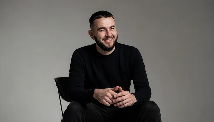
Val Pavliuchenko designs for a future he does not accept on trust. In a post about visualizing artificial intelligence, he admitted that talking to AI could leave him feeling short of control. Doing the task himself sometimes seemed more reassuring. It is a useful admission from someone whose work includes AI interfaces. The person arranging the invitation understands why a guest might hesitate at the door.
That hesitation gives his work a human starting point. Handing over an instruction sounds simple until the machine begins interpreting it. A button usually announces a limited intention. A conversation can expand in several directions. Somewhere between the request and the result, a person needs to understand what has been agreed.
Pavliuchenko is the founder and CEO of Hosanna Studio and its design director, based in San Francisco. His professional territory includes the surfaces through which people encounter complicated products: what they see, what moves, what they can select, and what happens afterward. The attractive screen is part of the assignment. So is the question someone asks after looking at it.
From Milkinside to a studio of his own
His work history places him at Milkinside as a product designer from 2019 to 2023, followed by his founder and design executive role at Hosanna. A published crypto-wallet exploration carries the Milkinside team credit alongside his name. The pairing of a financial interface with an AI assistant shows how early those interests were sharing space in his portfolio.
There is a considerable range of screens in that career. His portfolio biography describes work across phones, computers, tablets, televisions, and automotive interfaces. These devices have different manners. A television sits across the room. A phone comes along for the errand. A vehicle display belongs to a setting with its own demands on attention. The same visual habit cannot simply put on a new jacket and call the move complete.
Seen through that range, his move into studio leadership changes the scale of the problem. Someone has to decide how an experience fits its setting, then help other people carry the decision through. The founder’s name may occupy a small space on a company page. The decisions spread across the work.
Milkinside
Hosanna
Future London Academy
A ticket, a lock screen, a little less searching
The travel work offers an accessible entrance. StayFly, published with fellow designer Ivan Pepchuk, sets out to shorten the route from searching for a flight to buying a ticket. That is a modestly worded task with a substantial design problem tucked inside it. Travel information arrives in pieces, but the traveler experiences the journey as a whole.
A ticket has to describe a choice clearly enough that someone can commit to it. After that commitment, the same person needs another kind of help: recognition, reassurance, and details they can retrieve. The business transaction takes a moment. The need to understand the purchase lasts rather longer.
A separate lock-screen exploration turns toward airplane mode. It brings the travel theme down to a small, familiar surface. A lock screen is an interesting place to work because its owner may give it only a glance. There is little room for a grand explanation. Every element has to justify the attention it requests.
These portfolio pieces make ordinary information a useful subject for visual ambition. A seat, a time, a destination: none is especially glamorous, yet each can become the most interesting thing on a phone at the right moment. A designer who gives such details room to speak is doing the traveler a practical favor.
The work also offers a way to read Pavliuchenko’s broader interests. He returns to experiences in which appearance carries instructions. People should be able to enjoy the treatment and still locate the thing they came for. A beautiful ticket remains obliged to tell you where you are going.
The Crystal Bank app presentation, another collaboration with Ivan Pepchuk, takes that attention into banking. Its listed tools include Figma, Cinema 4D, and After Effects, putting interface work and moving imagery in the same project. Read alongside StayFly, it offers a reminder that a digital product can have a visual personality while dealing in information people need to take seriously. Money and travel both come with decisions attached. The design occupies the interval before someone makes one.
Movement with somewhere to go
His Audi website study asks viewers to consider the transitions. It is a small invitation that redirects attention from the finished screen toward the passage between screens. Movement determines what appears to continue, what seems to change, and where the eye goes next. It can make a sequence feel intelligible before someone has consciously described why.
The MacPaw product presentation is explicitly labeled a website UI exploration. Its interest lies in presentation as a design exercise: how a software product acquires a visual setting and a rhythm. Alongside the automotive work, it shows a portfolio willing to examine both the control surface and the stage on which a product introduces itself.
Those are different jobs with a shared temptation. Once a designer can make things move, movement becomes available everywhere. A transition can establish a relationship; it can also delay an impatient thumb. The question worth asking is what the motion contributes at the particular moment when it appears.
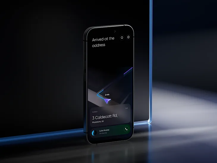
Pavliuchenko has described a deliberately unflattering test for visual ideas: remove their ideal conditions and see how they behave. Smaller screens and everyday product states make useful adversaries. His phrasing has the cheerful violence of an editor reaching for a pencil.
“I try to ruin the beautiful version early.”
Val Pavliuchenko
There is affection for craft in that willingness to interfere with it. The test assumes that the design deserves more than admiration under favorable lighting. Give it an inconvenient setting. Ask it to keep working. The difficult version may tell you more than the cover image ever could.
What did the assistant just agree to do?
His CoStar work brings those questions to an assistant that combines voice input with chat-based output. The challenge includes a gap between what people think they can ask and what the product can actually accomplish. Finding a hotel and booking it may begin with similar words, yet they ask the user to grant very different authority.
The team used prepared prompts and visible cues to explain capabilities and approval points. Pavliuchenko’s contribution extended through scenarios, screens, prototypes, chat logic, and the presentation of results. The assignment followed the interaction beyond the attractive opening message.
Consider the distinction in everyday terms. A helpful person can suggest a restaurant. A helpful person who books it has made a commitment on your behalf. Software crossing that boundary needs to make the change understandable. Otherwise the customer must keep a mental account of invisible permissions while supposedly saving time.
- RequestWhat do I want?
- UnderstandingWhat did it hear?
- ApprovalWhat may it do?
- ResultWhat happened?
A way to read the interaction, rather than a reproduction of a particular product screen.
That is where the designer’s own reluctance to surrender control becomes interesting. It makes room for a user who wants help and still wants to follow the proceedings. The interface can acknowledge both desires. Delegation becomes easier to consider when its boundaries remain visible.
Keeping the whole thing in character
Pavliuchenko’s account of design systems extends to a product’s behavior across different tasks. An assistant handling maps, weather, hotel choices, and dinner arrangements needs continuity. The user should not have to discover a different set of manners every time the subject changes.
The same issue appears inside the studio making the experience. Hosanna’s team spans UX, product design, animation, and motion. Jesh Nanthakumar, Nick Babich, Ilya Pavliuchenko, Reuben Nanthakumar, Ben Ponchek, and John Pepchuk appear alongside him, with Doreen Jane Guanco bringing UX and production experience. The roster puts several kinds of attention around the same product.
A director has to make those contributions understandable together. Motion can establish emphasis. UX can organize the journey. Visual design can make a place recognizable. Each discipline adds something, and each addition affects what the others are trying to say. The finished experience has only one customer looking at it.
Hosanna describes its work in terms of connections between people and products. For Pavliuchenko, the interesting part of that connection seems to arrive when someone needs to act. A traveler looks for a detail. A driver reads a display. A customer decides whether an assistant may proceed.
Those are small encounters with a large amount of design behind them. The person using the product has no obligation to appreciate all that labor. They have somewhere to go, something to choose, a task they would like finished. Pavliuchenko’s work keeps returning to the screen between the capability and the person. Even a machine with plenty to say should be able to explain itself.
Follow the work
Hosanna Studio · LinkedIn · Instagram · Dribbble · Behance · Vimeo
Watch: Adivir website presentation ↗
INTERVIEWS & FURTHER READING