A woman arranges flowers in a shop crowded with petals, branches and hanging lights. In Alon Blum’s portfolio, the scene does two jobs. It stands alone as a piece of creative direction. It also fills a BloomNation homepage mockup, where a delivery-location field sits over the photograph. The flowers get your attention. The field gives you somewhere to go.
That pairing is a useful introduction to Independent Consultant, the design practice associated with Blum. His work moves between the visual character of a product and the decisions required to use it. A photograph, a shopping interface and a wireframe can belong to the same professional vocabulary. Look through the portfolio and the interesting question becomes how those pieces relate.
The range is unusually easy to see: flower-marketplace screens, trainer profiles, dashboards, emails and a brightly dressed music-playlist page. These are examples from Blum’s career portfolio, rather than a roster of contracts credited to the consultancy. Together, they show the kinds of problems his design experience addresses: finding something, judging it, taking action and coming back.
A bouquet with a next step
The BloomNation homepage presentation makes its priorities visible. A large photograph occupies the opening screen. Over it sits a compact form asking where the flowers are going, followed by a shopping button. Below, arrangements appear with florist names and locations. Further down, the page offers browsing by city. Geography is part of the shopping experience from the beginning.
Read as a design decision, that opening form is the most instructive object in the image. Someone buying flowers has a destination in mind. The mockup gives that practical constraint a prominent place while letting the photograph establish the mood. A reader can see the intended sequence without being told an elaborate story about the technology underneath.
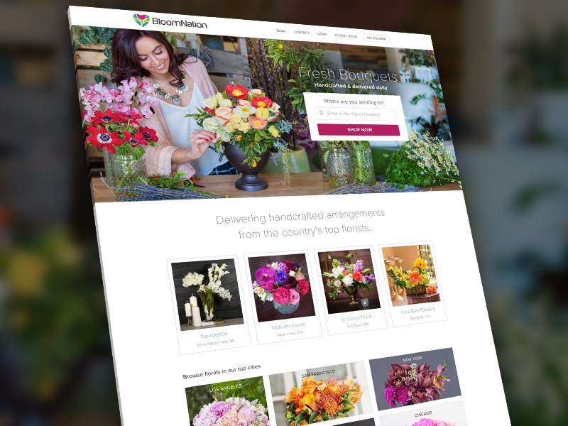
The lesson to borrow is specific: identify the information that makes the next choice useful, then place it where the choice begins. For this mockup, that information is location. Another product would need its own answer. Copying the floral photograph would reproduce the surface; examining the relationship between the form and the task gives a team something to discuss.
The photograph is part of the interface
Blum’s floral-shoot entry credits him with set design and creative direction, and names Nataliia Baidiuk as the photographer. That distinction matters. A digital product contains work from several disciplines, and a portfolio can show where those contributions meet. Here, the photograph is both a documented collaboration and a visible ingredient in the homepage design.
The image has plenty going on: rough timber, glass vases, hanging greenery, warm bulbs and a person working with stems. It puts flower arranging in a recognizable setting. In the homepage mockup, the same scene supplies a human focal point behind the shopping form. The commercial interface borrows its atmosphere from a picture of someone making something.

This is one of the more distinctive connections in the portfolio. Blum shows an interest in the material an interface presents, as well as its arrangement on a screen. For a business commissioning design, it raises a useful question: does the brief cover the content the page needs? An empty rectangle labeled “image” leaves a substantial creative decision for somebody else.
Fitness has a front room and a back office
The TrainersVault work shifts the emphasis from atmosphere to structure. Blum published a personal-trainer profile-page wireframe on Behance on November 30, 2015. A separate dashboard-wireframe project followed on December 1. His portfolio also lists a TrainersVault homepage. Those entries describe different surfaces of the same product world, from a public introduction to an operational interface.
A profile and a dashboard have different jobs. The first presents a person to someone considering them; the second organizes work for someone already inside a service. That is a reading of the design categories, not a claim about measured results. It explains why the pairing is useful evidence of scope: the work reaches beyond a single promotional entrance.
An editorial reading of the TrainersVault portfolio, not a conversion funnel.
The dates belong to the portfolio publications. The more durable detail is the decision to show wireframes at all. A wireframe invites scrutiny of hierarchy and sequence before visual finish dominates the conversation. A prospective collaborator can ask why a piece of information appears in one place, what happens next and which person the screen is meant to serve.
The inbox gets a seat at the table
Smaller entries broaden the picture. Blum’s Dribbble portfolio includes work titled “Marketplace Transactional Emails,” alongside contact, login and 404 pages. Behance also lists transactional e-commerce emails and a Valentine’s Day email campaign. The titles distinguish communication tied to a transaction from a seasonal campaign, while the surrounding work gives ordinary utility screens a place beside the more photogenic projects.
These are useful items to notice when evaluating a designer. A homepage can communicate an idea in one glance. An email or login page has to meet someone at a more particular moment. Looking at both creates a better conversation about the extent of a design brief. Which interactions are included, and which are being left for another phase?
The portfolio also contains 5Th & Hollyhock, identified as an identity for a BloomNation blog. That adds an editorial surface to the marketplace work. A store, a publication and a customer message can have different immediate purposes while appearing under a related brand. Blum’s examples make that breadth visible without requiring the reader to treat every artifact as a separate business.
Then the playlist turns up
The Summer Vibes landing page changes the temperature. Blum’s Dribbble description identifies it as a page for a summer music playlist and links it to a REVOLT interactive. The mockup features tropical foliage, yellow and purple lettering, geometric accents and a pink doughnut-shaped pool float. A music player sits within the composition. Nobody will mistake this one for a spreadsheet.
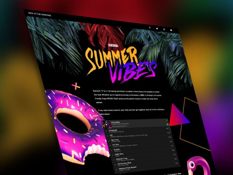
His portfolio presents a second view of the landing page and a separate playlist cover. Those companion pieces are interesting because they extend the visual idea beyond one screenshot. The cover and the page belong to the same listening context. Examining them together lets a reader consider how a campaign identity behaves when its dimensions and surroundings change.
Placed beside BloomNation, the playlist suggests stylistic flexibility. The flower page organizes a purchase around a destination; the music page creates a setting for listening. This comparison is an interpretation of the visible work. It is also a useful way to assess range: ask whether the visual treatment suits the activity, rather than whether every project bears the same decorative signature.
What the consulting brief actually buys
Independent Consultant describes services across product strategy, user experience, interface design and prototyping, with collaboration extending into development. Blum presents a front-end background as part of that offer. The commercial proposition is professional design work for businesses developing digital products. The public examples give that broad description something concrete to attach to: screens, structures, visual identities and content.
“test and iterate on my designs quickly”
Alon Blum, describing the purpose of his prototyping skills
For a potential buyer, the useful distinction is the span of responsibility. An assignment could begin with defining a user problem and extend through a prototype into conversations with the people building the product. The alternatives are familiar: engage another independent designer, commission a studio or hire internally. The relevant choice depends on the work, the required availability and the people already on the team.
A concrete brief makes that choice easier to evaluate. Specify the task a user should complete, the screens involved, the evidence already available and the expected deliverables. Separate research, prototypes, production design and implementation support when discussing scope. Those are editorial suggestions for a purchasing conversation, not a description of Blum’s contract terms. They turn a broad promise into work that can be reviewed.
Borrow the question behind the screen
The portfolio rewards close looking more than grand conclusions. The flower page asks for a destination. The trainer work separates a public profile from a dashboard. The playlist gives a listening session a visual setting. Each example offers a different starting question for a product team. What must the user know or provide here, and what should the interface help them do next?
The answer requires contact with the intended audience. A prototype is useful only if the team is willing to examine what people do with it and revise the design accordingly. A striking presentation cannot, by itself, settle whether a service solves the right problem. That is a condition for applying the ideas in this portfolio, rather than a reported failure in Blum’s work.
Independent Consultant’s most persuasive introduction is the collection itself. Its interest lies in the distance between a bare wireframe and a florist surrounded by flowers, and in the practical decisions connecting them. For a reader planning a digital product, there is a manageable place to start: pick one task, find the moment of choice and make the next step clear.