The easiest way to misunderstand National Forest is to imagine trees. The second easiest is to call it a graphic-design shop. The Glendale studio does make graphics, with a taste for bright color, blunt shapes and images that feel as if they have wandered in from a very good record sleeve. But the useful part of its story is what happens next. A drawing refuses to stay put. It migrates onto a snowboard, across a retail window, around an airplane hangar, into a television commercial. The medium changes; the idea keeps its accent.
Founded in Los Angeles in 2002 by artists and designers Steven Harrington and Justin Krietemeyer, National Forest describes itself as a design firm and creative consultancy. That two-part label is precise. The consultancy establishes what a brand should say and how it should behave. The firm gives that thinking a body: identity, advertising, illustration, photography, web design, packaging, environmental graphics, film or some untidy combination of them.
Its customers are the people responsible for making a brand legible in public - marketing chiefs, brand teams and agencies - especially when a tidy standards manual will not do the job. The public client roll has included Nike, Sonos, Target, Roxy, Burton, Puma, Aldo and the Bonnaroo Music and Arts Festival. Logos displayed by the studio add Google, Coca-Cola, IKEA, AOL, MillerCoors and Beats by Dre. These are large names. The more telling fact is the range of assignments.
01 / The operating ideaMake the language, then let it roam
Many agencies split their thinking by channel: brand over here, film over there, digital somewhere down the corridor. National Forest presents the opposite proposition. Art direction, photography, advertising, design, illustration, websites, film and art are treated as one vocabulary. The problem it solves is fragmentation. A brand can look handsome in the launch deck and strangely unrelated to itself six months later, after a dozen suppliers have translated it into stores, posts, boxes and events.
The studio's answer is not sameness. It is a governing visual thought sturdy enough to survive translation. For Sonos, that meant custom graphics, wordmarks and illustrations rather than a lone mark. For Creative Solutions, it built an identity system for a company and its family of brands - a hierarchy problem as much as a drawing problem. For the Lyon web-marketing agency Better & Stronger, it designed an identity system capable of making an abstract promise visible.
This breadth changes the commercial relationship. National Forest is not selling a subscription or a boxed product. It is a private, project-based consultancy paid for strategy, design, art direction and production. Buyers are paying for continuity of judgment and, when needed, a network of specialist makers. The Jimu Robots television work, for example, joined National Forest with production company Ways & Means, directors Jason Miller and Krietemeyer, and filmmaker Eli Born. Small does not have to mean solitary.
The older campaign list sharpens the point. National Forest made a global in-store campaign for Aldo, an outdoor campaign for Target, a seasonal campaign for Burton Snowboards and a global campaign for Puma. Each job puts pressure on a different part of the system. Retail must persuade at walking speed, outdoors must land before the light changes, and a seasonal campaign has to feel new without making the brand unrecognizable. This is where a multidisciplinary studio earns its keep. It can judge an image not only as a picture but as an object with a distance, a duration and a job. The output may be a poster, window, garment or moving sequence. The discipline is deciding what cannot change when nearly everything else does.
“The vibe has to fit the function.”National Forest, describing its studio
02 / Proof at full scaleA basketball court is a very large business card
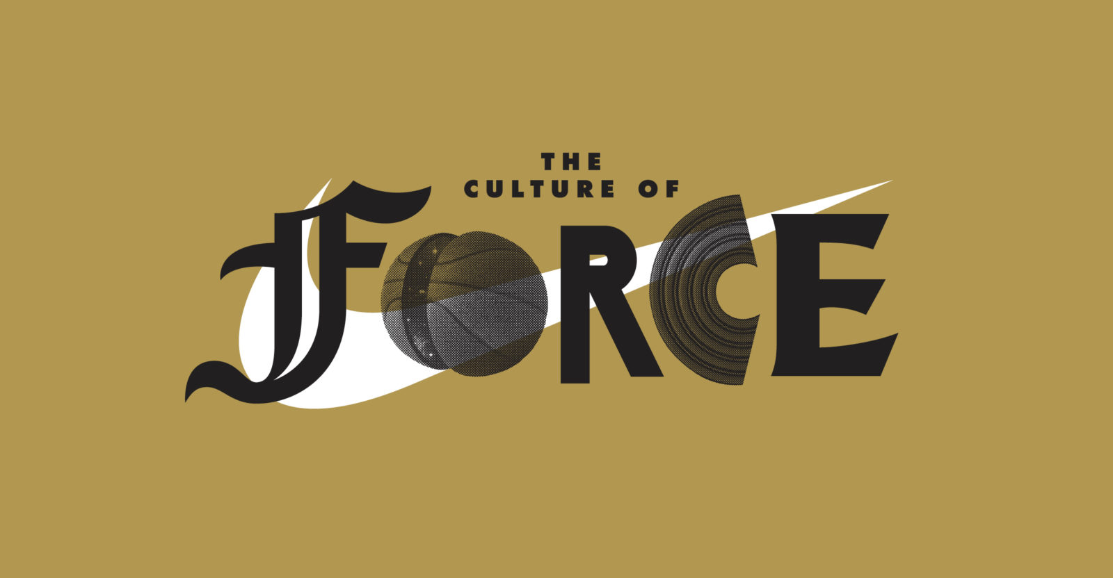
The Nike work makes the method easy to see. For a series of Southern California basketball tournaments, tutorials and activations, elite high-school, college, NBA and Olympic athletes arrived at airplane hangars clad in National Forest graphics. The studio's branding and art direction had to work at architectural scale, guide people through an event, look alive behind athletes and still compress into photographs. A separate identity and art-direction project for Nike's Basketball Academy addressed the same sport with its own system.
At ComplexCon, National Forest handled branding and art direction for a Nike Air Force 1 installation. Brian Roettinger designed courts and tees; Atomic built the set. The credits matter. They reveal the studio's role as an orchestrator: establish a coherent world, invite excellent specialists into it, and keep the joins from showing.
ComplexCon
Solutions
commercials
snowboards
Then there is Roxy. National Forest's selected snowboard graphics put the visual system directly under a rider's boots. The studio also lists a worldwide Roxy rebrand among its work. The assignment demonstrates an advantage of an art-led consultancy: product is not the awkward last stop of a campaign. It can be the main canvas. An independent retail listing for a 2017 Roxy Ally BT board explicitly credits its graphics to the Los Angeles studio.
Bonnaroo posed a different translation test. A music and arts festival is a temporary city with a permanent fan culture. Its identity has to live on schedules, stages, wristbands, merchandise and memory. National Forest's rebrand sits neatly inside its market position: more expansive than a logo boutique, more design-centered than a conventional ad agency, and able to coordinate production without pretending every craft lives permanently in-house.
03 / The hidden machineryThe office was a prototype of the company
A 2015 tour caught the firm in a 2,400-square-foot Atwater Village studio it had occupied for seven years. It was part gallery, part workshop, part office and part photography studio, with an outdoor area large enough for gatherings. Skylights reduced the need for electric light. There was room for big physical projects, a wall of skateboard decks, a poster archive, paint carts, a large sound system and a dog.
This was more than the familiar creative-office circus. The building mirrored the workflow. Thinking, making, displaying and documenting could happen in one place. The team named Saul Bass's studio, Stanley Kubrick sets, sunshine, barbecue, friends and conversation among its inspirations. Its biggest challenge was less romantic: live-work balance. Its biggest indulgence was speakers larger than the room required.
The studio described its culture as open-minded and collaborative, a small crew of “culture sponges” where every voice mattered. That posture is visible in the founders' history. In 2008, while commercial assignments included Urban Outfitters catalogs, snowboards and a Standard Hotel mural, they were also preparing paintings for a gallery show. Their Subliminal Projects exhibition that year used prints and sculptural objects to explore human connection. Client work and self-directed art were not rival careers. Each supplied the other with nerve, technique and references.
“Make work you believe in, in a space you enjoy doing it.”The studio's advice, 2015
04 / The practical bitWhat another team can actually borrow
The copyable lesson is not National Forest's color palette. Borrowing another studio's surface manner is a fast route to expensive camouflage. Borrow the operating sequence instead. Begin with one governing idea. Stress-test it in formats with different physical demands. Let a wordmark sit beside a moving image; let a campaign meet a room; make the packaging argue with the website. If the idea becomes unrecognizable, it was probably decoration, not a system.
A four-move field guide
Write the visual premise in one sentence. Prototype it at the smallest and largest scales. Bring production partners into the concept early. Keep a physical archive of the work so the next project begins with evidence, not nostalgia.
There are conditions attached. This model needs a client willing to buy a point of view and allow the same creative logic to cross departmental borders. It is a poor fit when procurement wants interchangeable production, when every channel has a separate owner with veto power, or when the only success measure is rapid direct-response variation. A compact studio can borrow production scale, but it cannot manufacture shared conviction inside a client organization.
The archive offers its own warning. National Forest's public website foregrounds work published from 2017 through 2020, while company databases disagree even on headcount. LinkedIn calls it a two-to-ten-person studio; supplied commercial data estimates 28 people. The sensible conclusion is not a precise size but an operating character: private, compact, collaborative, and comfortable assembling the right team around the assignment.
National Forest's strongest distinction is therefore not a secret process or a celebrity client. It is refusal by design. The studio refuses to treat art as a weekend activity, production as someone else's concern, or a brand as a mark trapped in a PDF. The resulting work can be exuberant, occasionally strange and very physical. It also answers a sober business question: how do you make one organization feel like itself everywhere?
05 / Keep lookingTrails out of the forest
The studio's own portfolio is best explored project by project. Its social feeds provide the less formal view: experiments, references and work in motion.