There is a peculiar kind of message that only works because it looks as if nobody gave it permission. A sticker on a lamppost. A poster pasted onto plywood. An image repeated until the repetition becomes the argument. Shepard Fairey spent years learning that language in public. Then, in 2003, he and Amanda Fairey founded Studio Number One and asked a more awkward question: could the same language survive a purchase order?
The easy answer is that Studio Number One, or SNO, is a Los Angeles creative agency. It makes identities, advertisements, packaging, illustrations, apparel, murals, environments and social campaigns. The more useful answer is that it moves ideas between worlds that distrust one another. A drinks company wants cultural fluency. A nonprofit wants reach. A city wants an identity that does not feel selected from a municipal dropdown menu. SNO translates among them.
This is what Fairey calls the inside-outside strategy. The outside supplies skepticism, urgency and a feel for how images circulate without permission. The inside supplies budgets, manufacturing and distribution. In Fairey’s telling, using that machinery can amplify an independent message. The bargain is uncomfortable. That discomfort is the business.
The first product was permission
SNO did not begin as a romantic rejection of commerce. It began after several lessons in how fragile romantic rejection can be. Fairey’s earlier Subliminal apparel project failed. In the skate world, the people who seemed closest to his values could also be the people who paid late, paid little or did not pay. Professional work for larger companies offered something subculture did not: dependable machinery.
That changed his mind about corporate assignments. A system could flatten a point of view, certainly. It could also distribute one. Early Studio Number One work included label designs for Express and graphics for a Sunkist repositioning. The agency inherited a productive contradiction from its founder: the artist who had pasted over advertising was now being hired to make advertising harder to ignore.
“Sometimes I feel like a double agent.”Shepard Fairey, describing the line between street art and commerce
The quote has lasted because it names the risk cleanly. Cultural credibility cannot be transferred by invoice. Put a rebellious typeface on a timid proposition and you have only made the timidity louder. SNO’s better work gives the visual energy a job to do.
One idea, many surfaces
Consider Angel City Brewery. The assignment started with a logo and branding capable of standing out in California supermarkets and liquor stores. But a brewery identity does not live in a presentation deck. It must hold together on a can, a tap handle, a festival tent, a wall, a website and whatever product comes next. SNO built a system of logo, color and pattern that Angel City’s internal team could extend. The deliverable was not merely artwork. It was a set of decisions that could survive the artist leaving the room.
The SNO transmission system
The practical lesson: consistency is a chain of reasoning, not a folder of matching files.
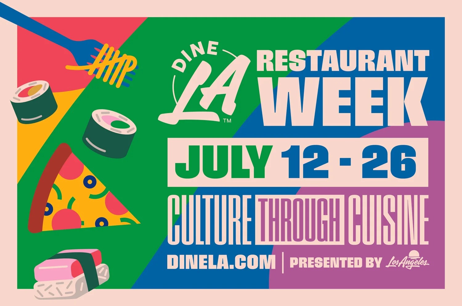
For Dine LA’s Restaurant Week, the problem was scale of a different sort. The program showcases roughly 400 restaurants each season. SNO created illustration, messaging, sample advertisements and guidelines around the idea of “Culture through Cuisine.” This is less glamorous than the myth of the lone artist, and more instructive. A good system gives hundreds of participants a common accent without forcing them to say the same sentence.
The studio’s customers range from drinks brands and entertainment franchises to tourism bodies and advocacy organizations: Stella Artois, Pacifico, Call of Duty, the Los Angeles Tourism & Convention Board, NRDC, Homeboy Industries and the Koreatown Youth & Community Center. They are not buying identical aesthetics. They are buying a way to turn a position into a visual object, then turn the object into circulation.
A logo is a piece of local gossip
When SNO and House Industries redesigned the Los Angeles Tourism identity, they did not attempt to summarize the city. That would be like summarizing weather. They used a script with movement and self-expression, then put it against a sun whose dome recalls the Hollywood Bowl, Cinerama Dome, Griffith Observatory and Walt Disney Concert Hall. The symbol behaves like local gossip: several references compressed into one familiar shape.
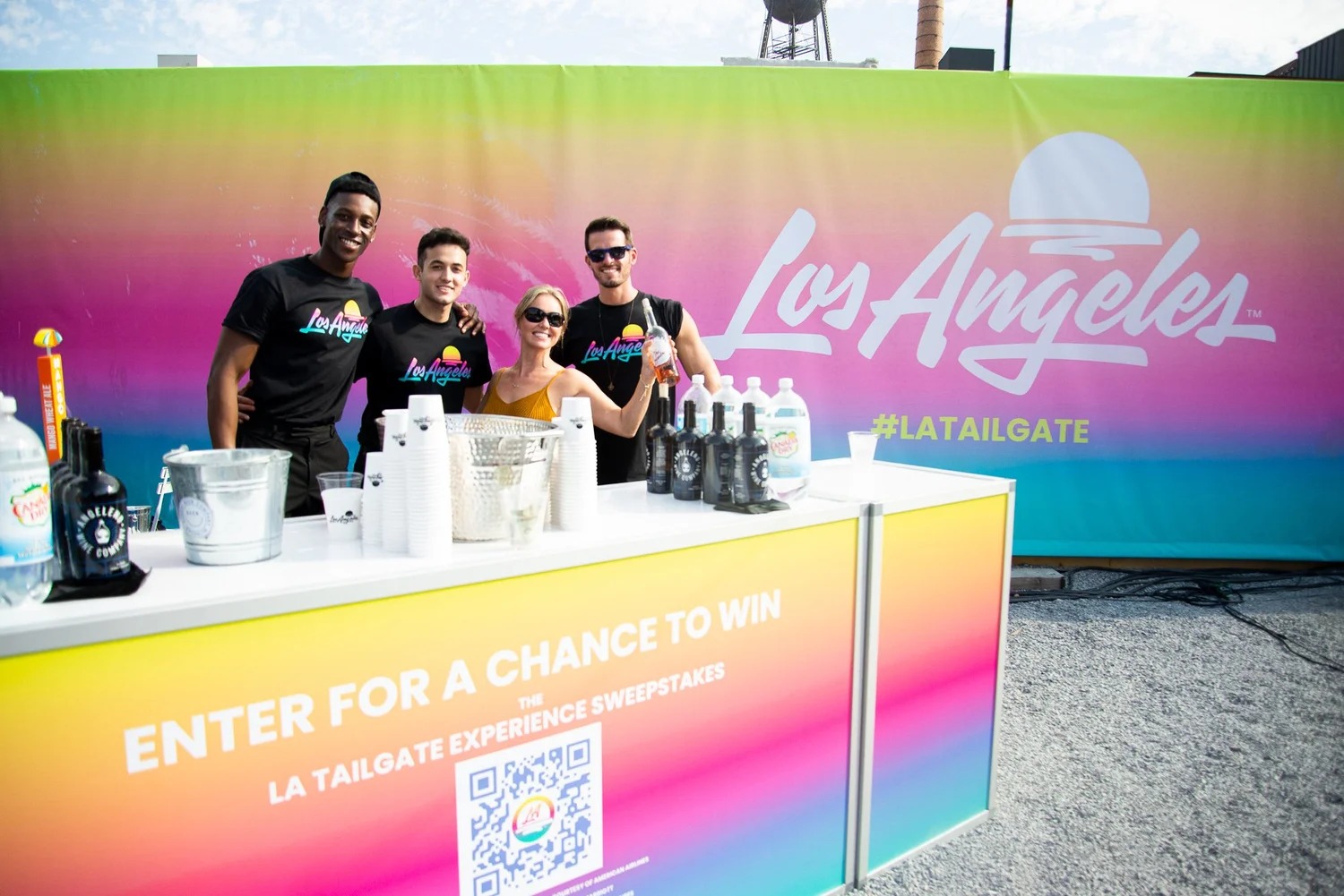
They also created the unromantic part that makes identity work: formal guidelines and a toolkit for staff and outside vendors. This is where SNO sits in the market. A muralist can make a wall unforgettable. A conventional agency can manage a channel plan. A pure identity studio can impose order. SNO competes in the overlap, where cultural imagery must become an orderly, repeatable business asset without looking orderly in the deadening sense.
The audience completes the picture
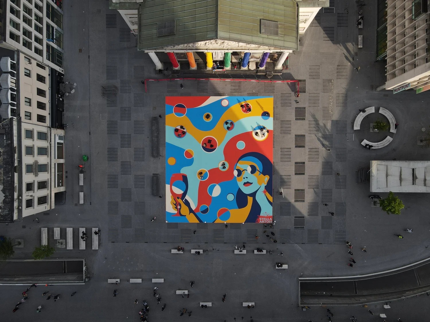
In 2020, as hospitality emerged from lockdown, Stella Artois and Mother London asked SNO to make safe socializing feel less like an instruction manual. The result, Together Apart, was a 46-by-92-foot floor artwork at London’s Truman Brewery. Its circles were op-art bubbles, graphic elements and places to stand at a safe distance. People entered the illustration to make it function.
The same participatory instinct appears in less commercial work. For KYCC, SNO turned a mental-health awareness campaign into a 20-by-40-foot mural carrying the message in English, Spanish and Korean. For a collaboration among Pacifico, OBEY Clothing and Surfrider Foundation, an ocean-protection mural became apparel, a tote and an art print, with proceeds supporting the nonprofit. For the film Creed, six murals in six American cities gave young people and communities a backdrop for declaring what they fought for.
Then there are the free downloads. SNO offers social-cause artwork that anyone can print, post online or take to a march. This may seem like a side project. It is closer to the studio’s clearest statement of product philosophy. An image is unfinished until somebody carries it somewhere.
The studio does not merely design things to look at. It designs reasons to pass them on.
What another team can steal
Not the red, black and cream. Not the heroic face or the radiating lines. Those are artifacts. The reusable part is structural. Begin with a sentence people can repeat. Decide which element must remain recognizable and which may change. Give the client rules sturdy enough to use without supervision. Finally, give the audience a verb: stand, wear, share, print, carry, protect, vote.
There are conditions attached. This approach depends on a real alignment between message and behavior. A conservation graphic attached to no conservation effort is costume. A civic mural developed without a community is decoration. A brand that wants the appearance of dissent but cannot tolerate a distinct position will sand away the quality it hired.
Studio Number One’s longevity does not settle the old argument about art and commerce. It makes the argument productive. The firm is a private, project-based creative business. Its work must satisfy briefs, deadlines and paying clients. Yet the office’s public language still includes “dissent is patriotic” and “brands can take a stand.” The useful word is can. Design cannot manufacture conviction. It can give conviction a shape, a system and a much larger wall.