A panda is an unusual place to begin a business story. KUYA’s is called Pogi, and the studio offers a disarmingly practical explanation for his existence: the world already had enough agency dogs. Friendly, expressive and fond of a good meal, he belongs to a brand that takes its work seriously while leaving room for a joke. That combination runs through the Los Angeles studio’s portfolio, from a neighborhood internet provider to a supplement line bearing Floyd Mayweather’s name.
KUYA specializes in brand identity and advertising. Its assignments turn an organization’s intentions into a recognizable look, voice and set of experiences. Sometimes the result is packaging. Sometimes it is an animated character, a launch campaign or an interactive website. The interesting part is how the pieces connect: the same underlying idea has to survive a change of medium.
For founders Michael and Janine Villa Sison, that work began close to home. Before KUYA, they were two of ContraBureau’s three founders. That studio operated for more than three years before its founders went their separate ways. KUYA’s introduction gave the couple an opportunity to decide what their next business should feel like, both to clients and to the people doing the work.
A second act, in their own colors
The studio’s identity draws on Michael’s experience of growing up in the United States while becoming more distant from his Filipino roots. A California upbringing and an immigrant history became material for a visual identity. The colors, illustrations and exuberance belong to that particular story. Pogi is one inhabitant of it.
Michael leads creative direction; Janine is listed on KUYA’s website as finance director. Her background spans fashion, advertising and finance, while his biography describes more than 15 years of creative work. Their respective interests put the design assignment and the business of delivering it under the same roof.
KUYA’s stated ambition is also a workplace proposition: make worthwhile creative work without consuming the lives of the people who make it. The founders emphasize respect, sincerity and enjoyment of the craft. Those are intentions a prospective collaborator can discuss in concrete terms: how feedback works, how a project is staffed and how deadlines are set.
“Unlike most projects, this one was challenging because it was so personal.”
KUYA, discussing its website with Communication Arts
The website made those choices public. Built with Rocani Studio, it uses animated transitions and playful type to introduce the business. Yet the designers faced a familiar agency problem: their own personality could overwhelm the client work they were trying to sell. A filter lets visitors narrow the portfolio to relevant disciplines. The exuberance has a practical companion: a way to find the right evidence.
Ollie has entered the neighborhood
Underline offers a clear view of KUYA’s method. The fiber network wanted to challenge established internet providers in smaller American cities. Its local teams suggested a more useful personality than another remote technology company: the helpful person down the street.
KUYA developed the refreshed identity around Ollie, an illustrated mascot who could embody that friendliness. In the studio’s explanation, Ollie appears in imaginative situations that communicate the possibilities of fast internet. The character does more than demonstrate someone opening a laptop. He gives an otherwise technical service a social presence.
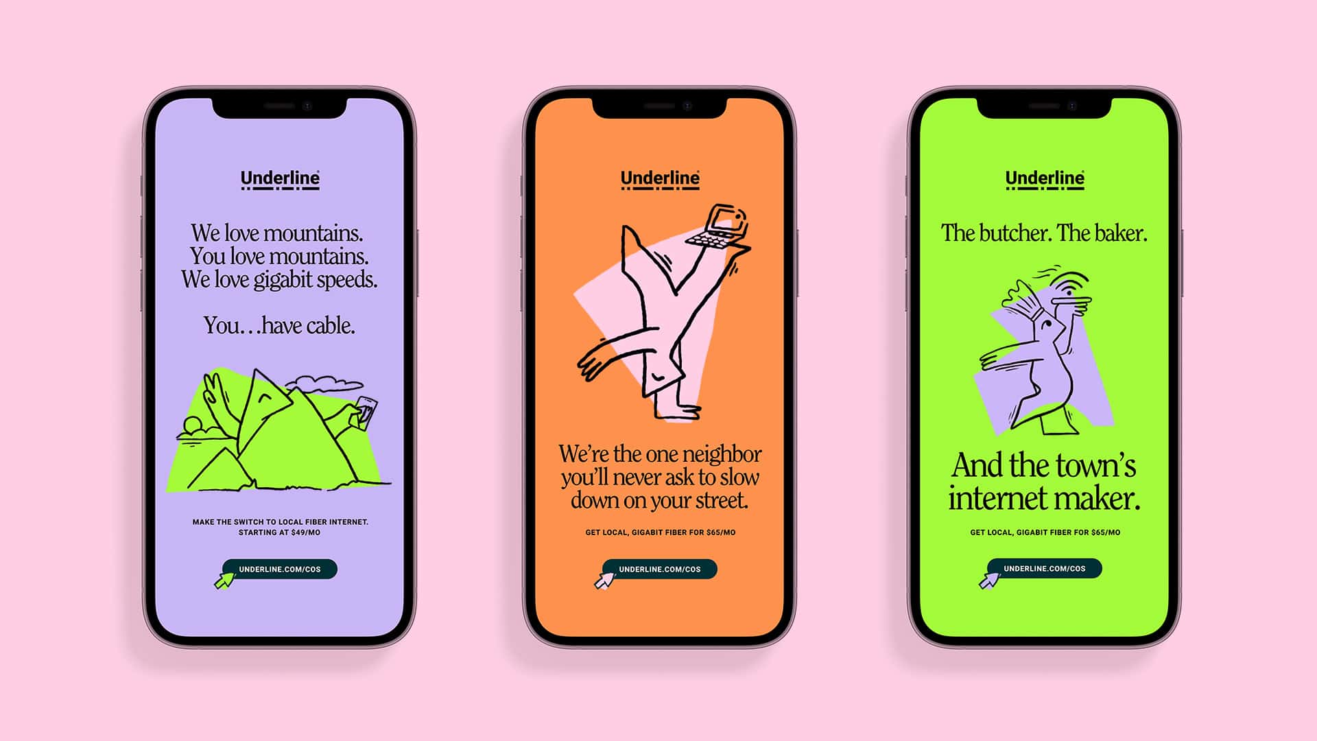
The execution carries that idea into color and copy. The portfolio’s phone mockups pair loose illustrations with conversational lines, giving separate advertisements a family resemblance. A potential customer can encounter different messages without meeting a different company each time.
For a reader commissioning a brand refresh, the useful move is the choice of relationship. Underline’s creative premise starts with how the company wants to behave toward its customers. The mascot follows from that decision. Drawing an appealing character first and trying to invent a reason for it afterward would reverse the logic.
Floyd’s name. A wider invitation.
One of One presented a different problem. Floyd Mayweather supplies immediate recognition, but a sports nutrition brand needs room for customers whose ambitions do not include a championship belt. KUYA’s case study explicitly describes an audience extending beyond committed boxing fans to everyday people pursuing fitness.
Working with Battery, the studio developed the identity and the launch campaign “You vs. Yesterday.” The creative direction draws on discipline and effort. Large, compressed lettering, strong colors and athletic imagery carry the theme across supplement packaging and promotional applications.
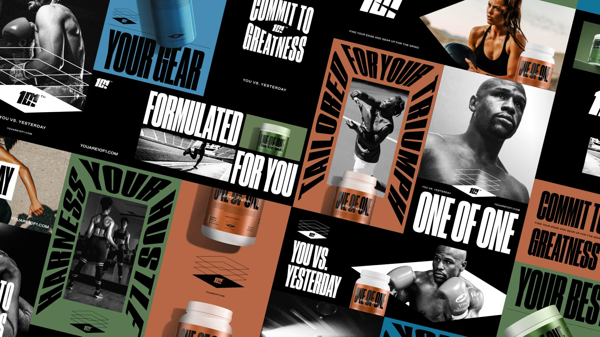
The campaign’s invitation is personal improvement. That gives Mayweather’s sporting identity a role without requiring every prospective buyer to identify as a boxer. The design has to hold those audiences together: recognizable enough to benefit from the association, broad enough to make sense away from it.
The portfolio shows how much of the assignment lives beyond a logo. Product labels, apparel, posters and social applications all need decisions. This is where a studio’s value becomes easier to inspect. A buyer can ask whether the idea still works when the canvas shrinks to a tub, stretches to outdoor advertising or appears beside a photograph with a different mood.
Three portfolio examples. An editorial reading of the design logic, not a prescribed studio process.
The useful part of a refresh
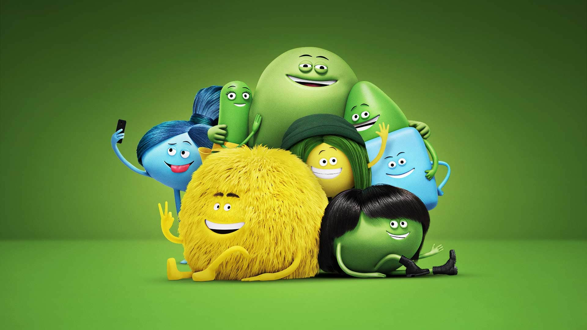
Cricket Wireless had another starting point: assets that had been used repeatedly and needed renewal. In collaboration with Argonaut, the portfolio team developed updated typography, a broader palette, a photography approach, layout configurations and new character art.
That list matters because it describes something a marketing team can use. A refreshed visual language gives the next advertisement somewhere to begin. The characters remain part of the company’s recognizable world, while the surrounding material gains more variety. The result can be evaluated across a collection of applications rather than one carefully chosen presentation slide.
For VelocityEHS, KUYA built the campaign “Safe Can’t Wait” and a visual language called Velocity Vision. Its starting point was the oval in the existing check mark. That shape supplied material for graphic treatments intended to convey movement and clarity. RDCL is credited for strategy.
The same portfolio also contains Wealth Enhancement Group, where architectural and furniture drafting inspired geometric forms and grids. These assignments place KUYA in the business of making services visible. Workplace safety software and financial expertise have little physical packaging of their own; design gives their marketing a vocabulary people can recognize.
Good intentions, uncomfortable work
The studio’s lighter work does not tell the whole story. For Change the Ref, KUYA created AR15 & Under, a campaign built around 11 range-target posters sized to the physical proportions of children aged five to fifteen. The deliberate discomfort was the point.
The campaign website let visitors send targets to lawmakers, with proceeds directed to Change the Ref. Here, design supplied both an arresting object and a way to participate. The project received a D&AD Graphite Pencil in 2024 and appeared in Communication Arts’ Design Annual.
AR15 & Under used scale to make its argument. The design itself carried the message.
Michael has described the difficulty of confronting the subject while making the work, and the importance it held for the founders as parents. It is a revealing counterpart to Pogi Panda. The studio’s interests can produce a friendly character or a disturbing image, depending on what the assignment requires.
The recognition is evidence that the work reached a design audience. Its participation mechanism is a separate, observable feature. Keeping those two things distinct makes the case study more useful: a strong campaign concept, an audience action and an award are different parts of the story.
What a client is buying
KUYA fits between brand design and advertising production. Its commercial offer is creative services: develop an identity, launch a campaign, refresh an established brand or produce the material needed to express it. Its portfolio shows relationships with brands and with agencies that bring the studio into larger assignments.
The credits are worth reading. Battery appears on One of One; Argonaut on Cricket; Rocani on the studio website; RDCL on strategy for enterprise work. They show how different expertise comes together. The portfolio also includes earlier career projects, so the breadth is best read as evidence of experience, with each assignment’s credits kept attached.
For a prospective buyer, scope is the useful starting point for a cost discussion. A brief should distinguish the central identity from packaging, motion, website development and launch assets. It should also establish who implements the work and what the client’s own team needs to produce afterward. These are different amounts of work, even when they share one creative idea.
The alternatives depend on that brief: a dedicated identity studio, an advertising agency, a motion specialist or an internal design team may each suit a different need. KUYA’s portfolio makes its clearest case when the assignment needs a concept to remain coherent across several kinds of output.
There is a practical condition attached. A neighborly identity needs neighborly service behind it. An energetic visual system needs a team able to use it consistently. The lesson to borrow from KUYA is to choose an idea specific enough to guide decisions, then test it in the places the audience will actually meet it. Ollie has to leave the presentation deck eventually.
Meet the work
Explore the project portfolio, meet the founders or start a project inquiry.
Follow KUYA on LinkedIn, Instagram and Threads. Watch the studio’s films and reels on Vimeo.