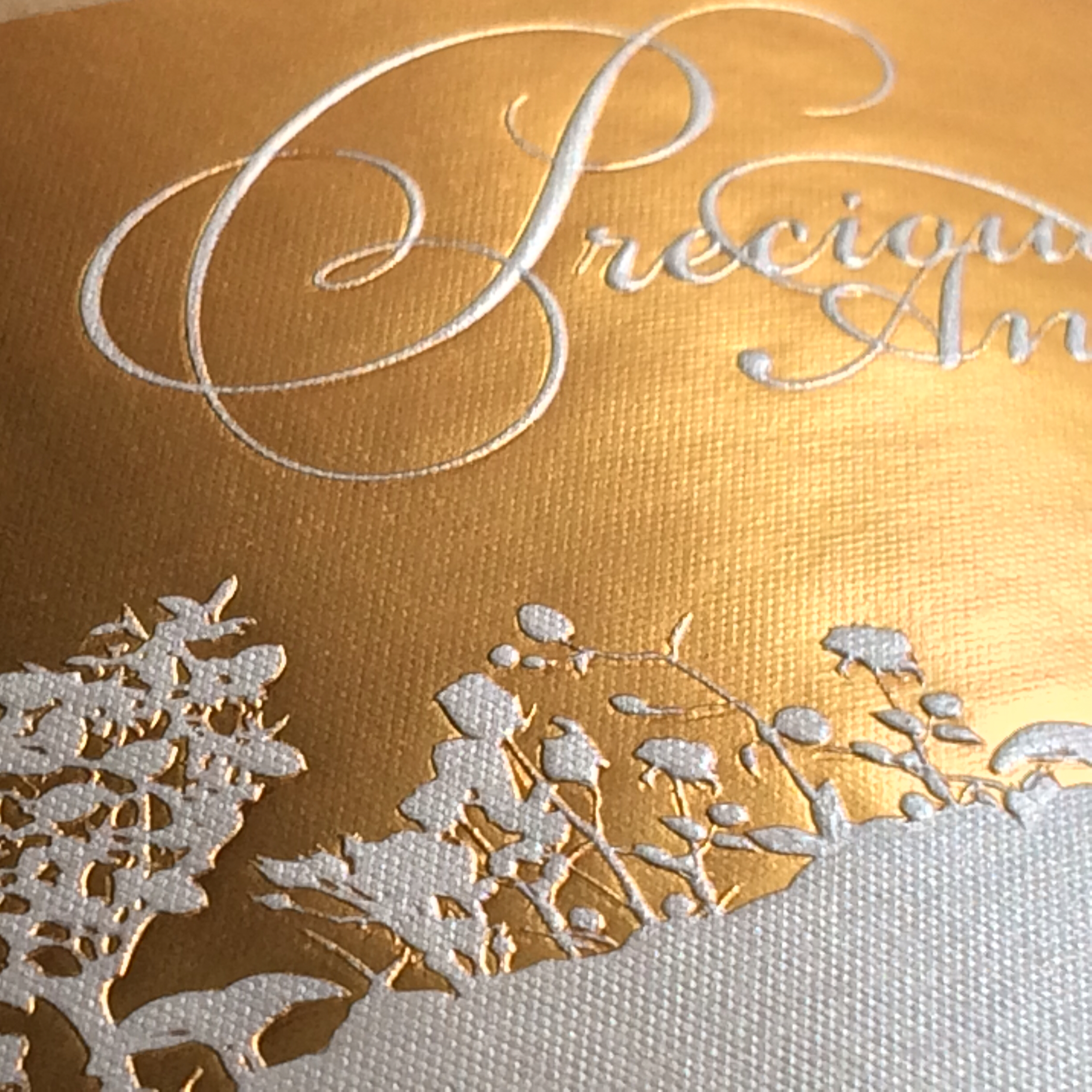
A wine label is a remarkably small place to put a manufacturing headache. On ZD Wines’ 50th-anniversary Pinot Noir label, Vintage 99 had to line up five colors, two foils, and two kinds of embossing. Even the cut edge had to agree with the artwork. A shopper might notice the shimmer. The printer had to notice everything.
“Register must be perfect,” plant operations executive Bill Bartee told the Flexographic Technical Association. Registration is the alignment of one production element with another. Here, a slight disagreement between ink, foil, and raised detail could turn an elaborate design into a rejected label.
That job, a silver winner in the 2020 FTA awards, captures the California company’s specialty: making ambitious wine packaging repeatable. Vintage 99 sells wineries the physical result of a design, including the difficult bits a flat screen makes deceptively easy to approve.
“Register must be perfect.”
Bill Bartee · Plant operations
On the ZD anniversary label
The label that left out the ink
Consider Bewitched Chardonnay. Designer Joy Hallman of Stranger & Stranger supplied an intricate gold-on-black design. Vintage 99 produced it with foil, finishing, die cutting, and varnish. The black was already in the dyed paper. Conventional printed imagery was unnecessary.
Before making the die, the company sent the artwork and a three-dimensional bottle rendering to its die supplier. Delicate lines needed to survive the translation from file to tooling. At the Santa Rosa plant, the flat-stamping unit required careful adjustment; protective varnish helped guard the finished surface against scuffing during transit.
The label won gold at the 24th FSEA Gold Leaf Awards. Its useful lesson is more modest than the trophy: involve the people who make the tooling while the design can still change. A beautiful rendering is a proposal. Reproducing its smallest marks is a separate job.
Before the press, a queue
Vintage 99’s operational trouble once began much earlier than printing. An EASTBAY Works case study describes customers expecting quotations within 24 hours while the company took several days. Orders were slipping away before its printing skills could become relevant.
Through Alameda County’s workforce development program, Manex consultants brought together sales, design, purchasing, production, and management employees. They mapped the order-entry process and examined the approvals, handoffs, and communication needed to produce a quote.
The reported results included a 37 percent week-to-week reduction in docket errors and a 50 percent month-to-month reduction in quote turnaround. Those are case-study measures over specified intervals, not promises attached to every order today. The underlying move is portable: trace the request across departments and measure where it waits.
A separate Manex account describes management planning, a recruited quality-assurance manager, corrective-action procedures, and regular reviews of departmental metrics. It reports cutting the monthly financial close from 15 days to five. For a business selling precision, administrative precision belonged in the same conversation.
Ten days returned to the calendar.
Monthly financial close, as reported in the Manex case study. Historical results; not print delivery times.
Small orders changed the equipment
The company dates its beginnings to 1999. Its published history charts a waterless offset installation in 2003, digital printing and finishing in 2008, a Santa Rosa plant in 2013, and further digital capacity there in 2021. The chronology reads like a series of answers to production problems.
The 2008 decision had an explicit customer rationale. President Kathy Gonzales explained that conventional printing was expensive for small clients; large clients also needed short runs. An HP Indigo WS4500 paired with an AB Graphic Omega Digicon Series II gave those customers another route while expanding finishing possibilities.
Today, Vintage 99 promotes digital production for its reduced setup burden and absence of printing-plate costs. Its quotation navigation separates projects of 1,000 to 25,000 labels from runs of 25,000 to one million. Those ranges help orient an inquiry; the artwork and finishing still determine how the job should be made.
This is a custom manufacturing business. Wine is its public-facing focus, while the website sends non-wine inquiries to sister company Label Innovators, established in 2010. Customers buy a specified production job and, when needed, design expertise.
The $2,000 conversation
Vintage 99 makes the design portion unusually easy to discuss: its studio publishes three starting prices. The Small Brand package begins at $2,000, with at least two concepts and up to two revision rounds. Premium begins at $3,000, with more concepts and revisions. Expanded starts at $5,000 and adds brand strategy, back-label storytelling, and capsule design.
Published starting prices for design services, in USD. Label production is quoted separately.
The scopes also specify varietal versions and preparation of print-ready files. Additional naming, illustration, and bottle-size adaptations may require their own quotes. These boundaries matter: commissioning a brand identity and ordering its first production run are different purchasing decisions.
For a winery, the sensible starting point is therefore a quantity, an intended bottle, existing artwork, and a list of desired effects. Ask which costs recur and which belong to setup or tooling. That question is more useful than comparing two per-label prices built on different assumptions.
Black on black still has to be read
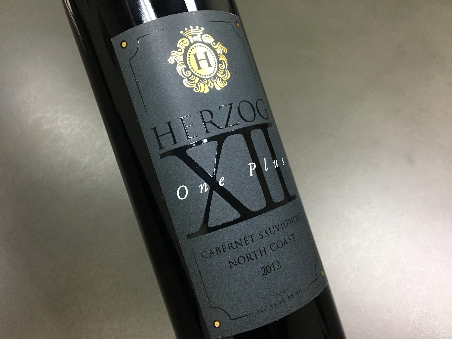
Decorative effects have practical assignments. In a 2016 account of dark wine labels, Vintage 99 described using raised varnish to help fine text read on a Herzog label. On work for Los Pinos Ranch Vineyards, a matte black background and selective gloss gave a cattle-brand logo texture and contrast.
For Secret Ravine, the combination was dark gray, gold foil, embossing, and spot gloss. For Cache Creek’s Port-style wine, white stock received rich black ink and decorative details. Similar colors, different manufacturing recipes. The expertise lies in choosing the combination that lets the particular design communicate.
That distinction is useful when evaluating suppliers. Blue Label Packaging, another wine-label producer, offers digital short runs and decorative finishes but says it does not directly provide design services. Vintage 99 publishes an in-house design offering. A winery with a finished design and a winery still deciding what its bottle should look like are buying different amounts of help.
Then put it in an ice bucket
A label has a life after the shelf photograph. Vintage 99’s Pristine Felt addresses one familiar indignity: paper that changes appearance when a bottle gets wet. The company describes its 77-pound uncoated stock as textured and resistant to the moisture associated with refrigeration and ice buckets.
The paper remained prominent in its November 2025 WIN Expo promotion, alongside consultation and production services. That emphasis puts a physical problem at the center of the sales pitch. The buyer wants texture and a bright white surface that hold up through serving.
Another recent project connects material choice to brand continuity. In a Fedrigoni Top Award 2025 entry, Vintage 99’s Crane Lake work is described as a collaboration with Bronco Wine Company’s design and marketing teams. Designer Kurt Gonsalves used a sandhill crane, sculpted relief, silver foil, and Fedrigoni’s Sorolla paper to refresh the brand. It was a competition entry, not evidence of an award win.
For anyone commissioning similar work, the implication is straightforward: choose paper with the intended finish and use conditions in mind. A texture that looks appealing in a sample book still has to cooperate with the artwork, the bottle, and the way the wine will be served.
A clever label needs a willing customer
Vintage 99 has also experimented with what happens when the bottle meets a phone. Its history dates the iQ-dio interactive-label launch to 2015. Trade coverage described access to tasting notes, food pairings, videos, and other content, with QR and later NFC implementations.
A 2017 report said four wineries were using the system and that Vintage 99 absorbed the label addition’s cost. That historical arrangement should not be read as a current price. By 2019, sales manager Brian Lloyd was describing slow adoption despite years of effort. Wineries were reluctant to surrender space on the front label; Twin Oaks Valley Winery used the back.
The limitation is instructive. A connection to online content needs information worth opening and someone responsible for keeping it useful. A customer must also choose to engage. Technical availability alone does not settle those questions, and an innovation award does not supply the answers.
For a producer considering an interactive label, the first planning question is editorial: what will a visitor get here that makes reaching for a phone worthwhile? Pairing advice, a useful video, or details about the particular release gives the connection a purpose. Maintaining that destination is an ongoing responsibility after the printed roll ships. The label manufacturer can provide an access point; the winery still needs to decide what belongs on the other side.
The last approval is not the last job
Vintage 99’s ordering process moves from quotation and confirmation through artwork proofs and color approval. Where a project needs it, a press check lets the client inspect the printed result before the full run. That is a decision point with real consequences: color on a screen and color on a chosen material are different viewing experiences.
The company says high-speed cameras inspect every label, while linked rewinding equipment helps remove flagged defects. Its process also includes retained production samples, roll specifications for shipping, and support from quality and bottling personnel after delivery. Inspection is a control method; it should never be mistaken for permission to skip a clear specification.
For a winery, this is the work it can delegate: translating artwork into production choices, coordinating decoration, checking the result, and preparing labels for application. Vintage 99’s appeal is most concrete when those steps are complicated enough to deserve a conversation. The bottle will eventually leave the factory. The design has to make that trip with it.