A toy package has an awkward assignment: make a child want what is inside while helping an adult understand what they are buying. Add a movie license, several sizes of action figure and a collector who remembers the original, and that rectangle of cardboard starts to look like a crowded meeting. McHale Design has spent much of its working life making the participants agree.
The Signal Hill, California, agency builds brand identities and packaging for toy makers, entertainment companies and retailers. Its portfolio includes Playmates Toys’ Teenage Mutant Ninja Turtles, Mattel’s WWE line and Walmart’s Play Day. The recognizable characters attract attention. The less visible achievement is organizing them: deciding which face gets prominence, which product feature deserves words and which graphic survives when a tall box becomes a wide one.
That is a useful distinction for anyone hiring a design agency. McHale sells creative services to businesses whose products have to communicate in stores and online. Its work includes logos, style guides, illustration, photography and digital assets. The practical promise is a coordinated identity that can travel across a product range without needing to be reinvented for every package.
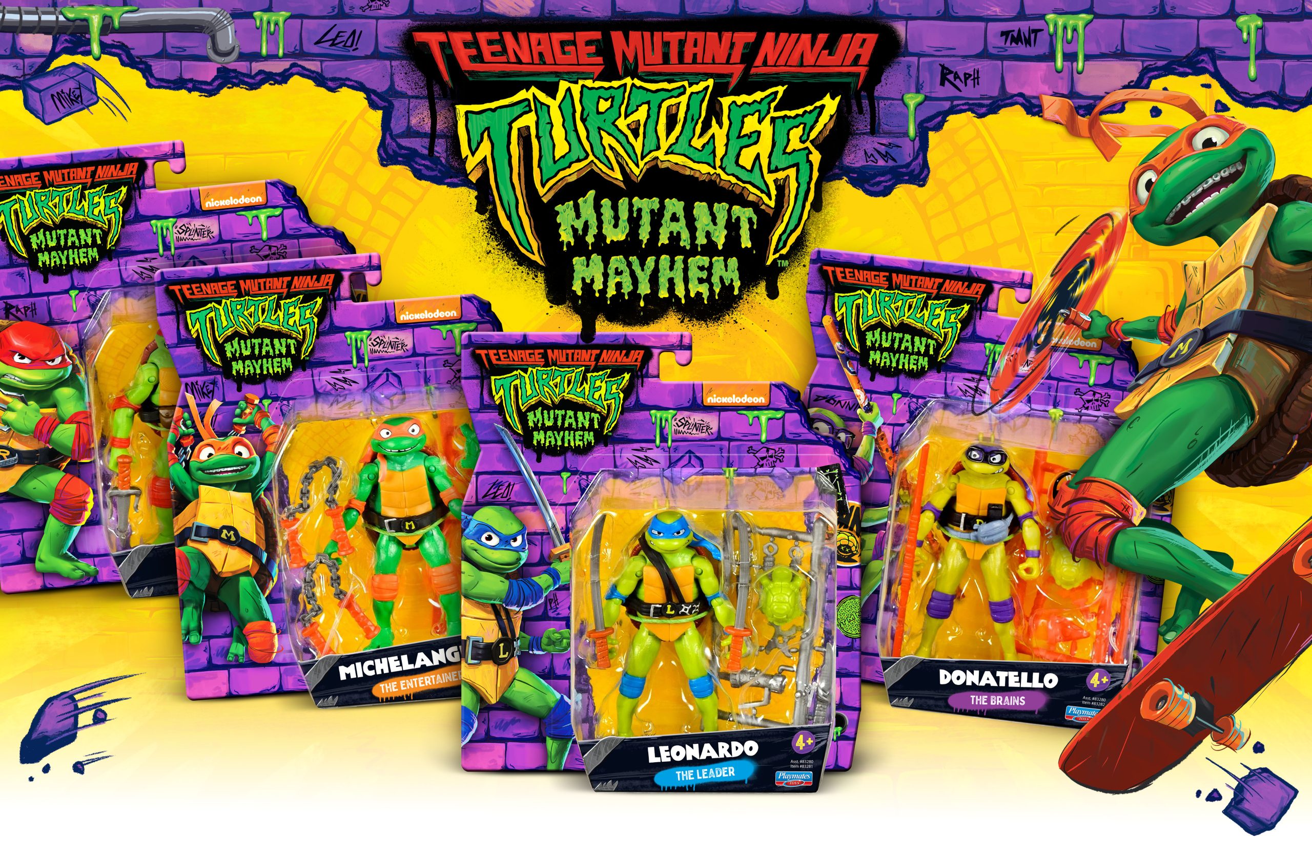
Walmart asked for a refresh. Shoppers remembered the red.
Walmart’s Play Day assignment makes the argument unusually clear. The private label covers indoor and outdoor toys, with hundreds of individual product listings, or SKUs, according to McHale’s case study. A refresh had to work across that assortment. A handsome logo on one carefully chosen mockup would only begin the job.
The designers started with a competitive market analysis and mood boards exploring color, texture, type and photography. Then consumer feedback supplied a boundary: focus groups associated the existing logo and red brand color with familiarity. McHale explored both modest and more radical logo changes, but the selected design retained the original colors while updating the typeface, surrounding shape and circular elements.
The lesson is specific enough to borrow. Before discarding a familiar visual cue, find out whether shoppers use it to recognize you. In this project, research supported continuity within a redesign. The resulting modular layout addressed the second problem: making packages of different proportions belong to the same family. Recognition had to survive a change in shape as well as a change in artwork.
Two monsters, one small stage
For Playmates Toys’ Godzilla vs. Kong packaging, the early constraint was a shortage of finished creative assets. McHale began with sketches of possible package structures, testing where the logo and film imagery could sit. The agency says that early concept work also helped determine packaging structure costs. Drawing was doing financial work before the finished art arrived.
The eventual composition placed the monsters high on the package, confronting each other above a ruined city. Scale became a relationship inside the picture: enormous creatures, smaller buildings, a confrontation the shopper could understand at a glance. McHale reports a 2021 GDUSA American Package Design Award for the work.
As the assignment expanded across Monsterverse properties, the studio used different color schemes, textures and backgrounds to distinguish segments while maintaining a shared identity. Its later Godzilla x Kong: The New Empire work received a 2024 GDUSA package-design award, according to the portfolio. The repeatable idea is to decide what must remain recognizable across the range, then give each branch a controlled set of differences.
The lion that does not join the robot
Voltron presents a less cinematic problem and, for a buyer, a potentially more irritating one. Some figures in the Playmates line could combine into a larger robot. Others could not. The packaging needed to make that distinction clear while appealing to children and established adult fans.
McHale’s solution paired imagery from the show with a color-coded lion identification system. The code highlighted which products could combine and differentiated them from the rest of the assortment. This is where packaging earns its space: explaining a product relationship before someone takes the wrong item home.
Walmart’s Adventure Force posed a related information problem across blasters, vehicles and other action toys. McHale developed an overarching identity, modular packaging rules and coordinated pattern colors for different segments. It also simplified the many feature callouts and used angles to suggest movement. Both projects support the same practical reading of the agency’s work: organize the buying decision, then make it lively.
A shoebox for a sewer-dwelling ninja
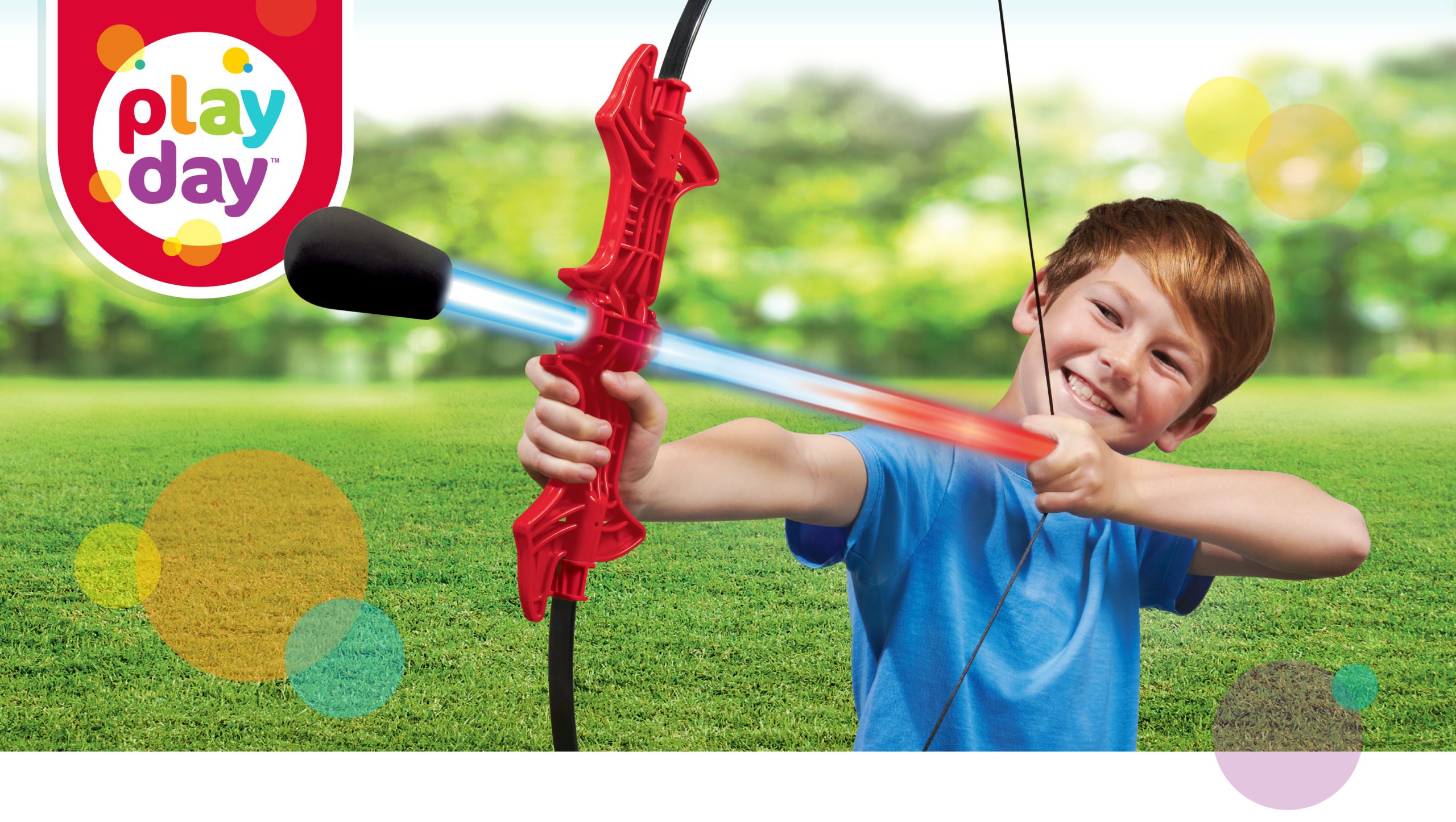
The Turtles let the studio indulge a different instinct. For an Amazon-exclusive Mutant Mayhem “Be A Ninja” role-play set, McHale took inspiration from 1980s sneaker culture. The package used a shoebox concept and a slide-on sleeve. It could also serve as storage for the toy, giving the container something to do after the first opening.
Elsewhere in the Mutant Mayhem range, enhanced product photography and graffiti-style callouts explained feature-heavy vehicles. The visual treatment suited the property while accommodating the ordinary requirement to show how a toy works. A pizza-launching van does, after all, need to advertise its pizza-launching credentials.
That flexibility extends beyond boxes. SEGA commissioned a Classic Sonic trend guide with Y2K-inspired grids, saturated colors and graphic compositions for seasonal products. A subsequent Modern Sonic guide drew on early-1990s pop culture and Memphis-style geometry. The deliverable was a collection of usable graphics, badges and patterns. For a licensing team, such a guide gives multiple products a shared visual direction without demanding identical artwork.
A garage business changes hands
Maureen McHale started the agency in her garage in 1985. Early relationships with Mattel and Playmates helped establish its toy-industry footing. Four decades later, the company’s name still reflects its founder, while ownership and leadership have passed to Joe Campos, now listed as CEO and president.
Campos’ route into toys included an involuntary detour. In a 2023 People of Play interview, he described looking for work after Vivendi Games closed its creative services department. He joined Mattel and stayed for ten years, working with properties including WWE, Hot Wheels, Batman and Superman. The experience put him on the client side of the kind of assignments McHale now handles.
Buying the agency required another shift. Campos said meeting Maureen in 2020 and receiving her trust gave him confidence to take on the business. He later purchased it following her retirement. Asked about his strength, he pointed to listening to clients and communicating their goals to his team. His account makes the succession sound personal and practical: industry experience mattered, and so did the founder’s confidence in who would carry the work forward.
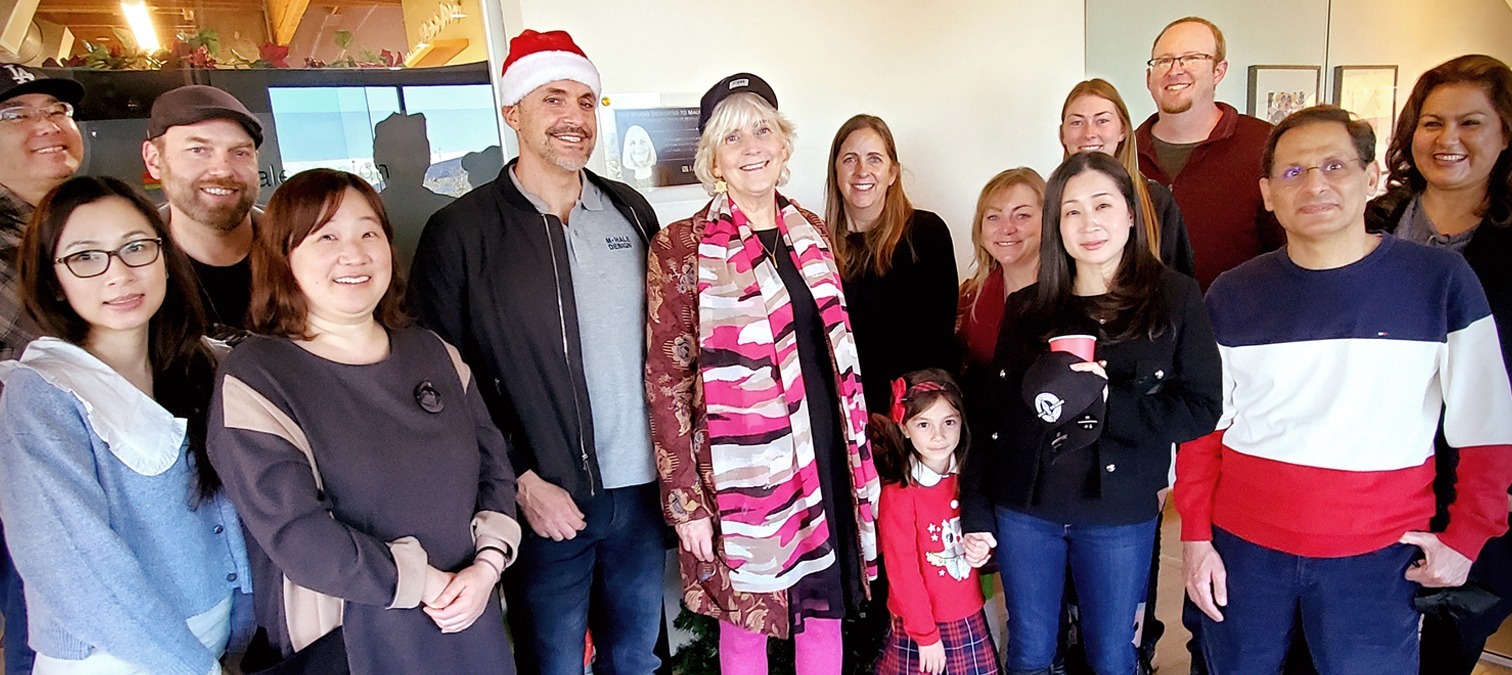

“We have worked with the McHale team for 20+ years.”M. Adamsen, Playmates Toys
Client testimonial published by McHale Design
The invoice buys a system
McHale’s commercial model is agency work commissioned by clients. Its public inquiry form asks prospects to select logo design, packaging, full brand development or another scope, then supply a budget. The first listed band is $2,500–$5,000, labeled minimum engagement; higher bands cover $5,000–$10,000 and $10,000–$25,000-plus. These are inquiry ranges, not prices for the portfolio projects or a promise that a complete toy line fits the entry band.
The About page describes four stages: discover the challenge, define the solution, develop the creative and deliver the solution. For a prospective customer, the important preparation is to bring the audience, commercial objectives and product requirements into the conversation early. The Godzilla sketches show why physical packaging decisions belong there too.
Style guides are a recurring output. For Mattel’s 2024 WWE core line, McHale placed performers’ faces and names at the center of a system of colors, fonts and artwork. For Sunny Days Entertainment’s Honey Bee Acres, the agency created the logo, branding and package structure, with country-inspired patterns and guidance for consistent use. The products differ considerably. Both assignments require an identity other people can apply accurately after the original design meeting is over.
The first budget band, labeled minimum engagement. Scope and a proposal determine the actual fee.
Nostalgia, with production attached
McHale occupies a specialist position between a broad branding consultancy, an independent packaging designer and a toy company’s own creative department. Its visible strength is repeated work with youth entertainment, licensed characters, retail house brands and products bought by both children and collectors. A buyer comparing alternatives can use those assignments to judge relevant experience, alongside scope and price.
The team’s public introduction fits the territory. Art directors appear as illustrated personalities; their miniature biographies include karaoke choices, favorite shows and very particular coffee orders. Operations coordinator Kristina Sledge names puce and gamboge as her least favorite colors. It is a pleasingly occupational grievance. This is the company’s chosen public personality, supported by a roster that also includes production management and operations.
There are quieter examples of judgment in the portfolio. For Mattel-Mega Brands’ Scribble Stuff pens, McHale deliberately let the barrel and cap colors show through the packaging. Scribbles and swirls supplied the surrounding identity. With a colorful product, the object itself could do some of the selling. The designer’s contribution included knowing where to leave room.
What survives beyond the toy aisle
The work suggests a useful sequence for other brands: identify what buyers already recognize, decide what they need to understand, then build rules that survive across the assortment. Play Day supplies the recognition test. Voltron supplies the compatibility problem. Monsterverse supplies a way to distinguish related products without making them look unrelated.
Those approaches depend on the assignment. A modular system becomes more valuable when a range has many sizes or variants; a single product may need fewer rules. Nostalgic graphics depend on an audience that recognizes the references. A shoebox that doubles as storage makes sense when the object fits and the owner wants to keep it. Each solution has a reason to exist beyond its appearance.
McHale’s recent publishing continues the same conversation. Its 2026 posts address startup branding mistakes, lessons from global clients, packaging and trust, and choosing a creative agency. The subjects point toward a broader audience for a business established in toys. Its portfolio remains the more revealing introduction: shoppers remembering red, lions sorted by compatibility, monsters given enough room to loom. Those are small design decisions with a clear job to do.
Into the toy box
Explore the work, meet the studio and follow its next projects.