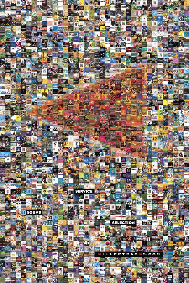
A production-music company wanted a poster its clients might actually frame. Samuels answered with a picture made from pictures: album covers assembled into Killer Tracks’ red arrow logo. The library became the illustration. Stand back and see the brand; move closer and find the inventory. It is a neat way to make an advertising claim without writing a paragraph about it.
The client chose two concepts. The other turned the logo into a musical note and subsequently became the basis of trade advertising. A commission for one object had yielded material for a wider campaign. Samuels’ account describes the starting point as a blank sheet of paper
. The interesting part is what the designers put on it: two different reasons to look.
That small assignment is a useful introduction to the Los Angeles entertainment-design agency. Its work includes film and television campaigns, awards advertising, packaging, booklets and graphics for physical spaces. The familiar movie title gets you into the portfolio. The less familiar object underneath it explains the business.
The work after the first poster
Think of a film campaign as a succession of encounters. A potential viewer needs an invitation. Someone who has already watched may need a reminder. An awards voter needs a reason to reconsider a performance or a piece of filmmaking. A collector may want something to keep. Those encounters can share a title while requiring quite different design.
Samuels occupies that territory. Its The Lost Daughter portfolio, for example, connects to a public account of work spanning key art, print and outdoor awards advertising. Founder David Samuels has described the agency’s key art debuting at Venice. That is a specific contribution to a film’s presentation, rather than a claim to have made every piece of its marketing.
The distinction matters when browsing an agency’s client list. Film campaigns contain many assignments, and a recognizable title can conceal the actual scope. Here, separate portfolio entries for awards work, premiere books and theater displays help a prospective buyer ask a more useful question: which of these jobs resembles mine?
A designer who had sat on the studio side
David Samuels’ background includes both agency design and studio employment. CineMaterial’s agency biography dates his graphic-design and art-direction career to 1989, his entertainment focus to 1994, and a stint managing creative advertising at Sony Pictures to 1997-1999. Samuels opened in 1999. That sequence places the founder inside entertainment marketing before the company carried his name.
The current contact page lists him as president and chief creative officer, alongside creative director Rachael Anderson and senior designers Stephanie Shure and Elizabeth Stroll. This is a business presented through named creative people and their work. The practical appeal of that presentation is straightforward: a client can identify the creative leadership before making an inquiry.
The agency calls itself a boutique and emphasizes personal service. Read that as its positioning. The more concrete evidence lies in the assignments: a promotional package here, a magazine advertisement there, a book built around a particular film. The scale of the object changes; the attention to presentation remains visible.
The agency’s published cumulative count for theatrical and television work since 1999. A measure of experience, not a tally of trophies.
Asking the audience to remember
Awards advertising provides the clearest account of Samuels’ thinking. On its campaign page, the agency describes a visually connected sequence intended to bring an audience back to the emotions of a film. The idea is more demanding than choosing an attractive still: several pieces must feel related while giving each encounter a reason to exist.
That is a useful distinction between recognition and recollection. Recognition says, “I know this title.” Recollection brings back the performance, atmosphere or scene that made the title matter. An awards campaign works in that second territory. Design supplies the prompts, though a portfolio cannot isolate their effect on a ballot.
The Squid Game work includes an outdoor execution featuring Lee Jung-jae. The site also carries separate entries for Ripley, Beef and Baby Reindeer. Seen together, these projects show the agency applying its entertainment-design practice to episodic television as well as feature films. Each title supplies different imagery and a different emotional temperature.
“The art of entertainment advertising.”
Samuels’ stated tagline
The useful lesson for another creative team is to plan the sequence before polishing every individual piece. Decide what should remain recognizable across the campaign and what each new execution should contribute. Otherwise, a series can become a pile of attractive advertisements with little cumulative argument.
A streaming film with something to take home
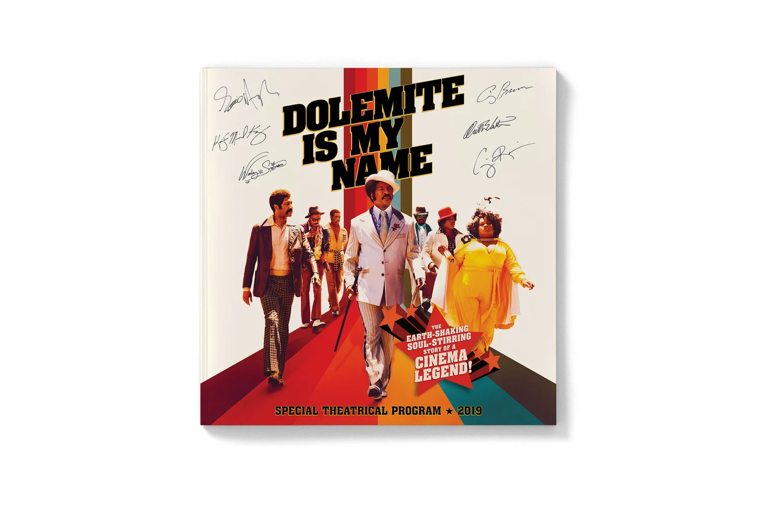
For Dolemite Is My Name, Samuels designed a 24-page collectible book. David Samuels’ public account says it was distributed at the premiere and selected theaters, exploring Rudy Ray Moore’s rise and the movie’s origins. The portfolio shows a cover with retro color bands, an emphatic title and a cast arranged as if walking toward the reader.
A booklet changes the pace of promotion. A poster has to establish its priorities immediately. A book can move through an introduction, photographs, supporting detail and another turn of the page. The reader controls how long to stay. The design problem becomes one of pacing as well as impact.
The agency’s Marriage Story and The Two Popes portfolios also include for-your-consideration booklets. Its Netflix screener work places those books within a broader collection of physical awards materials. For a company promoting screen entertainment, print can still provide another kind of encounter with the work.
There is a buying lesson here, too. Before commissioning a booklet, decide what earns the extra pages and how it will reach its reader. The object needs both an editorial purpose and a destination. The Dolemite example has those ingredients built into the assignment: a story to expand and a premiere audience to receive it.
The yellow dress leaves the screen
Samuels’ La La Land theater-display portfolio moves the problem into a room. One mockup places costume cases on either side of a large image of the leads dancing. The yellow dress appears both in the picture and beside it. A familiar visual element becomes a physical point of connection.
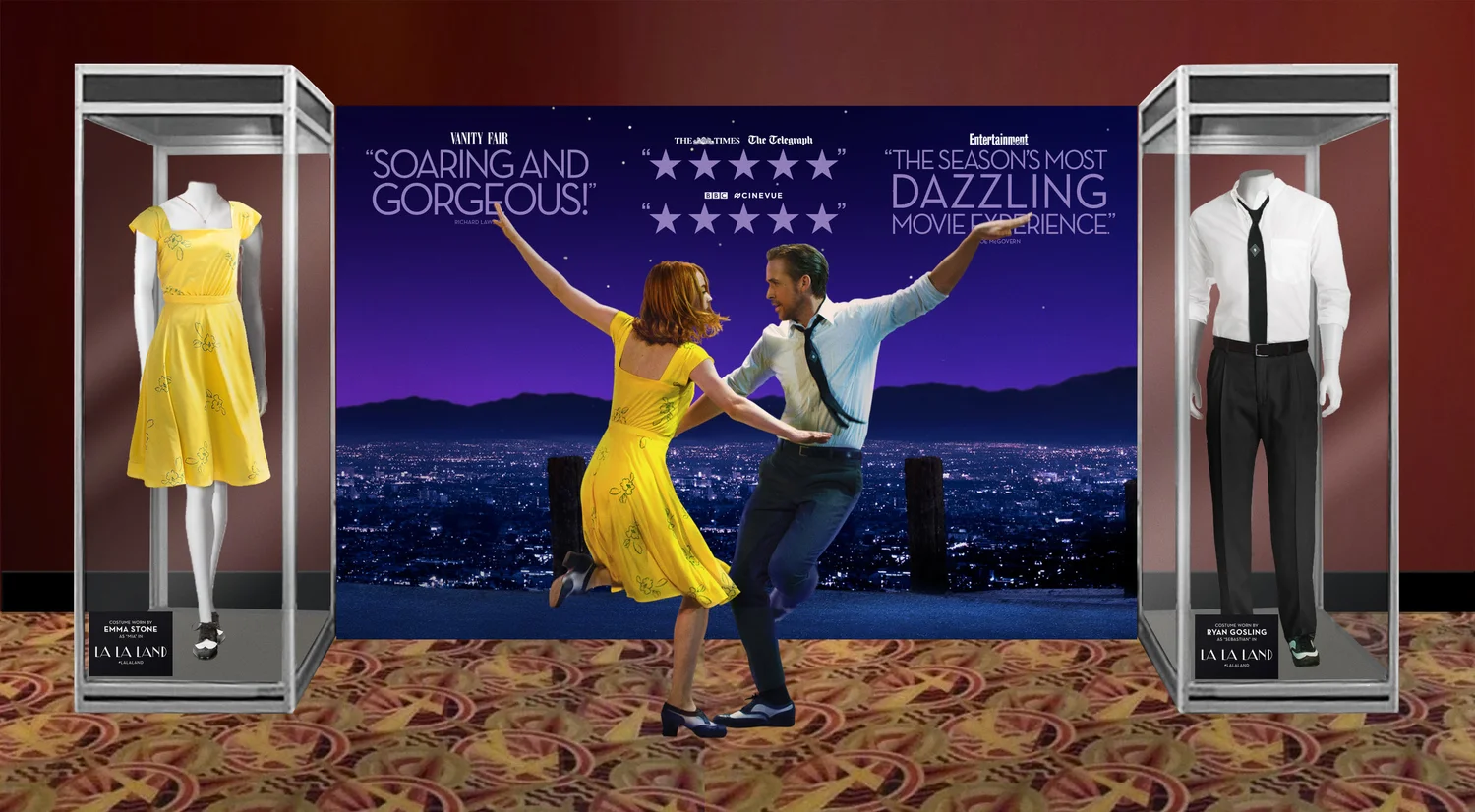
The arrangement asks for different judgments from a magazine page. Where will somebody stand? What is visible across the lobby? Which details reward walking closer? The mockup lets a client consider those questions before treating the design as a finished environment.
Elsewhere, the Peeta’s Bakery entry shows a logo and product mockups, while the home-entertainment gallery includes a Barney Miller box set. These are different objects with different audiences. Together they explain why packaging and environmental graphics belong beside key art in the same agency portfolio.
Establish the image.
Work at a glance.
Expand the story.
Reward another page.
Use the room.
Invite a closer look.
What a client is actually buying
The commercial model is commissioned creative work for other businesses. Studios, streamers, distributors and music companies hire design expertise around particular releases and campaigns. The resulting products are the campaign materials themselves: artwork, layouts, packaging and related creative assets. The portfolio is the sales demonstration.
Comparable choices include BLT Communications, whose services cover key art, campaigns and digital work, and Create Advertising, which offers a wider entertainment-marketing menu including motion and editorial services. Those overlapping capabilities put Samuels in a specialist creative market. Its case rests on the fit between its people, its portfolio and the assignment.
For a buyer, the sensible starting point is a scoped brief: intended audience, formats, supplied imagery, approvals, deadline and distribution. Treat design, print production and placement as separate budgeting questions unless the proposal explicitly combines them. A booklet and a billboard involve different commitments even when they promote the same film.
The first thing to test is whether the proposed format can do the requested job. A beautiful booklet cannot compensate for having no plan to deliver it. A display needs a suitable space. An awards advertisement can encourage reconsideration; it cannot promise an award. These are practical boundaries for commissioning the work, not verdicts on any Samuels campaign.
The next assignment is already different
Samuels marked 27 years in June 2026. Its portfolio, reviewed in September, includes Beef Season 2, Train Dreams and KPop Demon Hunters alongside older packaging and print projects. The company’s published work spans several generations of entertainment formats without requiring every assignment to look alike.
The lesson worth borrowing is modest and specific. Start with the audience’s next encounter. Give competing concepts different jobs. Examine the piece at the distance, scale and pace in which someone will actually meet it. Sometimes that means a large image in a theater lobby. Sometimes it means enough pages to tell the story behind a movie. And sometimes a catalog of album covers can become the picture itself.
Look closer at the work
Explore Samuels’ full portfolio, the Killer Tracks project and its awards-campaign approach. Follow the company on LinkedIn or David Samuels, and use the contact page for project inquiries.