A surfboard logo has a difficult job. It must look contemporary without making the people who already love it feel that somebody has sold their club. When Firewire hired Libre Design & Digital to update its identity in 2024, that tension was the assignment. The mark had nearly two decades behind it. The business wanted cleaner lines and a more precise appearance, while retaining the pleasure and freedom associated with riding a wave.
That is a useful introduction to Libre. The Encinitas agency works in the space between recognition and reinvention, then follows the work into websites, packaging and advertising. Its portfolio runs from handmade eyewear to gaming keyboards and mycelium materials. The common question is practical: how does a company make its next move without becoming unrecognizable to its customers?
The answer can involve typography. It can also involve an unglamorous afternoon reorganizing an advertising account. Libre sells both kinds of attention. Its appeal is the possibility that the people developing a brand’s appearance can stay involved when the business needs that appearance to generate interest, purchases or a visit.
A product founder at the drawing board
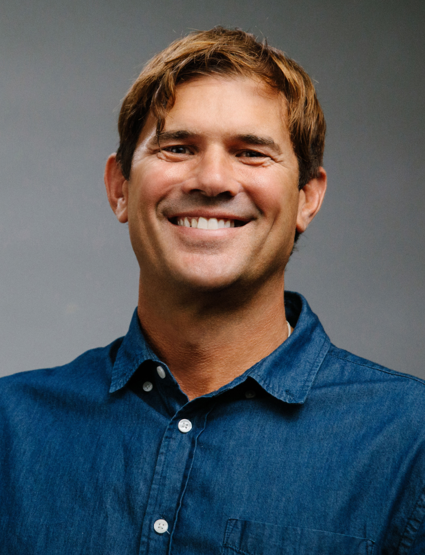
Founder and creative director Justin Heit launched Libre in 2005 after working with Transworld Media and Nixon. Those roots help explain the surf and lifestyle companies in the portfolio. They also provide a more specific credential than a general declaration of creativity: familiarity with communities that pay close attention to how brands present themselves.
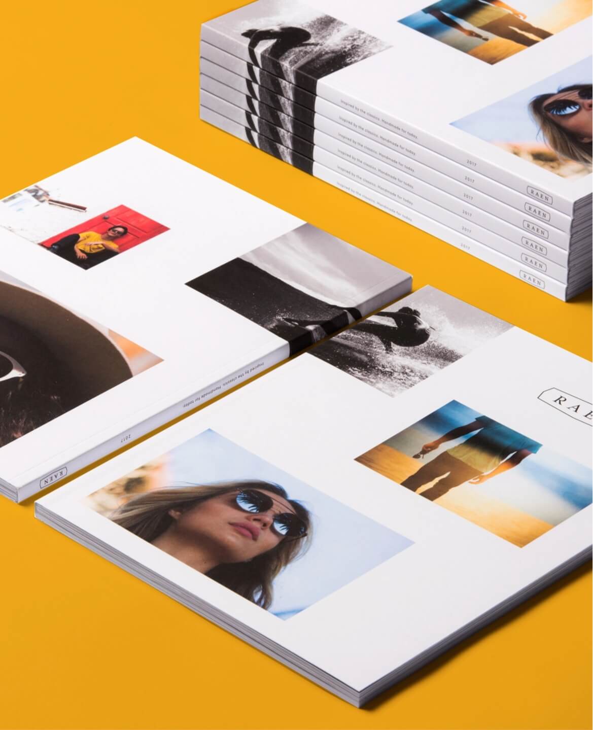
Heit helped establish RAEN in 2008 with his brother Jeremy and Jordan Percy. In an interview about the eyewear company, he described using a product matrix to identify opportunities by gender, style, face shape and trends. It is a revealing detail. Designing something attractive was part of the job; deciding which attractive thing the collection needed was another.
Libre’s RAEN relationship has continued across art direction, digital assets and printed materials. That longevity gives the agency a view of a brand across multiple collections, rather than through a single launch. In June 2026, Libre described its work on REC°, RAEN’s move into performance eyewear. The assignment joined technical features to an established visual identity, extending the collection’s mark and patterns across frames, packaging and product pages.
The refresh that leaves something standing
Firewire makes Libre’s approach especially easy to see. The project concentrated on refining the icon and wordmark, bringing cleaner geometry and balance to a familiar identity. The published work extends into messaging and website applications. A useful refresh has to survive those everyday uses, where a customer encounters only a small fragment of the design system.
The same instinct appears in Libre’s Ecovative work. The materials company was broadly satisfied with its logo and wordmark but wanted refinement. Libre smoothed the forms, expanded the color palette and introduced patterns. The resulting system reached business cards, a website and a trade-show booth. A company can need more expressive range without needing to throw away its name or recognizable mark.
Forager presented a different brief. The Ecovative business approached Libre in 2021 for a sub-brand identity and a website. Libre developed the logo, typography, colors and patterns, then says it spent four months designing and building the site. Here the problem was giving a new materials proposition its own public face, with enough structure to work across different applications.
“The team consistently produces high quality work.”
Andy Bass, quoted in Libre’s Forager case study
These projects locate Libre between a specialist identity studio and a broader digital agency. A buyer can commission the visual system and also obtain the website, photography, campaign assets and marketing support that put it to work. That breadth is useful when the same unresolved question keeps surfacing in several departments.
What broke was the media plan
Glorious Gaming supplies the less photogenic half of the story. The hardware company sells keyboards, mice and related accessories to gamers and PC enthusiasts. Libre’s account of the engagement describes paid media without a clear structure for balancing awareness, customer acquisition and revenue. The response was to establish clearer measures, separate campaigns more deliberately and coordinate search, social advertising and website conversion work.
The live case study reports monthly ecommerce transactions rising from roughly 2,900 to more than 6,700 during the partnership. It also reports a high-performing month with approximately $591,000 in revenue. These are agency-reported observations from selected periods; the sales figure is Glorious’s ecommerce revenue, not Libre’s fee or revenue.
One decision offers a concrete lesson: Libre says imagery featuring people generated 85 percent more revenue than product-only creative in its testing. The finding favors testing the customer’s context alongside the object for sale. It does not establish that every keyboard campaign should use a face. The useful habit is allowing observed behavior to revise an attractive creative assumption.
How a glove brand made room for socks
Gordini’s category expansion required a different kind of coordination. Beginning in summer 2022, Libre worked on the brand hierarchy for dual-layer socks, developing color, handwritten typography, icons and patterns. Photography combined close views of the fabric with product and lifestyle imagery. Packaging and point-of-sale displays had to explain the category where people actually bought it.
Then came videos, advertising, ambassadors and email ahead of the October 2023 launch. Libre reports that socks accounted for 26 percent of online sales during the 2023/24 winter season, with three sock products among the five best sellers. The work gives that number context: the launch involved a sequence of connected decisions across retail and digital channels.
Share of online sales attributed to Gordini socks in the 2023/24 winter season, according to Libre.
A reader can borrow the sequence. First decide where the new category belongs within the existing brand. Then explain what the product does, using imagery that makes the difference visible. Carry that explanation into the store, the product page and the launch email. The design brief becomes easier to judge when each piece has an assigned job.
A can of FIZZ leads to a surf park
Libre’s Hard FIZZ project shows how one assignment can lead to another. For the Australian seltzer brand, the agency chose warm, bright packaging colors to stand apart from the white cans it saw dominating the category. It also used regional Google Trends interest to inform launch planning and built a Shopify store for direct sales.
That work caught URBNSURF’s attention, according to Libre’s account of the relationship. The surf-park operator engaged the agency to refresh existing guidelines and create event campaigns. In the first five months, Libre says it refreshed the guidelines and produced original artwork for three events. The relationship later included the campaign for the Sydney park’s opening.
The attraction here is accumulated familiarity. An agency that understands the audience can use its time on the particulars of the business: how beginners and experienced surfers find their place, how an event sits within the wider identity, and how the same team produces the next piece of communication. Reusable design decisions become part of the operating machinery.
The price of keeping it connected
Libre operates through scoped services and continuing client relationships. Clutch lists a minimum project size of $10,000 and hourly rates of $150-$199. An Ecovative review places its branding and website engagement in the $50,000-$199,999 range. Those are published directory figures and a client-reported project bracket, rather than a universal price list.
Time has a structure, too. Libre describes discovery using research, questionnaires and a brand exercise, followed by a design phase typically lasting eight to 12 weeks. Its process allows up to three feedback rounds, with deliverables such as a brand book, launch campaign or digital strategy. Ongoing support can follow the initial project.
*Typical design phase described by Libre; scope and complexity affect timing.
This model asks something of the client. Someone must supply the commercial priorities, make decisions and consolidate feedback. An organization seeking a single quick asset may find a narrower supplier more suitable. A coordinated engagement earns its cost when there are several connected problems to solve and enough internal attention to keep the work moving.
Client feedback adds a useful wrinkle. Ecovative’s reviewer praised the adaptable design system but wanted more detailed updates during design. Another small-brand reviewer identified prioritization within a limited budget as the challenge. Access to more capabilities still requires choices about what deserves attention first.
The next brief glows in the dark
Libre’s newer work stretches the portfolio beyond its surf roots. For Nuevo’s Sanctuary development, the agency created identity, naming and messaging for nine homes in Olivenhain. For Glowing Oceans, founded by marine scientist Andy Bass, it developed a name, visual system, tone of voice and environmental graphics around a bioluminescence experience.
In August 2026, Libre announced plans for a Glowing Oceans pop-up in Singapore that October. The identity was designed to work for an experience that could travel. That changes the brief: the same idea must make sense on a screen, inside a physical space and in another city.
For a prospective client, these are useful questions to bring to Libre’s proposal form. Which part of the business is changing? What should customers still recognize? Where must the new idea appear, and what action should follow? The answers turn a request for better-looking marketing into a brief that a designer, developer and media specialist can each act on.
Follow the work
Explore the projects, meet the studio and see what it publishes next.