In October 2025, Philadelphia’s great art museum did what institutions often do when they want to seem more open: it changed its name. Out went “Philadelphia Museum of Art.” In came “Philadelphia Art Museum.” The Brooklyn studio Gretel supplied the visual identity around it: a redrawn griffin, custom lettering, a palette with the texture of the city and a system that could live on a building or in a browser. Four months later, the museum changed the name back. The griffin stayed.
This is the rare rebrand with a second act. Brand launches normally end with a triumphant case study and a film in which type slides across the screen. Philadelphia offered a more useful ending. One part of the new identity proved negotiable; another proved durable. For a studio that says it creates clarity, that distinction is worth more than a hundred perfect mockups.
- Gretel is an independent Brooklyn studio founded by Greg Hahn in 2005.
- It designs strategy, language, identity, motion and experiences for organizations whose many parts need to feel related.
- Its clients include CBS, Nike, PayPal, RISD and the Philadelphia Museum of Art.
- The Philadelphia museum restored its old name in 2026, but kept Gretel’s griffin and visual system.
A griffin with a past
The museum’s griffin was not an invention from a mood board. Versions of the mythical animal had been sitting on the museum’s cornices for decades, and a griffin badge dated to 1938. Gretel redrew the badge to work at two extremes: enormous on a facade, tiny as a social icon. This is a particular kind of restraint. The studio’s job was to make a familiar creature speak clearly in new places.
The supporting typography went deeper into local history. Gretel and type designer Ryan Bugden built Fairmount Serif after studying lettering in the museum’s archives and around its campus. The reference trail led to Sol Hess, a Philadelphia designer whose Hess Neobold joined industrial weight with classical form. The resulting typeface was meant to steady a looser family of type inspired by storefronts, street vendors and murals. The museum could be formal on a wall label, exuberant on an exhibition poster and still recognizably itself.
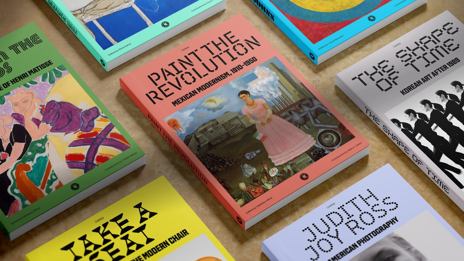
Gretel also worked with digital partners Gone Fishing and Self Aware on the museum’s web experience. That matters because an identity is only partly a drawing. It is a set of agreements among signage, merchandise, exhibitions, social posts and a website. If those pieces cannot use the same grammar, the finest logo becomes a lonely stamp.
Then the name went back
The museum announced the new identity and shorter name on October 8, 2025. The change drew criticism, especially around the name. In February 2026, its board decided to return to “Philadelphia Museum of Art” after reviewing feedback from staff, trustees, members and the public. Its own announcement said the griffin and brand identity would remain. Gretel was involved in the modifications. The result is a useful distinction between the part a designer can craft and the part an institution must earn from its community.
The museum introduces Gretel’s griffin, typography and broader system.
The board restores the former name and retains the visual work.
The economics are less tidy than the press images. The museum said discovery, strategy and visual labs cost $250,000, with additional spending on wayfinding and media. Later reporting put the entire rebrand north of $1 million and the name correction at about $50,000. Those are museum project and rollout figures, not a published Gretel fee. For a prospective client, the point is practical: the invoice for design is only one line in the cost of changing a public institution.
What failed first? The name, plainly. What changed the museum’s mind? Feedback from the people who felt they had a stake in it. The studio’s surviving work suggests that visual continuity can be separated from a naming decision, provided the system was built with enough flexibility. That is a lesson a board, a marketer and a designer can all take home, though each may tell it differently.
How an old eye learned new tricks
Philadelphia is not an outlier in Gretel’s portfolio. At CBS, the studio faced another inherited mark: the Eye, designed in 1951. CBS News, Sports, Entertainment and Studios had developed inconsistent typography, colors and even versions of the Eye. The assignment was to make those units feel related without sanding away what made each one useful. Gretel pulled the Eye apart into geometric elements and a motion behavior that expands and contracts. The core image remained; the rules around it became more capable.
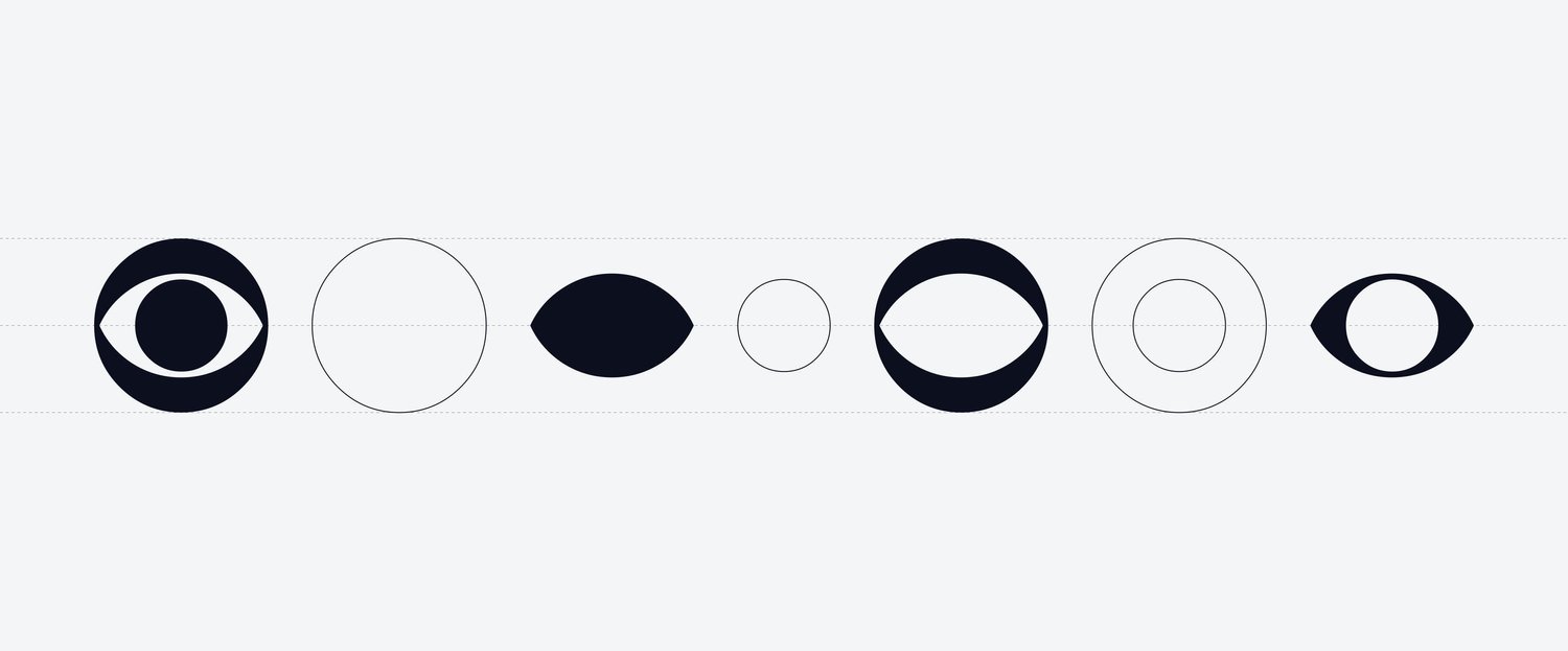
The system even had a five-beat sonic signature, made with audio partner Antfood. A CBS viewer might encounter the brand on broadcast television, a phone, a sports graphic or a bus shelter. Its recognition could no longer depend on a static logo in the corner. Gretel gave the identity a behavior. That emphasis makes sense for a studio that began in motion design and still thinks about how marks move, appear and interact.
Nike Membership shows the verbal side of that method. Nike Plus had become easy for customers to miss inside a larger Nike world; some did not know they were members. Gretel helped rethink the program’s positioning, naming and messaging. After exploring options, the simplest name won: Nike Membership. The lesson is almost rude to the cleverness industry. Sometimes the breakthrough is telling people what the thing is.
The business behind the beautiful pages
Gretel sells client commissioned work, not a packaged software product. Its public disciplines cover discovery, strategy, brand architecture, visual identity, writing, experience design and art direction. A client pays for a combination of thinking and execution: decisions about what the organization means, followed by tools that let many people express those decisions consistently. Project prices and studio revenue are not public.
The clients differ in scale and temperament. A global payments company needs a visual, verbal and sonic system that can work across languages. A design school needs a framework loose enough for its students to use. A Brooklyn audio shop can ask for felt-tip marks that are deliberately awkward. Gretel’s specialty is finding a small set of principles sturdy enough to hold all those differences without making every brand look like Gretel.
That positions the studio among independent brand firms such as Collins, Pentagram and Base Design, alongside larger agency design departments and in-house teams. Its advantage is visible in the work rather than a claim of size: strategy and motion are considered together. Its limit is also clear. A graphic system cannot settle who gets a vote on an institution’s name. If the public has a sense of ownership, the organization has to bring them into that decision before spending on signs.
The most copyable move is mundane enough to be neglected: separate the enduring assets from the debatable ones. Identify the mark people already love. Test the proposed name with the people likely to defend the old one. Design typography and behavior that can outlast a slogan. Budget for rollout as well as the reveal. Gretel’s Philadelphia project demonstrates what such a system can preserve; the museum’s reversal demonstrates what it cannot decide alone.
The name went back. The griffin stayed. Neither event cancels the other. Together they make a better case study than a launch ever could.