A saxophone, a paintbrush, a sun umbrella and an enormous red 50 crowd into Michael Freeland’s anniversary design for the Smoky Hill River Festival. The artwork has a lot to celebrate, and very little interest in sitting quietly. It is also a useful introduction to his business: a designer translating the life of a Kansas community into something people can recognize, carry and wear.
Freeland Design, which trades as Mr. Freeland Design, works across branding, websites and marketing. Its most distinctive subject is Salina itself. Look through the portfolio and the assignments begin to resemble a civic itinerary: a foundation, a library, a festival, a workforce campaign. These are organizations that need people to understand what they do before they can persuade them to participate.
That gives the studio a particular place in the design market. It offers an experienced individual’s attention to organizations with practical communication problems. The interesting question is how well a designer can understand an institution, then give that understanding a public form.
The hometown was a decision
Freeland grew up in Salina, graduated from Kansas State University and spent almost a decade in Fort Worth. In a Chamber of Commerce interview, he explained that having children prompted him and his wife to return. The decision about where to build a family became a decision about where to build a business.
He had already spent more than 13 years doing freelance design when, in that undated interview, he described moving into it full time. Remote communication let him work with clients from Salina. His immediate business priority was building referrals in the surrounding area; a possible office and staffing were longer-term ambitions.

The current practice still introduces itself personally. Freeland’s biography describes more than 23 years in design and marketing. His starting questions concern the client’s business, audience and differences. The promised output follows from those answers, whether the assignment calls for a logo, brochure or website.
“make your message clear so your audience listens.”Michael Freeland, on his design goal
That is a modest-sounding ambition with a demanding test. An organization may understand itself perfectly and still explain itself badly. A designer has to notice the gap. For a buyer, the first conversation should reveal whether the person across the table can describe the problem in ordinary language before proposing a visual treatment.
A library with more to say
Freeland’s relationship with the Salina Public Library extends beyond a portfolio entry. In an October 2024 essay, written as a member of the Re-Imagining our Library steering committee, he recalled using the library from childhood onward. His reading had progressed from early readers to Stephen King and professional-development audiobooks. He reported owning almost every King book.
The same essay described a working parent’s library: a place for business meetings, family activities and books for his children. He set himself a goal of reading or listening to one professional-development book each month. His argument for renovating the youth area came from having used it, and from wanting his own children to benefit from its next chapter.
There was earlier involvement, too. In 2018, Freeland was part of a six-person Leadership Salina group that installed six permanent story-walk signposts on library grounds at Caldwell Plaza. The project supported early literacy through the library’s 6 by 6 Ready to Read program. It turned a walk near the building into an opportunity for children and caregivers to engage with reading.
That history adds texture to the design relationship. Library staff describe working with him on a logo update and a custom illustration for an Adult Spelling Bee fundraiser. The assignments require different voices: an institution needs an enduring identity, while a fundraiser can afford a little mischief. Both have to feel at home with the same audience.
The brief stretches beyond the logo
The festival anniversary makes that range visible. Freeland’s theme work includes posters, wristbands and digital marketing. In the artwork, the oversized anniversary number supplies the main event; smaller objects suggest music, art and summer. The year range, 1977-2026, gives the celebration its historical frame without asking the viewer to read a paragraph.
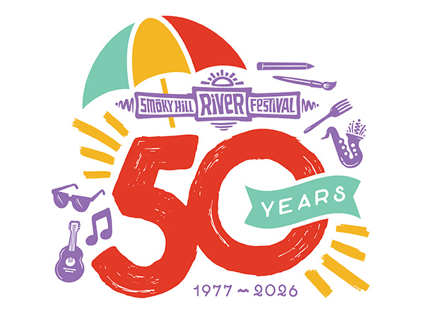
For someone commissioning similar work, the lesson is to list the destinations before approving the design. A poster can carry detail. A wristband offers a narrow strip. A digital placement might receive only a passing glance. An attractive composition in one format is the beginning of the review, with the other formats still waiting their turn.
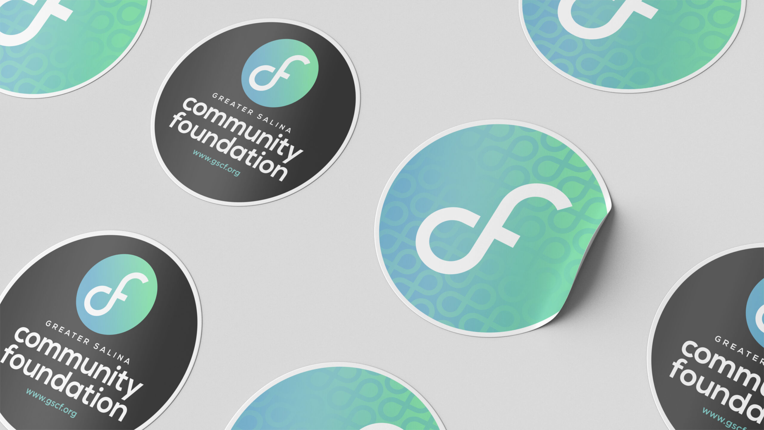
The Greater Salina Community Foundation project presents another problem: related organizations need a recognizable family resemblance. Freeland’s portfolio identifies branding for the foundation and its Kansas affiliates. The pictured materials pair a circular symbol with a clear name treatment and a blue-green palette. The work has to support both recognition and distinction.
Imagine Salina brings the same question to recruitment. Freeland developed visual materials for a five-year workforce campaign, while the Chamber’s campaign document lists him on its branding and marketing committee. A place recruiting workers needs to present a coherent invitation across its materials. The design helps introduce the opportunity; employers and the community must then make good on it.
The outside designer who stays in the conversation
The business sells creative services to clients. Its menu includes visual identity, print, web design, advertising graphics and signage, alongside social media, illustration, photography and marketing consultation. That breadth suits an organization whose needs move between channels and whose staff would benefit from a designer already familiar with its voice.
Client accounts suggest several ways the relationship can work. Kansas Wesleyan University’s former marketing director described Freeland as an extension of its department for outsourced assignments. Child Care Aware of Kansas describes a relationship lasting many years. ProcureVision’s Dallas testimonial recounts remote conversations followed by a design that combined aspects of two initial options.
The ProcureVision account is particularly useful for buyers. Feedback did not require treating one first-round concept as untouchable. The client identified elements worth keeping, and the design developed from there. That is a concrete form of collaboration: explain what communicates the right idea, then give the designer room to bring those choices together.
In the market, the alternatives include an agency, an internal designer or another independent practitioner. Freeland’s appeal is the combination of direct contact and a portfolio with substantial community work. A buyer should compare the relevant assignments, the proposed scope and the working relationship. An impressive client list alone cannot answer whether the next brief is a good fit.
What the invoice can tell you
A public Kansas campaign-finance filing offers a small glimpse of paid work. It records payments to Mr Freeland Design of $175 on September 27, 2024, and $1,000 on October 10, 2024, categorized as electronic or website advertising. Those are individual transactions. They should not be read as a logo price, a website package or a general rate card.
The distinction matters when comparing creative services. A payment amount makes sense only alongside the assignment it covers. For a new project, buyers can ask for the deliverables, revision rounds, approval responsibilities and production costs to be spelled out. Design fees, printing and advertising placement can represent different parts of the same undertaking.
A useful brief also sets a finish line. Is the job complete when the artwork is approved, when the website goes live or when the campaign materials are ready for use? Answering that early gives both sides something more reliable than a shared hope that the project will somehow feel finished.
Recognition, with a local address
In March 2023, Salina’s Choice placed Michael Freeland first in its graphic designer category. The result fits the geography of his public work: community recognition for someone whose assignments repeatedly intersect with community organizations. It is one signal of local standing, alongside the projects themselves and the people willing to describe their experience of working with him.
His public creative conversation also extends beyond client delivery. With Fili Creative producer Alicia DeHaan, Freeland has discussed advertising in Marketing: Mishap or Marvel? Their subjects include New Balance’s use of white space and movie-trailer promotion. The format puts design judgment on display: what catches attention, what communicates, and why a particular choice might work.
For readers borrowing from this practice, the useful habit is to begin with the audience and follow the idea into its actual uses. That approach needs cooperation. If an organization cannot agree on whom it serves, or cannot assign anyone to approve the work, a fresh visual identity will inherit the confusion. The brief deserves as much attention as the reveal.
Freeland’s portfolio keeps returning to places where that attention has a visible destination. Someone sees a festival poster, recognizes a foundation or encounters a library fundraiser. The designer’s name may never enter the conversation. The organization’s name does. For this kind of design business, that is a sensible place to measure the work.