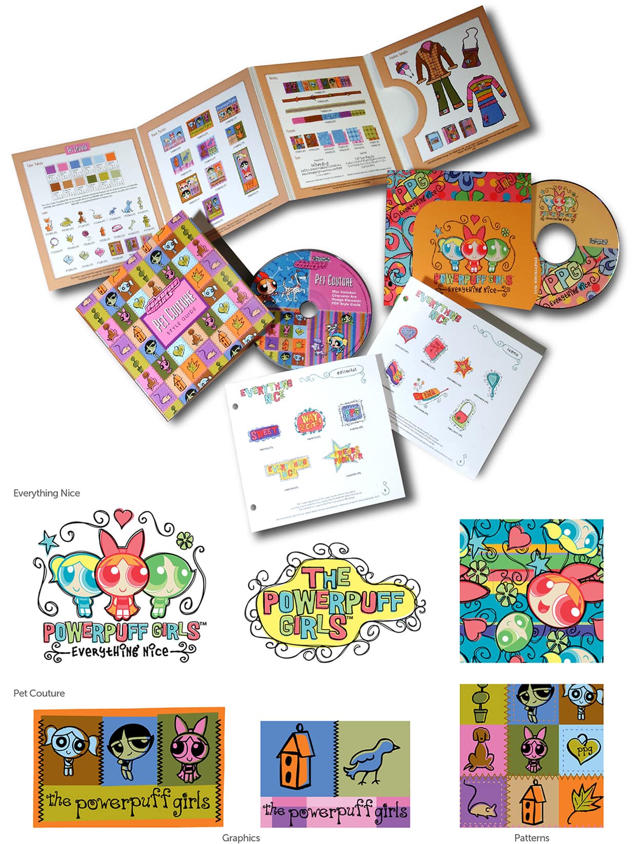
The Powerpuff Girls have acquired a wardrobe, a pattern library, and something called “Pet Couture.” In DGVC’s portfolio, Blossom, Bubbles, and Buttercup appear amid curling letters, cheerful color blocks, little birds, and doghouse drawings. The presentation includes printed guides and discs: a cartoon world packed up so other people can put it to work. It is a useful introduction to a studio whose designs have to do more than look good in a frame.
DGVC is Dan Georgopoulos Visual Communications, an Orange County design practice founded in 1995. Its territory stretches from logos and packaging to entertainment style guides, album artwork, and consumer products. The interesting part is how often those assignments overlap. A character becomes a pattern. A pattern becomes an accessory. A visual identity finds its way onto a supermarket sign or a motorcycle tank.
That gives a prospective customer a concrete way to read the portfolio. Look past whether a particular logo appeals to you. Look at the range of surfaces the work must inhabit. This is a practice concerned with what happens after an identity is approved and starts encountering the world.
A cartoon needs a working wardrobe
The Powerpuff Girls presentation makes the process unusually visible. Colors, lettering, illustrations, and patterns sit together as related parts. There are layouts that put the characters front and center, and quieter supporting elements that can fill a background. The charm comes partly from the drawn quality of the marks: the letters and little decorations have personality without requiring a whole new cast.
In a public description of his Ben 10 work for Cartoon Network Consumer Products, Georgopoulos identifies both key artwork and repeat patterns intended for apparel, accessories, and soft goods. That distinction matters. A large character composition and a repeated fabric motif have different jobs, even when they share the same fictional universe. A style guide helps make those jobs compatible.
His account of designing the Horseland show identity makes a related point: the logo was conceived with consumer products and other uses in mind. The studio’s broader guide portfolio includes Disney’s Ultra Modern Princess, Captain Morgan, Sesame Workshop, and Warner Bros. properties. These are portfolio credits for particular work, rather than a claim to have created the underlying characters or brands.
For a licensing team, the useful question is whether a designer can extend something recognizable without making every application identical. DGVC’s published work offers a way to inspect that judgment. The evidence is in the relationship between the pieces: how much they share, how much each can change, and whether the original property still comes through.
Before the studio, a burger stand
Georgopoulos’s company biography places his formal training at ArtCenter College of Design in Pasadena, where he received a BFA in Graphics/Packaging Design in 1990. He subsequently worked on the redesign of Surfing Magazine and became its art director. DGVC followed in 1995. The sequence connects editorial composition with the packaging and identity work that would fill the independent studio’s portfolio.
His account of learning to work starts much earlier. In an April 2025 Bold Journey interview, he recalled helping at his Greek immigrant parents’ burger stand in Boyle Heights. He picked up parking-lot litter, cleaned tables, and accompanied his father on early trips to the Los Angeles produce market. The recollection is specific enough to puncture the usual polished founder biography: some mornings started at 3 a.m.
He describes creativity, adaptability, and perseverance as central to his career. His advice to younger designers includes regular sketching, studying work from different periods, learning tools, and accepting feedback. These are working habits rather than a glamorous origin myth. They also suit a portfolio that changes subject repeatedly while returning to lettering, illustration, and the organization of visual information.
The motorcycle gets a color argument
A particularly clear example appears in CSC Motorcycles’ 2025 San Gabriel 250 Café Racer. CSC credits Georgopoulos with the model’s logo and colorway, alongside broader work on the company’s visual identity, website, and social media. The published project image pairs a pale blue tank with a black mechanical silhouette and vivid orange accents.

This is graphic design with a physical destination. The emblem must sit on a tank as well as in promotional artwork; the palette must relate to an object with wheels, metal, and a very particular outline. DGVC’s contribution here is visual identity and appearance. Keeping that scope precise makes the example more useful: it shows the designer’s part in a larger product.
The motorcycle also gives the studio’s emphasis on color a practical setting. In the image, blue occupies a broad, simple surface while orange supplies smaller flashes. The badge introduces a compact patch of lettering. Those are observable choices about proportion and attention, and they are easier to discuss than an abstract promise that design will make a business memorable.
Packages, bags, and the supermarket wall
Across the packaging portfolio, DGVC lists assignments for Aroma Paws, Studfloats, BinkLink, Verti-Clone, and Message for Your Bottle. Some entries combine branding with packaging; others explicitly add product development. The product gallery extends that range to Sweda bottles and notebooks, Buckle-Down wallets, Disney Store backpacks and lunch boxes, and housewares associated with A Christmas Story.
The distinction between designing a package and developing a product is worth preserving. These are different responsibilities, and DGVC’s labels do not give every project the same scope. For a buyer, that is a reason to discuss the actual assignment: an identity, the graphics around an object, or work on the object itself.
In his 2025 interview, Georgopoulos described Marketón supermarket identity work and an interior assignment for its new Las Vegas flagship. He also discussed women’s bags and branding for Wicked Misfit. Together, the examples suggest why the studio’s range can be useful to a business with several related design needs. The conversation can encompass a retail setting or a carried accessory as well as a mark.
Music supplies another set of surfaces. The portfolio includes Pablo Cruise, Davy Knowles, Cory Charles, and Katrina, with album work, posters, and advertising appearing together. A musician has a different audience from a supermarket or a pet-accessory company. Seeing those assignments side by side encourages a more discriminating reading of the work: which choices belong to the client, and which reveal the designer’s hand?
The service is judgment, delivered as design
DGVC offers creative consulting and commissioned design. Its public capabilities include strategy, art direction, identity, illustration, packaging, print production, and product development. Georgopoulos also invites collaboration with agencies, manufacturers, and product developers. That places the studio in the market for outside creative expertise, whether the buyer is commissioning its own identity or needs help with a client project.
“Our focus and passion is solely concentrated on good design.”DGVC / Thinking
The studio’s website is unusually blunt about the language around that work. It says it avoids familiar agency buzzwords and wants designs to stay relevant over time. The claim is best assessed against the portfolio itself. A prospective client can compare the studio’s hand-drawn elements, forceful lettering, and color choices with the character of the business it wants to present.
Alternatives include an independent designer, a specialist packaging studio, a licensing-art agency, or an internal creative team. DGVC’s particular case rests on the overlap of these assignments in one portfolio. A buyer seeking identity work with a path into physical products has several relevant examples to examine. Someone whose needs lie elsewhere should evaluate a different body of work.
What a buyer can take from the portfolio
The most useful lesson is to commission with the final applications in view. If the identity will appear on a label, a bag, a sign, and a social post, bring those uses into the brief. Ask to see how an idea behaves at those different scales. DGVC’s style-guide presentations make it easy to understand why the supporting lettering, colors, and patterns deserve attention alongside the logo.
Budgeting that brief requires defining what is being bought. Identity development, packaging artwork, production preparation, and additional applications are separate pieces of work to discuss. A clear list of deliverables and an agreed review process gives both sides something concrete to price. That is a commissioning takeaway from the range on display, rather than a claim about DGVC’s contract terms.
The same range offers a useful limit. A distinctive visual treatment still has to suit the audience and the object. Familiar entertainment artwork carries existing expectations; a supermarket has information to communicate; a motorcycle badge has a small surface to occupy. The interesting design decisions happen inside those constraints. DGVC’s portfolio is worth a look because it puts those decisions where a reader can see them.
See the work up close
Explore the DGVC portfolio, its character style guides, and product designs. Follow the studio on Instagram or LinkedIn, and visit Dan Georgopoulos’s profile.
Read Georgopoulos’s 2025 conversation with Bold Journey and CSC’s feature on his motorcycle design work.