An elephant takes center stage. A lioness bares her teeth. A bear seems to be making an objection nobody intends to overrule. Across the black-and-gold artwork for Queens, the instruction is short: “All hail.” National Geographic’s animals have been given the billing of an ensemble cast. Before a viewer hears a word of narration, the poster has established a pecking order.
This is familiar territory for Canyon Design Group, the Los Angeles creative agency whose assignments include entertainment key art, digital advertising and home-entertainment packaging. Its work lives in that small interval between encountering a title and deciding whether it deserves attention. A show can have hours to explain itself. Its advertising usually gets considerably less patience.
Canyon’s portfolio stretches from Netflix and Hulu to National Geographic, Amazon and Paramount+. What connects those commissions is a practical problem: how to give a story a recognizable face without reducing it to a summary. The agency’s strongest examples make a useful argument for design as interpretation. A good campaign chooses what an audience should feel first.
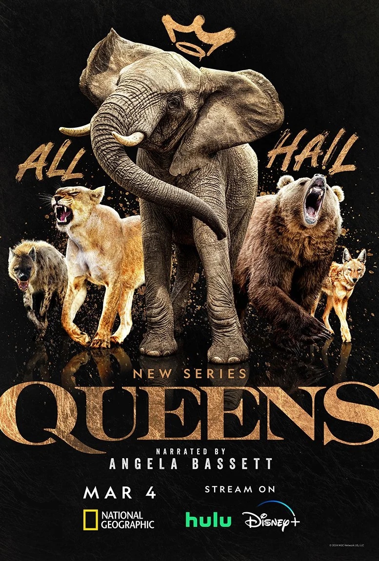
A royal entrance, built from available parts
For Queens, the glamorous approach met a mundane constraint: suitable imagery. In a retrospective published by Graphis, creative director Dan Pavia described the asset shortage. A live-animal shoot was considered but exceeded the budget; stock imagery provided a workable route. The team had to reconcile lighting and species accuracy within the assembled compositions. The campaign received a Graphis Advertising Platinum award.
“The lack of assets always presents a challenge.”
Dan Pavia, creative director · Graphis, February 2025
Look at the finished poster and the labor becomes easier to imagine. The animals occupy a shared dark stage, with reflections beneath them and a loose crown above the elephant. Gold ties the lettering to the creatures’ warm highlights. The composition asks us to accept a theatrical gathering, while the textures keep each animal specific. The effect depends on both the large conceit and the small decisions.
Canyon’s project page follows that visual identity into Times Square and the Columbus Circle subway station. Those placements matter to the reading of the work. A poster can reward inspection; a public screen has to announce itself amid movement. The animals and the title supply a simple hierarchy that can travel. That is a more useful lesson than copying the gold.
The audience changes the assignment
Entertainment marketing has several destinations, even when the underlying show stays the same. Canyon’s Fargo work is explicitly an FYC campaign: “For Your Consideration,” the industry’s appeal to awards voters. Its Netflix work for Guillermo del Toro’s Pinocchio is also labeled FYC, with digital executions. These are assignments aimed at consideration and recognition, with a different context from the first invitation to watch.
The distinction helps explain the breadth of the agency’s services. A client may need a title introduced, a season distinguished or a performance brought back into focus. The right image depends on which of those jobs is on the table. Treating every commission as a launch poster would flatten those differences before the designer had even opened a file.
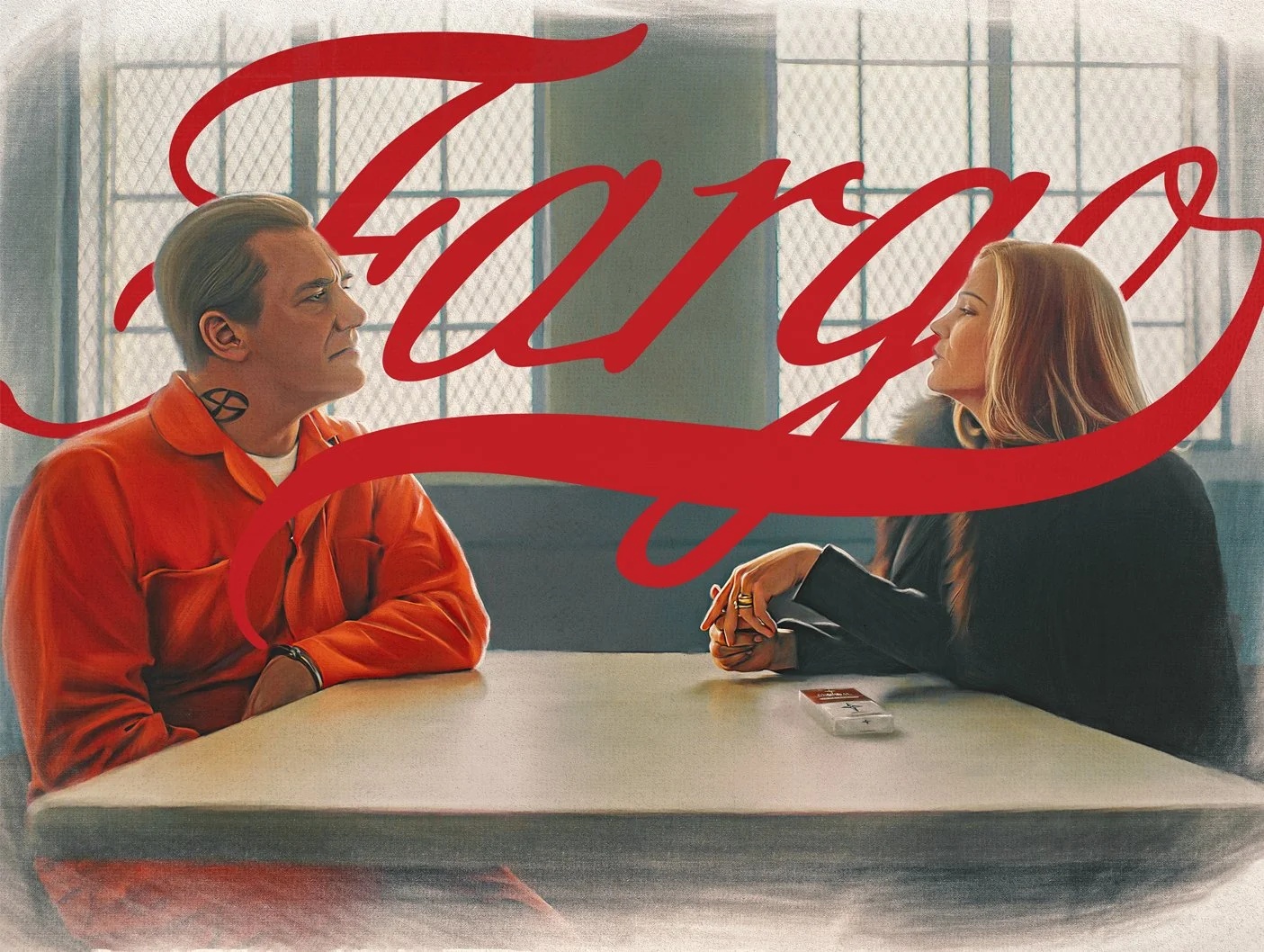
In the Fargo image shown here, red script sweeps across a tense encounter at a table. The letters almost become a third participant. Clothing, posture and the space between the figures carry the scene; the title supplies a flourish that feels at odds with the institutional setting. This is an image built around a relationship, rather than a roll call of faces.
The Clios awarded the campaign Silver in 2024, in the mixed-campaign category for key art. Its entry identifies FX as the brand and Canyon as the entrant. That recognition establishes an achievement in advertising craft. For a prospective client, the more useful next step is to examine the actual executions and decide whether that kind of visual interpretation suits the assignment.
One idea needs several working lives
A glance down Canyon’s project list produces a recurring pattern: print, digital, social and motion. The labels are easy to skim past. They also describe much of what a commissioning team is buying. A campaign is a collection of things that must remain recognizably related while fitting different spaces, timings and viewing habits.
The Handmaid’s Tale offers a particularly readable example. Canyon’s page gathers work for season four, season five and the final season, including outdoor photography, character pairings and a motion placement identified as the Pendry East. The page lets a buyer inspect both continuity across seasons and variety within a campaign. Familiarity is an asset, but each new installment still needs an invitation of its own.
DIFFERENT ENCOUNTERS.
Editorial illustration of the formats in Canyon’s portfolio.
Two other project pages make the range concrete. Hulu’s Nutcrackers is credited across print, digital and digital out-of-home, with a video execution available to watch. National Geographic’s theatrical documentary Blink carries the same three format labels. The common service is the ability to carry a creative direction through several kinds of finished advertising.
For a buyer, that suggests a sensible test: ask to see the awkward formats. The narrow placement, the moving version and the small digital unit can reveal more about production judgment than the spacious presentation image. This is an inference from the work, but a practical one. A campaign’s identity has to survive the places where there is less room to explain it.
The box still gets a vote
Physical packaging adds another dimension. Canyon won a 2021 Clio Entertainment Silver for Twin Peaks: The Complete Series, entered for Paramount Worldwide Creative Services. The category was box-set, collection and complete-series packaging. It is a distinct commission within the same entertainment economy: giving a screen property a physical form that someone might choose to own.
A package has obligations a billboard can escape. It has surfaces, edges and a sequence of encounters. It may need to communicate what is inside while making the object feel worth keeping. These are general design considerations, and they explain why packaging belongs in a different conversation from a promotional image, even when both use the same title.
Twin Peaks
Clio Silver · Packaging
Fargo
Clio Silver · Key art
Together, the packaging and key-art awards show that Canyon’s documented expertise spans more than one advertising surface. That gives a studio marketing team a reason to consider it for connected assignments. It also offers a useful reminder to smaller brands: the thing a customer takes home and the image that first caught their attention are parts of the same relationship.
A television background, a production-minded team
Eileen Brown established Canyon in 2003 after nearly two decades as a vice president of television advertising at a Santa Monica agency. The company’s account of its beginning emphasizes a few initial clients and a workspace capable of taking a campaign from concept through production. That origin fits the portfolio’s attention to both ideas and their finished applications.
A 2022 recruiting notice gives a more concrete picture of the work. Canyon sought an associate creative director with entertainment experience, calling for conceptual development, photo-shoot direction, title design, finishing and adaptations for outdoor or digital use. It also asked for mentoring junior designers. Photoshop, retouching and typography were mandatory skills. The glamour, apparently, still required very good file work.
The same notice stressed kindness and respect alongside collaboration. Those are stated hiring priorities, rather than a verdict on anyone’s working experience. They nevertheless describe the environment Canyon wanted to recruit for: experienced people able to make things together, review them together and help less experienced colleagues improve. The published role placed craft and interpersonal judgment in the same job description.
What a client is actually buying
Canyon operates as a creative-services agency, taking commissions from business clients. Its public work points to a fee-based service model: the client buys creative development and execution for an assignment. For someone preparing a brief, the central purchase is specialist judgment combined with the capacity to produce the required materials.
Comparable agencies include Art Machine, whose entertainment offering spans print, digital and social, motion and production, and Leroy & Rose, which describes a collaborative full-service practice. Canyon’s difference is best assessed through its particular work and people. A buyer can compare genre sensitivity, illustration, photo treatment and campaign extensions, then ask which team best understands the audience and delivery requirements.
Geography also deserves a closer look than the office address. Canyon’s portfolio explicitly credits Amazon Brazil for Dom season three. Alongside its American network and streaming assignments, that provides evidence of work beyond the domestic market. An international brand should still define its language versions, territories and approvals at the outset; a familiar entertainment logo is only the beginning of that brief.
The repeatable lesson is straightforward. Name the audience. Decide what the image should make that audience notice. Audit the available material before promising a production approach. Then test the idea in the actual placements. For a studio, that may mean a season launch; for another business, it might mean a product introduction. The method requires a clear promise and enough craft to make it legible.
It also needs restraint. A decorative treatment that misreads the subject can attract attention for the wrong reason, while unsuitable imagery can unravel when enlarged. Canyon’s portfolio is most instructive when viewed at that level: an invitation to inspect decisions. Before the viewer presses play, somebody has already chosen the face the story will wear.
Look closer at the work
Explore Canyon’s portfolio, its Fargo campaign and The Handmaid’s Tale. Watch the motion examples on the Nutcrackers and Blink project pages.